

The color scheme you choose for your website involves much more than simply selecting your favorite colors. Your color palette is vital to your brand’s visual identity, helping you to stand out from the competition and communicate who you are. Colors also have the power to convey emotion and influence decision-making.
Selecting the best colors for web design might sound overwhelming, but it doesn’t have to be. This guide will help you understand the psychology of color and how to identify the right ones for your website.
What Is Your Website All About?
The first step in picking a color palette is to define your site’s brand identity. Your audience should understand who you are and why they should engage with your brand. A recommended practice to create a list of adjectives that describe your brand’s character, as if you were talking about a person.
Ask yourself these questions:
- What are your brand’s values?
- What is your website’s purpose?
- Who are you trying to reach?
- What emotions do you want your audience to feel when they visit your site?
- What sets your site apart from the competition?
Next, you can use color psychology to find the palette that best represents your website’s identity.
What Is Color Psychology and Why Is It Important?
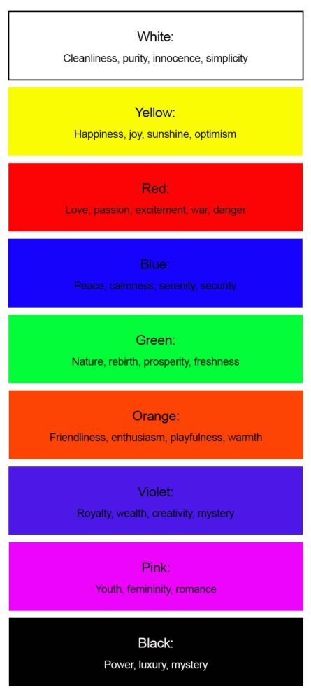
The psychology of color refers to howt different colors influence human emotions and perceptions. Each hue impacts viewers in a specific way, so it’s crucial to understand the meaning of each color when choosing your website’s color scheme.
Before choosing your colors, it’s important to keep your audience in mind because some colors have different meanings depending on the culture. For example, purple symbolizes creativity and wealth in many parts of the world. But in Brazil and Italy, purple is associated with mourning and bad fortune.
Here’s a rundown of the most commonly used website colors and what they symbolize:
How Use Color Theory to Choose the Best Colors for Your Web Design
The art and science behind the most effective use of color is referred to as color theory. Designers and artists use color theory to guide the mixing of colors and the visual effects of a specific color combination.
According to color theory, a general framework for selecting your website’s color scheme is picking three colors: a base color, an accent color and a neutral.
Base: This is the most dominant color. It should reflect your brand’s most dominant personality trait and appeal to your target audience. Your base color will also help you determine your other colors.
Accent: The accent color is the second-most important hue after your base color. It can be tricky to choose your accent. It must align with a personality trait of your brand, pair well with your base color and appeal to your audience.
Neutral: This is a background color, so it should be subdued. Neutrals are usually a shade of gray, beige, white or off-white. In some instances, black can serve as a neutral as long as it’s not overpowering.
Choosing a Color Scheme
When selecting your colors, you should keep a specific color scheme in mind. Typically, brands will use one of these color schemes: monochromatic, analogous, complementary, split-complementary or triadic.

Monochromatic: If you have one dominant brand personality trait, a monochromatic color scheme might be the right choice, as this approach emphasizes the meaning of that particular brand color. Picking different shades of one color will emphasize that personality trait.
Analogous: Analogous colors are next to each other on the color wheel. These adjacent colors typically have similar emotional connotations without being as bold as a monochromatic look. Analogous color schemes don’t usually stand out as much as complementary or triad schemes.
Complementary: Complimentary colors are directly across from one another on the color wheel. Since they’re opposites, they bring out the best in each other when paired. Complementary color schemes are popular, so make sure that yours doesn’t look too similar to another brand.
Split-Complementary: A variation on the complementary color scheme, this approach contains a combination of three colors: one primary color and two colors adjacent to its complement. Split-complementary colors offer more of a contrast than complementary colors.
Triadic: Triadic colors refer to three colors that are evenly spaced around the color wheel and usually result in a vibrant look. These schemes are on the safer side, like analogous colors, but offer more visual interest, like complimentary colors.
How to Apply Your Color Scheme
After you’ve chosen the color palette for your web design, the next step is to ensure it’s used consistently and aligns with your overall brand identity. Here’s how:
- Establish your overall brand identity. Your brand identity refers to the collection of concepts, slogans and visuals that make a company unique. Just like a personal identity, finding your brand identity involves a deep understanding of the core of your brand.
- Create a brand style guide. A style guide will set the standard in terms of colors, fonts and other brand attributes. It will also ensure that everyone on the team knows how to work with the colors and other elements you’ve established.
- Design a logo for your brand. A logo is a brand’s most important visual asset. Brand awareness, trustworthiness and other attributes depend on your logo design.
- Choose the right typography. Just like your color palette and logo, your typography will help convey your brand identity.


