
These days, it seems like every business is jumping on the latest marketing trend and rocking a sleek, minimalist logo. It’s understandable with all the buzz around it. But hey, no need to feel pressured to follow suit if it doesn’t match your brand’s personality. If you’re more into that charming, old-school vibe and it aligns better with your brand identity, then go ahead and rock a vintage logo design.
Here at Penji, we’ve had plenty of clients come to us seeking the perfect logo that truly represents their brand. With our top-notch designers, they know they can trust us to handle their most crucial branding asset. And now that we’re offering one-off designs, more and more clients are trying out our services.
If you’re thinking about going for a vintage logo design, get ready to learn the ropes and get inspired by some amazing examples we’ve gathered. And hey, we’ve got a bonus tip for you on how to request a stunning vintage logo, so make sure to stick around until the end!
Need an awesome logo for your brand? Check out Penji for unlimited graphic design services or one-off logo designs.
Awesome vintage logos for your brand
Have your brand logo designed by the world’s top 2% creatives

What Goes into Vintage Logo Design?
We often associate the term vintage with old, and in most cases, that could be correct. However, many may be confused as to how it differs from other terms like retro or antique.
To understand this further, let’s look at the meaning of these terms according to Apartment Therapy:
- Antique. The art and design industry uses this term to pertain to pieces of furniture, works of art, or any decorative object created at an earlier time. For customs in the furniture industry, the period of creation should be 100 years ago or greater.
- Vintage. On the other hand, you can use the term vintage to pertain to a certain period, such as “vintage 1940s.” Vintage also pertains to a work that embodies the best qualities associated with that era.
- Retro. Retro is short of “retroactive” or “retrograde.” Retro works of art may not necessarily belong to a certain period but may imitate or revive those aesthetics.
Given the reference above, a vintage logo is a branding asset designed using dated visual aesthetics. When the concept of vintage is applied to graphic design, it can also mean reviving or relating old-school aesthetics and visual cues. In that sense, retro and vintage can be interchangeable when used in the context of a logo.
Related Post: Fashion Logos and the Stories Behind Their Iconic Designs
Factors to Consider for Vintage Logo Design
In short, a vintage logo displays elements that make the viewer think of an earlier period. There’s no single approach to do this, and there are various factors that a designer could incorporate to channel a vintage feel.
Below are a few factors a graphic designer may use to make a visual asset look vintage.
Shapes
If you look at old logos, many are encapsulated in a unifying shape, such as a round or a rectangular margin. This may be because the old-school way of branding products was through stamping.
That said, it’s not surprising that brands who want a rustic logo look to aim for rounds, oblongs, or other traditional shapes, usually adorned with decorative vectors such as images or ribbon labels.
Lines
Vintage logos use various types of lines, depending on the unifying shape or the stamp frame. For instance, Victorian-style logos may use elaborate accents that spell luxury and opulence.
Rustic barn house logos may seem more simple and rustic, but simple round shapes and straight lines. But the lack of complexity doesn’t take away from its quaint and old-timey vibe.
Typography
Vintage typography typically comes in fonts reminiscent of old-school dip pens. Vintage typefaces can range from decorative calligraphy to simpler shadowed typefaces.
Whatever font you choose, it’s crucial to ensure that it fits the shapes and lines used in the logo. For one, the text and the other elements should work well with one another and not compete for the viewers’ attention. In addition to that, the overall look should be cohesive and not overwhelming.
Color
There’s no one set of colors considered to be vintage. But as mentioned above, vintage design pertains to the best aesthetics related to a certain period or era. That said, a monochrome logo can be just as vintage as a vibrant palette.
So, how does one come up with a palette that reminds people of a certain era? Here’s a trick – reverse engineer your colors. Take an iconic photo from an era and analyze the colors that appear on that image. More or less, you’ll find a palette that reflects the period you’re going for.
Vintage Logo Design Ideas
Now that we’re clear on the vintage logo meaning and the factors that make it so let’s take a look at some examples.
1. Hermes
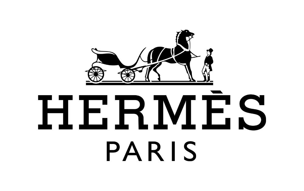
When it comes to vintage logo design, Hermes is always a good one to emulate. The logo shows a Duc carriage with a horse paired with block letters. It seems that the artistic director hit the mark with this classic logo. In fact, the fashion house hasn’t changed this emblem since the 1950s, and it still looks luxe and relevant.
Related Post: Clothing Brand Logos: Free and Paid Options for Your Business
2. Stella Artois
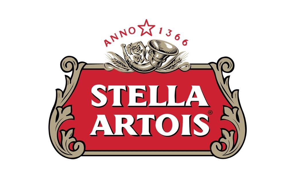
If you’re looking for vintage logo design ideas that look regal, check out this logo for Stella Artois. Though Stella was launched in 1926 as a Christmas beer, its parent brewery has been serving up pilsners since 1366.
3. See’s Candies
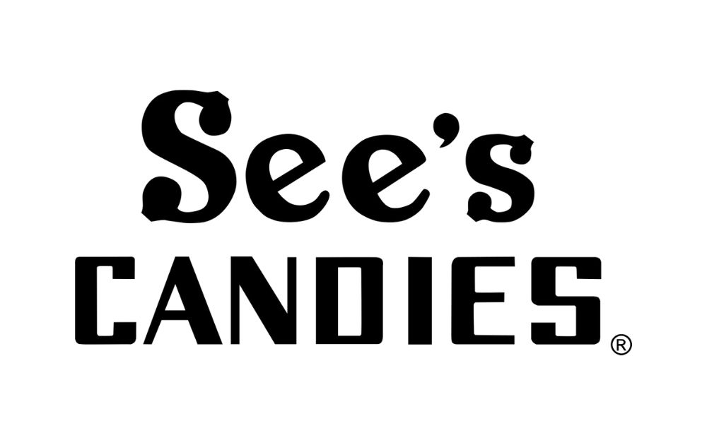
Founded by Charles See in 1921, See’s Candies has been satisfying the sweet tooth for a century now. As seen from their logo, their brand asset reflects how seasoned they are in the industry. If you look at old photos of their shops from decades ago, you’ll see the very same logo they’re donning today.
4. Angelina
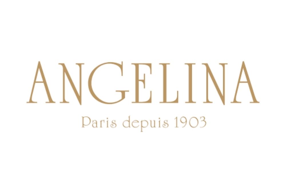
This tea house is known for its mont-blanc dessert and rich hot chocolate. But Angelina also offers a delicate feast for the eyes through its vintage logo design. The typography shows an art deco serif typeface in capital letters that’s simple and lavish at the same time.
5. Twinings
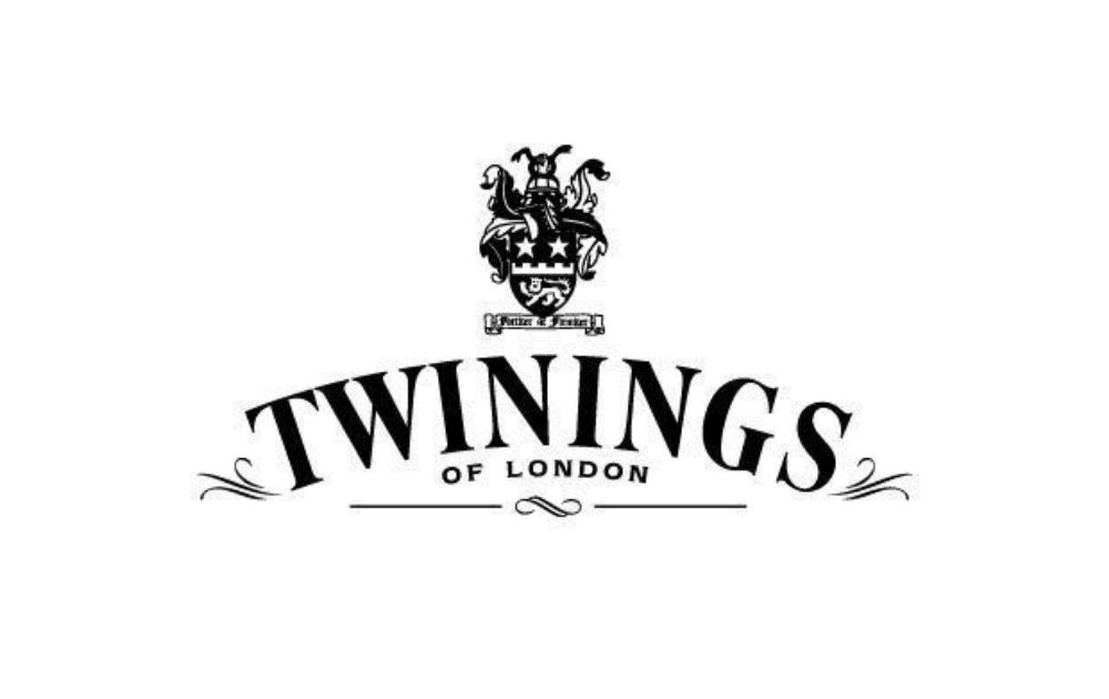
Many know Twinings for its delicious teas, but did you know that it’s also one of the oldest tea brands worldwide? In fact, its logo, which was designed in 1787, is one of the world’s oldest emblems.
Related Post: 15 Amazing Tea Packaging Designs From All Over the World
6. Cailler
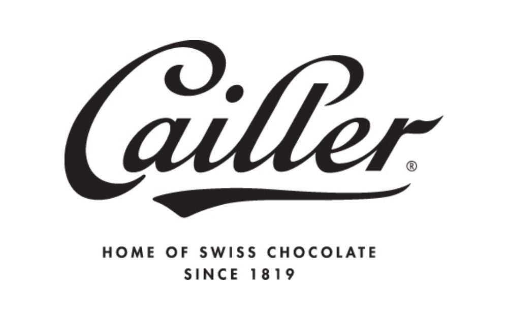
Here’s an example of a vintage logo design that’s relatively minimalist. Cailler, though now brought by Nestle, is one of the oldest Swiss chocolate brands founded in 1819. Its logo is anchored on the decorative text – much like fluid calligraphy.
7. Harney & Sons
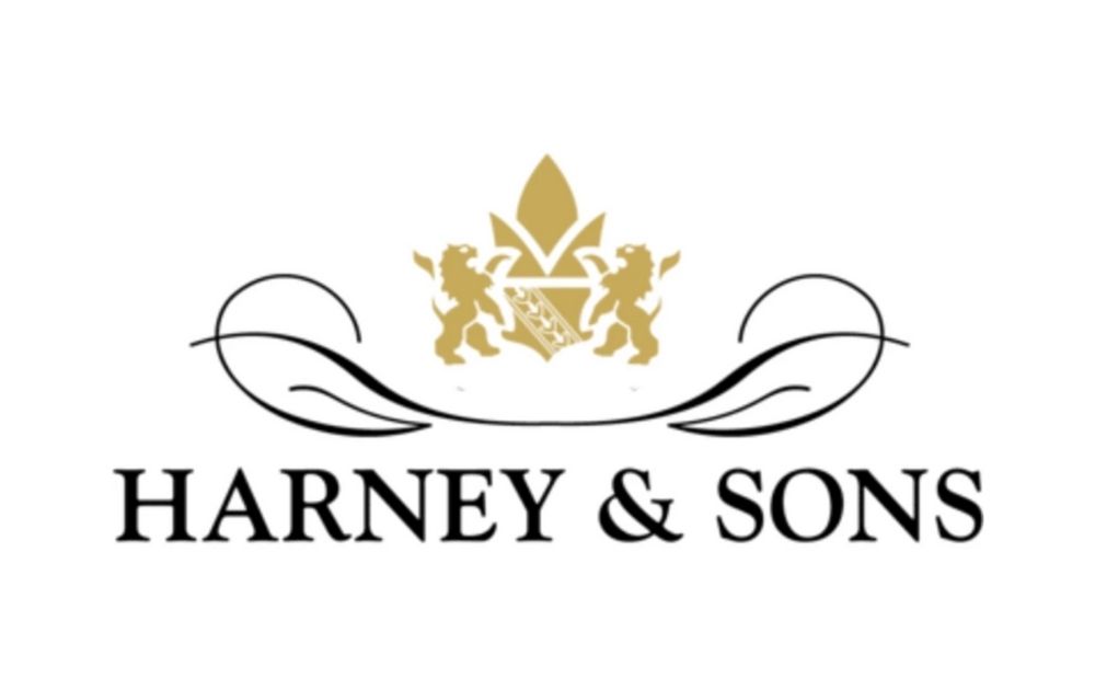
Though Harney & Sons had only been founded in 1983, its vintage logo design reflects a certain brand of sophistication. The gold emblem offers just the right amount of opulence, while the swirly lines that form leaf shapes go well with the simple serif font.
8. TWG
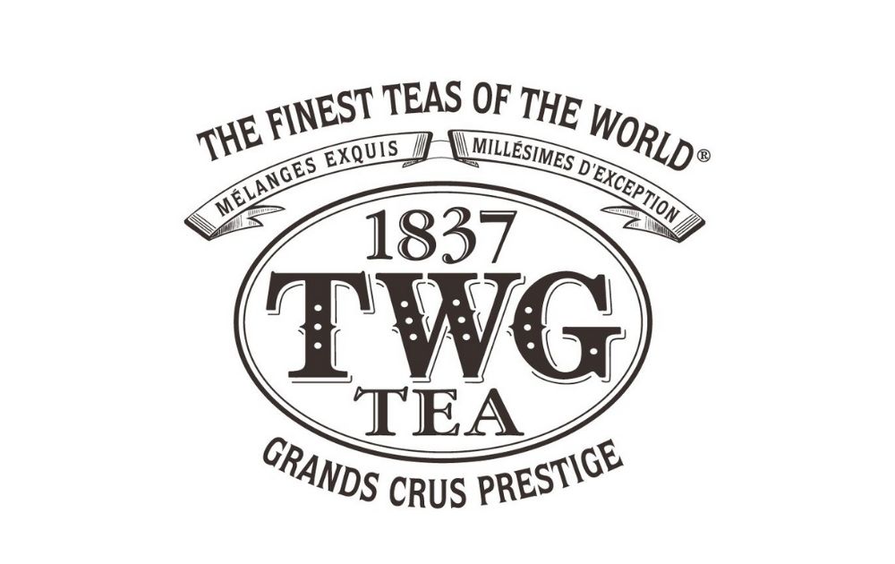
Here’s an example of a beautiful design you won’t get from a vintage logo illustrator. TWG’s logo spells luxury and old-world charm. But did you know that the Singaporean tea line was only established in 2007? The 1837 mention in the logo refers to the year when free tea trading in Singapore began.
9. Brotherhood
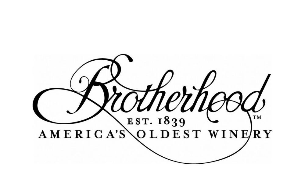
A template-based online retro logo maker probably won’t give you a logo that looks as customized like this. The brand claims to be the oldest winery in America, and its logo surely reflects this brand identity.
10. Trappistes Rochefort
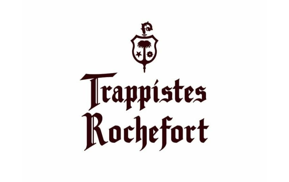
If you’re looking for inspiration for an antique logo design, consider this one from Rochefort Brewery. It’s a Belgian brewery that dates from 1899, but it’s associated with Rochefort Abbey, which originated in the thirteenth century.
Vintage Logo Design Dos and Don’ts
As seen from the examples above, coming up with a vintage logo requires a good design intuition. Here are the dos and don’ts you may want to keep in mind when designing a vintage logo.
Do
- Make sure that your design elements work well together. If you’re drawn to a particular era, research the aesthetics of that period and work from there.
- Consider your brand identity. After all, your logo should, first and foremost, reflect your brand. Even the most beautiful logo won’t get you far if it’s not in sync with what your brand stands for.
Don’t
- Pick out elements from various eras and throw them into one logo. For example, pairing a busy art deco pattern with elaborate Victorian elements and a Gothic font will be too much for the eyes.
- Be afraid to marry vintage elements and a minimalist approach. Mixing the two can result in a sleek logo that still retains a classy and elegant feel.
How to Get a Vintage Logo Design (Free and Paid)
So here’s a question you might be pondering about since you started reading this article: how can you get a vintage logo design? There are generally three options, and there are pros and cons for each.
Option 1: Vintage Logo Design App
Online logo design apps are a dime a dozen these days. All you need to do is to pick a template, encode your brand name, and add in images and other design elements.
Pros:
- Most online apps are free and easy to use.
Cons:
- Your logo could look like thousands of other businesses using the templates.
- Despite ready-made templates, there’s a big chance your logo could look amateur.
Option 2: Freelance Graphic Designer
If you want a unique logo and you don’t mind spending a fee, hiring a freelance graphic designer is a good option. The easiest way to find freelance artists is through online job marketplaces. In the same vein, there are also online platforms that allow users to hold online contests over a design project.
Pros:
- Many freelance designers (especially those who are at the start of their careers) charge an affordable price.
Cons:
- Browsing through a handful of applications and portfolios may not be the best use of your time. This is especially bothersome if you’re working on a tight schedule.
- There’s always a risk of the freelance designer going MIA in the middle of a project. When that happens, you’ll be left with a pending design that could delay your business or revamp launch.
Option 3: Unlimited Graphic Design
Going for an unlimited graphic design service can be one of the most practical and convenient ways to get visual assets done. For one, you can get all the visual assets you need without needing to spend an arm and a leg. Here are some of the sample logos we’ve done for clients in the past:
Pros:
- You’ll get to work with the best designers in the industry. For instance, we assign the most suitable designer for every project with relevant skills and experience.
- There’s no risk of the designer leaving you out in the cold. Even if the designer assigned to you needs to deal with an emergency, there will be a team who can provide back up and get your project going no matter what.
- At Penji, we offer a state-of-the-art dashboard that makes it easier for clients to comment and request revisions. As a result, the designer gets a better grasp of what the project needs sans the email back-and-forth.
Cons:
- If you only need one visual asset, you might not make the most out of the unlimited service.
The Bottom Line
Without a doubt, a vintage logo design will add a layer of sophistication to your retro business. However, vintage design can be tricky. Sometimes, all it takes is a wrong font or a line out of place to turn a logo from fab to drab. Thankfully, there are reliable service providers that can do the design heavy lifting as you focus on other crucial parts of your business.
Are you looking for a partner to help you design vintage logos and more? We, at Penji, are here to help! With unlimited graphic design at a flat monthly rate, we can take care of all your graphic design needs without charging you an arm and a leg. From digital illustrations to ad designs, we’ve got you covered!
We offer a turnaround time of 24 to 48 hours, so you can stay on top of your campaign schedule. Sign up now, and get unlimited graphic design services or one-off logo designs.
About the author

Carla Deña
Carla is a journalist and content writer who produces stories for both digital and legacy media. She is passionate about creativity, innovation, and helping small businesses explore solutions that drive growth and social impact.


