
Statista reveals that an average smartphone user will download at least ten apps (not the pre-installed ones) on their phones. With both app stores having millions of apps launched and ready for download, how can your app vie for your user’s attention? One way to do that is through the app design icon.
They say that first impressions matter and your app’s icon can influence a user’s decision. And to capture your audience’s attention, you need one that will stand out from the crowd. In this article, I discuss how you can create an app icon design, examples of excellent app icon designs to follow, and how Penji can help ease your ongoing design tasks!
App Design Icon Guidelines
App Store
The App Store provided its guidelines on how the app icon should look like in their OS. According to the guidelines provided, Apple values simplicity. It’s in line with their branding and aesthetics. Other things to note when publishing an app on iOS:
- Ensure that the logo is opaque
- Check the app icon on different colored backgrounds
- Make sure that it is square (Apple applies a mask that will make the corners round)
The sizes of the icon depend on the device type as well.
iPhone:
- 180px x 180px
- 120px x 120 px
iPad Pro:
- 167px x 167px
iPad and iPad mini:
- 152px x 152px
App store:
- 1024px x 1024px
Google Play Store
Across all devices, the final size should be at 512 x 512 px. Google Play recommends following the keylines when designing the app icon. It’s 75% of the final size (384px x 384px).
Another thing to note is when your design has a drop shadow, Google Play automatically adds a drop shadow on the icon. Plus, like Apple, publish a square icon since Google Play applies a mask to round the icons.
Now that you know what sizes you need to follow, learn what the good app design icon elements are.
Elements of a Good App Icon Design
According to Michael Flarup, grab your users’ attention by following the principles of logo design. Here are the basic concepts of icon design.
Scalable
Like logos, an icon design needs to look great in any size. You don’t want an app icon to look pixelated. You also don’t want the app icon (if it’s a logo) to look huge in the app design, either. That would cause slow loading times and wouldn’t look pleasing on the app.
Recognizable
As brands decide to create apps, it’s much more important to stick out if you want users to download an app. After all, there are billions of apps available in both app stores. Create an app icon design that will make users pique their interest because of the icon.
Unique
If you want to stick out on the App or Play stores, your icon design should be unique. You want users to remember your app and not your competitor’s. Productivity apps, for example, tend to follow a checklist type of icon. Most of them may have the same design, but they differentiate through color or form.
Consistent
If you’re using the logo as your app icon design, make sure that logo colors, sizes, and elements look the same. It should also apply in the app design as well since this will help in recall.
Another thing Flarup mentioned was not to add words.
Thermopylae reveals that the brain processes visuals 60,000 times faster than text. Your app icon can become a visual representation of your startup, brand, or company. After all, you have limited space, you want to maximize it through compelling design.
It can’t be helped if the logo is a word or lettermark. However, brands could work around it without making it cluttered.
Tips On How To Create an App Design Icon
Having noted what the elements are, here are other quick, handy tips to guide you in creating an app design icon that will stand out.
Research Competitor Icons
Before you start designing an app icon for your client, you need to find what their competitors created. After all, you want to produce a unique app icon. For example, camera apps would have different iterations of the shutter. While you want to make it simple, how can you make it eye-catching? That’s one thing you want to consider as you craft an app design icon.
Make it Relevant
Besides sticking to a functional app icon design, relevance also refers to your target audience and time.
Your client’s target audience should always be at the forefront of your design. After all, you want them to keep your client’s app on your phone. If the app icon doesn’t speak to your target audience, they might have second thoughts about having the app installed on their phones.
The second one relates to time. Due to design trends constantly changing, the app icon design should be updated. An outdated-looking design would leave an impression of having an outdated app and would have users looking for a “newer” one on an app store.
Conduct Testing
When it comes to testing, you have a few considerations here.
First, you need to test if the app icon works well on different backgrounds. Since the dark mode is an available feature for most smartphones, you might need to adjust the color of your app icon. There’s also the wallpaper and background of the user’s smartphone.
Second, you might have to try different models. For example, you want to stick to the function on your app icon. You can try to make a few tweaks by adding perspective or shadows. Perhaps, you might want to add some modifications to it.
Lastly, you have to A/B test your icon before launch. Yes, A/B testing is still crucial in app icon design. Luckily, Google offers an A/B test feature. It’s so you can experiment if that app icon works.
Now know you know how to design an app icon, check out these examples from 20 apps.
20 Examples of Cool App Design Icons
1. Asos
For their app design icon, Asos used the a from their logo and put a circle around it. Unlike most fashion apps, they observed the no-word rule on the app design icon. It looks like the copyright symbol, but Asos keeps its branding thanks to the font consistency on the app icon.
2. Snapseed
The app icon for Snapseed is unique against its other photo editing competitors. It’s intriguing because it can make one wonder what the icon’s significance to its name and use is. Its meaning remains unclear. However, Google developed this app, and it follows the icon style from other Google products.
3. Whereby
Don’t hesitate to use a combination of lettermark and illustrations, just like how Whereby designed their app icon. They even go the extra mile by having two different app design icons for the Google Play Store and App Store. The different illustrations are intriguing and will make a potential user click on it to learn more about the app.
4. Timehop
This example from Timehop uses their mascot, Abe, the dinosaur, as the app icon design. It’s a great alternative to using text since Timehop uses a wordmark logo. Plus, it’s unique, too, because you rarely see characters on any social app.
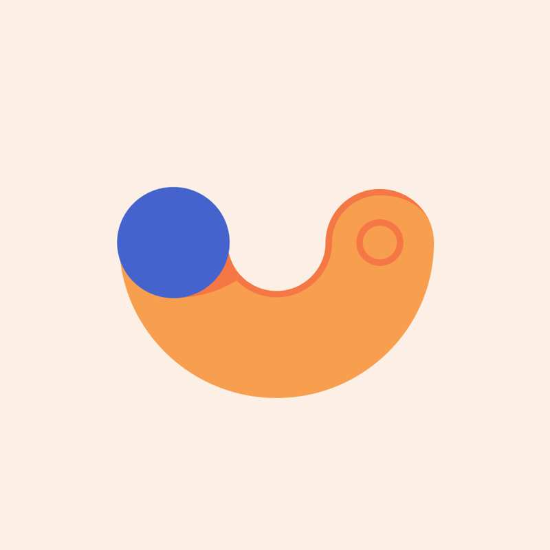
5. Karrot
The Karrot app design icon shows you can get straight to the point and put a twist on it. It’s a shopping app where users can find buyers or sellers. The carrot morphed into a location pin while keeping the carrot form by adding the leaf atop the pin. It conveys the name of the app and its use.
6. American Airlines
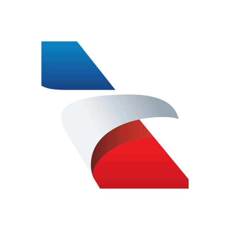
One example of scaling your logo onto the app is from American Airlines. As you can see, they cut off the wings, but the logo remains recognizable on the icon. That’s why you should have a custom logo design that will fit in any size. Check out what our designers have produced for our clients.
7. Wanna Kicks
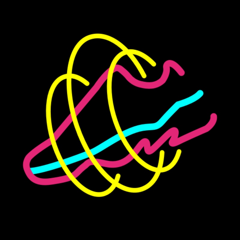
You won’t see many neon designs on any of the app stores, but that’s advantageous for the Wannaby product, Wanna Kicks. It helps them stand out against other AR apps. The app design icon is relevant to the app’s name and its function.
8. Jumprope
The Jumprope app icon design takes inspiration from its name. However, it seems that the icon design appears to relate to the app’s purpose. It’s as if the icon design can either look straight at the user or sideways as if it were jumping up a rope. Either way, it seems to teach the user how to jump up a rope.
9. Squid
The icon design for the Squid app is unique. Most note-taking apps would use notepads and pens. However, because of its name, the app design icon takes the form of a squid. The tip of the fountain pen acts as the body, while the ink lines are the legs.
10. Perfect Ear
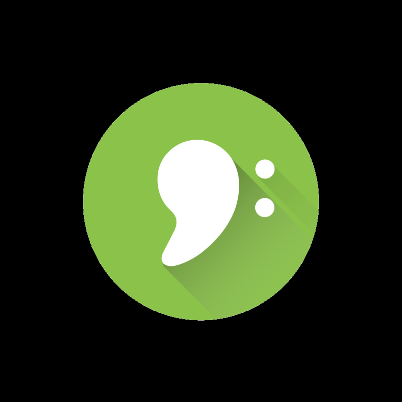
Music app, Perfect Ear, has a double meaning to their icon design. The obvious one is it looks like an ear with two earrings. However, musicians know that it also looks like the bass clef. It’s a great way to attract their target audience.
11. KakaoT

In some cases, you might need to create separate apps for different functions. That’s the instance for Kakaotalk’s KakaoT app. Kakaotalk is a chat app, but KakaoT is for transportation.
As you can see on the app icon, they used a road shaped like a T. It’s a clever yet simple illustration. As part of the Kakaotalk brand, it uses yellow on the T-shaped road to make it consistent and recognizable.
12. Fabulous
Like the Timehop example, Fabulous uses an illustration for the app design icon. The app is about creating habits. The illustration on the app is striking because of the colors. Plus, the image is captivating; this will make a user click on the app and read more about it.
If you want illustrations on your app icon design like Fabulous, learn more about how you can request those and more on the Penji platform.
13. Flipd
The toggle on the Flipd app icon is curved to look like a smile. It’s significant because it signifies when someone uses the app, they can focus. It’s also unique because most productivity apps would show time.
14. Unwind
Some meditation apps use a head vector or a meditating person as their app design icon. The Unwind design is unique. The design seems like a play on toggles.
At first glance, it might be a weather app. However, what Unwind wants users to remember is anyone can meditate at any time of the day.
15. Two Dots
Players of this game know how addicting Two Dots can get. One of the best things about Two Dots is they change their app icon for new level updates. I’ve played this game before, and when I see the change in app icons, it’s time to play new levels. It’s a great way to reduce the uninstall rates because you want users to keep the app on their phones. Plus, they create eye-catching app icons, too, through illustrations or color changes.
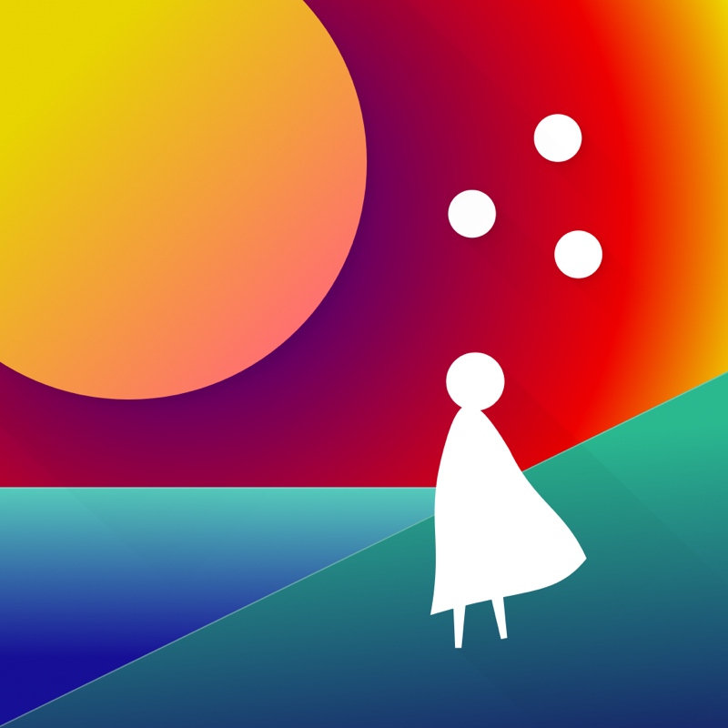
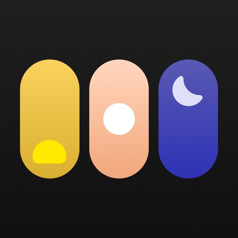
16. Waking Up

The app design icon for Waking Up may seem a little sullen because of the colors. However, it signifies that the sun is about to rise. Plus, it looks like a window view of the sky as it brightens in the morning. Going back to the colors, the use of blue does provide a sense of calm.
17. Windy

Weather-related apps would show clouds or the sun. This one by Windy looks like a W and a visualized gust of wind. It’s an excellent way for them to stand out from other weather apps. Plus, it’s an eye-catching app design icon as well because of how unique it looks.
18. Otter Voice Meeting Notes
What’s great about the Otter Voice Meeting Notes app design icon is the combination of the waveform and Otter. Or what at least looks like an otter. It’s an excellent way to get recognized on any app store because most sound apps would use only soundwaves.
19. Friend Shoulder
The Friend Shoulder app icon both presents a heart and two people hugging. It’s a cool way to combine two different concepts that represent the app. Added to that, the use of green can make users calm as well. After all, one of the functions of this app is to help users vent their problems.
20. Piano by Yousician
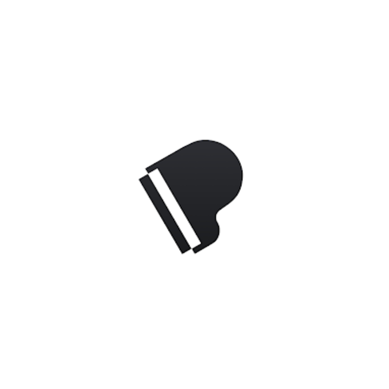
Sometimes, you no longer need to overcomplicate app icon designs. You can get inspiration from the app’s overall function or concept, like this one by Piano by Yousician. It uses a grand piano icon that resembles a letter P. And while it’s unclear it’s tilted, it was still a good idea to do so because it will attract people’s attention.
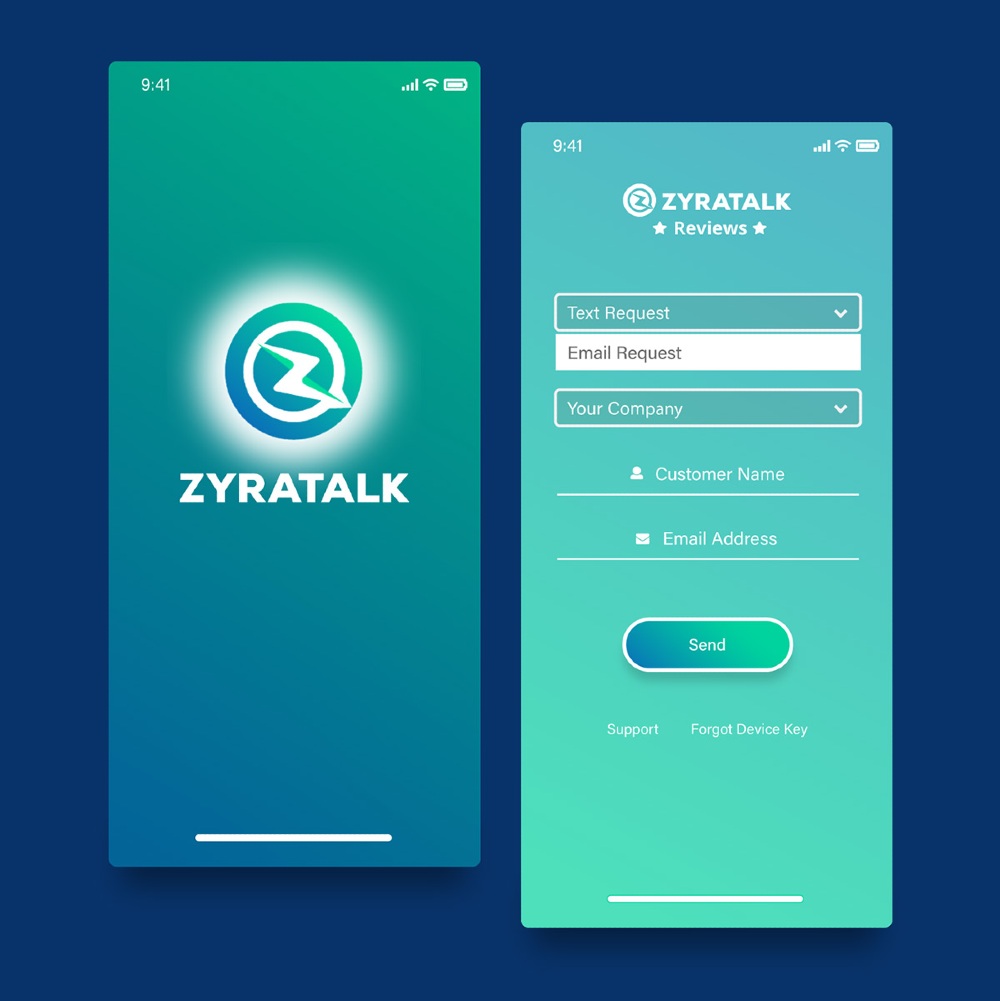
How to Request an App Design on Penji
By subscribing to Penji, you won’t have to go through the trouble of looking for a graphic designer. All you need is to sign up, and you can start requesting on the Penji platform. Here are the three easy steps in requesting an app design.
1: Create a Project
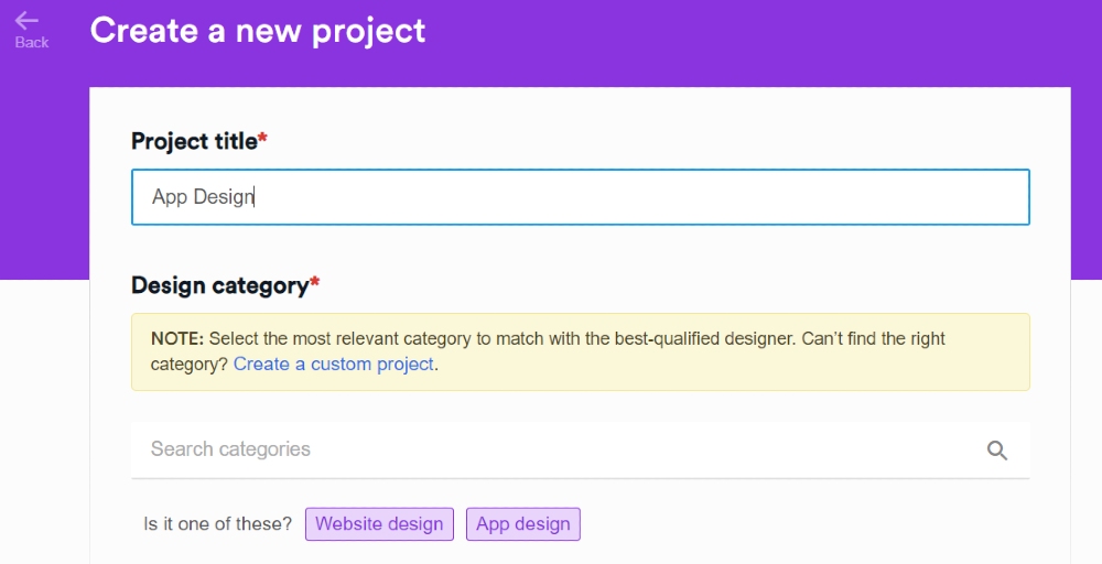
Once you subscribe to a Penji plan, you get access to the Penji platform. On the platform, click New Project. You’ll see a form where you’ll fill up the details of your request. Supply a Project title and Design category.
Tip: Put what you’re requesting on the Project Title. For example, you can type something like this: App Design – Client X
You’ll see the words App Design pop up beside “Is it one of these?” Then click it.
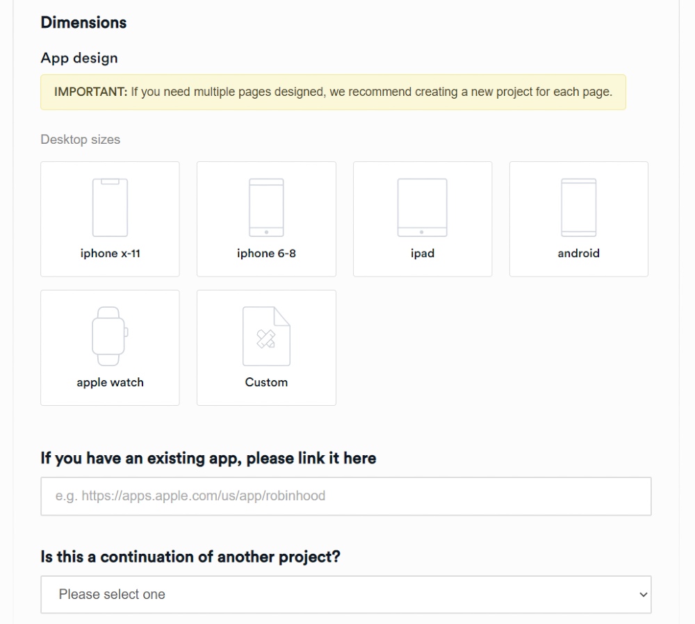
After this, make sure to select the Dimensions of your app. You can also click Custom if you need custom dimensions.
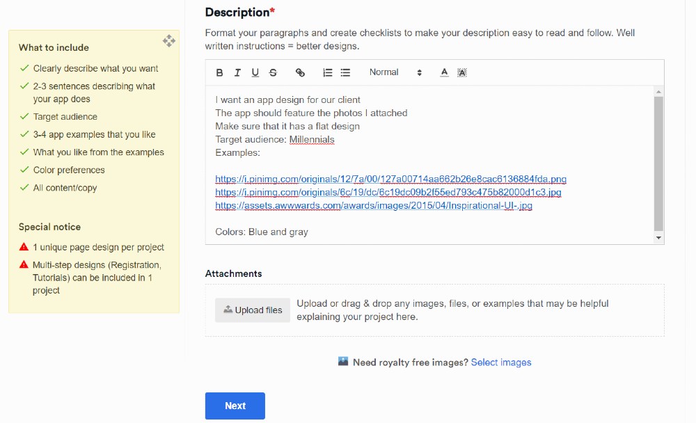
After this, you’ll see the Description field. Feel free to follow the What to Include guidelines. This will guide your app designer on how to work on the app design page.
Then, click the Level of Customization, File Deliverables, and Associated Brand. Once done, click Create Project, and you’ll have your first active project on the platform.
Penji assigns a designer to your project, and they will review your request. From there, they’ll submit the first draft of the app design. Please remember that app designs might take time depending on the requirements of the page or pages.
2: Review the Project
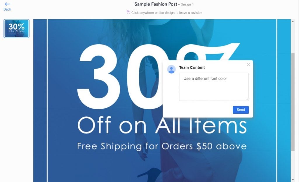
Once the designer submits the first draft, you can review the design. One of the reasons why Penji clients continue to use the platform is the revision tool. If you think the design needs more work, point and click on the design.
Leave comments on how your designer can improve their work. No need to download the first draft and put markings on it by using Paint or another design software.
Once you pointed out what needs improvement, the designer will submit a revised version within 24 hours.
3: Download the Design
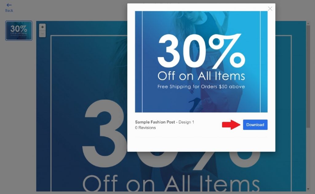
If the design meets your standards or exceeds expectations, all you need to do is download it. By clicking on the Download button, your files will be saved to your computer. That’s it. There’s no fuss. It’s easy to receive your design.
Plus, you can access it anytime when you need it. Penji stores the designs in a cloud. So, if you need another copy of the design, just log in to the Penji platform, and download the design once more.
Final Thoughts
The 20 examples above show that you can create an app design icon that will capture user attention. You don’t have to use the company’s logo as an icon. Maybe you can use illustrations or icons that can make users take a second look while browsing. Either way, don’t settle for a lackluster icon that will decrease install rates.
You can rely on Penji for high-quality and compelling work for only $899/mo on the Agency plan. Get access to ALL design types. Plus, we streamline your work by assigning two or more designers for your projects. You won’t find this rate anywhere else.
Increase productivity rates and double your outputs when you sign up for Penji. Don’t settle for cheap options or spend too much on mediocre work. Subscribe now and try Penji 100% risk-free for 15 days.
About the author

Katrina Pascual
Katrina is a content writer specializing in graphic design, marketing, social media, and technology. In her spare time, she writes monthly personal blogs to practice her craft.


