
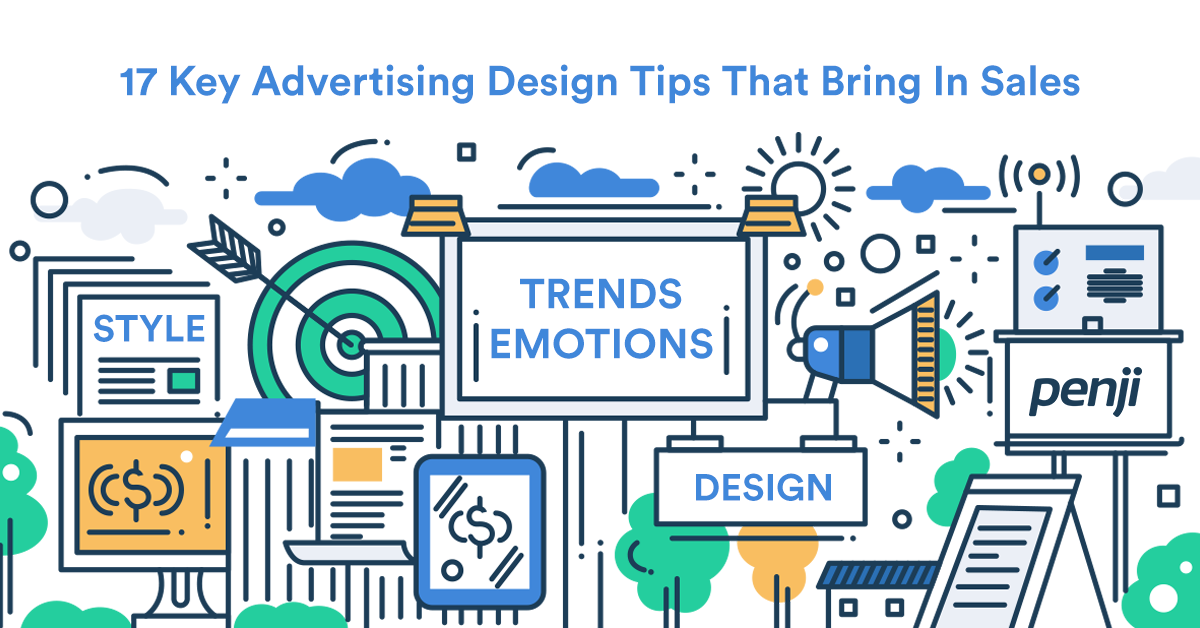
Ever wish you could create breakthrough advertising design – without paying an agency $1000/hr? Well, within the next 5 minutes you can. When it comes to advertisements, you often think it’s the copy and messaging that matters, and you’re not wrong. Except people don’t notice the messaging first, they actually don’t even notice you at all.
And that’s where your understanding of design comes into play. A well thought out and structured design will enable your audience to actually NOTICE you, thus giving your messaging, call to actions, etc. a fighting chance to win their business. Having designed literally thousands of pieces of ad design for our agency clients, we’ve seen what works and what doesn’t. And today, we’re giving you the 17 secrets (hacks really) that digital marketing agencies use to create some of the highest converting ads.
1. Ask a question
Image Credit: Etienne Girardet from Unsplash
Asking a simple question in your marketing graphic is a powerful technique that accomplishes a lot more than you think. Asking a hyper-specific question allows you to filter your audience. Only those you want to target will either understand your question or will even pay attention since it’s relevant to them. Asking a question also identifies a pain point that your prospect may not be aware of.
“Are you paying too much for advertisements and not getting enough result?”
A simple question like that uncovers a hidden pain point triggering an emotional response (see #4) from your viewers. And when someone feels something while engaging with your ad, they’re much more likely to either read further or take action. So for your next design, try an experiment with asking questions instead of presenting benefits and features.
Here’s an example of a Facebook ad that we use. Don’t let the simplicity (See #2) of this ad fool you, it’s one of our best performing ad!
2. Simple advertising design
The first order of business is keeping things simple! Don’t make the mistake of having too many words/graphics jammed into your ad. By having a simple design, it’s easier for viewers to notice the one “important” thing you want them to see. Keep your design hyper-focused, elegant, and most important – simple. A simple design is one of the most important aspects of an ad that performs well and have a high ROI.
Do use this idea with a bit of salt because it certainly does vary based on the industry and the audience. Simple advertising design is important, but certainly not the most important. Typography, color, style of stock images (if applicable) are all factors to consider as well.
Learn how the Healthcare industry utilize simple ad design for conversion: Top 20 Best Healthcare Ads To Inspire Your Next Marketing Campaign
Good ad example
This is a great example of a simple advertisement design utilized by Lego. The dinosaur silhouette in conjunction with the dinosaur-like blocks speaks volume to the end-user. No further explanations needed.
Bad ad example
The ad below contains way too much information for your eyes to digest. Although it does a good job portraying the type of service the company offers, the information overload makes this ad easy to miss, and therefore likely to perform poorly.
3. Have a Call To Action
You’d think this would be obvious by now to put a Call-To-Action in your ads. But because so many people still don’t add this basic element, I’m forced to add it to the list. Call to actions work, there’s no debate about it. You need to have a call to action either in your design or in your copy somewhere. Sometimes, just by modifying the call to action, some of our clients have seen as much as 60%+ in their traffic conversion.
The purpose of creating an ad is to convert sales. So, a way to ensure that you have an effective ad is to always include a call to action section. This feature is used to promote or urge consumers to take action, through terms such as “Sign up now”, or “Buy now”. When creating your Call To Action, make sure to tailor the language of the button (or action) specific to the industry, and avoid using generic phrases such as “CLICK HERE” or “See more” when possible.
This is especially important when designing landing pages to complement your ads. Further reading: 15 Secrets Of A High Converting Landing Page Design
Example of good call to action
4. Appeal To Emotional Cues
Your visitors are emotional creatures, especially when it comes to the buying process. We all know that there’s a strong emotional element to sales and advertising, yet we often ignore it when we design ads. Make your ads relatable to your audience by appealing to certain emotions that you’d like them to feel when seeing your brand/product/service. We don’t often remember the things we read/see unless it triggers some sort of emotional response from us.
One of the easiest ways to appeal to emotional cues is through the use of colors. According to Toptal, popular idioms show that people have long associated colors with the emotions they evoke. Using bright colors such as red, orange, and yellow tends to evoke your visitor’s appetite. Meanwhile using green, blue, and more subdue colors tend to correlate with honesty and trust, which explains why you see a lot of law firms and financial institutions use these colors in their advertising.
Learn more about Food advertising: 25 Top Food Ad Designs That Will Make You Hungry For More
5. Use “Uncommon” Images
Image Credit: Google Deepmind from Pexels
Images have a strong aesthetic appeal for designs. Consumers would rather look at images than read ads. The images that you pick represent the message that you are also trying to portray. So, be careful and be creative with the image that you chose. With that being said, it’s best to have a photographer take unique, uncommon, and professional photographs for your designers to use when creating ads.
If that’s not possible, stock images will work fine, but be careful NOT to use something that looks like an obvious stock photo. You want to avoid generic looking images like the plague. Choose something that looks unique and uncommon. People are likely to scroll or move past an image that they believe they’ve seen already. A unique and never-before-seen image is more likely to grab attention.
Avoid using obvious stock photos like these.
Use these photos instead.
While still stock photos. This one looks a bit more convincing and less obviously-stock than the picture above.
6. Have a Celebrity or Influencer in your industry
Consumers follow influencers more than brands. So, have a representing influencer or famous figure be integrated into your design. A well known figure typically has a certain persona and following attached to their name. So, when brands associate their product or service with a figure, they are collectively bringing in their followers and are representing the same personality and beliefs.
But that doesn’t mean you need to bring in Jay-Z for an ad-shoot. An influential figure, speakers, or someone who’s reputable in your industry works even better. The more narrow and niche your product/service is, the better because almost everyone in that small community will likely recognize the person. And it also won’t cost a fortune to hire them. Often times, they’ll do it for free to get free press/publicity along with your ad campaign.
Penji using a community influencer in our ad.
This is an ad design pulled directly from our current Facebook ads campaign. We asked an influential member of the startup community (whom everyone is familiar with in Philadelphia) to be a part of our campaign.
7. Clean Typography
Typography is a creative but technical gateway for good consumer experience. The font must be clear and legible, but also a creative representation for your overall message. Unfortunately, it’s also one of the most overlooked design element. Sometimes you’re looking at an ad and it just doesn’t look “clean” or “cohesive” but you can’t quite put your fingers on it. If that happens, chances are the fonts don’t match the messaging.
A good advertising design utilizes clean and structured fonts that represents the brand well. Check-in with your brand guideline to see what fonts you’re already using, and stay consistent. It’s okay to use a different font than the ones your brand already uses, however, check with your designer to make sure it looks good on screen before committing any budget to it.
Here’s an example of typography matching the brand. Looks simple and clean right?
Now here’s an example of bad typography ruining everything. The only time this font is acceptable is Halloween.
8. Design For Trends
Good advertisement design makes sense – at the time. Check with Google trends and make sure the theme/messaging/content you’re displaying to your visitors are actually relevant and trending. If it’s trending, it’ll do much better since people are more likely to recognize, relate, and understand what you’re trying to say.
Trends are topics chosen by the people (consumers). These topics tend to be popular, easily shared, and are in demand. Businesses and marketers turn to consumer demands when it comes to creating ad campaigns, products, and services. So, create an advertising design that fits in with the trend today in order to attract engagement and interests.
9. Use Testimonials In Your Advertising Creatives

Image Credit: Towfiqu Barbhuiya from Pexels
When it comes to promoting a new product or service through digital ads, consumers don’t trust the business. Because obviously you’ll toot your own horn. In order to gain a dependable reputation and some trust, use testimonials from your actual customers in your digital advertising design. By using testimonials, you represent a welcoming, authentic, and dependable spirit.
We’re also all affected by the crowd effect and tend to make decisions based on what the majority does. Use this to your advantage and create a compelling advertisement design that showcases someone’s experience with your product or service. At Penji, we utilize a wide variety of ads showcasing some of our best customers. And we’ve seen significantly more conversions and click-through-rates with ads that utilize testimonials versus generic graphics.
To make this even more potent, get a testimonial from someone influential or a celebrity and you have yourself a winning combination that will drive sales through the roof.
These are some of the highest converting testimonial ads we use for our own marketing campaigns.
10. Have a Sense of Urgency or Scarcity
Although this is more related to the ad copy and landing page itself than the broadcast design itself, we’re including it’s a powerful trick that can double/triple your results. Urgency and Scarcity isn’t a new trick by any means, but it’s more common with TV infomercials. Remember Billy Mays? Although the day of outlandish and over-the-top TV commercials are slowly fading behind us, their use of scarcity was effective and can be adopted.
Customers tend to act faster when an item is scarce, due to fear of missing out on a deal. A consumer’s mindset is to always aim for the best value, or to get the most out of a product or service. So, by creating the idea that you provide a scarce item in your advertising design, consumers will feel a sense of urgency to respond.
Combined that with a clear Call-To-Action, you’ve just created yourself a powerful lead magnet.
Nintendo Switch Time-Sensitive Ad.
11. Do Not Capitalize Letters
Although capitalizing certain letters or phrases sound like a good idea, the receiver will disagree. Just by looks alone, it comes off as an intimidating and even aggressive form of sales. Try not to capitalize letters in your advertising design, because it feels like the receiver of the ad is getting screamed at. Despite it being a creative idea, some consumers will not take the design well.
12. Emphasize on Headlines and Captions
Consumers are more likely to read headlines and captions, instead of body paragraphs. By nature, people want to put in the least minimum amount of work for anything that they do. Thus, causing innovation. Knowing this, as a marketer, provide as little words as possible for your audience to read. Instead, get the message across through a strong headline or caption.
13. Use The 20 Percent Rule

Image Credit: Nghia Nguyen from Unsplash
The 20 percent rule is strictly enforced by Facebook ads. The rule states, no more than 20 percent of the space can include text. This rule emphasizes the importance of visual cues. So, include this concept in your advertising design. As shown by Facebook metrics, consumers respond more positively if there are more visuals than text.
14. Give Users Something In Return
Everyone loves free stuff, regardless of its value. By receiving something for free, it makes people feel special. A good ad will give users something in return. Remember, it does not have to be a big prize. It can simply be a $5 rewards card. But, regardless, by giving users something in return, your ad campaign will spark a lot of engagement and have a positive impression.
15. Have a Functional White Space
White spaces found in ads are the empty spaces around an image. This creative strategy is found in logo and poster designs, in order to shape a focus point. Include a functional white space in your advertising design. By doing this, the campaign will be less cluttered by designs. So, add an important message in the ad’s white space. Studies have shown that users tend to look towards the lightest areas on the screen first. So, take advantage of this and provide a functional white space.
16. Let The Audience Be Creative
Create a fill in the blank section on the ad campaign. This will allow consumers to engage and be active with your ad. By allowing the audience to be creative with your advertising design, the campaign is more likely to be shared with others online.
17. Create a Puzzle

Image Credit: Diva Plavalaguna
Play on optical illusions if you want to make your advertising design memorable. Many optical illusions require the audience to stop and stare closely at the image. This is fun and easily shareable content, especially fitting for a brand that wants to gain awareness.
How Can Marketing Help Businesses Grow?
Creates Brand Awareness
One advantage of marketing a business is making a brand known. In a digital world, brand awareness is needed more than ever as businesses with similar products or services are coming out to compete with existing brands. Brand awareness can be achieved easily by posting ads on different channels, which will help the business gain more traction.
Educates Audience
Once your brand becomes known to users, it’s time for them to get to know your brand in a deeper sense. This means you must educate your audience about who you are, what your brand stands for, and what value you can offer them. One of them open secrets of marketing is leveraging social media marketing to get a faster reach. Additionally, you can supplement that by usnig other tactics like email marketing and posting valuable blogs. This way, you can get ahead of the competition in no time. Plus, you can start earning their trust.
Drives Customer Loyalty
Once a lead becomes your customer, you should continue to nurture this relationship so that they do repeat business with you. You should earn not only their trust and respect but also their loyalty. Email marketing is the best way to do this. You can trigger emails when they visit your website and remind them that they can revisit their cart and purchase what they need. Additionally, you can offer subscriber-only promotions, which will let your business stay in their inbox longer.
How Can Penji Help with Your Marketing Materials and Ad Designs?
As your business grows, so does your demand for better marketing and ad design. It’s essential that you find the right graphic design partner to help you with your marketing and ad assets to ensure that your brand is consistent. Plus, it captures your audience’s attention.
Fortunately, Penji is one of the few businesses that can help you with your graphic design work. One advantage of subscribing to Penji is that you can outsource your work while you focus on making your ad and marketing strategies work. Additionally, you can get stunning marketing and ad design work in 1 to 2 days! Our designers ensure that deadlines are met at all times and you’ll be on track with your campaigns! Watch a demo and learn how Penji can help your business thrive!
About the author

Ginny Nguyen
Ginny is a Marketing Assistant and Content Writer focused on technology, innovation, and business.
Table of Contents
- 1. Ask a question
- 2. Simple advertising design
- 3. Have a Call To Action
- 4. Appeal To Emotional Cues
- 5. Use “Uncommon” Images
- 6. Have a Celebrity or Influencer in your industry
- 7. Clean Typography
- 8. Design For Trends
- 9. Use Testimonials In Your Advertising Creatives
- 10. Have a Sense of Urgency or Scarcity
- 11. Do Not Capitalize Letters
- 12. Emphasize on Headlines and Captions
- 13. Use The 20 Percent Rule
- 14. Give Users Something In Return
- 15. Have a Functional White Space
- 16. Let The Audience Be Creative
- 17. Create a Puzzle
- How Can Marketing Help Businesses Grow?
- How Can Penji Help with Your Marketing Materials and Ad Designs?


