
Without a doubt, there is no shortage of apps to download. Millions of apps are available on the App and Play Stores, and it’s not surprising that the number will grow in the coming years. Your idea can become part of the new wave of apps. But if you’re weighing your options or deciding which app to develop or launch, know which categories are the most popular. Plus, look at some app examples to get inspiration from for your upcoming app launch!
Examples of Mobile App Categories
The most downloaded apps are gaming, but game development is time-intensive and requires the experience of skilled game developers. However, if that’s not what you’re aiming for, here are other app ideas to consider:
- Lifestyle
- Social media
- Educational
- Entertainment
- Business
- News
- Productivity
- Grocery
- Food
- Finance
- Fitness
- Shopping
- Communication
- Medical
- Travel
- Utilities
- Navigation
These categories are the most popular app examples you can download on the App and Play Stores. And if you need inspiration for some categories, check out fantastic app examples below.
Mobile App Examples for Different Industries or Categories
1. Blossom
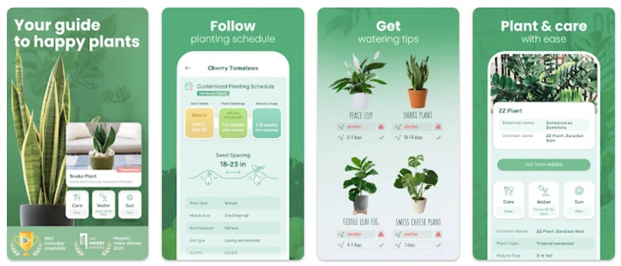
Blossom won the People’s Voice Winner award in the Webby Awards. As an educational app, Blossom presents information clearly through tables and cards. Plus, they kept the design consistent with the green motif. And they integrated visual elements, such as illustrations and icons. They are great alternatives to text in app or web design.
2. Sweetgreen
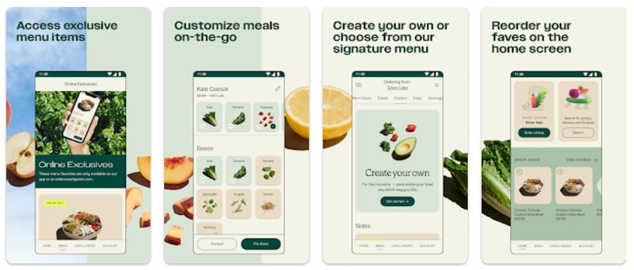
If you want a visually appealing app design, you can take notes from the Sweetgreen app. Visuals are necessary for designing mobile apps. And if you have compelling photos of your product or service, you can add that to your mobile app.
Sweetgreen uses images for ingredients and menu items. Plus, they incorporated illustrations for other functions, such as pickup and search.
But what makes this app unique is the tab bar. Most app designs will use icons, but theirs uses words instead. You can make it work with a compact and lightweight font.
3. Brex
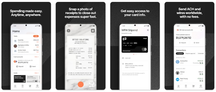
Finance app creators have the challenge of presenting numbers that won’t overwhelm the user. It’s crucial that they observe app design principles, such as predictability, simplicity, and consistency.
Brex is an excellent example of a finance app showing visual hierarchy through weighted and colored fonts and cards. For example, they use a bolded font for amounts. Plus, they use the orange motif on the app, keeping it consistent with their website.
4. Balance
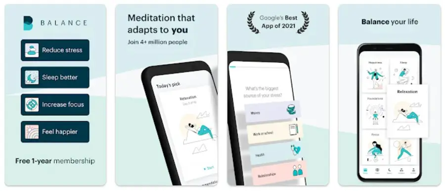
You must keep the target audience in mind when developing and designing an app. And for meditation apps, you want to keep the design simple. Plus, you don’t want to overwhelm the user.
Balance has a user-friendly and simple interface. Illustrations take centerstage. Aside from that, a blue-green motif is present in buttons, illustrations, and progress bars.
5. Breeze
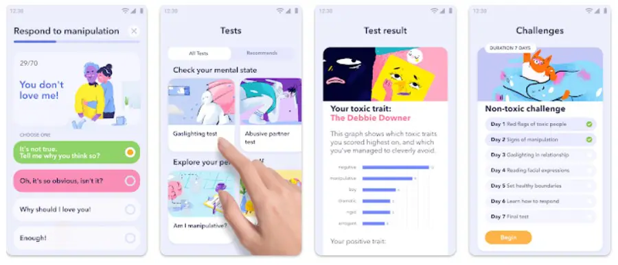
If it’s a mental health app you want to launch, check out this example from Breeze. Their app design is engaging because it’s colorful. You see it on the buttons, cards, and graphs. Even the tab buttons are color coded. Another reason it’s compelling is the visuals. They use custom illustrations to demonstrate tests or results. Plus, the overall motif is a light blue, contributing to a calming look.
6. Noom
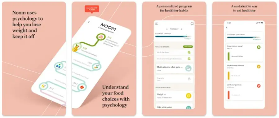
Many apps offer a goal-setting feature to help users stay on track. Noom is a fantastic example of this. Grid cards and charts are ideal for goal-setting since they let users know their progress. The added progress bar is a great way to provide a concrete visualization of their goal setting journey. Plus, don’t forget to add color to it to entice the user to use the app often.
7. Asana
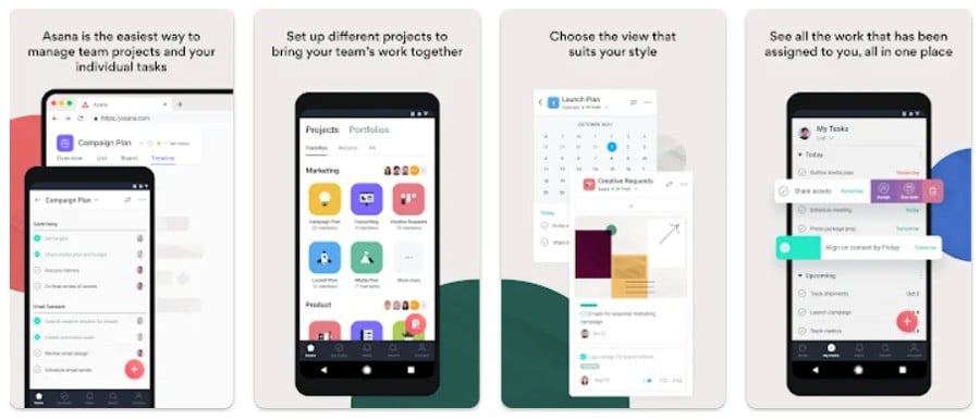
Productivity and business apps are jam-packed with features to ensure users maximize the tools necessary to get things done. It’s important that app designers separate functions through various pages.
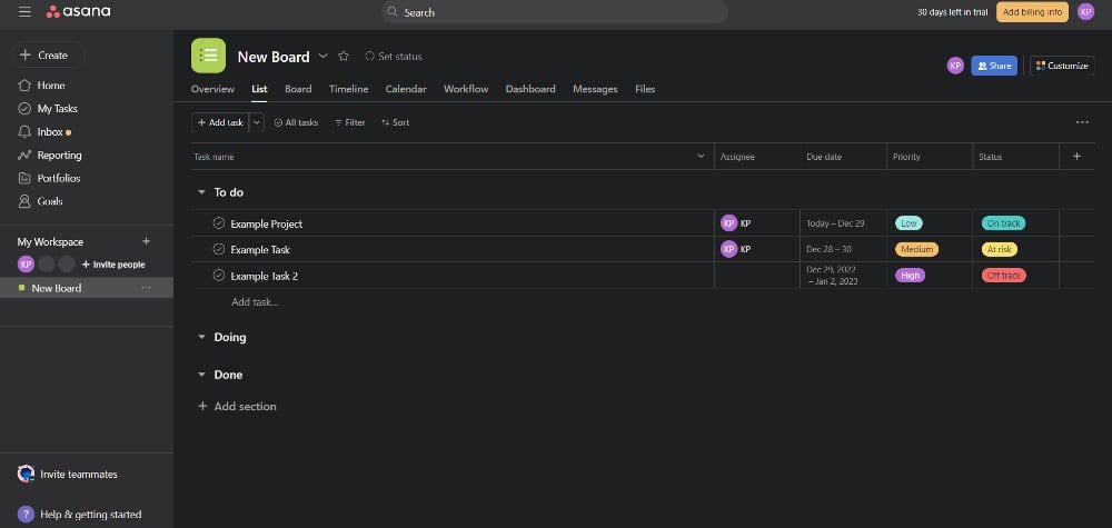
Asana is an example of a productivity/business app that keeps everything compact and helps users accomplish their tasks on the go. The mobile app uses a similar interface to their web-based one. Plus, they have incorporated visual hierarchy through grids, headings, and cards.
8. ThredUp
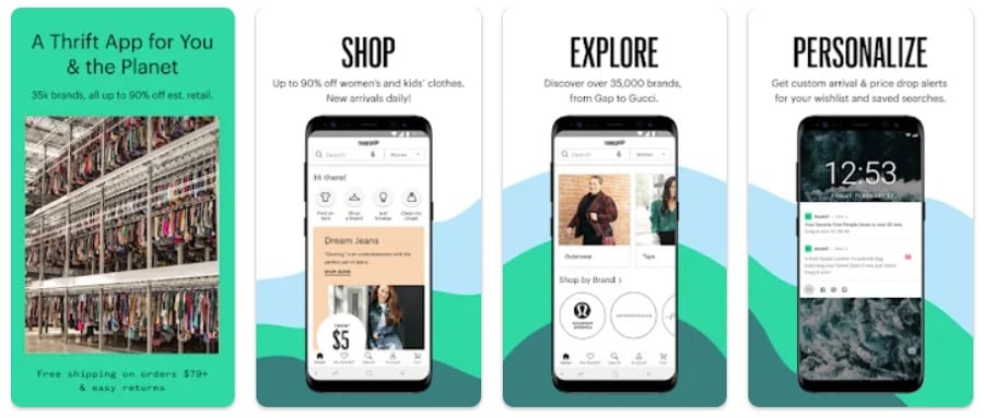
When designing an app, familiarity is key. That’s the case for most online shopping apps. But you can make your shopping app unique through compelling visuals and an intuitive interface.
Or, in the case of ThredUp, tweak the design by adding a search bar with audio and icons to choose what they need to do. Then, you can add the cards as users scrolls down or to the side. You can reshape a button or card into a circle to provide contrast and variety to your app design.
9. Sweat
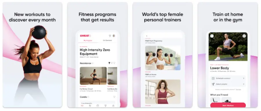
Personalization is one key app design principle. Fitness apps demonstrate that you must personalize the user’s experience so that they can choose among various workouts. Plus, they can get exercise recommendations when they open the app at another time.
Sweat shows us that personalization can provide a great user experience. Once the user opens the app, they are greeted with a “My Program” tab. Aside from personalization options, Sweat makes great use of whitespace. Plus, it uses visual hierarchy, icons, and contrast to give its app a compelling look.
10. Kayak
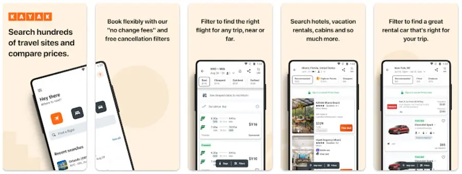
Travel apps like Kayak need to accommodate different functions, such as air and land travel and hotel bookings. You don’t want to overwhelm users by overloading them with these functions on one page. Hence, it’s necessary for them to create new pages for every purpose.
Similar to most apps, cards are used to organize tasks. With Kayak, they use it to separate travel times and car options. Plus, since they use a predominantly white background, a green and orange motif gives the app a splash of color.
How Can Penji Help with App Designs
Now that you’ve seen amazing app examples, are you interested in launching an app for your business or idea? If so, and you are in need an app designer, you’ve landed on the right page! Penji has vetted and experienced app designers ready to take on your requests. And if you want to see what Penji can do, book a demo to see how Penji can help you with your new app!
About the author

Katrina Pascual
Katrina is a content writer specializing in graphic design, marketing, social media, and technology. In her spare time, she writes monthly personal blogs to practice her craft.


