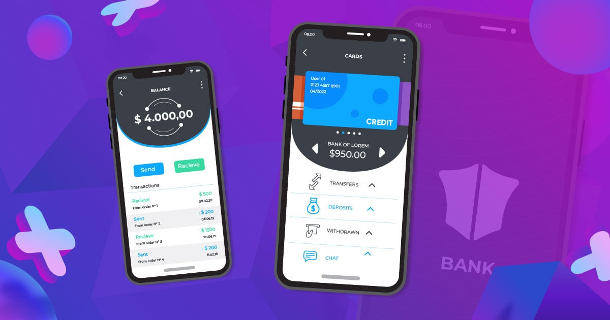
Technology has disrupted the way we do things, and this includes banking. Mobile banking is so convenient that many of us vow never to return to what it used to be. Thus, banking app designs get more creative by the day, and everybody wants to get noticed. Here are ten of the best mobile banking app designs that stood out in 2022:
1. Bank of America
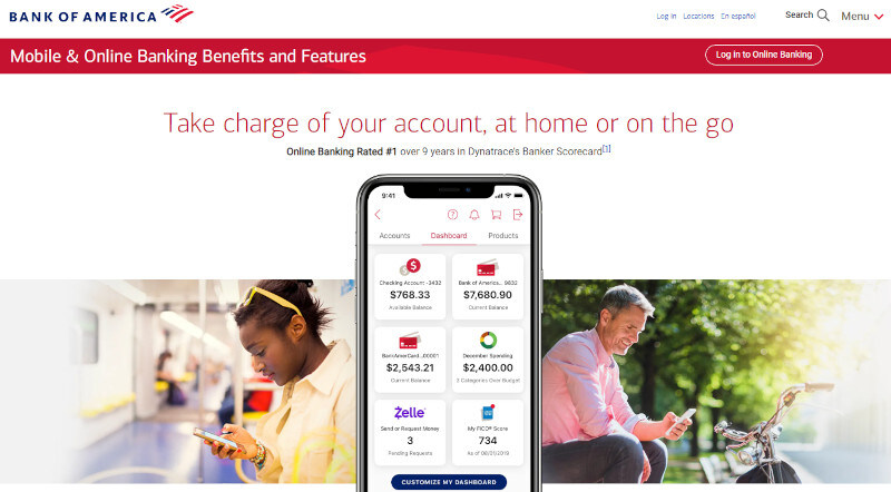
Usability is essential in designing a bank app. Bank of America has made it straightforward with its use of its virtual voice assistant, Erica. It will guide new users on how to navigate through the app and have them access what they need to in no time.
Its intuitive user interface lets you do your banking with such a low learning curve. Not only is the bank app design aesthetically pleasing, but it is also packed with features users will love.
2. Chase Bank
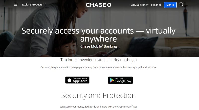
Mobile banking is made easy by Chase Bank. The bank app was designed to make it simple and easy for users by avoiding information overload. Mobile banking typically involves a ton of data that can make it overwhelming, especially for newbies.
What Chase Bank did was put bits of information in snackable portions, so it’s easier for users to digest. Additionally, the banking app uses images of landscapes that add charm and appeal to an otherwise stiff business nature.
3. Revolut
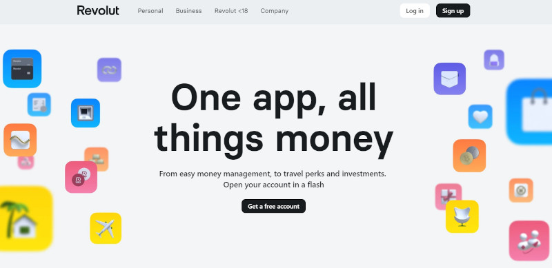
With plenty of white space, bright colors, and a trendy vibe, Revolut has a friendly appeal that’s endearing to users. Many people associate banking with rigidity and strictness, which makes it intimidating. This banking app does the opposite of this.
Thinking out of the box is always a great idea in design, and Revolut has done it with aplomb. The bank app has playful vibes that are welcoming and approachable. The design makes mobile banking fun and enjoyable.
4. Honeydue
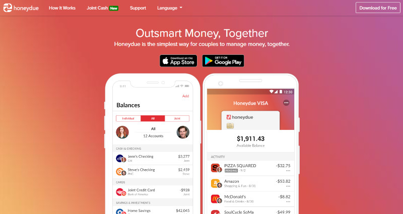
Using a minimalist approach to design, Honeydue promises a user-friendly mobile banking experience. The simplicity of the interface makes banking a breeze. This is something you need to factor in when designing your banking app.
Honeydue’s mobile app uses a white background with very few design elements on it. This avoids cluttering which can dampen a user’s vision. To make the design even more interesting, accents of red color splashes are added throughout. This is an excellent example of usability paired perfectly with beauty.
5. N26
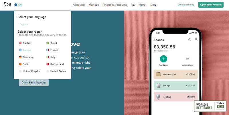
Readability is an essential design factor that banking apps should always have. This is to make banking easy for customers, as this is an industry that needs precision. Mistakes should be avoided at all costs, which is what N26’s mobile app design does precisely.
The app design uses soft colors and a layout that’s easy to navigate. It uses cards to present the information instead of the usual vertical list of text links. This makes it easier for users to find what they need.
6. Capital One
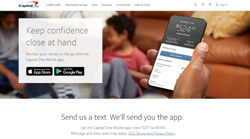
Banking apps should always focus on functionality before aesthetics. Capital One combines both and does a good job of it. One of the world’s largest banks, it comes as no surprise that its mobile banking app is one of the best. Its usability, intuitiveness, and visual appeal make the app even more noteworthy.
From the color combination to the font choice, this banking app design gives the brand a professional, dependable, and trustworthy personality. It provides an excellent banking experience for its users.
7. Starling Bank
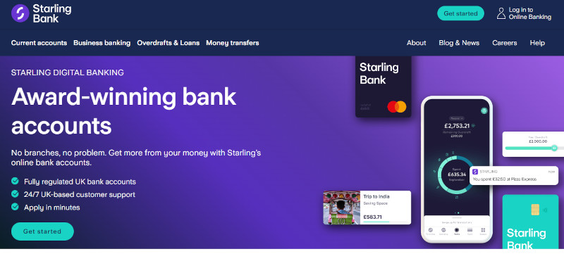
Giving users complete control over their banking is what makes Starling Bank’s app design worth its place in this list. The app displays information such as the user’s spending habits, savings, and other financing data. This gives users a quick look at their finances to make them feel confident about the security of their accounts.
This banking app uses a dark shade of violet as its background, which adds class and sophistication to the overall design. Banking may be a serious business, but you can never go wrong with having style and elegance.
8. Monzo
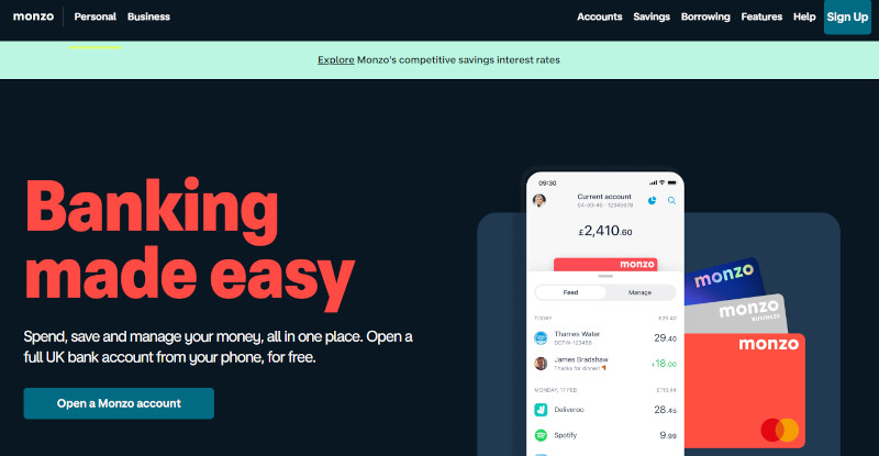
If there’s one feature that makes Monzo’s banking app unique, it is its mapped transactions. While most mobile banking apps will include maps to help users locate their branches, Monzo goes a notch higher. Its map lists where you made the transaction and whose name did it.
Designwise, Monzo’s mobile app is also worthy of its spot on this list. It uses bright colors, bold fonts, and helpful illustrations. Navigation is easy, and its user interface offers a low learning curve.
9. Lloyds Banking Group
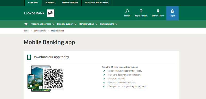
The first thing most mobile banking app users would want to see is their account balance. This is precisely what Lloyds Banking Group has done with its mobile app design. Users will see information on the app that matters most to them as soon as they log in.
The banking app design is pretty straightforward, with no bells and whistles that can distract users from doing their finances. Its other pages also readily display information, making it easy for users to see what they need without much fanfare.
10. Itaú Unibanco

This online banking app from Brazil caught our attention thanks to its highly useful feature. Itaú Unibanco has a keyboard feature designed to be used alongside WhatsApp and Messenger. This allows users to chat with family and friends while sending bank transfers.
In addition, this banking app has a clean layout, easy-to-follow instructions, and an appealing overall design. Users will no longer toggle between their bank app and messaging app to do both tasks simultaneously. Now that’s usability for you.
Final Thoughts
This list of 2022’s best mobile banking app designs can help you build the design for your own app. You just need to take note of the features these have that will be useful for your app and copy them. As for the aesthetics, you need not sweat it out.
Let Penji take care of the banking app design for you. Click on this link to get our professional designers working on your bank app. For a fixed monthly rate, you’ll get more than banking app designs and many other digital design assets.
About the author

Celeste Zosimo
Celeste is a former traditional animator and now an SEO content writer specializing in graphic design and marketing topics. When she's not writing or ranking her articles, she's being bossed around by her cat and two dogs.


