Colors matter for your branding. Your customers will base part of their first impression on color. Choosing the BEST colors is essential to leaving a long-lasting impression on your customers and ensuring they recognize your brand even outside your website or social media profiles. However, if you’re unsure which colors to choose for your business, our guide about the meaning of brand colors should help you narrow down your options!
Brand Color Research
Colors have a major impact on brand recognition and public perception. While your logo and color scheme won’t run your business, they will have a subtle influence over everything you put out in the world. This is where color theory for business comes in.
The simplest way to understand brand colors is that they communicate without words. Language speaks to our left-brain, logically-driven mind. Meanwhile, color communicates with us through the right-brained world of feeling and intuition.
Various studies have shown that consumers are far more driven by emotion than by logic. We’d all like to think of ourselves as rational decision-makers. But the fact is, most people make gut decisions when it comes down to it. Especially nowadays with consumers experiencing so much decision fatigue and option overload, it would be impossible to weigh the pros and cons of every decision.
When uncertain or overwhelmed, the brain lets the gut take over. With this understanding of consumer behavior, the meaning of brand colors become far more than a silly afterthought. When selected strategically, colors facilitate your goals as a brand.
How to Define Your Brand
Whether you’re choosing brand colors for the first time or re-branding, an internal audit is key. Start by looking at your brand and defining it (“brand archetypes” are a good place to start). Ask yourself the following questions:
- Does public perception of your brand match your intended brand identity?
- Does the content you publish match your intended brand identity?
- Does your current brand design conflict with your intended brand identity?
If something isn’t working, it’s never too late to pivot. For example, if you notice your customers respond emphatically to your humorous side, there’s no reason you can’t reshape your brand with humor as a staple ingredient.
Once your brand personality is clearly defined, you can start exploring which colors make sense for you.
The Meaning of Brand Colors
In reality, color interpretation is subjective. It’s an art, not a science. People have unique aversions to certain colors and affinities for other colors. But that doesn’t mean color can’t be used strategically to evoke certain feelings and associations. Those who intuitively ‘get’ your brand will support you. Those who don’t simply won’t be a part of your target audience.
Determining the meaning of brand colors isn’t rocket science. A great way to start is with brands you don’t know. Look at the small business logos below and see what impressions they give you – What do the logo colors mean? If you’ve never shopped from these brands, you have no idea who they actually are. What insights can you glean from the colors, words, and images alone?




Too often, brand designers focus on visual appeal and neglect the underlying symbolism. This causes brands to lack depth and intrigue, instead coming off as boring or even shallow.
When your colors evoke the same impression as your actual brand, you’ve hit the branding lottery. That’s when you know your logo designer has done their job.
Brand Colors to Avoid?
Some color theory experts warn about negative color associations. For example, many connect blue with sadness and red with anger. But this isn’t something you need to worry about. If you’re putting your best foot forward, customers won’t make these negative associations. When your brand embodies the higher expression of its colors, it won’t be misunderstood.
It’s useful to review your biggest competitors and take note of their branding. You want to find a way to clearly distinguish your brand from the competition, including colors, fonts, tone of voice, and overall positioning.
The “Best” Business Colors
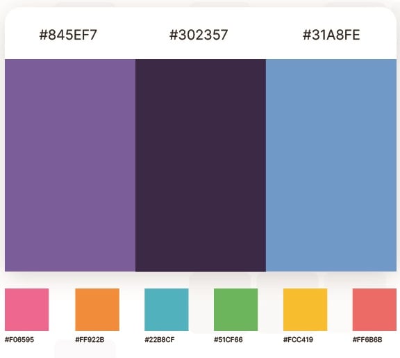

On the other side of the spectrum, brand color psychology research often suggests specific colors (eg. blue for trust or red for urgency). But this is a somewhat misguided way to engage with the meaning of brand colors. While yes, those color associations may be correct, if a brand defaults to them, they begin to blend in with everyone else. They may lose what makes them actually stand out from competitors. Color isn’t the only factor involved in sales, so defaulting to the “best” colors is a lazy way of going about branding.
Rather than choosing a color strategically for what you think it will give you, make authentic decisions that align with your values and mission. Dare to be on brand. Your audience will respect you and remember your originality when its time to make a purchase.
Some general color associations are:
- Red: energy, passion, excitement, and urgency
- Orange: friendliness, warmth, and enthusiasm
- Yellow: optimism, clarity, and happiness
- Green: growth, health, and tranquility
- Blue: trust, reliability, and professionalism
- Purple: creativity, luxury, and wisdom
- Pink: femininity, romance, and sweetness
- Black: sophistication, elegance, and authority
- White: purity, simplicity, and cleanliness
Which Brand Colors Are Used in Your Industry?
Are you still perplexed about which colors to pick for your brand? Here’s a quick guide on what the usual colors are for your niche or industry:
- Restaurant – Red, yellow
- Banking/Finance – Blue, red, black, white
- Airline – Blue, red, yellow
- Apparel – Black, red, orange
- Automobile – Gray, red, blue, black
- Retail – Blue, red
- Software – Blue, red, gray
However, don’t feel that you should use these colors because they are the most used ones in the industry. Go with what’s best for your business and what will stick with your audience in the long run.
How to Choose Your Brand Colors
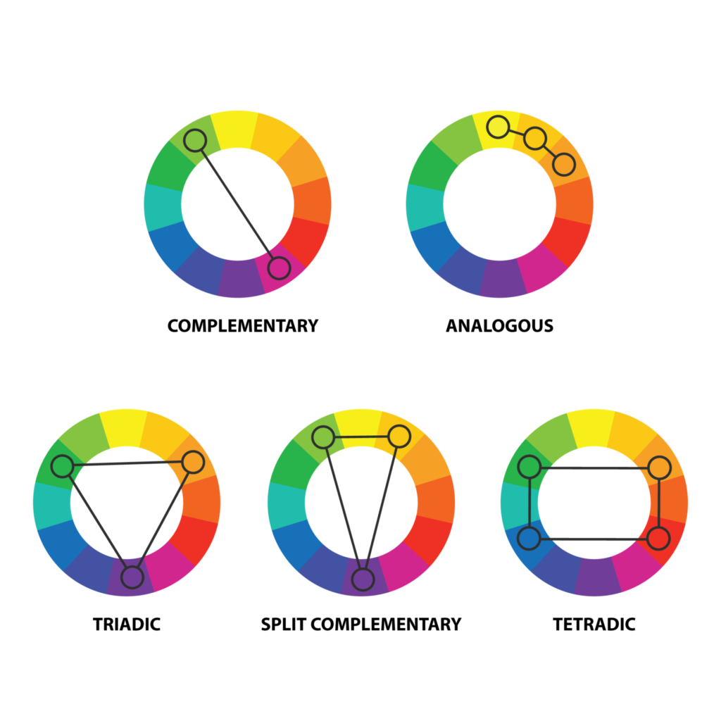

Good branding adapts. There are a few strategies for choosing a color scheme that stands the test of time. As your company grows, you don’t want to pigeonhole yourself with an odd color scheme. Start by looking at color schemes in web design to see how color can be flexible.
Monochromatic, analogous, and complementary colors are a good place to start. From there, use the above chart to experiment with more complex color combinations like tetradic. This color palette generator lets you experiment with different ideas so you can find your exact brand color codes.
Exploring the meaning of different colors proves beneficial, but you can take it a step further by examining a color within the framework of your brand. Flexibility is key, as your brand’s personality guides customers in understanding your design elements. This is where the magic of color theory blends with your distinct creative expression.
Another facet of color that brands often forget is audience accessibility. Ensure that your colors meet contrast guidelines to ensure that they are readable by everyone, including those with color vision deficiencies.
Remember not to limit yourself with too many arbitrary rules. While it’s common for brands to choose 2-3 colors, you can break the rules if it makes sense. Plenty of businesses have even opted for rainbow branding and logos with success.
Should You Base Your Brand Colors on What Colors Attract People the Most?
Choosing the best brand color isn’t about attracting people. Sure, if your color is unusual for your industry, it can turn heads. However, choosing colors because you want to attract them might be a recipe for disaster. You want to ensure that your brand color is aligned with your identity and values. For example, blue and green are the best options if your values are related to health, wellness, and relaxation.
Already Have Brand Colors?


There’s nothing wrong with backtracking to determine the meaning of your brand colors. Here’s how:
- Understand your target audience: Start by gaining a deep understanding of your target audience’s preferences, demographics, and psychographics. Consider their cultural background, age group, and industry-specific expectations. This will help you align your brand colors with their preferences and create a connection with them.
- Define your brand personality: Determine the key characteristics and values that define your brand. Is your brand energetic, sophisticated, playful, trustworthy, or innovative?
- Test and gather feedback: Conduct surveys or focus groups to gather feedback from your target audience. Ask for their impressions, emotions, and perceptions associated with each color option. This feedback can help you refine your choices and make change if needed.
- Ensure consistency: Once you finalize your brand colors, use them consistently across all touchpoints, including your logo, website, marketing materials, and packaging.
Need help with your brand colors?
Penji is revolutionizing the way businesses access graphic design services. With their unlimited subscription, you can access high-quality designs at an affordable price every single month. Whenever you need something designed, just put in a request and receive a draft back within 24-48 hours.
Penji’s unique subscription allows businesses to create a consistent brand identity through color, messaging, and effective promotions. With Penji, businesses can easily maintain their brand color meaning across all their designs and create strong visual recognition for their brand.
Never worry about consistency across platforms again!
About the author


Brianna Johnson
Brianna is a professional writer of 10+ years who specializes in branding, marketing, and technology content.
Table of Contents
- Brand Color Research
- How to Define Your Brand
- The Meaning of Brand Colors
- Brand Colors to Avoid?
- The “Best” Business Colors
- Which Brand Colors Are Used in Your Industry?
- How to Choose Your Brand Colors
- Should You Base Your Brand Colors on What Colors Attract People the Most?
- Already Have Brand Colors?
- Need help with your brand colors?
