Triangles are versatile shapes for logos. It lets you play around with possibilities that can represent your brand better. You can tilt the tips sideways and downwards or substitute A and V with the shape. Knowing that the triangle symbolizes movement, innovation, direction, and stability is fitting. And if you want a triangle logo, check out these ten logo examples created by our designers! Plus, check out our limited-time offer or a subscription discount below!
1. Axis Activewear
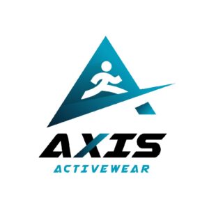
Axis Activewear is a company that caters to athletes and health and fitness buffs. The logo shows a person seemingly running on an uphill platform resembling a treadmill. The platform also cuts across the triangle-shaped background, giving it a unique twist. While the symbol depicts movement, the font matches the drawing by integrating the color into the letter “X.”
2. Summit Tours & Travels

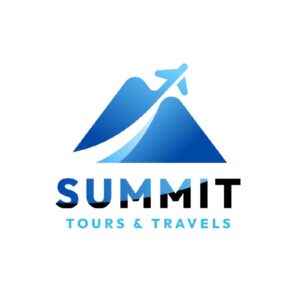
You’ll instantly comprehend what this company is all about even without the brand name at first glance. The logo could act as a stand-alone symbol representing this travel and tour company. Summit Tours & Travels’ logo is well-thought-out, with all the design elements you would expect from a travel agency.
For one, the triangles are reminiscent of two mountains, indicating the various travel destinations. The designer also incorporated an airplane going upwards to signify flying or traveling. The blue and black color combination on the word “SUMMIT” also gives it flair.
3 Arco + Associates
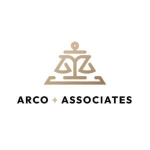
The Arco + Associates logo solely carries the company’s identity. It’s an abstract triangle that clearly communicates the law firm’s identity. First, the uniqueness and relevance of the logo are commendable through the Scales of Justice symbol shaped into a triangle.
Second, the tip of the triangle is replaced with a circle and horizontal line, which seemingly looks like a lawyer practicing justice. Overall, this triangle logo has all the elements of a logo, such as relevance, uniqueness, scalability, timelessness, and simplicity.
4. Violet Media
Violet Media is a marketing agency that offers various services such as marketing and advertising, video creation, and editing. The logo looks simple yet impactful as the triangle is made to look like a strip that wraps around an object. It resembles a “play” button from a digital or video camera, signifying what the company does. The typeface is also a playful choice, apt for a creative company that makes compelling advertisements.
5. Four Aces Productions
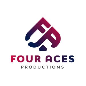
Four Aces Productions is a film company that produces video content for social media, television, and other media-related fields. The triangle logo is a play on the first letters of the brand name. This letter mark symbol shaped into a triangle exudes an air of authority. But that’s not all. The triangle also looks like a spade, a symbol that represents action and intellect.
This symbolism suits a creative company that relies on pure innovation and movement for creating stellar videos.
6. Alexander Ashford Realtor
This triangle logo design for a real estate company conveys the right personality that connects with its target audience. The logo looks simple, and the structure is clean, which makes this a straightforward design with no complex elements. The creative interlinking letter “As” make this logo design stand out.
The blue and grey color combination also creates a beautiful contrast between the two letters. It gives each letter enough flair to showcase its personality. Overall, the logo is tied as one impressive unit, which is what logo design is about.
7. Maia Weddings & Events
Maia Weddings & Events emanates an air of sophistication and elegance. The triangle logo design has no unnecessary embellishments that make it complicated. The designer incorporated a white abstract letter “M” inside the triangle to represent the brand name. The serif font is also a good selection to depict a traditional event planning company.
8. Xeno Builders
Xeno Builders is a construction company. You can see it from its logo when you land your eyes on it. A logo must be able to capture the brand’s target audience by making it understandable and relevant. In this case, you can quickly determine that the triangle is a house with a roof and window.
Once you communicate your offers to your target market, your logo will become memorable. And creating top-of-mind awareness is vital for every brand to ensure they get ahead of their competitors.
9. Aurora Jewelry
For a jewelry store like Aurora Jewelry, the connection between your branding assets and target audience is imperative. Jewelry companies deal with vast amounts of money. Therefore, creating a professional and trustworthy logo should be the goal.
Aurora Jewelry managed to make its logo look credible. It’s a combination of different design elements put together as one cohesive unit. The triangle looks like the letter “A,” representing the brand name. Plus, a diamond sits in the middle of the letter to showcase their products front and center.
10. Astra Tech
Astra Tech is a gadget company selling digital products and offering repair services. The font is apt for an innovative company such as this as it resembles the future. The triangle looks like a rocket about to launch, signifying movement and moving forward.
The word Astra is also squeezed inside the triangle neatly, without overcrowding the design. Overall, the logo looks modern and fitting for a tech brand.
Get Your 15-Percent Discount by Signing Up with Penji
Triangle logos are fun and unique shapes that depict your brand. Not only are they versatile, but these shapes are also eye-catching.
And if you want to integrate a triangle into your logo, let our Penji designers create one for you! Check out our affordable pricing plans here. Plus, browse our Marketplace to get one-off designs for your branding.

