One of the best things you can do for your business is get it a strong brand identity. A logo may just be a small symbol, but it’s what identifies, differentiates, and makes your brand unique.
A great logo works like your brand mascot. At Penji, many of our designers are logo specialists. The concepts and ideas that go with each logo speak of their importance. Letter logos are an all-time favorite and are effective for branding. Let’s look at these minimalist and classy letter U logo designs made by our team of graphic designers.
1. Ultraviolet Photography
A well-thought-out logo design – that’s what we think about this logo. This design features a camera, the primary tool of a photographer, and the letter U within the icon. The sleek design was highlighted by the gradient color of the letter logo and the simple fonts.
2. Uprise Tech Information Technology
The chosen color for the letter mark may work well in different backgrounds. Likewise, the circular icon aligns the design with the brand’s vision of thriving in the information technology industry. The overall logo is unique and memorable.
3. Unfazed Magazine
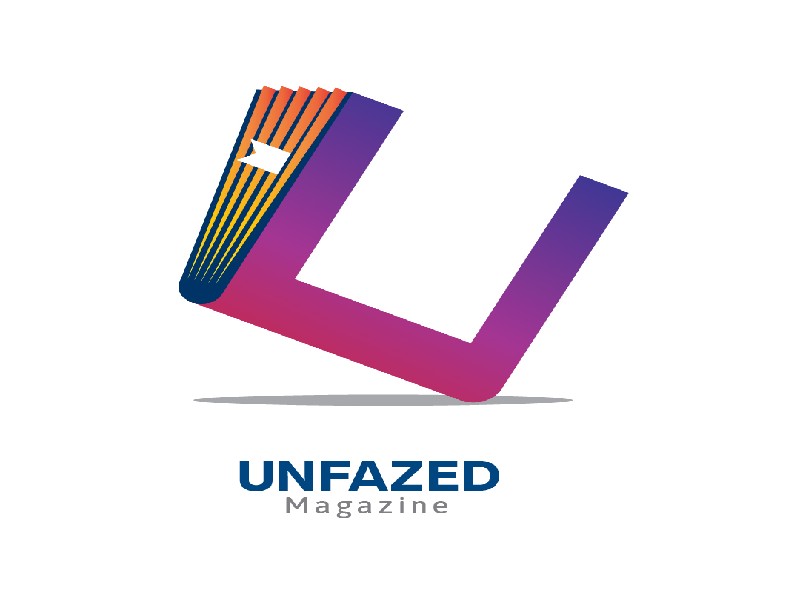
This letter U logo design is definitely eye candy. The colors and how the U magazine icon is positioned create an exciting feel. A design like this shows that its creator did a lot of research. We’ve seen a number of logos with magazine or book illustrations, but they’ve done it differently with the Unfazed Magazine logo. This is indeed a fresh logo design idea!
4. Underwood International School
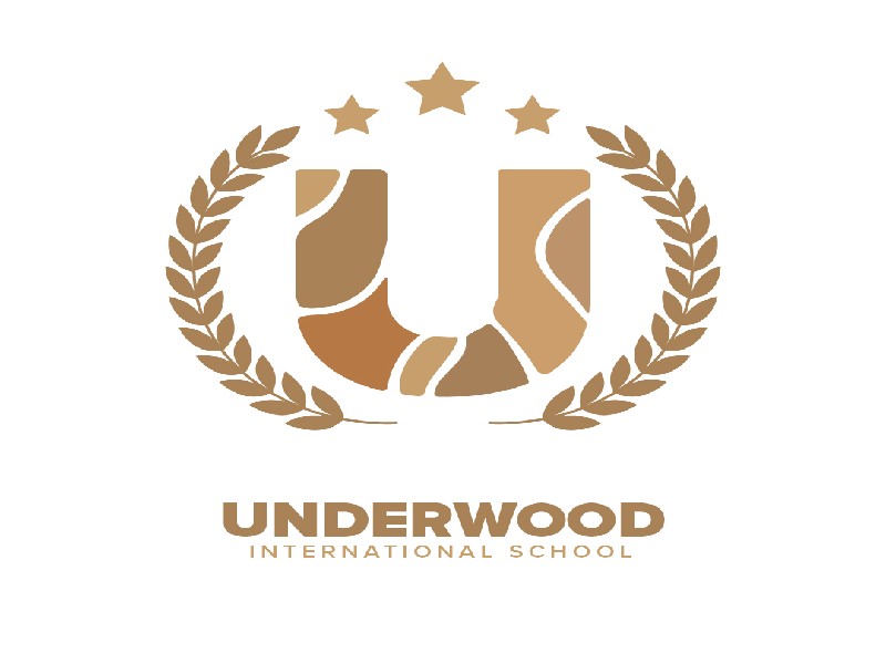
The Underwood International School logo is presented in an emblem-type design. When we see an emblem logo, badges and seals quickly come to mind. These logos seem to have a traditional look that can make a remarkable impact. It’s also a timeless design. With that said, they are often preferred for schools, government agencies, or organizations.
5. Ulrich and Associates

This no-fuss letter U logo design is perfect for professional service providers such as law firms, accounting firms, etc. The font color, style, and background altogether represent the trustworthiness and professionalism of the Ulrich and Associates brand.
6. Upstage Performers
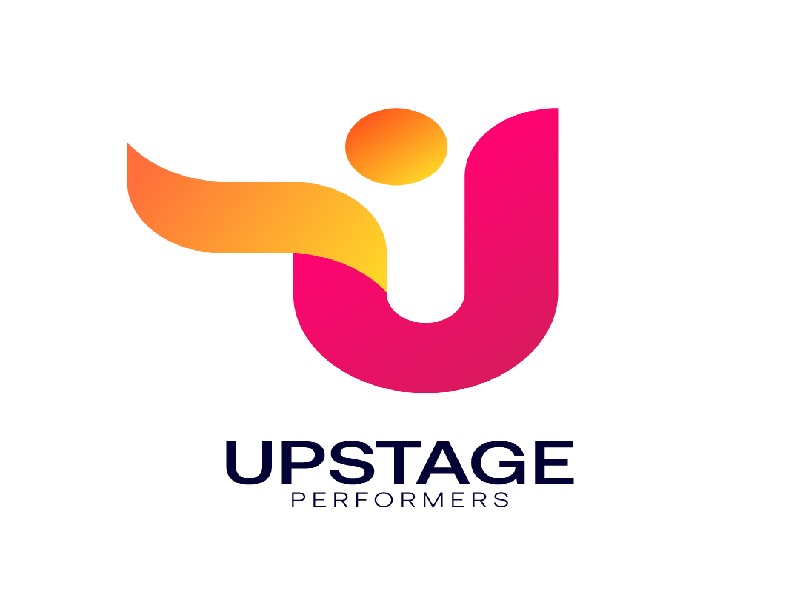
The letter U symbol demonstrates a person (performer) showcasing his talent on stage. For this design, the artist used thin fonts below the emblem. The color complements each other creating a dainty and trendy overall look.
7. United Pets Clinic
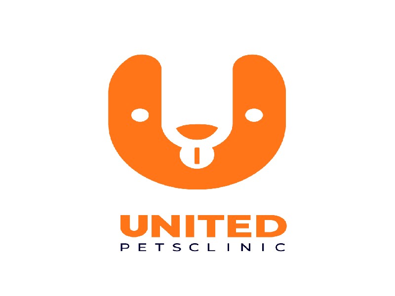
The United Pets Clinic logo exhibits a playful vibe. The icon seems like a cute puppy’s head. It’s a creatively curated logo that brings out a caring and social brand identity. Focusing on only three colors – orange, black, and white potentially makes it a go-to clinic for pet owner clients. Apart from that, there’s a flexibility characteristic of the logo. The sizes can be easily adjusted to make them suitable for any brand’s marketing materials. It also makes a cute and quirky t-shirt design for employees and clients alike, either as uniforms or souvenirs.
8. Urbanized Clothing
This cute and artsy letter U logo strikes a positive impression on audiences across all platforms. The logo itself represents the brand and industry even without the brand name. It’s a clothing line, after all.
9. Utopia Aviation
The aviation industry caters to a diverse range of stakeholders with different characteristics. Because of this, a creative logo design helps encourage people to patronize its products and services. This logo incorporates three arrows in an upward direction that clearly manifests the objectives of Utopia Aviation. The arrows also represent the positive growth of the business.
10. Unikorn Motions
This design features a creative combination of two separate icons, one being a film strip. Similar to other designs in this list, the logo itself is enough for a visual statement of a brand. Meanwhile, tweaking the spelling of unicorn a bit adds to the creativity of the Unikorn Motions logo design.
11. Urban Impact Entrepreneurship and Accounting
This logo uses transparent Urban Impact initials with building icons on the background. We believe this is a unique logo design idea. Even though it employs more than two colors, it does not appear cramped and doesn’t affect the design’s overall look. It might be because the elements blend very well.
12. Use This For That

If you want your U logo to be timeless and memorable, go for a straightforward design. The Use This For That logo embraced this specific element of logo design. The colors complement each other, too. It will create a lasting impression even for people who saw this design for the first time.
13. Unisko Clothing

The combination logo for Unisko Clothing gives it a versatile look. You can take out the wordmark, and the logo will remain recognizable. Plus, with yellow, you can grab people’s attention because it’s bright and warm.
14. Uncentric Pizza House
Different elements can come together to form one unified look, like this one for Uncentric Pizza House. The pizza logo has various facets, such as the illustration, the U-shaped pan, and the whimsical font. It’s one surefire way to grab your audience’s attention.
15. Unplugged Live Theatre
The Unplugged Live Theatre logo is unique in every sense of the word. Instead of sticking to a wordmark, their logo has an added visual element to reflect the business name. On top of that, the orange background is striking. The black and white combo is a classic one that will never go out of style in a logo.
16. Ultimate Company
This simple logo for Ultimate Company is not dull in any way. Make your modern U logo stand out by adding gradients. Plus, give it contrast through font use. There is also texture contrast with the round logo and sans serif font.
17. Unicorny Pub
Pub logos will include a beer mug or bottle imagery. Unicorny Pub has the beer bottle visual, but they used negative space to form the U using the bottle. Another thing to note here is the red motif. Red could symbolize energy or excitement.
18. Unison HQ Securities
Armor is a popular visual in any security company logo. You can still use it, but to give your logo a unique appearance, you can modernize it like this logo from Unison HQ Securities. Whitespace gave this logo a modern look. Plus, light blue armor will stand out from a sea of blacks and grays.
19. Upskill Developers
The Upskill Developers logo demonstrates simplicity and relevance. For one, the upward-facing arrow shows the experience developers can gain. Plus, the wordmark logo exudes a modern and professional appearance.
20. Umbrella Light Academy

The Umbrella Light Academy logo shows us you don’t need a book or graduation cap as your education logo. You can use your business name to make your school stand out. In addition to the unique imagery, picking a color like blue can depict reliability and tradition.
21. Universal Motion Productions
The Universal Motion Productions logo can already give you an idea of what they do even without the business name. It shows that they handle various activities in their studio. Other than that, the orange and red palette add a splash of color to the black and white motif.
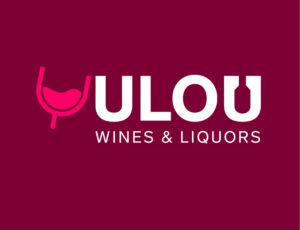
22. Ulou Wines & Liquors

This logo for Ulou Wines & Liquors offers a unique take on the liquor store logo. It uses the wineglass bowl to represent the letter U logo. In addition, the liquor bottle acts as the counter in the letter U. It’s a smart way to incorporate a wine bottle without being a separate entity.
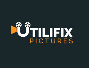
23. Utilifix Pictures

Here’s another production company logo, but this time it uses an old movie projector as its visual representation. The Utiflix logo cleverly uses the letter U to create the illusion of a film being shown. In addition, the orange motif can signify the adventure that the studio is undertaking when filming movies or shows.
24. Unova International Corp.
Tech company logos like Unova International Corp use blues, greens, and purples to give them a contemporary look. This gives tech companies the impression that they are innovative. You can add geometric or abstract visuals to emphasize the modern look.
25. Upzet Management
An upward motion can indicate development and growth, and that’s what Upzet Management wants to convey. Gradients are a great choice for the abstract monogram. It creates a contrast between the wordmark and the background. Plus, the arrow can also represent the “up” from the business’s name.
26. Urius National Library
The Urius National Library exudes professionalism. The font combination and contrast help to achieve a professional look. Moreover, the added book visualization strengthens the library’s branding. Plus, the added shadow on the abstract mark is a nice touch and emphasizes the books.
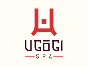
27. Ugogi Spa
The Ugogi Spa takes inspiration from Japanese culture. As you can see, the letter U logo looks like a Japanese character. Even the font has a Japanese influence, further enhancing the spa’s branding and identity. This is a fantastic example of a relevant logo.
28. United Shades
Optical stores use glasses to fulfill the relevant and simple logo design principle. If you want to stick with the glasses visual, you can make it unique like this one for United Shades. The glasses are incorporated into the wordmark instead of a separate element. Even so, the logo can stand on its own with the pictorial mark.
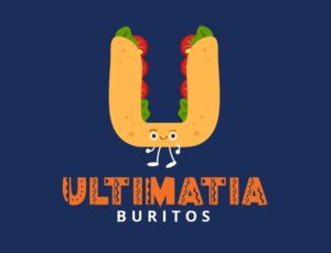
29. Ultimatia Burritos
This fun and unique logo from Ulitmate Burritos will make you crave Mexican food. Thanks to its cheerful mascot, this letter U logo will make you smile. Aside from that, you can also use a playful and whimsical font to solidify your branding.
30. Up Ninja Van

The Up Ninja Van is another no-fuss logo. Once again, it uses Japanese-style characters to reflect the influence of the country’s culture. Plus, the ninja imagery enhances the business name and identity. In addition, you can achieve variety through shapes, like the button-looking element on the word “van.”
31. Ultraeus Power Plant
Power plant logos will show factory silhouettes. But this one for Ultraeus Power Plant uses a gear and lightning. Your organization can stand out from the rest by using these two other visual elements. It’s an excellent way to depict energy without using buildings or structures.
32. Urbaza Securities
Urbaza Securities is another example of a modern security logo. Besides armor, wings are another common feature of security logos. It could represent that they have eyes in the skies. Another notable element of this letter U logo is the lock, signifying that they will keep their client’s institution or place secure.
Get your graphics designed by us!
If you’ve reached this part, we believe you’re now inspired to enhance your existing logo or create a new one? Start now by signing up with Penji for your logo design needs. With your subscription, you’ll get unlimited access to the world’s most experienced design team. Modern teams choose only Penji because of this – 120+ designs services a one-time subscription. Plus, the turnaround time for every project is only 24 to 48 hours.
Check out the hassle-free pricing plans and decide what’s best for you. Design services at Penji start at $499 a month with a 30-day money-back guarantee.
About the author

Rowena Zaballa
With a background as a former government employee specializing in urban planning, Rowena transitioned into the world of blogging and SEO content writing. As a passionate storyteller, she uses her expertise to craft engaging and informative content for various audiences.
Table of Contents
- 1. Ultraviolet Photography
- 2. Uprise Tech Information Technology
- 3. Unfazed Magazine
- 4. Underwood International School
- 5. Ulrich and Associates
- 6. Upstage Performers
- 7. United Pets Clinic
- 8. Urbanized Clothing
- 9. Utopia Aviation
- 10. Unikorn Motions
- 11. Urban Impact Entrepreneurship and Accounting
- 12. Use This For That
- 13. Unisko Clothing
- 14. Uncentric Pizza House
- 15. Unplugged Live Theatre
- 16. Ultimate Company
- 17. Unicorny Pub
- 18. Unison HQ Securities
- 19. Upskill Developers
- 20. Umbrella Light Academy
- 21. Universal Motion Productions
- 22. Ulou Wines & Liquors
- 23. Utilifix Pictures
- 24. Unova International Corp.
- 25. Upzet Management
- 26. Urius National Library
- 27. Ugogi Spa
- 28. United Shades
- 29. Ultimatia Burritos
- 30. Up Ninja Van
- 31. Ultraeus Power Plant
- 32. Urbaza Securities
- Get your graphics designed by us!

