Every logo tells a story, especially nonprofits and charities dedicated to transforming the world. Curious to explore which nonprofit and charity logos carry a deeper meaning or purpose? Keep scrolling to discover the logos have a purpose in mind.
While you’re here, why don’t you take a look at what Penji can do for your nonprofit? Get a preview of Penji in action to learn more about what graphic designs Penji can create for your organization or charity.
1. American Heart Association
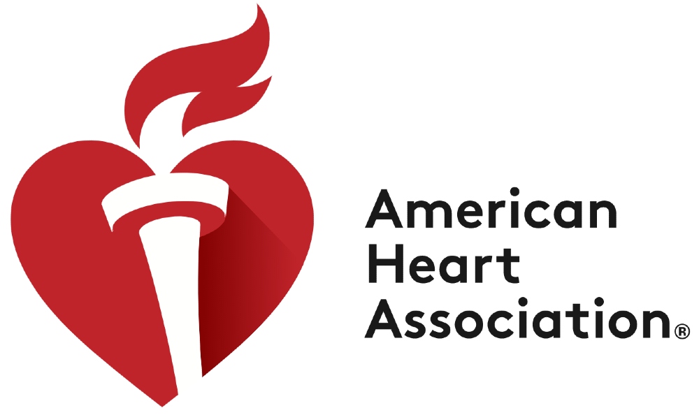
The American Heart Association logo would undoubtedly have a heart as part of its emblem. But you might think, what’s the significance of the torch?
According to the health organization, it symbolizes life and knowledge. The flame is life and optimism. Meanwhile, the torch represents knowledge shared across different generations and the information to live a healthier and longer life.
2. Red Cross
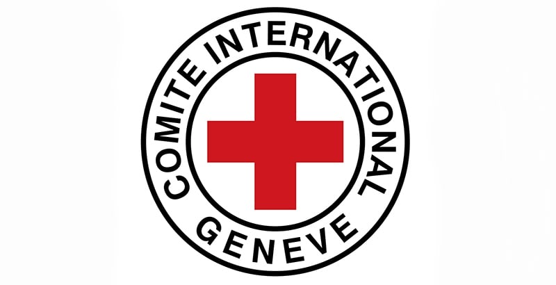
At first, you might wonder what else is there to explain about the red cross, but the Red Cross logo has historical significance. The red cross on this famous logo symbolizes that soldiers shouldn’t shoot this person because they’re assisting someone on the battlefield. Thus, it served as a symbol of neutrality. Plus, it also represents protection.
3. World Wildlife Fund

The World Wildlife Fund has one of the most recognizable charity logos of all time. The cute panda on the Worldwide Fund serves as a reminder that these cute creatures are endangered. Not only that, but the panda represents the organization’s commitment to preserving and protecting wildlife.
4. Habitat for Humanity
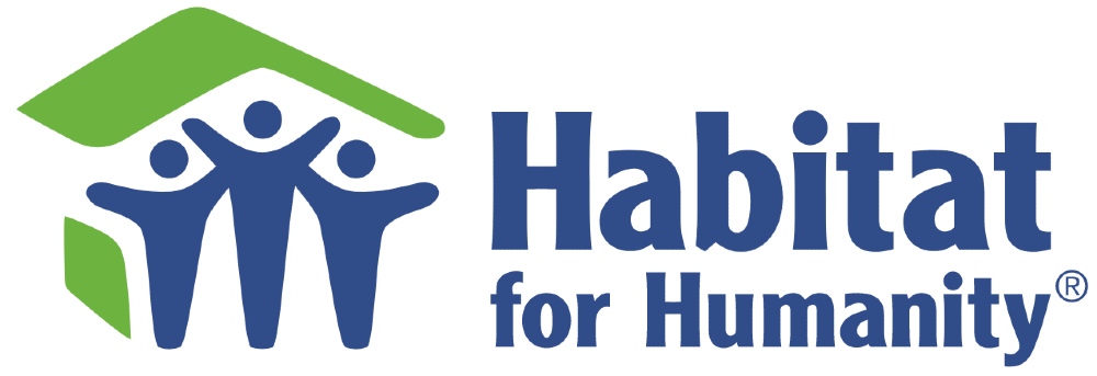
The logo for Habitat for Humanity may look like three people living under a roof. But if you know their mission, it symbolizes people building homes and giving those without shelter a stable one. Aside from that, the humans on the logo also represent people of any age or race coming together. Plus, they celebrate achievements and those to come.
5. Make a Wish

Make-A-Wish has only one explanation for why it conceptualized its logo. It represents the mission they aim to fulfill the wish of terminally ill kids under the age of 18. While they don’t further detail what the star and the swirl symbolize, the star may imply the act of making a wish whenever you see the heavenly body above the sky.
6. YMCA of the USA

Over the years, the YMCA of the USA has changed its logo, but one thing remains the same: a triangle. The charity’s founder, Luther H. Gulick, MD, suggests that it represents the body, man, and spirit. All of which are necessary.
While the triangle is no longer red, the charity mentions that the new colors represent vibrancy, unlike old iterations. Plus, they’ve maintained a commitment to being a people-first, caring nonprofit.
7. Goodwill

Goodwill Industries calls their logo the Smiling G, which has won awards as well. But what’s the meaning behind that smile? In their press release, they hired a graphic designer (Joseph Selame) to create one of the most iconic charity logos of all time.
The charity says that the letter “g” appears twice in the logo. One appears like the letter itself, and the other the smile. With this in mind, it reinforces their values and spreads the mission of self-confidence and hopes to communities.
8. charity: water

Here’s another example of the many charity logos where the symbol has significance in their organization. Charity: water uses a Jerry Can on their logo. They even call the can “Jerry.” The yellow can symbolize difficulties many in the developing world are facing. But it also signifies hope. The icon serves as a reminder of their values and mission.
9. GlobalGiving
The emblem on the GlobalGiving logo may look like four puzzle pieces melded together. But it symbolizes people coming together. The four “people” represents the following:
- Staff
- Donors
- Partners
- Supported organizations
10. Project Hope
The Project Hope logo is one example that you may need more than just a wordmark to represent your nonprofit or charity’s mission and values. The emblem on the logo symbolizes connections with the people they make.
11. Cystic Fibrosis Foundation
When looking at the Cystic Fibrosis (CF) Foundation logo, it may seem like a person standing up. But what it means is hope and tomorrow. The yellow circle symbolizes the sun, hoping to bring more tomorrows to patients with CF. But the modernized logo also represents momentum, signaling their efforts towards research and finding a cure.
12. Alzheimer’s Association

At first look, you might wonder what those icons or symbols are on the Alzheimer’s Association logo. They explain that it represents the human head (where, of course, the brain is) and a beaker represents science. With that in mind, they are committed to putting people and science together to further their advocacy and learning.
13. Americares

The Americares logo is an example of one that’s been redesigned for the modern and digital age. According to the nonprofit organization, Americares kept its red and blue motif, symbolizing the country. The added icon represents humanity and their activities, furthering their missions.
14. Humanity & Inclusion
Before rebranding into Humanity & Inclusion, they were called Handicap International. Their logo looks like it’s waving, saying Hi to anyone who comes across it. However, it also means one thing, “stop.” It doesn’t mean to stop when you see a person with a disability, but it represents that the organization wants to stop injustice against vulnerable people and people with disabilities.
15. FSHD Society
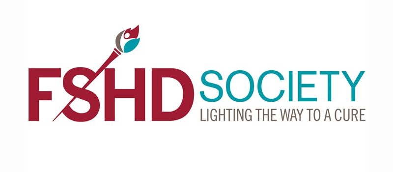
The FSHD Society aims to lead the way in finding treatments for those with facioscapulohumeral muscular dystrophy. And it shows in their logo.
For them, the lit, slender torch represents their resolve to educate those who might have the condition and give them hope to live their lives with optimism. Plus, they want to shed light on the condition to those who may have loved ones with it.
16. World Animal Protection

When it comes to animal nonprofits or charities, you may expect an animal to become their emblem or symbol. But this one by the World Animal Protection uses a compass. The charity says their logo wants to give direction in eliminating animal suffering. Not only that, but orange also signifies taking action. It’s something they do to protect animals.
17. American Physiological Society
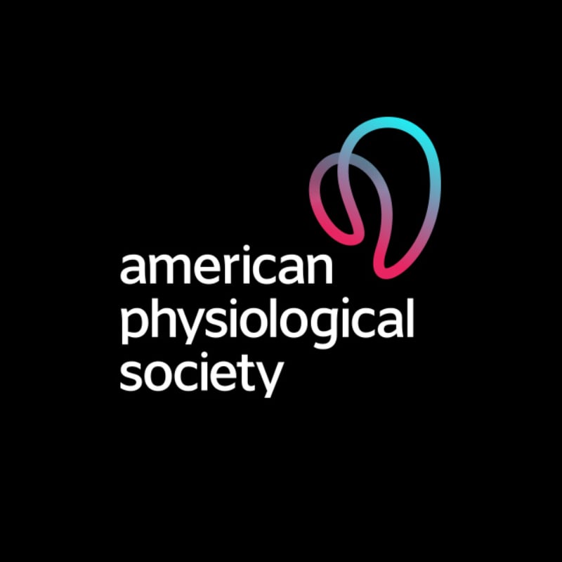
Movement can be challenging to translate into something static such as a logo. However, the American Physiological Society addresses this with its logo. The abstract logo indicates body movement. Plus, the nonprofit mentions that their logo represents discovery as well.
18. The Mental Health Coalition
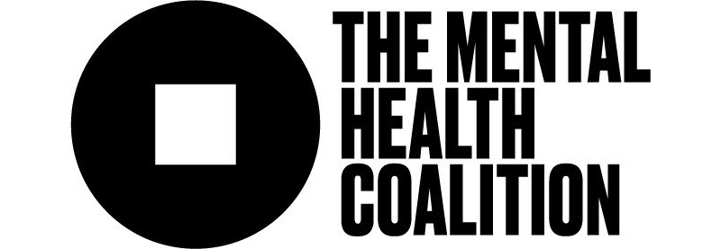
The Mental Health Coalition may seem like an ordinary logo. But the square in the middle of the abstract logo signifies that normalcy doesn’t exist in the mental health sphere. They hope that the square peg in the circle will become a global icon for mental health and a symbol of understanding of mental health disorders.
19. Apex for Youth
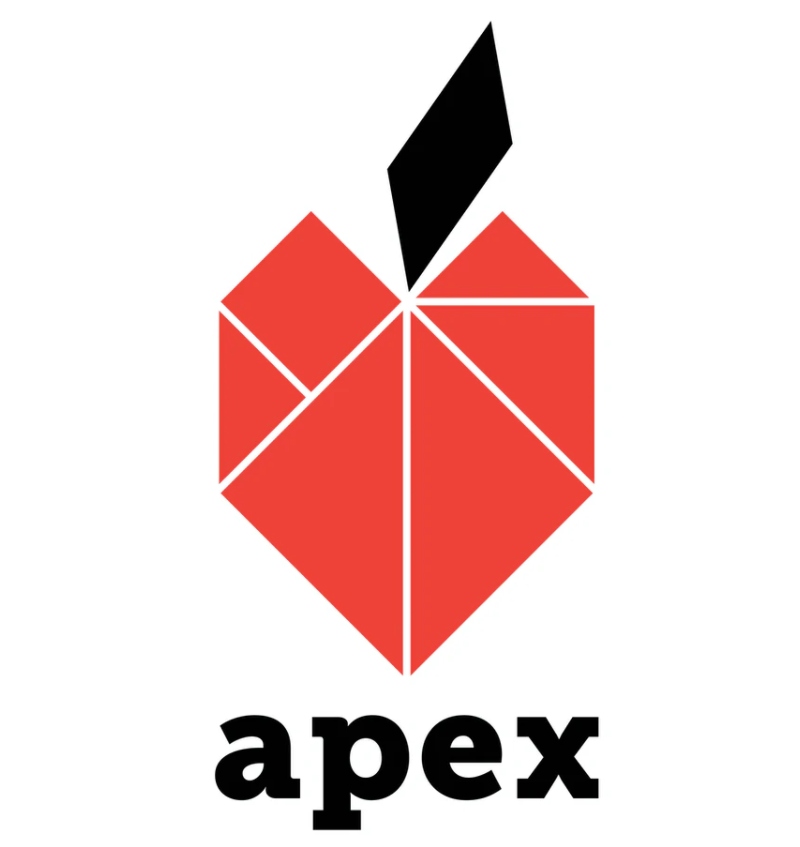
The historical background is a common theme for nonprofit and charity logos, and this one by Apex for Youth is no exception. The New York-based nonprofit has an Asian background, and their logo puts that all together.
For one, the logo is a tangram. While they draw inspiration from the old Chinese game, the tangram shapes can form infinite possibilities. Plus, the logo is in the shape of an apple, inspired by the nickname for one of the most famous cities in the world.
20. The Wildlife Conservation Society
Sometimes, you don’t need to put the full name of your nonprofit or charity in your logo. In fact, a letter will do, just like this one by The Wildlife Conservation Society. Even with just one letter, it symbolizes a host of different themes and audiences. The colors cover different emotions. And that it can interest those who visit their parks and stakeholders or policymakers.
21. Conservation International

Simple logos like this one by Conservation International can make an impact and reemphasize an organization’s mission. The blue circle is the earth, while the green line symbolizes protecting and sustaining the earth. And that’s what Conservation International stands for and supports.
22. Women Moving Millions

If you want a nonprofit or charity logo that needs to represent a global organization into a single logo mark, take inspiration from Women Moving Millions. The red circles represent the women they work with around the globe. Not only that, but it also symbolizes energy that comes from within, which will radiate outward.
23. Evident Change
If your nonprofit values collaboration and commitment towards research, take a look at this one from Evident Change. The e’s for both words symbolize the data and research this organization does. The cool colors taking center stage on their logo signify thought leadership, as explained by the agency (Mission Minded) tasked to work on their rebranding.
24. Freedom from Torture
A nonprofit logo can become a powerful symbol to those oppressed, and this one by Freedom from Torture does precisely that. The UK-based charity aims to empower victims and help them recover through therapy or intervention. In terms of logo meaning, blue symbolizes calmness and safety. At the same time, the lines on the word “torture” represent ties and binds and their aim to abolish torture.
25. Carmel Hill Fund Education Program

As an educational nonprofit organization, the Carmel Hill Fund Education Program uses a book on its logo. According to Constructive, the agency tasked to design their new logo, it represents liveliness and being an inviting organization. Plus, the different colors mean optimism and modernism. And another thing to note, their logo symbolizes literacy, which they aim to improve.
Impressed by nonprofit and charity logos like the ones above? Subscribe to Penji to get your logo and other graphic design work for your organization. We offer one-off designs too! Visit our new Marketplace today.
About the author

Katrina Pascual
Katrina is a content writer specializing in graphic design, marketing, social media, and technology. In her spare time, she writes monthly personal blogs to practice her craft.
Table of Contents
- 1. American Heart Association
- 2. Red Cross
- 3. World Wildlife Fund
- 4. Habitat for Humanity
- 5. Make a Wish
- 6. YMCA of the USA
- 7. Goodwill
- 8. charity: water
- 9. GlobalGiving
- 10. Project Hope
- 11. Cystic Fibrosis Foundation
- 12. Alzheimer’s Association
- 13. Americares
- 14. Humanity & Inclusion
- 15. FSHD Society
- 16. World Animal Protection
- 17. American Physiological Society
- 18. The Mental Health Coalition
- 19. Apex for Youth
- 20. The Wildlife Conservation Society
- 21. Conservation International
- 22. Women Moving Millions
- 23. Evident Change
- 24. Freedom from Torture
- 25. Carmel Hill Fund Education Program


