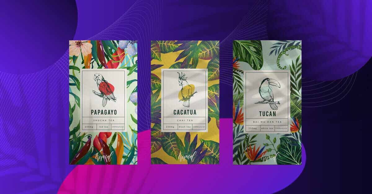
Tea is one of the oldest and best-loved beverages in the world. And just as interesting as its range of varieties and blends are tea packaging designs. If you’ve been looking for vector files, templates, and overall inspiration for your packaging design, you’ve come to the right place. We’re counting down fifteen of the hottest tea wrappings around the world. We’re also going to analyze what makes each one stand out and make consumers crave a steaming cup.
Before we dive right in, did you know that you can enjoy expertly-designed product packaging sans the hassle? Penji offers a flat monthly rate for unlimited designs, making it one of the best investments you can make. Aside from product wrapping, Penji can also help create materials for email marketing, content design, and social media marketing. The best part? You’ll have a team of design professionals who got your back as you try to grow our business.
Different Types of Tea Packaging
Marketers know how important packaging design is. Just as with coffee packaging designs, tea wrapping might just be that last push the consumer needs to add the product to their cart and proceed to check out.
American Marketing Association says product wrapping does a lot in promoting brand awareness. It lists product name, consumer targeting, messaging, brand identity, information, and advantages as crucial parts of a compelling copy. In short, package design should never be taken for granted.
There are a variety of ways to pack tea. Here are some common ways of presenting the product to the market:
Tin Can
First is the classic tin can. Loose-leaf varieties usually come in tin cans or jars. These materials preserve the quality of the leaves and help avoid moisture or contamination.
Cardboard Box
Second is the cardboard box that usually houses individually-wrapped tea bags. There’s no need for the box to be airtight as each envelope is adequately sealed. In the case of stringless and pyramid tea bags, however, an additional foil pouch is needed to protect the product from contamination.
Paper or Foil Pouch
Last but not least are foil or paper pouches. These wrappings can be used for both loose-leaf and teabags. For loose-leaf, however, it’s crucial to make sure that the pouch has a zip-top closure that would protect the product from exposure to the elements.
15 Amazing Tea Packaging Designs
Here are fifteen of the coolest tea wrappings we found online and the design principles we can learn from each.
1. Harney & Sons
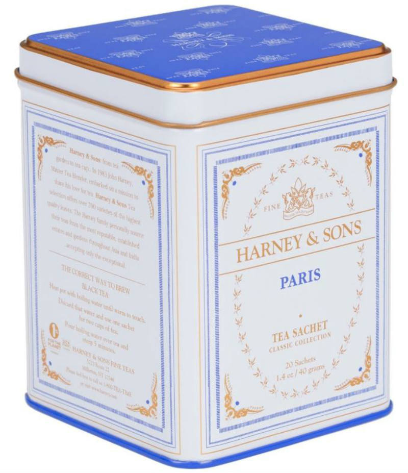
Image Credit: Harney & Sons
This tin can design looks as if it came straight out of a Wes Anderson film. The intricate accents, combined with simple lines and a regal color palette. The can belongs to sit beside a plate of Mendl’s courtesan au chocolat, the fictional fancy pastry in Anderson’s flick, The Grand Budapest Hotel.
2. Tazo
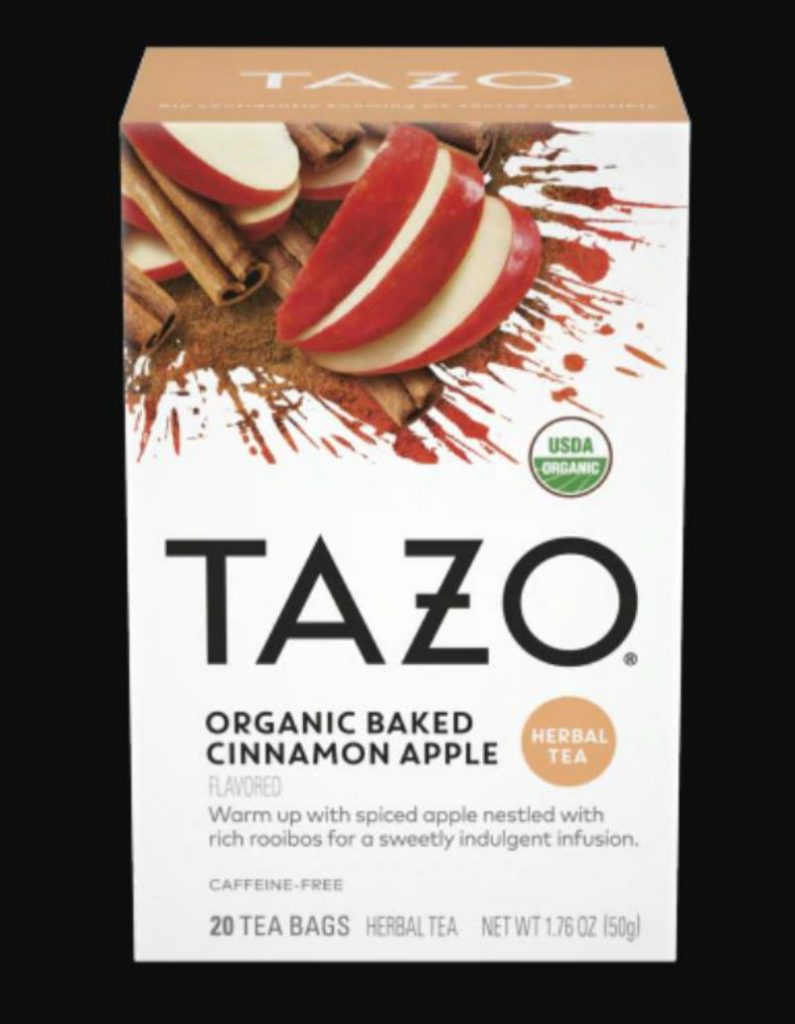
Image Credit: Tazo
You don’t need another glance to know the flavors of Tazo’s varieties. This box, for example, prominently displays photos of apple and cinnamon. Hence, it makes shopping easier and encourages consumer desire by painting a clear picture in their mind.
3. Numi Organic Tea
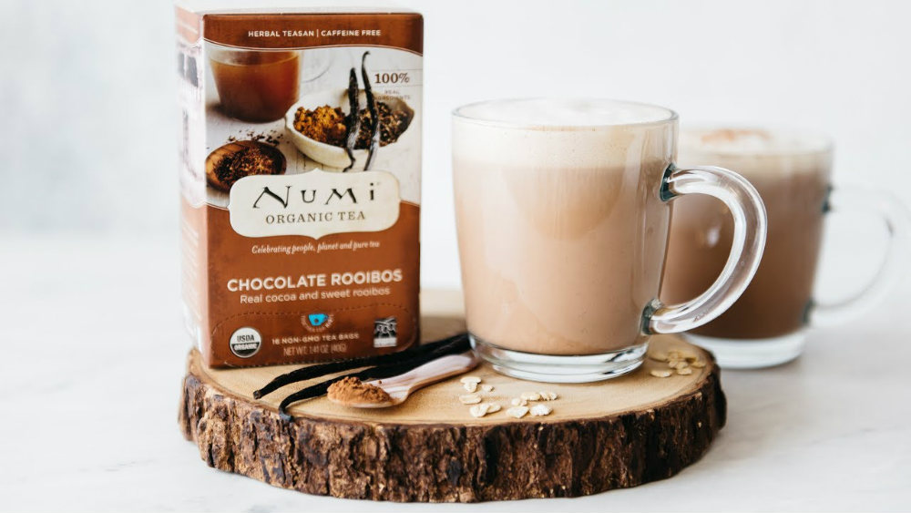
Image Credit: Numi Organic Tea
The perfect marriage of photo and layout makes this box an excellent example of food packaging. The image shows an artistic picture of cocoa and rooibos that falls within the same color family. In the same vein, the chocolate hue of the background matches the palette of the photo making for a cohesive image.
4. Juniper Ridge
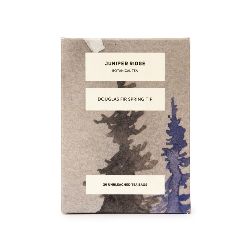
Image Credit: Juniper Ridge
This American fragrance, soap, and tea company offers a rustic and minimalist branding that highlights nature. Their packaging design is simple but striking. The brown box features three cream strips with minimal sans serif text. In addition to this, the watercolor art in the background saves the design from looking too dull.
5. Steven Smith Teamaker
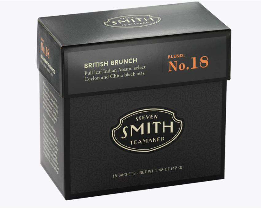
Image Credit: Steven Smith Teamaker
This packaging is so straightforward; it looks akin to a box of cigarettes. As a result, it seems like a brand that is so confident in its product that it doesn’t need any fluff.
6. Pukka
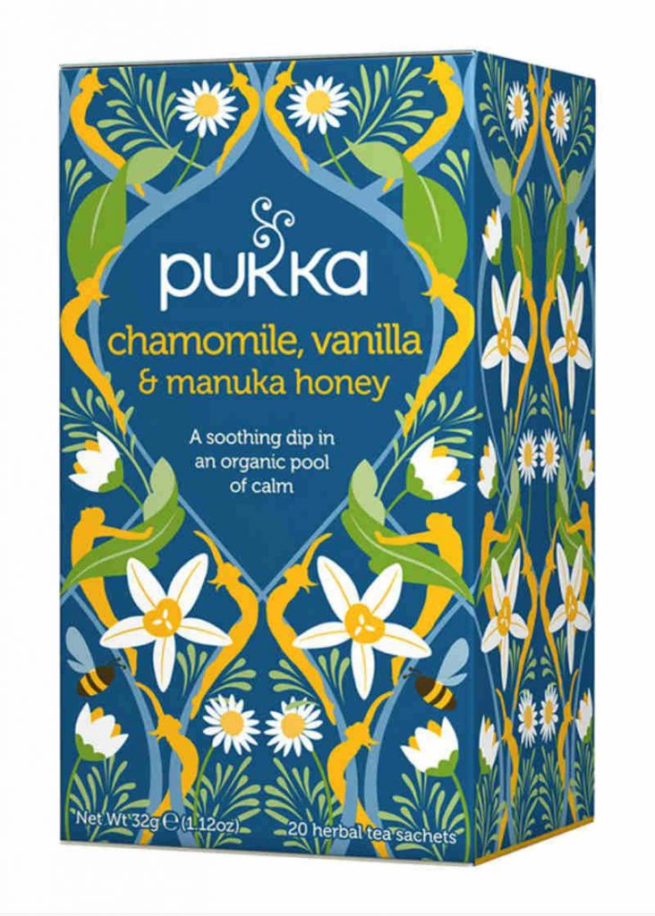
Image Credit: Pukka
This UK-based tea and supplement provider offers artistic packaging. This box, for example, looks like an art nouveau masterpiece. Its curves, flowers, and patterns are reminiscent of an Alphonse Mucha theatrical poster.
7. Twinnings
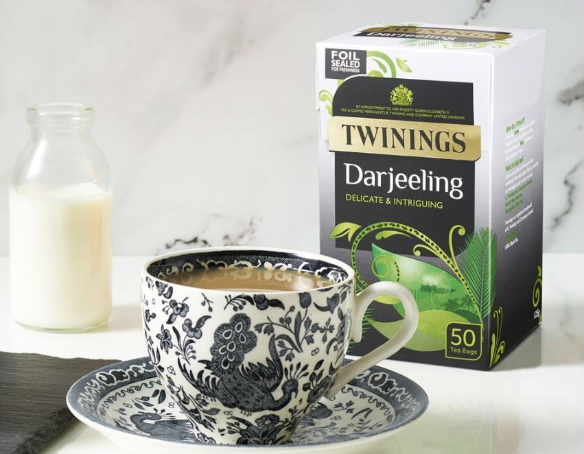
Image Credit: Twinnings
This Hampshire-based beverage company offers tea packaging designs that offer grace and elegance without looking hard-to-reach. Not only does it focus on the most important branding elements on the box facade, but it also features a design that highlights the unique identity of each variety.
8. Yogi
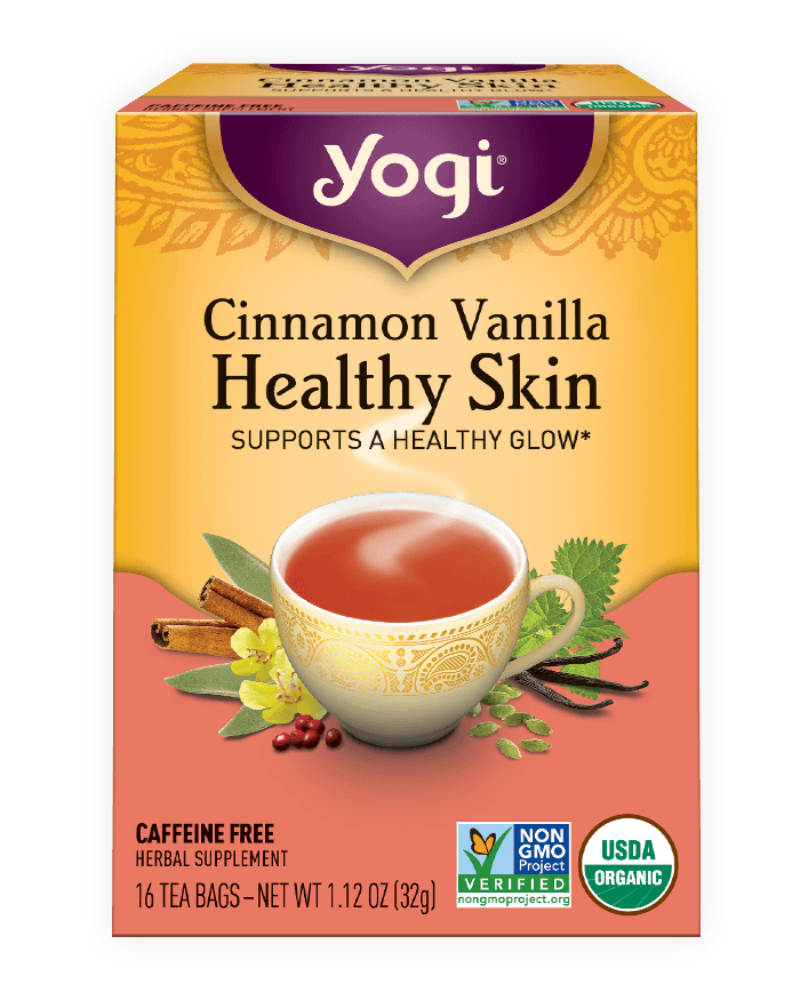
Image Credit: Yogi
Yogi’s identity anchors on relating physical and emotional wellness to its products’ benefits. Along with that, the brand aims to be a tea of choice for people seeking wellness and relaxation. Their packaging aptly shows its Ayurvedic logo. In addition to that is a simple illustration of the variety’s ingredients. Hence, just looking at the box would make you want to take a break, meditate, and enjoy a relaxing cuppa.
9. The Tea Spot
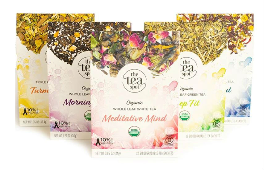
Image Credit: The Tea Spot
The Tea Spot offers whole leaf teas. Fittingly, they took advantage of the wrapping to explain the product to prospects at a glance. The box features a photo of what whole leaf teas look like. Along with this, the box features a background illustration that complements the hues of the product.
10. Tesco
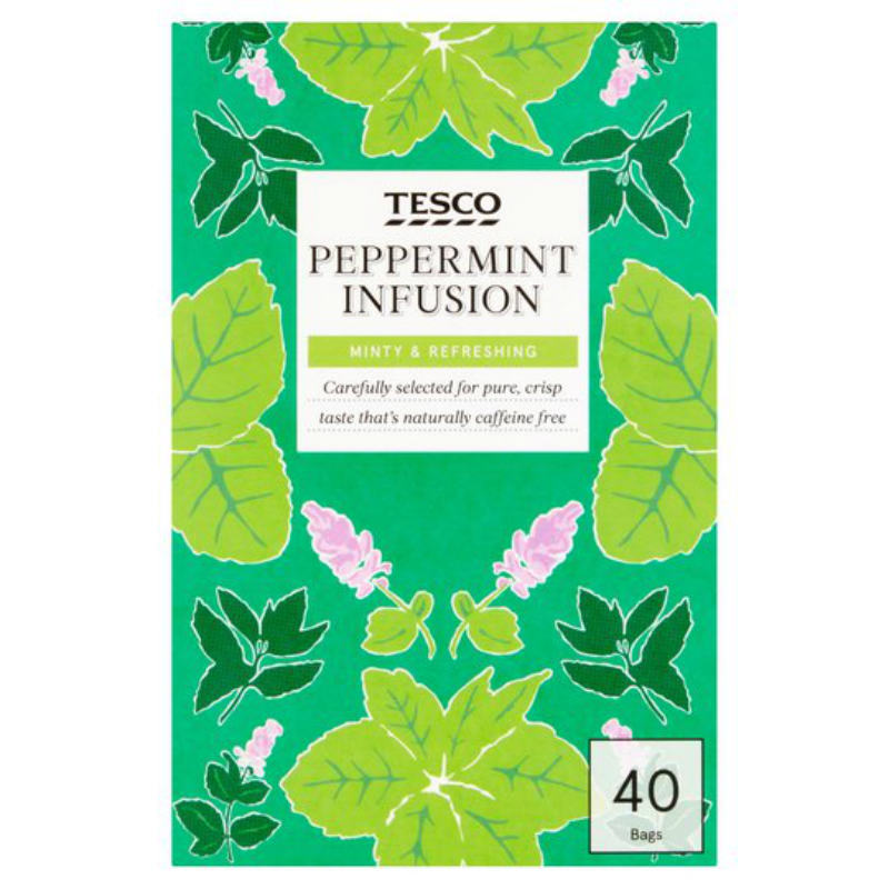
Image Credit: Tesco
The British grocery retailer proves that you don’t need to embrace a grandiose branding to look well. Their tea is known to be an affordable everyday beverage. Nevertheless, the box design presents a brand that looks clean and direct to the point.
11. STASH
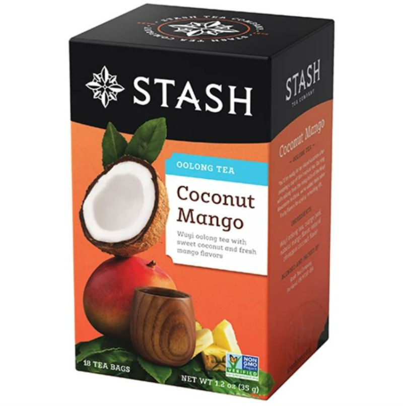
Image Credit: STASH
Not only does the box show a clear photo of its ingredients, but it also shows how well the flavors go together. This variety, for example, shows coconut and mango with a wooden cup amid a sunset-hued background. The image subtly hints at a tropical flavor.
12. Kusmi Tea
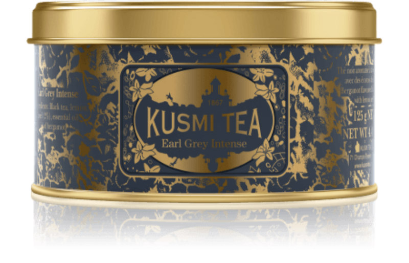
Image Credit: Kusmi Tea
This tin can design offers a luxe look without trying too hard. The metallic gold hue of the can shines through the black and dark gray print. As a result, the tin appears elegant and looks like something you’ll want to drink at a fancy afternoon tea party.
13. The Tea Makers of London
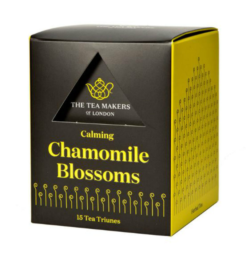
Image Credit: The Tea Makers of London
This brand might be one of the few that uses 3D packaging to create an impact. The box features a triangular hole at the upper half part. As a result, the material inside which bears the logo can be seen on the surface.
14. TWG
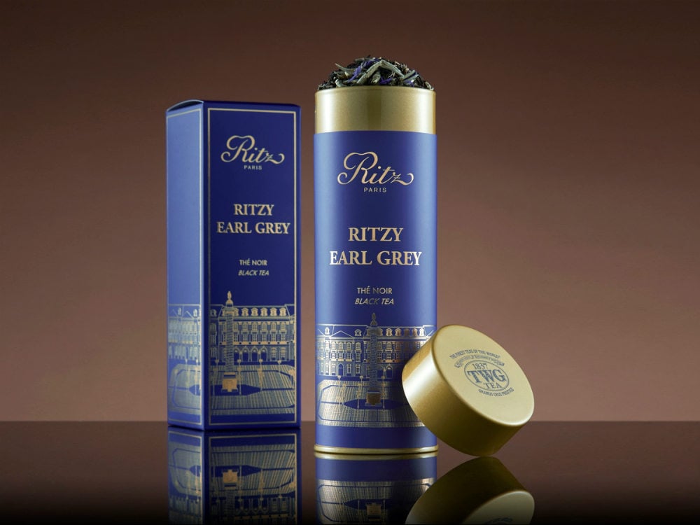
Image Credit: TWG
This brand partnered with The Ritz Paris for an exclusive line of teas inspired by the City of Lights. These four offerings, including Ritzy Earl Grey, come in tall, gold tins. The can features the logo of Hôtel Ritz Paris. At the same time, the package also shows an image of the luxury hotel’s facade.
15. Harrods
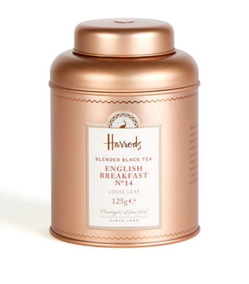
Image Credit: Harrods
Last but not least is this affluent-looking tin from Harrods. This could be one of the simplest but most elegant tea packaging designs in the market. The tin can’s old-school shape and rose gold hue look classy and sophisticated. Similarly, the front label is straightforward but intricate. The design draws the eyes to the white card in the middle, which indicates the brand and product variety.
About the author

Carla Deña
Carla is a journalist and content writer who produces stories for both digital and legacy media. She is passionate about creativity, innovation, and helping small businesses explore solutions that drive growth and social impact.


