
Split testing isn’t just a buzzword thrown on the internet these days. It’s an essential part of your marketing campaign, where you put ads side by side to see which one performs better. Split testing saves companies money, preventing them from investing in advertising methods that don’t bring in revenue. Landing pages are one of the ads you must split test. What are landing pages? Why should companies create these web pages? And how do you A/B test landing pages? Here’s how to split test landing pages.
What are landing pages?
A landing page is a standalone web page that brands create to convert leads. These are pages built for brands’ marketing and advertising campaigns. Landing pages are where users “land” after clicking on a banner ad, online ad, social media ad, or email from websites, Facebook, Google, or YouTube.
Here’s an example of a landing page from Wix. It showcases a simple yet captivating landing page with big hero illustrations, a heading, and one call-to-action button. Wix’s landing page marketing goal is to invite users to start a trial or subscribe to their plans.
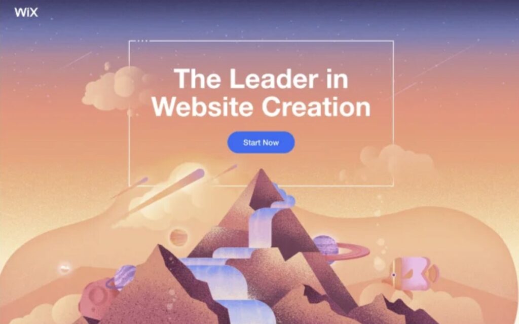
Unlike web pages, landing pages are focused on one goal—conversion. Landing pages look cleaner with an unobstructed design. On the other hand, web pages contain more text information and visual elements to educate viewers about the brand. Landing pages eliminate distractions that lead prospects to the call to action.
Most landing pages have hero images, a heading, a subheading, a body, signup forms, and, most importantly, a call to action. A call-to-action button must stand out against the landing page design, as this is the most vital visual element. This tells the users what to do and guides them to the next step of the sales funnel.
Are landing pages effective?
Research suggests that businesses with around 10 to 15 landing pages increase conversions by 55 percent. Landing pages effectively convert users provided the pages have good structure, are easily digestible, captivating, and highly convertible.
One way to test if the landing pages work is through split testing, also known as A/B testing. Read on to find out how to split test landing pages.
What is split testing or A/B testing?
Split testing is the process of comparing two different landing pages. It can also be used to split-test different email ads, online ads, and advertising content to see which gains the most engagement or conversion.
A/B testing or split testing is a way to identify which advertising methods resonate with your target audience. This way, you can create better landing page designs in the future that garner more conversions.
How does split testing work?
How to split test landing pages works by testing two different designs. One is called the “control,” and the other is the “variant.”
The first version is the original one, and the second version is diversified to see if it works better than the first one. You must change the second one to see if it appeals to more users. You can change the copy, call to action, color palettes, graphics, or layout.
If the second one garners more followers or signups, it’s considered the split test winner.
Here’s an example of split testing two landing pages from GatherContent. The test is about focusing on conversion goals. The first landing page shows two call-to-action buttons, while the second focuses on just one.
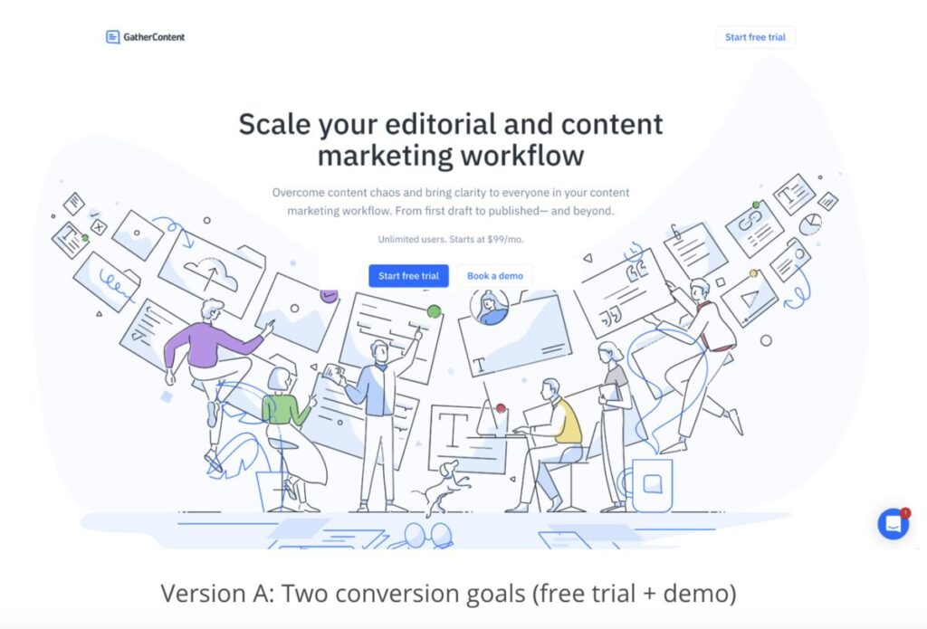
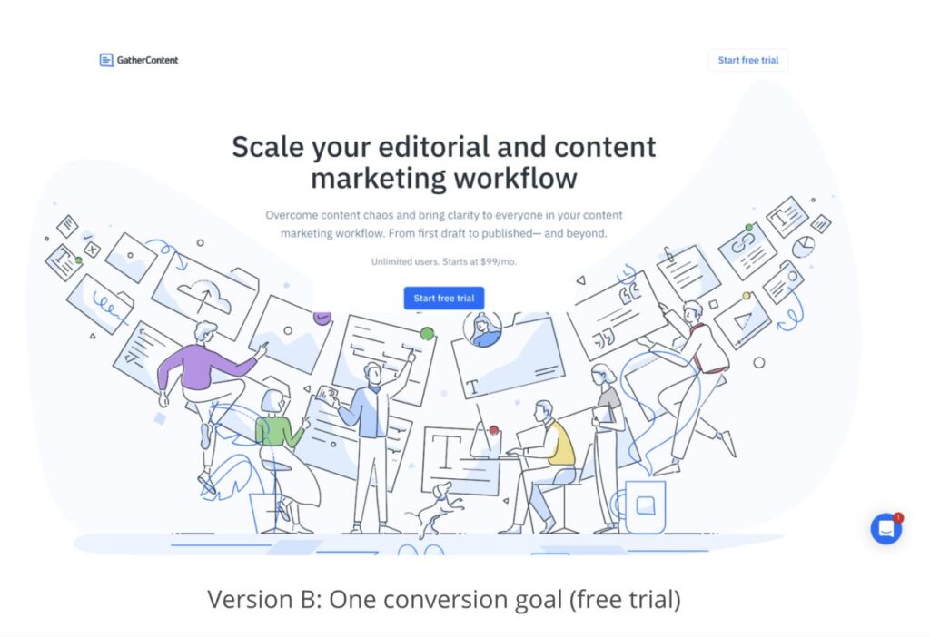
The theory is that when users see too many call-to-action buttons, these might confuse them. The first one shows two options: start a free trial or book a demo, which will likely get fewer conversions.
What are the benefits of A/B testing landing pages?
Knowing how to split test landing pages lets business owners make subtle or significant changes in the design. Depending on their marketing goals, this will allow them to use the changes on future landing page designs.
Here’s why marketers should split test landing pages:
- Data: Split testing allows marketers to gather, read, and analyze data. Instead of creating marketing campaigns based on intuition, A/B testing will help you leverage real user behavior to make informed decisions.
- User research: If you’re conducting user research, split testing your landing pages helps you test your positioning, messaging, and offers. This will allow you to publish campaigns that likely resonate with target audiences, eliminating guesswork and increasing conversion rates.
- Global research: Landing page split testing allows you to test elements that might be good for international conversions. You can incorporate landing page components catering to your global target audience. See if these elements work and push more landing page campaigns for worldwide marketing.
- Lower risks: Instead of redoing an entire web page, split testing lets you make incremental changes. This reduces the risk of compromising your current marketing and conversion performance.
- Conversions: The whole point of split-testing landing pages is to figure out which one gets the most conversions. After your A/B testing, you’ll find the winning variant that drives the most conversions.
8 Landing page elements you can split test

Testing out different landing page elements or features is crucial. The rule of thumb is to make subtle changes, limiting to one to two changes instead of more. This will prevent confusing your audience and help advertisers precisely identify which components contribute to conversions.
Moreover, making one to two changes on the variant landing page will make it easier for marketers to read and analyze split test results.
Here are some common landing page features you can A/B test:
1. Heading
The heading is the first thing that attracts your target audience. This determines if they want to browse through your landing page or not. Ensure your headline is catchy and concise. Experiment with the font size, kerning, typeface, writing tone, and copy. Analyze which headlines catch viewers’ attention and compel them to click the CTA button.
2. Subheading
Your goal is to make your headline catch users’ attention, so keeping it succinct is vital. This is where a supporting heading comes into play. Your subheading completes your heading and offers more information on what customers are getting. That said, ensure your subheading contains more valuable information that makes users explore the landing page further.
3. Body
A well-written body or paragraph increases your conversion rates. That said, your body must include all the features and benefits that will solve your target audience’s pain points. Avoid writing blocks of text on your landing pages. Make it easily digestible for readers to scroll through the text by using bullet points and keeping sentences short. The body must answer all your audience’s questions, so provide clear and concise information.
4. Graphics
Your landing page design is one of the factors that compels users to stay on your web page longer. If you’re promoting a new product, using high-quality, optimized images is crucial for better and seamless browsing. When split-testing landing pages, experiment with the images and layout. Highlight the best angles of your product or include a video demonstration to explain how it can help customers.
5. Forms
Forms are an essential part of your sales funnel. These forms are your connection to your customers, letting you gather the needed data for marketing and sales purposes. Forms also help in lead generation if that’s your goal in creating your landing pages. You can experiment with form length to see which forms increase abandonment rates. You may also use website form analytics to determine hesitation time, interaction time, etc. Some examples are Clicktale, Mouseflow, Formisimo, Hotjar, Decibel Insight, and more.
6. Social proof
Social proof refers to ratings, testimonials, recommendations, reviews, awards, certifications, badges, and media mentions. You need these trust marks on your landing page to add credibility so people believe what you’re claiming. You can experiment with the social proof layout. Is it better to add it above the fold or below the fold? What kind of social proof resonates well with your target audience? How many should you display? See what works best in your favor and get you the most conversions.
7. Structure
A landing page must be free of distractions. These web pages must lead users to the call to action and encourage them to click and take the next step. Therefore, creating a clean and high-converting structure is essential. Go for a layout familiar to users to match their expectations. Headings must be on top, fields or forms underneath or beside the copy, and the call-to-action button must be below or in the middle. Create an easy-to-navigate structure so users can easily browse through all the information.
8. Content
Content doesn’t only pertain to the copy or body of the landing page. When learning how to A/B test landing pages, you must consider every element, even data visualization. Content could also refer to your page’s charts, infographics, product previews, animations, and videos. See what types of content bring more leads to submit signup forms or click call-to-action buttons.
How to split test landing pages
Follow these step-by-step guide on how to split test landing pages:
1. Identify your goals
Identify what goals you want to achieve. Knowing your goals will help you determine which variable or element to change. It will also help you modify your landing pages to ensure the page keeps your audience interested. Some goals would include increasing website visits, click-through rates, getting leads, getting more newsletter subscribers, retention, or improving revenue.
2. Select one variable to test
The general rule in A/B testing your landing pages is to test one variable at a time. If you make two or more changes and test multiple variables simultaneously, you won’t identify which variable brings in more conversions. However, there are certain times when testing multiple variables is reasonable, called multivariate testing.
The new variable could be called your “challenger.” If you’re creating more than two variations, you can label these as A, B, C, and so on.
Pro Tip: Ensure you’re running one variable at a time and the control and variant landing pages simultaneously. This way, you know the performance is based on the variable you’re testing, not the season or month.
3. Divide traffic
Ensure you’re splitting traffic between your list of test users. Use split testing tools like Optimizely or HubSpot to divide traffic between multiple variations. Using tools also ensures users are exposed to random variations.
4. Run the split test
Run the split test for your landing pages for a considerable duration. Ensure you’re not prematurely ending the landing page A/B testing. This is to ensure you gather enough data to analyze results and performance.
Pro Tip: The sample size also applies to some split tests that might need enough statistical data for results.
5. Monitor results and analyze data
Look for statistically significant differences in the relevant metrics you’re tracking. Most split-testing tools also provide calculations to help you determine the winner.
Once you’ve gathered enough data, see which variation gives the most positive results. Consider both quantitative data, such as click-through, bounce, and conversion rates, and qualitative data, such as user feedback, heatmaps, etc.
6. Implement changes
Once you’ve chosen the winning variation, implement this element or variable on your main landing page.
7. Repeat and iterate
A/B testing or split testing isn’t a one-time process. You must continually repeat testing to ensure you’re making improvements maximizing conversions and revenue. Split testing landing pages is an ongoing process to ensure you’re optimizing your marketing campaigns.
The bottomline
Performing split tests on marketing campaigns, such as emails, online ads, landing pages, etc., is essential for business revenue growth. Knowing how to split test landing pages leaves little room for error in future campaigns. It also prevents you from investing too much of your marketing budget for advertising methods that don’t perform. Data is crucial in digital marketing. Brands thrive on data to determine how they can corner the market and reel in sales. And A/B testing is a way to extract data and user behavior for more accurate and calculated future campaigns.
Need images for your landing pages? Subscribe to Penji’s unlimited plans now and get 15 percent off your first month!
About the author
Table of Contents
- What are landing pages?
- Are landing pages effective?
- What is split testing or A/B testing?
- How does split testing work?
- What are the benefits of A/B testing landing pages?
- 8 Landing page elements you can split test
- 1. Heading
- 2. Subheading
- 3. Body
- 4. Graphics
- 5. Forms
- 6. Social proof
- 7. Structure
- 8. Content
- How to split test landing pages
- 1. Identify your goals
- 2. Select one variable to test
- 3. Divide traffic
- 4. Run the split test
- 5. Monitor results and analyze data
- 6. Implement changes
- 7. Repeat and iterate
- The bottomline


