
Your business or brand shouldn’t neglect one key webpage on your website: a 404 page.
In layman’s terms, when one sees a 404, it means there’s a broken link on the website. If you’re missing a 404 page, you might lose leads in the process and have higher bounce rates. Bounce rates mean visitors don’t stay on your website for too long. You should avoid that.
In SEO, the 404 is crucial to get your customers or leads back on track. Meaning, if they see “Page Not Found,” you need to ensure the following elements so they don’t leave your website for good:
- Simple but effective copy
- Navigational links
- Search bar
- Branding
That’s why you need to have not only have the 404 webpage, but also a good 404 page design. Not many realize it, but the generic 404 page (e.g. “Not Found” or “The Page cannot be found”) could make you lose leads.
As for a 404 page design, you can go for something minimalist or colorful. You should keep in mind that your lead or customer can visit other pages. If you can entertain them, then, by all means, go for it.
If you’re looking for inspiration for your next 404 page, you can check out our list of some of the best 404 page designs on the internet.
PIXAR
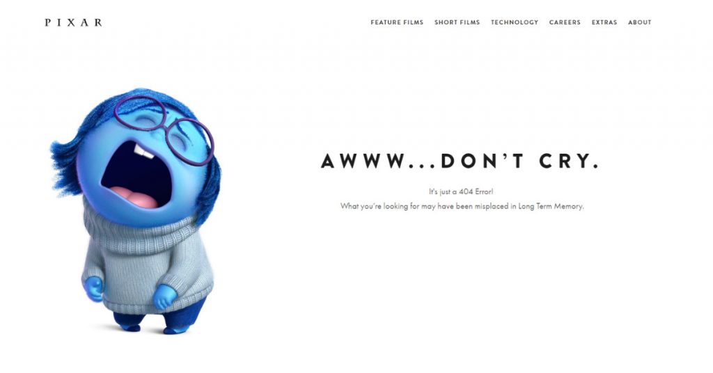
Pixar’s 404 page greets the user with an “Awww… Don’t Cry. ” You’ll see a photo of one of its popular characters, Sadness, from the movie Inside Out.
What makes it a good 404 page is not only do they use a recognizable character in their design but also still include the navigational buttons so users can still explore the Pixar page. For fans of the movie, they can get a kick out of the copy, which is a simple way to explain how some pages get lost.
9GAG
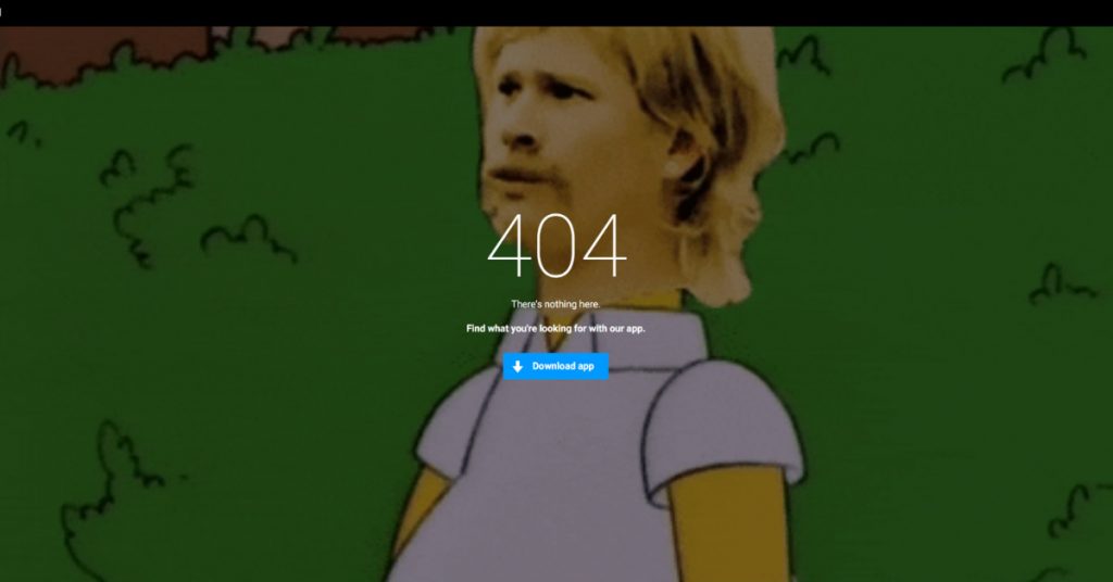
Previously, 9gag had a gif of John Travolta from Pulp Fiction as its designated 404 page. The website replaced it with the What The **** and Homer Simpson mash-up retreating to the bushes gif.
There’s not much after it, but it’s clever because it’s on-brand because 9gag is known for its memes. On their 404 page, it prompts you to download their app, where you could explore more content. However, if you don’t want to download the app, you can click on the logo on the upper left.
Their approach is minimalist, yet it’s effective to make you want to download the app to explore more content and pages.
MARVEL

Refresh the page and you get different superheroes on the 404 page. That’s what makes Marvel’s 404 page impressive.
The drawings and the superhero reveal makes you want to refresh the page and exhaust it. Plus, you get different copies too for every superhero, depending on which one you get.
CSS TRICKS
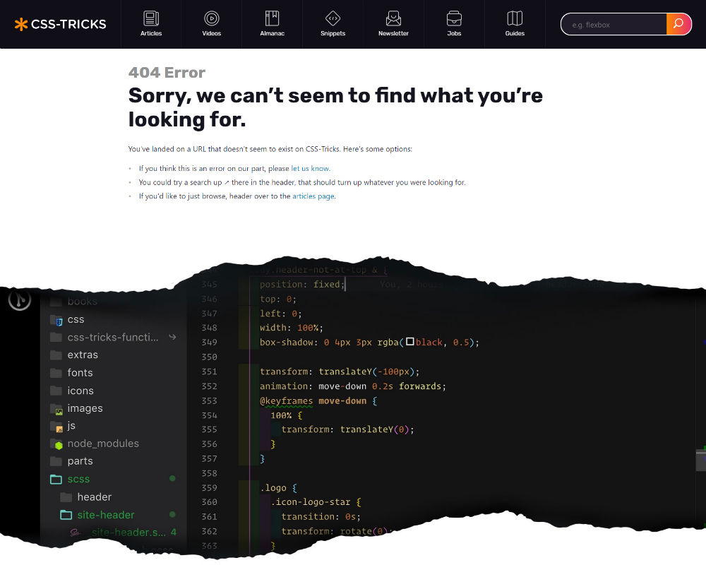
CSS Tricks has one of the most creative 404 pages on the internet. It has a navigation bar that leads its lost visitors to other pages. This limits bounce rates.
To refresh your memory, CSS means Cascading Style Sheets. What it does is it presents fonts and colors on your website.
They show a photo of what looks like an HTML program that shows CSS codes. Its design is on-brand because it can teach those who are learning CSS. As you scroll down, you can even check out other pages and even subscribe to their newsletter.
SLACK
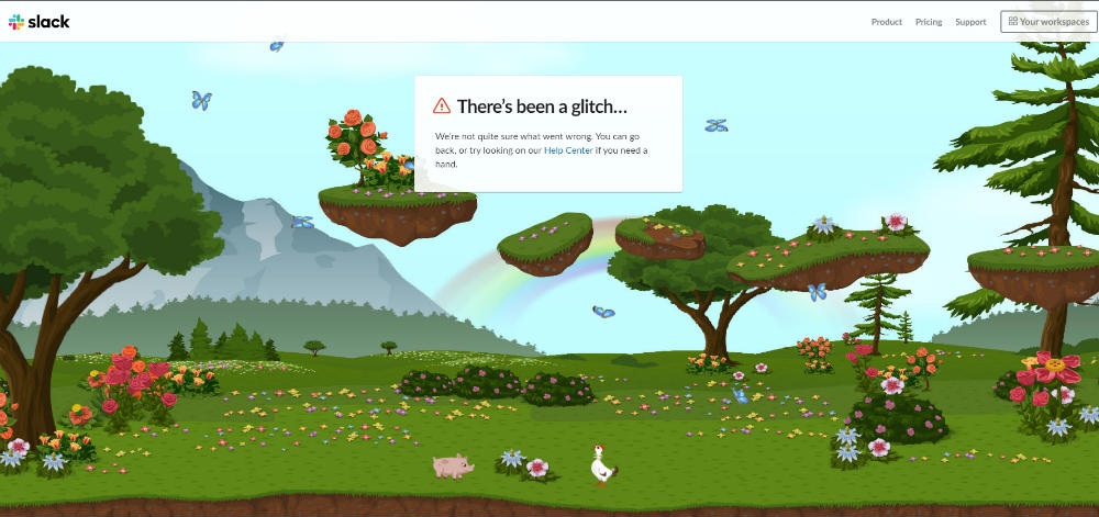
Probably one of the most impressive 404s in this list, Slack integrates animation and design to entertain visitors on that webpage. You can interact with the animals on the 404 page and explore the fields as you move your cursor from left to right.
The page doesn’t do anything much other than petting the animals on screen, but it’s a great design nonetheless. Of course, the navigational basics are present and it even offers lost visitors a link to their Help Center too.
Overall, It’s one of the best 404 page designs to get lost in and have some fun.
MAILCHIMP
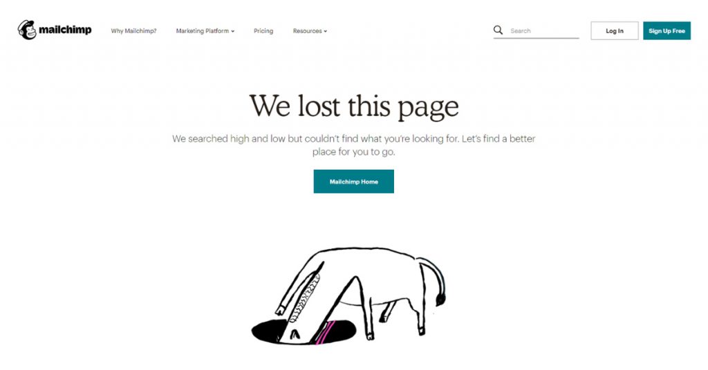
You would be baffled at first as to why there’s a horse’s head stuck in a hole. Then you realize, you can click on it and voila it redirects you to their 404 page game, revealed HorseSnake. Remember that old Snake game in Nokia? Yeah, it’s like that but they use a horse instead.
It makes you want to play the game so much more and beat your high score and may even forget why you visited the site. But, it’s a great tactic to keep visitors on the website.
Warning, the background is catchy too so it makes you want to play.
BITLY
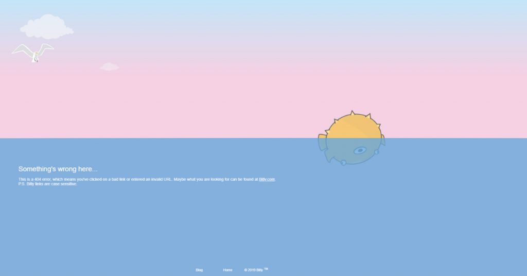
Bitly’s 404 page design is simple. You’ll see a bird flying above either the sea or ocean and a poor pufferfish floating. But you can make the waves move by hovering your cursor over the ocean.
It’s creative because it lets you want to revive the pufferfish by hovering over the waves. It’s a clever metaphor to what a 404 page is.
CODECADEMY
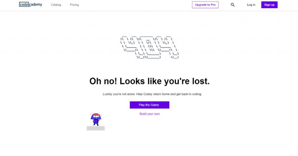
At first glance, Codecademy’s 404 page doesn’t seem much. Sure, the design looks great, but Codecademy’s 404 page lets you play a game even if you’re lost.
It’s a simple jumping game that you can play for a couple of times until you’re redirected.
HOT DOT

Hot Dot is a website that focuses on integrating technology with design, and their 404 page exemplifies their purpose.
Their 404 page is an interactive page that lets you hover your mouse everywhere and you can see the angles of the 404 anywhere on the page. Not only can you make the background move, but when you click on any part of the numbers, that part disappears and generates right after.
The explosion when you click on a part of the number looks like fireworks too and makes you want to click on the 404 over and over. Plus, it’s visually appealing.
THE ARTERY
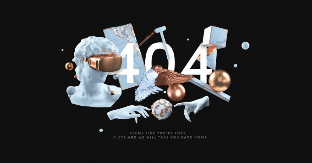
Just like Hot Dot, The Artery’s 404 page lets you hover on the page and check out some of their 3D assets. If you want to admire their work, don’t click, you’ll get redirected to their home page.
It’s effective and creative because you see an overview of their designs on the page. From there, you’ll know what type of output they produce.
MAGNT
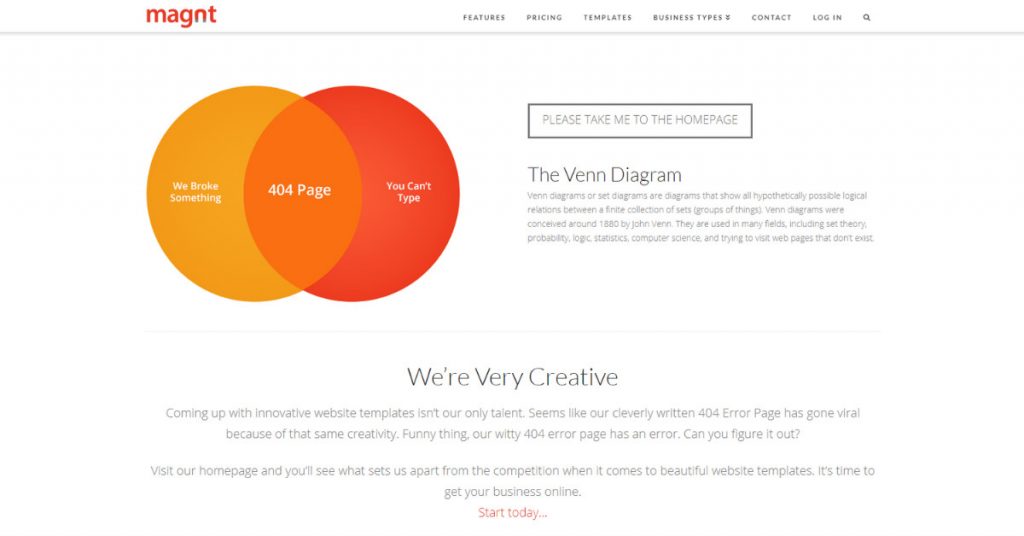
You might be confused about why a Venn Diagram appears on the homepage (you might even be thinking about the Mastercard logo too). But what makes the 404 page clever are the copies.
On the Venn Diagram, you’ll see the following copies:
- We Broke Something
- You Can’t Type
- 404 Page in the middle
It incorporates humor too. They even provide a brief history of the Venn Diagram, which adds that 404 pages happen as an example too. The design is simple and keeps you intrigued.
KUALO
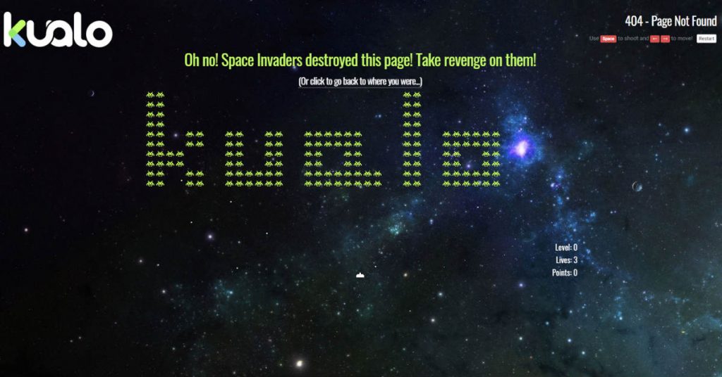
Kualo is a UK-based web or server hosting platform. Their 404 page is entertaining.
You’ll see on the 404 page their version of Space Invaders. Once you’re on the page, you may even start playing because the space invaders start attacking you.
It’s a clever 404 page because it gets people to stay on the page and maybe once they run out of lives, they can navigate different Kualo pages.
FLYWHEEL
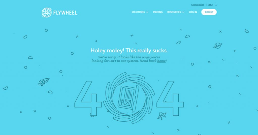
Some 404 pages feature space. It’s as if a visitor got a “lost in space” scenario. Flywheel does the same thing but takes it up a notch higher than others.
Their 404 page seems psychedelic somewhat. The objects move slowly, especially the pinwheel in the middle. It just wants to make you look at the site and watch every single element. Blink and you’ll miss it, there’s even a rocket that disappears a few seconds when you stay on the site.
If you’ve been hypnotized long enough, you can click on their homepage and makes you snap out of it and return to what you needed to do.
IMGUR

IMGUR’s 404 page has portraits of animals with googly eyes. Like some in this list, you can hover on the page and the googly eyes move. Think of portraits that follow your every move no matter what angle they are.
It’s a quirky and clever 404 page design that makes you want to move your mouse anywhere on the page and let the googly eyes do their thing.
GITHUB
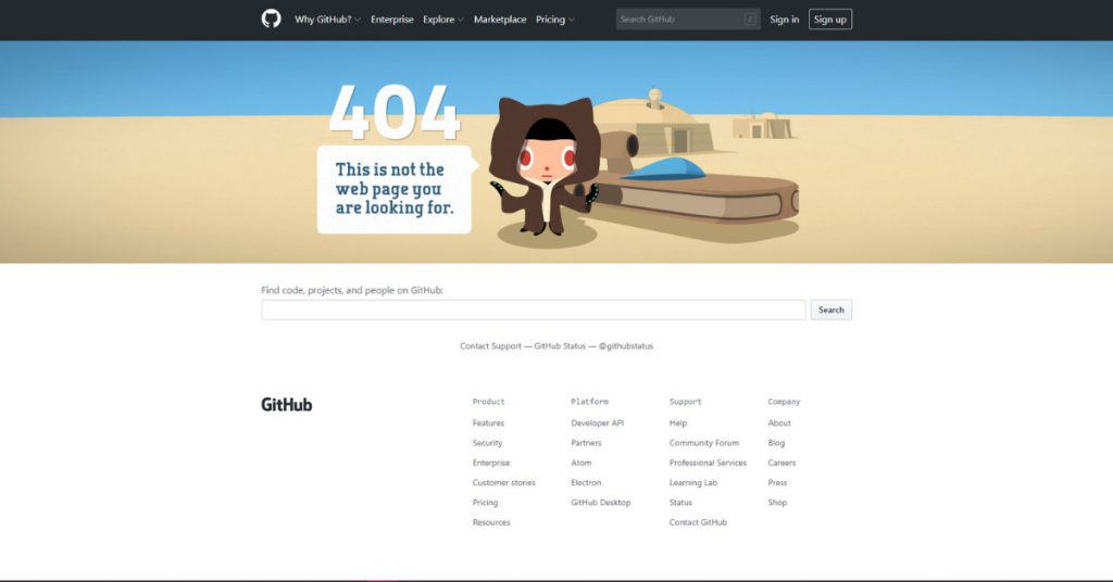
Github uses a Star Wars reference on their 404. It’s also a hover and move 404 page. It seems that as you explore, the Jedi is stopping you from looking any further because there’s nothing to see.
Star Wars fans can get the reference easily, which can entertain them. The design also looks good and isn’t overcomplicated. It reminds you to be productive or do the thing you need to do on their site.
KEY TAKEAWAYS
Clever and creative 404 pages mix design and copy perfectly. One of the most important aspects of having a 404 page is to redirect the user to other pages on the site.
Some businesses take it to the next level and make it interactive. It’s also an effective approach because you don’t want them to leave the page easily. Also, it’s a way for them to stay on-brand too so you can instill the brand’s or business’s identity to the user or consumer.
In terms of utilizing creative 404 pages on your website, go with what you want. It can be minimalistic or over the top interactive. Take inspiration from the list above if you want. So long as you can redirect the user to other pages or keep them on the 404 for a while, you’re good.
About the author

Katrina Pascual
Katrina is a content writer specializing in graphic design, marketing, social media, and technology. In her spare time, she writes monthly personal blogs to practice her craft.


