
There is no other event in a person’s life that entices such a visceral reaction. Weddings are such a monumental occasion that some people spend the better part of their young life saving for it. And weddings aren’t complete without wedding menu cards. Are you in the process of creating menu cards? Here are eight wedding menu card examples to inspire you.
Why Do Menu Cards Matter?

It might be a small part of the wedding event, but wedding menu cards help tie the whole theme together. An amazing wedding menu card can help make your wedding guests feel like honored dinner guests.
You need to have menu cards at your wedding when: you are having a formal sit-down dinner for your wedding reception, your guests are selecting from different entree choices on the menu as opposed to ordering ahead of time through the RSVP card, and lastly, when you want to add a touch of style and decoration to the table. You can even add a short thank you note for your guests to read and include a drink menu complete with a signature drink and its ingredients.
What Makes a Good Wedding Menu Card?
A wedding menu card is mainly an artistic pursuit and, therefore, should be considered as a piece of art at a wedding. There is no right or wrong way to create these menu cards. It mainly falls on the design sense and style choices of the couple.
There are, however, guides on creating a beautiful and memorable menu card online. Plus, there are online app design tools you can use to create your menu cards. Basically, it boils down to three major key points: font style, paper quality, and graphic design. And speaking of graphic design, Penji has set its footmark in creating high-quality wedding materials at a reasonable price.
Penji is a subscription-based unlimited graphic design service tailored to the client’s every need. From wedding menu cards, and wedding invitations to any designing jobs, Penji gets the job done within 24 to 48 hours.
Elements in Memorable Wedding Menu Cards
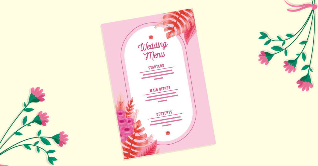
Font Style
A wedding menu with poor font style choice will fade into guests’ minds during dinner. Not only does it convey information, but the font style choices on a menu card mirror the creativity and personalities of the couple.
First and foremost, the font should be clear, simple, and straightforward. It should not leave your dinner guests squinting over the menu trying to decipher the words.
Paper Quality
The foundation of the wedding menu relies so much on the type of paper you use. Choosing the right paper quality involves selecting the texture, weight, thickness, and color.
All these aspects complement the words and the art printed on the menu. Paper quality is also an excellent way to make an impression on your wedding guests as they sit during the dinner reception.
Graphic Design
If the font style of the menu card is its soul, then its graphic design is its heart. Wedding menu cards that comprise words only, no matter how beautifully done, will always pale compared to a card that’s complete with excellent graphic design.
A great wedding menu card dons a clean design that goes well with the overall theme of the wedding.
How to Make Wedding Menu Cards Stand Out: 8 Examples
1. A splash of color.
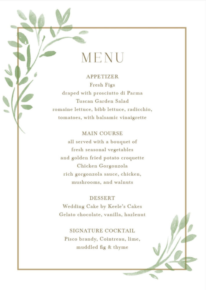
The font style is clean and simple, sticking to one font family and only changing the font sizes for hierarchy. The beautiful gold border accented with leaf vectors done in a watercolor style centers the design into one cohesive idea.
2. Realism and boldness.
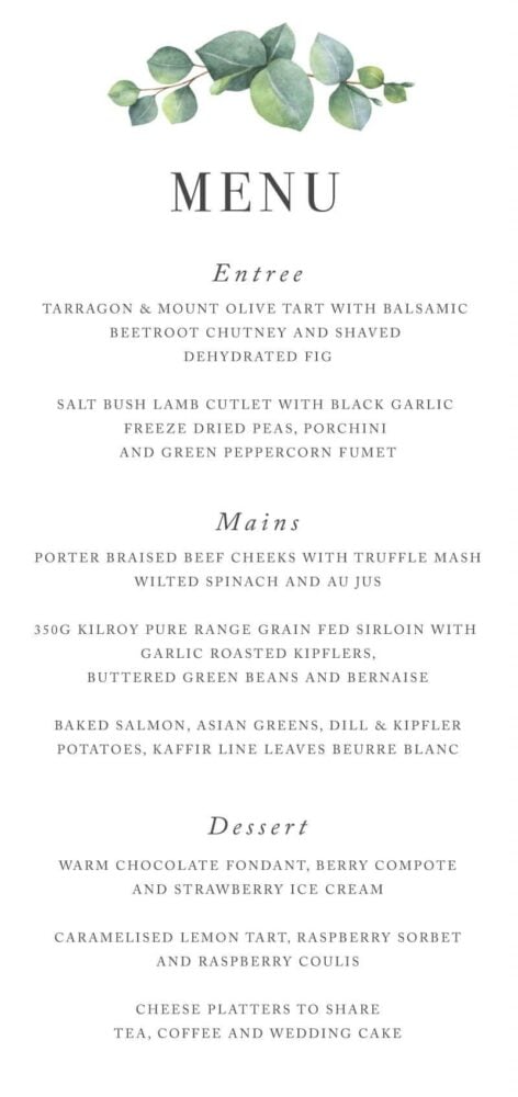
This menu card offers another side of the previous design with its use of realistic greenery to accentuate the corners of the card. What sets this card apart from the previous one is its use of bold fonts, which make reading far easier for the guests.
3. The foliage of color.
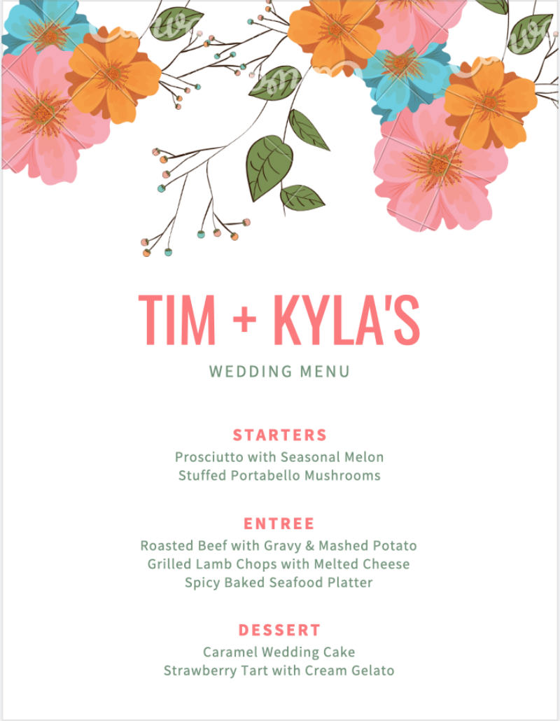
Bold, vibrant, and chic, these three things jump first on seeing this menu card. The graphic design dominates the majority of the space, yet it still maintains balance with the texts. The font style is still under one family. However, this time, it opts to denote importance by using colors on each heading.
4. Beauty in simplicity.
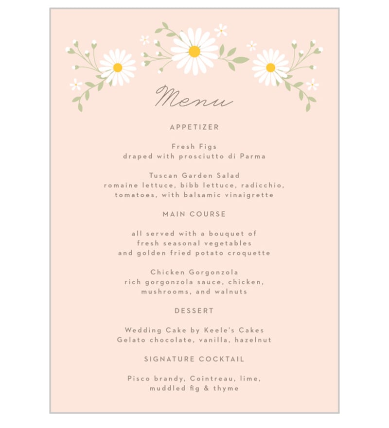
What sets this wedding menu card from the other designs is its smart use of negative space. To balance the bareness, three font styles were used, each one for a different purpose. The design concept is held together by floral accents placed strategically on the corners.
5. Elegant and avant-garde.
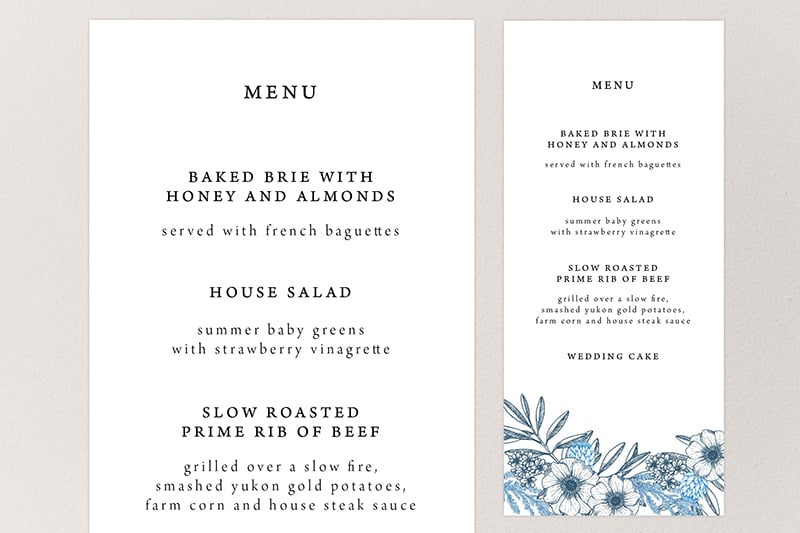
Different colors in the same tonal range dominate the style of this menu card. Each color complements other elements nicely. Multiple font styles were used, with the main heading in bold to denote importance.
6. Hot in pink.
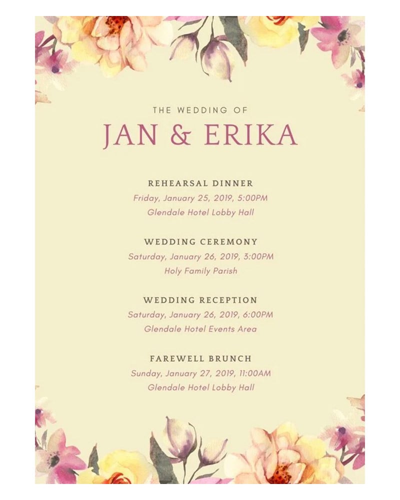
This wedding card exemplifies the proper use of colored paper to complement the rest of the design concept. The soft salmon of the paper serves as a stable foundation for the fonts and flower graphics to exist and thrive.
7. Line art at its finest.
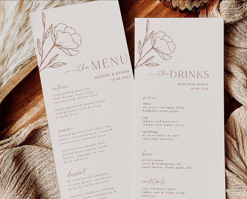
Beautiful fonts in a simple, bold style clearly communicate information on this menu card. What sets it apart is the gorgeous line art of flowers on the background. This style gives guests a small hint of what awaits their palate.
8. Black beauty.
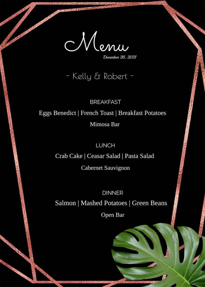
For a wedding dinner to truly stand out, go against the grain. Create truly unique wedding menu cards like this one. The dark paper is the perfect pedestal to bring out the vibrant colors of the texts and the floral design.
Conclusion
These beautiful wedding menu cards should make every couple jump with joy as they do the finishing touches of their big celebration. If you’re creating a wedding menu card but don’t know where to start, work with Penji.
We offer a flat monthly rate, and you get UNLIMITED EVERYTHING! Want to try our service risk-free? Here’s a 30-day money-back guarantee, so you won’t miss out on our impressive service.
About the author
Table of Contents
- Why Do Menu Cards Matter?
- What Makes a Good Wedding Menu Card?
- Elements in Memorable Wedding Menu Cards
- Font Style
- Paper Quality
- Graphic Design
- How to Make Wedding Menu Cards Stand Out: 8 Examples
- 1. A splash of color.
- 2. Realism and boldness.
- 3. The foliage of color.
- 4. Beauty in simplicity.
- 5. Elegant and avant-garde.
- 6. Hot in pink.
- 7. Line art at its finest.
- 8. Black beauty.
- Conclusion


