
In any modern art form, there are creatives who fall into one of two categories. Some artists’ work exists within the established confines of their craft’s standards. The other category is the vanguard, whose work pushes against the expected towards bold new horizons. Typographers can be looked at the same way.
The vanguard’s work typically consists of reshaping conventions and breaking down their formulas in order to push the boundaries.
Of course, the true test of how effective a boundary-pushing artist’s work is coming down to how well their work is received by the general audience.
Experimenting with an art form
You can compare it to experimental pop music. To keep it simple, we can use one of the most notable instances of innovation in pop.
What made the Beatles such successful adventurers in the mid-to-late 1960s was their ability to exercise constraint. That is, it wasn’t simply their willingness to go far out—any number of artists had done that before—but how far out they went without losing their commercial appeal.
The height of invention isn’t measured by how far out one can go, but by how far out one can bring their fans without alienating them. That’s the art.
But it can be a tight line to walk, especially when you consider that the “line” isn’t fixed. A number of variables affect it at all times, and that uncertainty contributes to the unique set of limits placed on art.
Typographers are limited by concepts like legibility; people must be able to discern what characters they’re looking at. They’re trying to reshape the alphabet, but their audience must be able to recognize their letterforms without a second thought.
[in_content_ads gallery=”logos” logo=”on” title=”Need graphic design help?” subtitle=”Try Penji’s Unlimited Graphic Design and get all your branding, digital, print, and UXUI designs done in one place.” btntext=”Learn More” btnlink=”https://penji.co”]
Trending towards humanity
But bubbling just under the surface, there are new trends growing, taking hold of typographers the world over. More and more, the tendencies of mid-century typography seem to loosen their grip on the current wave of designers. The strict reliance on geometry and legibility above all else is slowly crumbling.
In its wake, a far more expressive, humanist style seems to be emerging.
Here are 5 typographic designers offering a fresh approach to their work in 2022.
Paul Eslage (Hamburg, Germany)
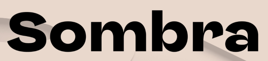
German-based type artist Paul Eslage develops and designs brand identities for both print and digital media. Sombra, his own creation, is perhaps one of his most noteworthy recent works. Eslage has described this typeface as a “geometric yet organic grotesque” design.
The characters are quite soft, often featuring oblong, rounded elements to their form. But despite this, it’s also rather sharp.
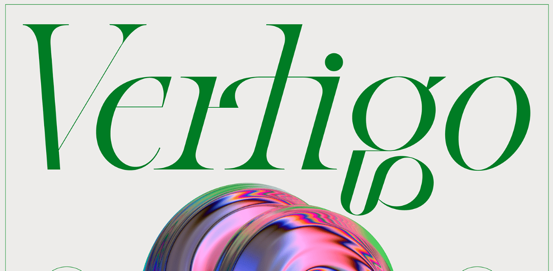
Barret Reid-Maroney (Ontario, Canada)

Working out of Ontario, Canada, Barret Reid-Maroney is a brand identity craftsman whose affable work is often shrouded in his own distinctively-designed typefaces. Among his more commonly deployed typographic tropes is the use of high-contrast and highly intricate fonts that balance qualities of retro-futurism and classical elegance.
This is typified (no pun intended) by Kafka, a typeface that balances elements of geometric sans serifs with swirling, humanist, and banner-like quirks.
Moshik Nadav (Brooklyn, New York)

Born and raised in Isreal, Moshik Nadav works out of Brooklyn. His work tends to offer poise and flair through high contrast between thick and thin brush strokes. His pride and joy seems to be his serif work, which tends to have long, curving flourishes lurching off of the letterforms.
Segol is an excellent example of his work. It’s characters are wonderful for display copy, boasting a clean-yet-detailed charm.
Hey Porter! (Amman, Jordan)

Hey Porter! is an independent type foundry working out of Jordan and founded in 2017. Their website states a focus on designing experimental modern fonts, marks, logos, and identities.
A number of their typefaces are designed purely for the Arabic alphabet and are fantastic options for display text. Much of their work is strong, modern and condensed. Options for the Arabic language include Talama, Sindeed, and Watad.
But Palestine is one of their few typefaces that work with the English language. It offers a highly angular, diamond-like letterform that cleverly evokes its namesake.
Bagerich Type Foundry
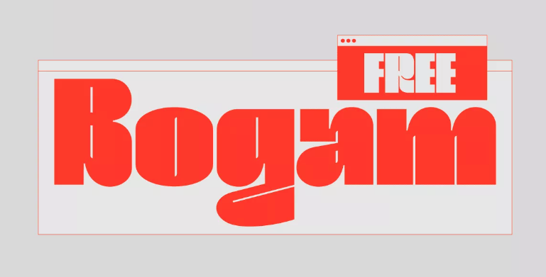
Bagerich Typefoundry is an Indonesian-based type foundry. The company offers multiple fonts for various purposes. Plus, they offer free fonts! The Free Bogam font is an urban style font, ideally used for music and fashion. It also comes in uppercase and lowercase styles. Plus, it has custom numbers and punctuation!
For more typographers to follow in 2022, check out our previous article on new, burgeoning type designers!


