
Have you ever thought to yourself, “where do fonts come from?”
It might not be the most pressing question. The origin story isn’t as loaded as that of babies, and no one stumbles over themselves in an attempt to awkwardly explain it to you.
If you’re like me, you probably went most of your childhood thinking very little about the beginnings of typefaces. The digital age was in its teen years when I was first coming into contact with them and as a result, I took their existence for granted.
I just figured they were the result of some bleeps and bloops.
But folks raised outside the thralls of computers had relied on other, more mechanical methods of type production. In these cases, there was quite a bit of thought going into the profession. Even now, there’s way more thought than one might think at first glance.
Those tasked with designing new typefaces are known as typographers.
The first true typefaces mimicked calligraphic handwriting. They were referred to as Blackletter and looked about piratey as its name suggests. Since then, typography has developed and adapted to the needs of commerce, technology, and art. Notable advancements include the introduction of sans serif typefaces, which sought to reflect modernity by using simple, geometric characters. We then began to get even more creative, utilizing more eccentric and decorative styles; who can forget such hits as Papyrus?
Today, there are countless foundries and independent typographers that produce tons of typefaces each year. Here are 5 typographic designers worth checking out in 2022, followed by some examples of their work.
[in_content_ads gallery=”logos” logo=”on” title=”Need graphic design help?” subtitle=”Try Penji’s Unlimited Graphic Design and get all your branding, digital, print, and UXUI designs done in one place.” btntext=”Learn More” btnlink=”https://penji.co”]
1) Grilli Type (Noël Leu and Thierry Blancpain)
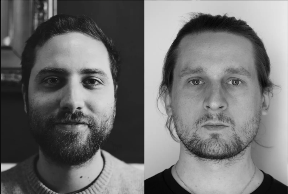
Leu and Blancpain founded Grilli Type in Switzerland in 2009 with the purpose of providing an avenue for collaboration. This collaboration between artists now exists on a global scale. Operating with an expanded team, Grilli Type has partnered with brands such as Samsonite, Esquire, and Pitchfork.
GT America. Sans serif.
This workhorse sans supports a mammoth family of 84 styles. Additionally, it supports Latin, Cyrillic, Greek, and Vietnamese. Styles include condensed, compressed, standard, extended, expanded, and mono. All are available in ultra-light, thin, light, book, regular, medium, bold, and black. All are available in italics.
GT Haptik. Sans serif.
GT Haptik offers an interesting, sensibly experimental take on a simple geometric sans. Its most notable feature is its uppercase R, with the leg piercing through the bowl of the letter. Besides this quirk, the letterforms are all quite traditional. The style family includes lazer, thin, light, regular, medium, bold, and black. All are available in Oblique. All are available in Rotalic, which adds an eccentric tilt to each of the characters.
Grilli offers a free trial for all of their typefaces, allowing you to create mockups in a number of design applications.
2) Jazlyn Fung
This Hong Kong native started her career in wayfinding and branding before moving to Sydney to focus on freelancing. She has since found success experimenting with different typefaces, specifically those inspired by recent events. Fung exemplifies the ways in which typography is an art unto itself, capable of expression and self-reflection.

Happy Fat Font. Display.
The creativity of Fung is on full display with her lockdown-inspired typeface, which has been heralded for its inclusive, body-positive subtext. “I often design my type with my experience or with a story in mind,” says Fung in her interview with the online publication It’s Nice That. Happy Fat Font is inspired by the “growing belly” so familiar to those of us who have been subject to the pandemic lockdown. With a limited palette of uppercase characters and numbers, this font is most effective as a zeitgeist-capturing logo.
For more of Fung’s work, check out her site.
3) Alaric Garnier

Mars. Sans serif.
“Flexed and stiff at first sight.” This powerhouse sans possesses both character and clarity in all three offered styles: Condensed Regular. Standard Regular. Extended Regular. It supports dozens of languages, all of which are outlined in the specimen.
Kessler. Serif.
One of Garnier’s most prominent traits is his ability to take what’s classic and timeless about a typeface and add loads of personality without sacrificing the former. This serif font shows him at his best.
This typeface comes in three styles: super display, display, and text. All available in italics.
4) Laura Csocsán
Csocsán hails from Budapest and is currently based out of Lausanne, Switzerland, where she works as an independent graphic and type designer. She produces and distributes her work through Laura Csocsán Typefaces.
Ambiant Sans. Sans Serif.
Ambiant Sans is the crown jewel of Csocsán’s typographic repertoire — and it’s not your traditional neo-grotesque. Marrying heavy stroke modulation with a sleek curve in its character’s shoulders, Ambiant Sans pushes the boundaries of elegance previously associated with sans serif typefaces. This type family offers six styles: light, regular, book, medium, semi bold, and bold.
Zorn. Display.
Whereas Ambiant Sans straddles the line between simplicity and modern elegance, Zorn exists outside earshot of either. As a highly stylized typeface, Zorn is an excellent choice for display text, but don’t expect it to function as body copy or other long-form texts. For one, it offers no upper-case characters. But with a full range of numbers and special characters, this type is ripe for branding.
5) Hrvoje Živčić
Živčić is based in Zagreb, Croatia, and has quickly gained attention in the industry. In 2012, he was included in Print Magazine’s “20 Under 30” series in which the publication highlights young, up-and-coming visual artists. Additionally, he was a 2020 recipient of the Certificate of Typographic Excellence by the Type Directors Club.
Rector. Serif.
Rector gives a medieval impression with a contemporary twist. It feels both regal and working-class. This low-contrast serif provides a fertile bounty of sixteen styles split between two familes. Among them are extra light, light, regular, medium, bold, and black. All are available in italics. Additionally, Rector offers two display text options. One is referred to as ‘hairline’ and another as ‘outline’.
Halte. Sans Serif.
This sans is tall and oblong with gentle curves. It elicits feelings of professionalism and reliability, especially in its thicker weight. It is offered in thin, light, regular, medium, and bold.


