
Brands rebrand for a multitude of reasons. Most brands would rebrand due to establishing a better identity for consumers, while some would like to connect with their target audience better. In some cases, some brands have successful rebrands, while some fail. Not everyone is fond of change.
Public backlash or bad design can contribute to the failure of some rebranding efforts that a few revert to their old branding strategies. While some, despite the backlash, would pursue their new rebrand.
In this article, we explore 15 of the least successful rebrands by different companies.
Radio Shack (The Shack)
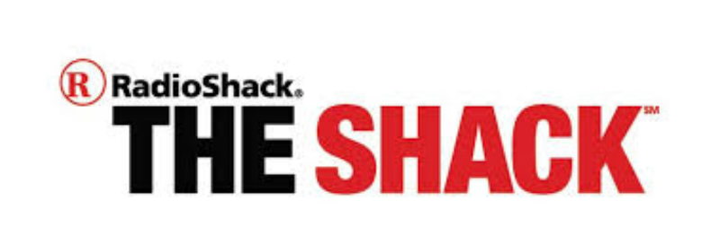
In 2009, Radio Shack rebranded for its Netogether campaign, as “The Shack”. Critics say that the Radio Shack’s The Shack rebranding was the brand’s attempt to connect with their younger audience.
One of the criticisms about The Shack came from Joshua Topolsky from Engadget. The impression the rebrand gave was for its consumers to “picture a remote location where very, very bad things happen.”
Even if Radio Shack’s no longer one of the huge names in electronics retail, their shift to “The Shack” was one of the least successful rebrands of all time.
Mastercard
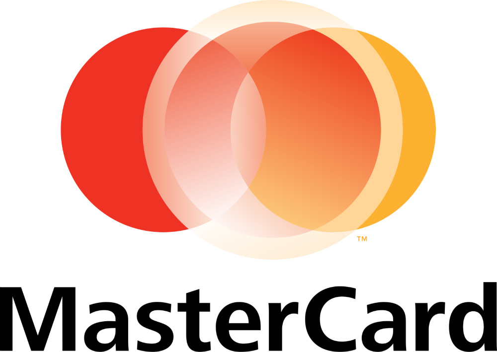
The “Priceless” company was known for its red and orange Venn Diagram logo, with “Mastercard” appearing in the middle of the Venn Diagram. But in 2006, the company decided to add another circle on the Venn Diagram that isn’t even centered.
It doesn’t look appealing than its predecessor because the white circle eclipsed the familiar Venn Diagram.
The new logo’s tenure didn’t last long and Mastercard eventually returned its former logo. Fortunately, they learned from their former mistake and have a new minimalist logo that keeps the Mastercard brand at its core.
Tropicana
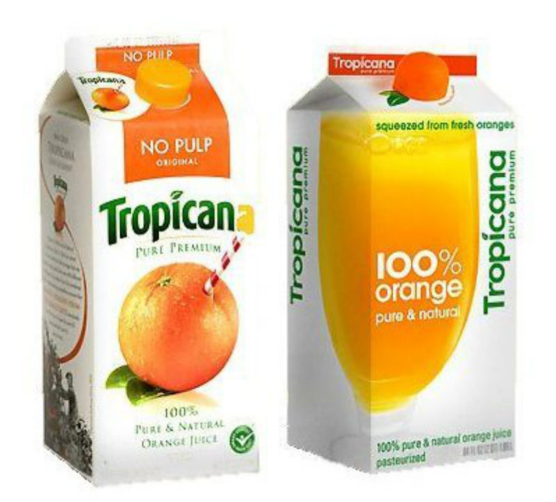
Like some other brands, PepsiCo wanted Tropicana’s company rebranding through its new packaging design. Its short-lived former (and eventually brought back) design was familiar to its consumers.
The new packaging sparked outrage that sales even declined in 2009. It was even the subject of criticism in social media networks. “Ugly” and “terrible” were some of the adjectives used to describe the new packaging by Twitter users.
PepsiCo’s attempt to reintroduce Tropicana with new packaging is one of the least successful rebrands of all time.
Gap
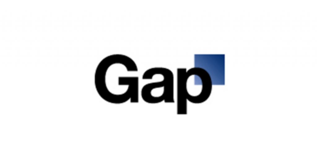
The Gap rebrand was one of the most infamous and least successful rebrands in history.
The famous blue background with the serif letters was replaced in 2010 by a white background with a bolder font and small square on the right-hand corner of ‘P.’
Due to backlash received online saying that it “failed” and was “lame”, Gap had to reverse its logo brand redesign. Some even quipped that the criticism of Gap’s new logo and Gap’s eventual reversal was considered as an achievement by social media users.
Best Buy

Best Buy’s Yellow Price Tag Logo is recognizable to millions of Americans.
In 2008, the retailer decided to change up its look in keeping up with the trends. It didn’t ditch its signature yellow price tag, but it minimized it and the new logo had a navy blue background.
Commenters in Under Consideration seemed to lean towards the old logo for its impact and familiarity.
Coca-Cola (New Coke)
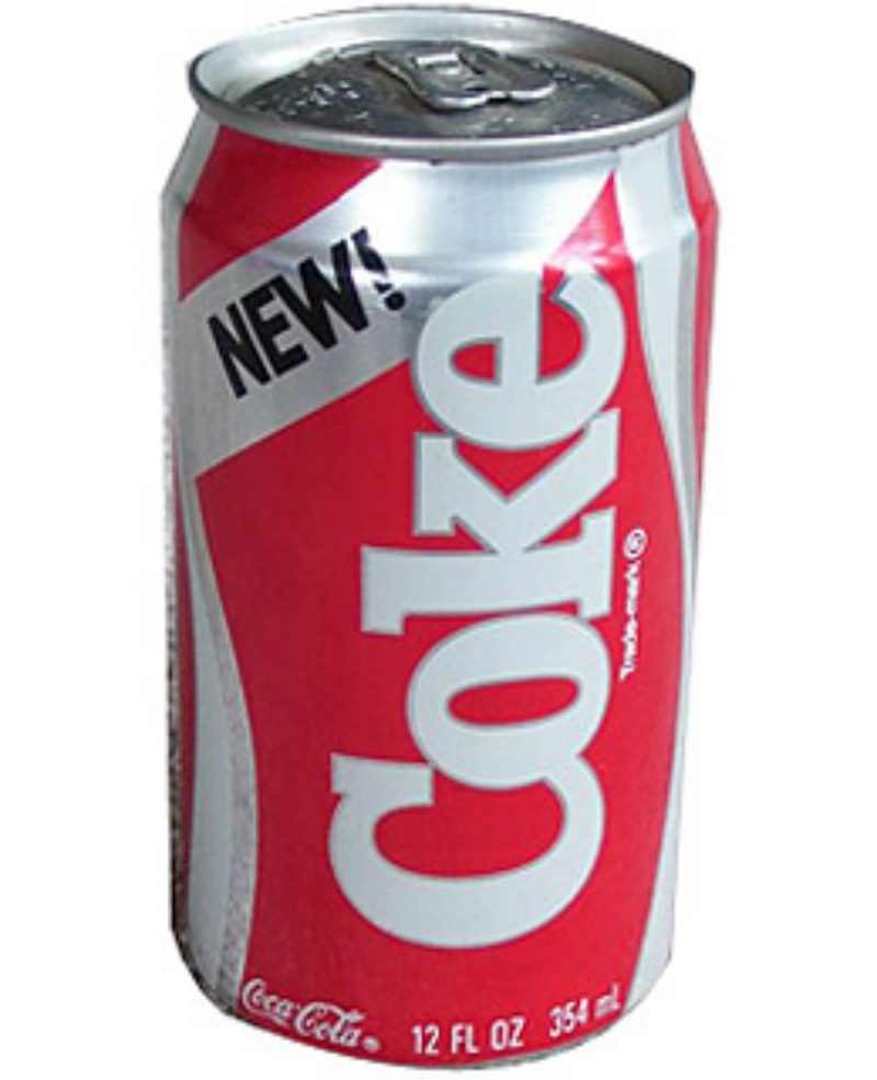
When people have gotten familiar with something, rarely do they ever respond to change positively. That very statement applies to Coca-Cola’s once short-lived New Coke.
New Coke was a way to thwart Pepsi from reaching the top. Unfortunately, those who’ve grown to love its taste (and brand), Coca-Cola had to revert to its formula to appease its loyal customers.
New Coke wasn’t at all a failure, some sought the taste and was even part of the Netflix show Stranger Things marketing.
Still, a lesson to be learned is never to mess with something that’s loved by most people.
Pizza Hut (The Hut)
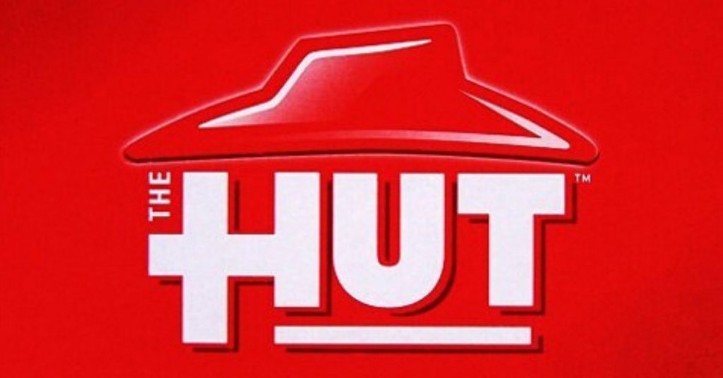
Back in 2009, Pizza Hut decided to drop “Pizza” in their name and become “The Hut”. Just the Hut. It wanted to become trendy at the time.
The rebranding didn’t sit well with Twitter users, while some even joked to comparing the Hut with a Star Wars character Jabba the Hutt.
Brian Niccol, then CMO of Pizza Hut, said that the well-known pizza establishment wasn’t changing its name. Rather, Pizza Hut was integrating “The Hut” in their marketing strategy.
It was during the same time as The Shack too, so those on social media made fun of both companies that wanted to shorten their names to appeal to the younger crowd.
Overstock
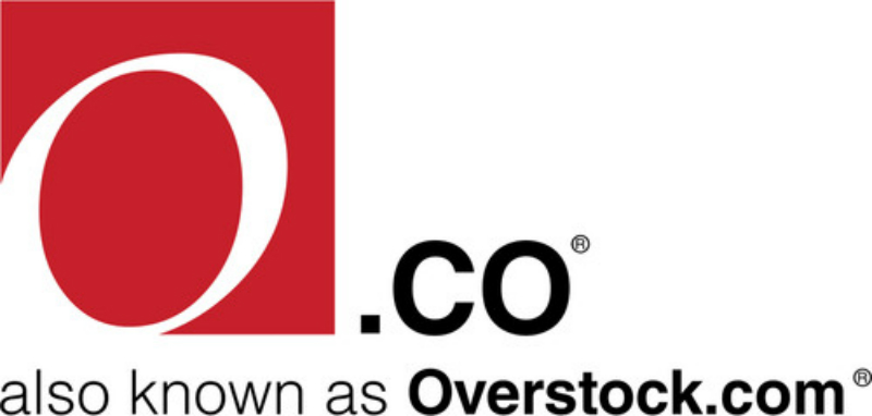
Overstock is a Utah-based furniture online retailer. In 2011, the retailer decided to change its name to o.co. According to AdAge, customers were confused by its rebranding effort, that at the time, o.co reverted to Overstock.co so it wouldn’t hurt holiday sales.
Due to their rebranding, around 60% of people went to o.com instead of o.co, hurting their traffic.
Vegemite (iSnack)
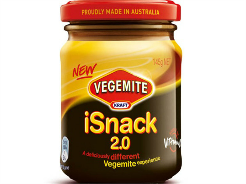
Australia’s beloved spread fell victim to a rebranding blunder in 2009.
It was more than just a blunder in the name.
Kraft wanted to mix Vegemite with cream cheese and name it as iSnack. It was a crowdsourcing effort gone wrong and eventually, Kraft went on to drop iSnack in less than a week. It was then changed to Cheesybite due to the backlash received by Kraft.
Sun Chips
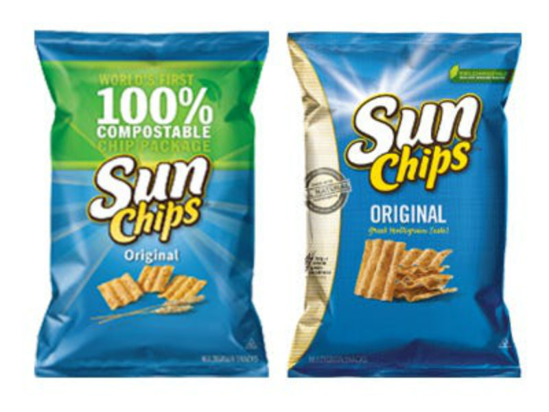
The Sun Chips rebrand also focused on its packaging. PepsiCo wanted the snack’s packaging to shifting to more environmentally-friendly packaging material. Its initiative to become greener was commendable but at a great cost.
Customers weren’t happy about how loud they opened their new Sun Chips bag. Complaints and even comparison videos were made of how loud the bag was to other loud noises. To appease its loyal customers, PepsiCo reverted to the less environmentally-friendly option.
Netflix (Qwikster)
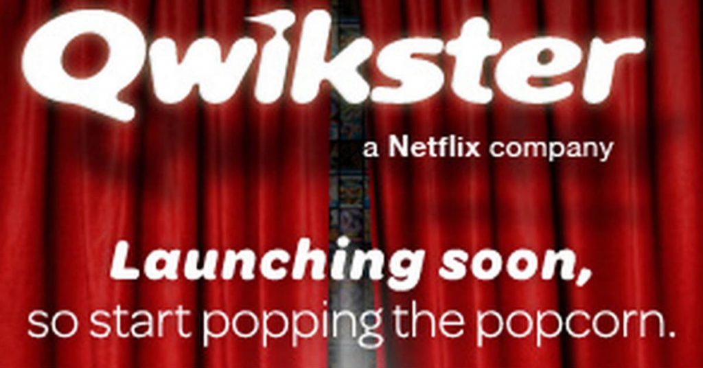
Netflix is one of the largest streaming services and had its start as an online website for viewers to have DVDs sent by mail.
In 2011, it started testing on the streaming model but it decided to separate streaming and DVD-by-mail. The separate DVD-by-mail service, if it were successful would still be present as Qwikster. Unfortunately, its subscribers weren’t too keen on the company’s idea to pay for separate plans.
Due to the Qwikster mishap, the New York Times reported that Netflix lost 800,000 subscribers.
To make matters worse, stocks plummeted to half due to the rebranding. In the end, the DVD-by-mail and streaming service reintegrated a few months later.
Kraft
Kraft is one of the most well-known brands in the world. Its red hexagon-like logo and the bold blue letters were familiar to many households worldwide.
However, for some reason, the brand decided to change its logo in 2009. While it kept the blue and red motif, it added color and a swoosh and a copy. It wasn’t memorable because its familiar logo had been imprinted in many people’s brains.
Kraft redesigned a new logo after the 2009 criticism. In 2012, the company eventually took inspiration from its classic logo.
JCPenney
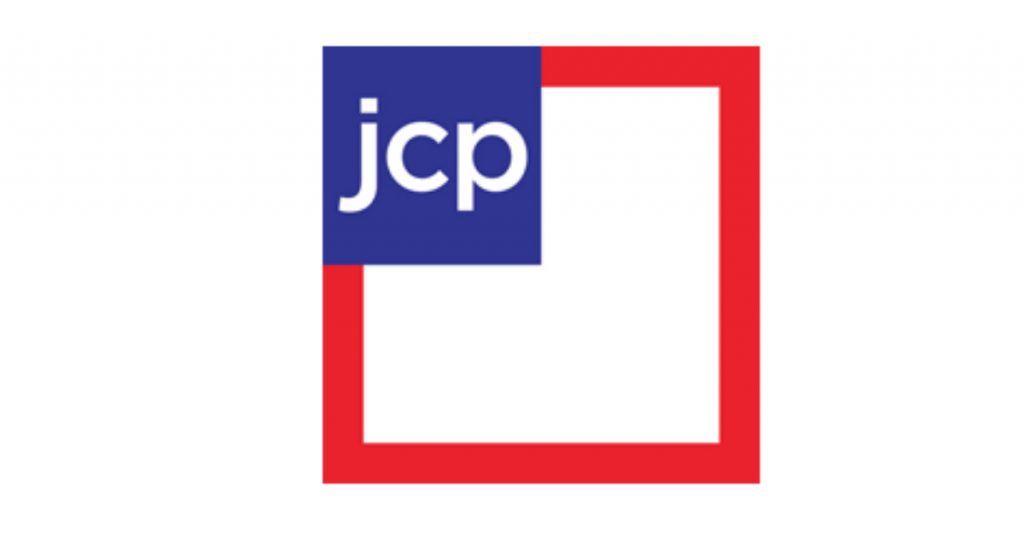
JCPenney has had its fair share of criticism over its rebrand in the past few years. From 2010 to 2013, JCPenney changed its logo four times. It’s a case of not knowing their brand identity.
Its 2012 brand redesign wasn’t as well-received by some. It was even compared to the 2010 Gap logo. According to those in JCPenney, the 2012 logo represented a “fair and square” theme, to refer to their prices.
It seems that JCPenney has the budget to spend on changing their logos every year. Due to its constant change, JCPenney decided to revert to the old logo that many recognized.
Capital One
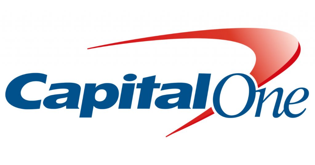
In 2008, to engage with its younger audience, Capital One gave its logo a makeover by adding a red swoosh.
Users of Underconsideration didn’t like the new logo Capital One introduced to the public. Overall sentiment by users say the design was bad enough. Hubspot also weighed in by saying it “looked dated” than ever before.
Despite the criticism, the Capital One logo remains on the cards of every banking client.
Hershey’s
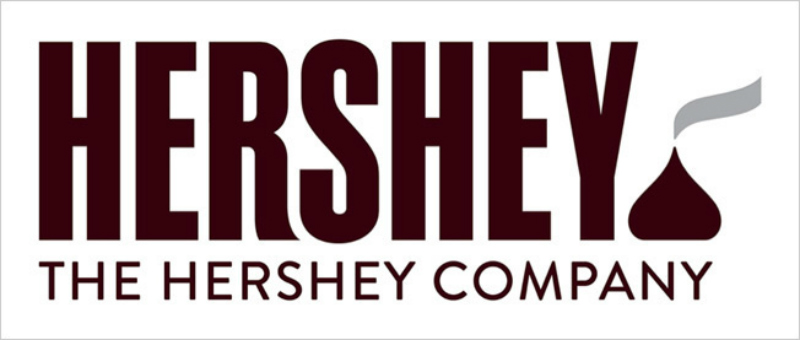
The Hershey’s logo featured its signature Hershey’s kiss as a photo, with the Hershey’s logo that looks like a candy bar and The Hershey Company copy below it.
In 2014, Hershey’s gave its new logo a makeover. It wasn’t well-received by many. Redditors and Twitter users alike had the same sentiment. To put it lightly, the new Hershey’s kisses on the logo, looked like the poop emoji.
Despite backlash from the public, Hershey’s kept its design, yet it made history as one of the least successful rebrands of all time.
Key Takeaways
Sometimes, brands don’t have to resort to rebranding to establish or reintroduce their identity to a new set of consumers. There have been many successful cases of rebranding, which may have helped in their strategy.
However, when it’s not yet time for a brand to rebrand and if it’s not something appealing to the eyes either, it may result in backlash. For these brands and some other brands with familiar logos or design, it’s best to stick with the brand’s design and identity before it gets lost in translation.
About the author

Katrina Pascual
Katrina is a content writer specializing in graphic design, marketing, social media, and technology. In her spare time, she writes monthly personal blogs to practice her craft.


