While some businesses think of rebranding as getting a facelift for their brand, the wiser ones do it for strategy. Whether it’s a shift in messaging, distancing from controversy, or maintaining relevance in the market, rebranding requires careful thought and planning. Let’s look at successful rebrandings and the not-so-successful ones to learn what you need to do and what to avoid.
The 5 Most Successful Rebrandings
Let’s look at five successful rebrands you can take inspiration from:
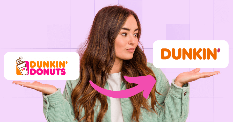
Dunkin’

2018 saw us in shock when Dunkin’ Donuts decided to just drop the Donuts part of its brand name and go only as Dunkin’. The rebrand was beyond cosmetics, it was the company’s strategic pivot to focusing on its beverages. With around 60% of its sales from its drinks, it placed the emphasis on its coffee offerings.
Dunkin’ retained its iconic pink and orange colors and well-loved fonts, which is great for continuity while showcasing modernization. As part of its rebrand, the donut giant also introduced next-generation shops as proof of its commitment to convenience and speed. This successful rebranding saw a significant boost in brand buzz, demonstrating how evolving with consumer habits can lead to a rewarding transformation.

Alternatively, 2016 showed us Instagram unveiling its bold, new look. It dropped its skeuomorphic logo, the vintage camera icon, and replaced it with a sleek, gradient one. This was done in line with the social media channel’s evolution from a simple photo-sharing app to a dynamic space. Instagram now includes Stories, videos, and even shopping, making the logo the upgrade needed to reflect this new, modern identity.
However, the change sparked mixed reactions, with many users criticizing the new logo as overly generic and minimal. Over time, though, the rebrand was proven successful. The new look gave Instagram a future-ready identity and a more versatile image, demonstrating its alignment with its growing role in the digital ecosystem.
Pepsi

One of the regulars in the rebranding game is Pepsi. The soda giant has undergone several redesigns in its efforts to stay relevant. Its most recent endeavor, in 2023, brought back the bold, retro-inspired look, with tones of nostalgia cleverly blended with a modern edge. It features a darker blue, punchier font and a larger globe emblem.
What makes this a successful rebranding is its ability to strike a harmonious balance between evolution and familiarity. You can consider it an homage to the brand’s legacy while still being contemporary and fresh.

When Facebook rebranded its parent company, Meta, in 2021, headlines buzzed with news of the platform’s shift towards building the metaverse. It wasn’t just about changing its name, it was a strategic repositioning to show its broader ambitions that go beyond social media. It aimed to lead the charge into what its CEO, Mark Zuckerberg, called the “next chapter of the internet.”
The rebrand sparked reactions of curiosity, criticism, and skepticism, but still succeeded in framing Facebook’s long-term vision. It built a distinction between the Facebook app and all of the brand’s other products, like Instagram, WhatsApp, and Oculus. The change highlighted the company’s redefinition of its identity to align with its future goals and evolution.
Eurostar

Passenger train service Eurostar underwent a rebrand after its merger with Thalys, a high-speed train operator. It introduced a refreshed logo inspired by the North Star, riding on its image of guidance and connection across borders. As with the others on this list, the rebrand wasn’t to upgrade the aesthetics but to strategize.
When the two brands merged, Eurostar positioned itself as a leading name in sustainable, cross-European travel. The unified look provided clarity to its customers, improved visibility, and showed its commitment to connectivity and innovation.
The 5 Least Successful Rebrandings
Now, let’s look at what to avoid when rebranding:
Gap

A logo design lasting only six days surely can’t be considered a successful rebranding. This is what happened to fashion retailer Gap when it launched a new logo in its attempt to modernize its brand. The old design that uses a classic bold serif typeface was replaced with a minimalist Helvetica font and a small blue gradient box. The drastic departure was met with instant backlash, saying the redesign lacked character and was disconnected from Gap’s iconic identity.
The negative response from customers, brand loyalists, and even other designers caused the fashion company to revert to its original logo in just 6 days. This sent a cautionary message to everyone in the fashion world that you need to listen to what your audience is saying and understand brand equity.
Tropicana

A bold packaging design gone epic failure is Tropicana’s attempt at giving the brand a more minimalist and modern look. It aimed to get a fresh and contemporary look but ended up having a major disconnect with its audience. Consumers found the new design too generic and lacked the emotional connection that its users had with the original design.
It was quick and significant, causing the company a 20% drop in sales and roughly $30 million in losses. Like Gap, it reverted to its original packaging while acknowledging that it missed the mark. It now stands as a textbook example of a brand identity change that results in major business consequences when you overlook customer perception and loyalty.
RadioShack

In an attempt to shorten its name to The Shack, RadioShack goes down in history as one of the most unsuccessful rebranding stories ever. The move was thought to signal a shift from an outdated reputation toward a growing focus on mobile devices and electronics. What happened instead was confusion among its customers rather than making a good impression.
Critics quickly pointed out that the new name lacked clarity and failed to communicate what the brand wanted to offer. So, the higher-ups decided to revert to the old name, and the use of The Shack quietly faded into oblivion.
MasterCard

Like Pepsi, MasterCard is no stranger to rebranding. It has undergone several over the years, but the most criticized was its logo redesign in the early 2000s. The credit company’s branding service introduced a more complex, layered logo with iconic red and yellow circles. It now had multiple gradients, interlaced lines, and shadow effects, cluttering the design and making it less recognizable.
Its audience found the new logo harder to identify, which was bad for a global brand that depended on instant visual recognition. To correct this, MasterCard released a minimalist redesign in 2016, reverting to flat colors and simple forms.
NBC

Removing one of its most iconic logo elements, the peacock, NBC committed a noteworthy rebranding faux pas. Strategizing to show a more unified identity under Comcast’s ownership left many questioning the decisions. The peacock has been the symbol of color, creativity, and innovation for a long time, defining the NBC brand.
As with others on this list, NBC reverted to its original concept, bringing back the peacock but in a simplified design. In 2022, it updated the peacock logo and infused it with a modern look.
Key Takeaways from These Rebrands
Successful rebrands from the above list show how aligning with a clear strategy, staying true to brand values, and making changes that resonate with the audience are key. On the contrary, the failed rebranding examples result from ignored customer sentiment, straying far from brand recognition, or lacking a strong purpose.
If you’re considering a rebrand for your business, the most important thing to note is that you should evolve with intention. Understand your audience, honor your core identity, and ensure that changes add clarity.
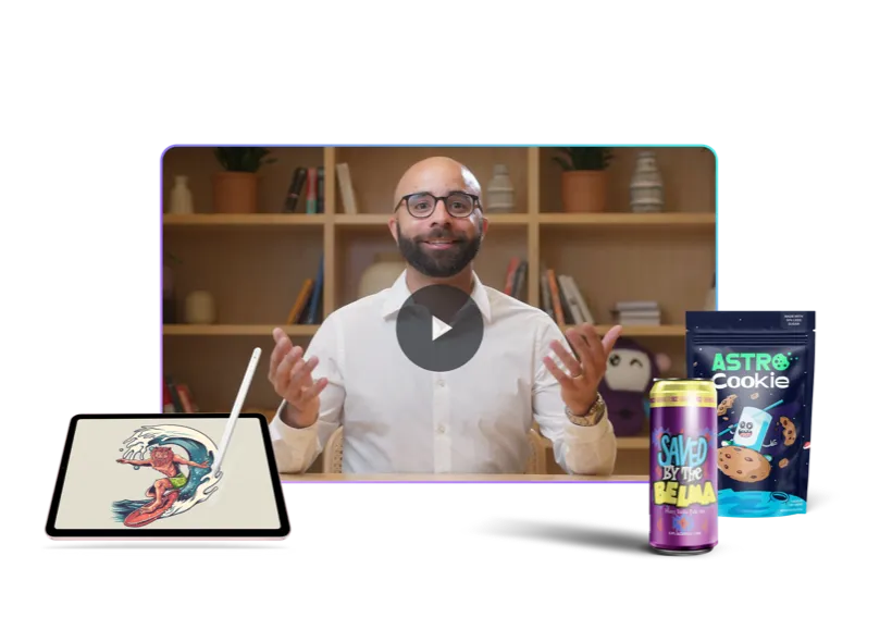
For amazing logo designs and redesigns, there’s Penji, the best graphic design and branding service. Watch our demo video here to learn how you can have a successful rebranding. You can now send your first design request through this link.
About the author

Celeste Zosimo
Celeste is a former traditional animator and now an SEO content writer specializing in graphic design and marketing topics. When she's not writing or ranking her articles, she's being bossed around by her cat and two dogs.