
Would you pass up on a cool sticker handed to you for free? Of course not, right? It’s way too much fun sticking them on your everyday sundries. Stickers are small, convenient, attractive, and not to mention, effective ways to reach people that other marketing campaigns can’t. Sticker marketing is taking over the world in 2028, with a forecasted market size of about US$191 million. So if you’re looking for sticker fonts to pair with your sticker designs, start with these 12.
Work with Penji for your sticker typography–it’s fast, convenient, hassle-free, and affordable. Here’s a 15 percent discount to get you started.
1. Candyhouse
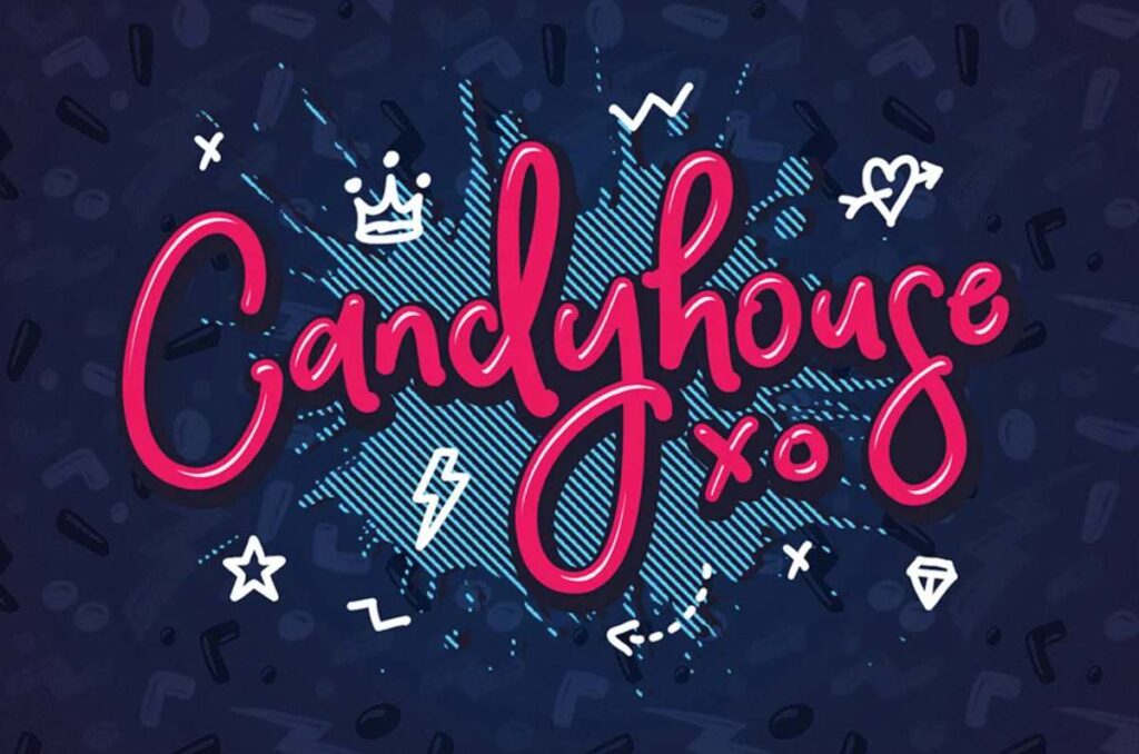
This Candyhouse font is just way too playful not to notice. Imagine this font on a die-cut sticker that has your company logo. This script font style is fun and legible on any marketing material you can think of. It permeates an atmosphere of freedom and femininity.
2. Shipment
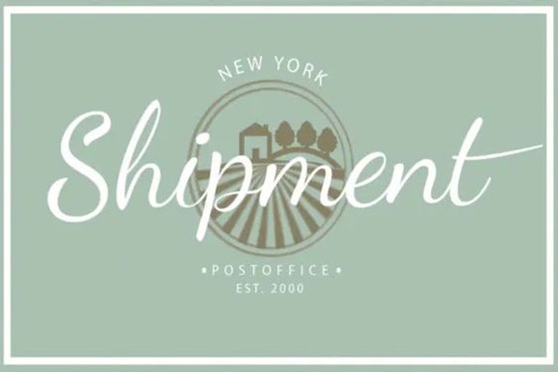
Shipment is one of the stickers fonts that has clean and big strokes. This script font is excellent for modern brands with sophisticated branding. The Shipment font is also not intimidating. But there’s a friendly appeal to it, making it an ideal choice for clothing retail stores or fast-food chains.
3. Claudira
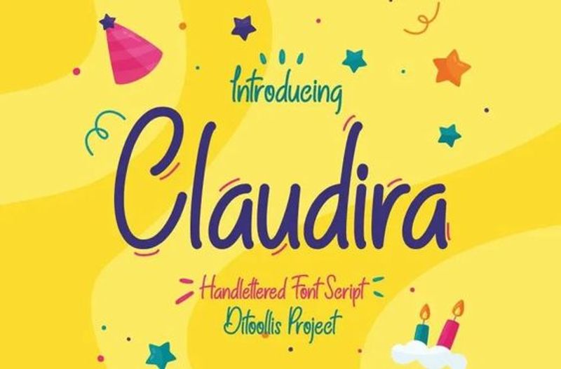
Here’s a very playful font style Claudira. This sans serif typeface is eye candy, suitable for children’s brands or companies with a younger audience demographic. The look of this font is reminiscent of a young person’s penmanship. It comes off as simple, with a slight excitement to it, as seen on each letter’s slight curves.
4. Bubble Boom
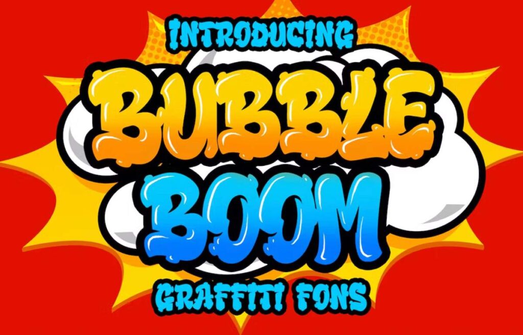
One look at this sticker font style, and you want to tear it up like opening a piece of candy and shoving it in your mouth. The Bubble Boom font exudes nothing but fun-loving and naughty vibes at the same time. This font could be paired with your guerilla marketing campaigns because of its graffiti-like appeal.
5. Beloving
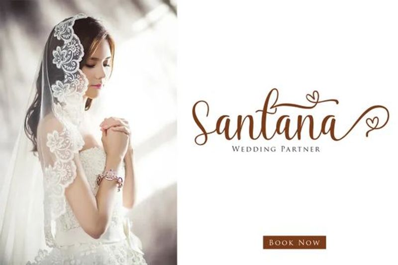
Script sticker fonts are suitable for formal events such as weddings, conferences, or galas. And Beloving is a classic script font that is perfect for your wedding sticker invitations or giveaways. The soft curves that connect one letter to another emanate a dainty vibe. Plus, the hearts at the end of the swirls also add a lovely, distinct touch.
6. Tastify
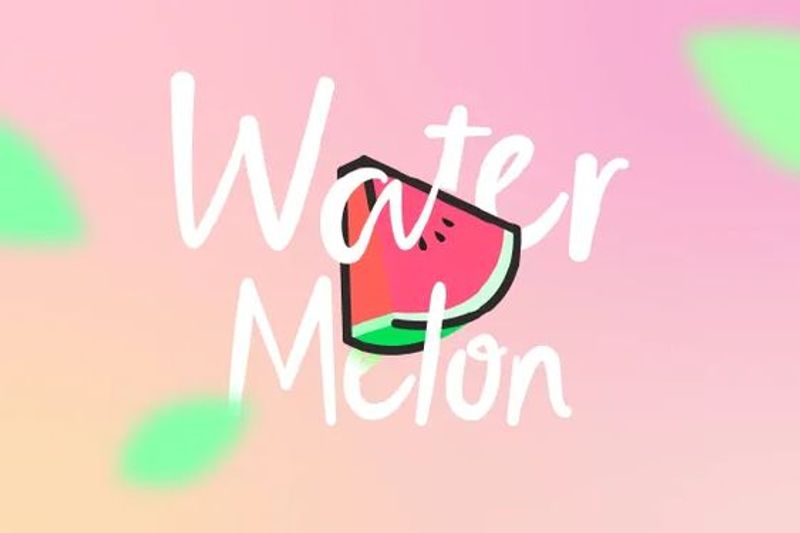
The Tastify font is an informal and casual typeface that is best paired with colorful visuals or backgrounds. It’s welcoming, and it has a playful edge to it. This can be perfect for innovative agencies or barbershops looking to create stickers for their advertising collaterals. This font can also complement a cartoonish graphic design to make its interesting look pop even more.
7. Notice Things
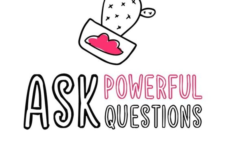
The Notice Things font style is one of the sticker fonts that should be used with short text or messages only. Due to its heavy and unconventional nature, this typeface can become overly dominating. When paired with the right visuals, the sticker design can be compelling with this unique font style. To avoid creating a dull sticker font design, try to give some words a different color — just like this example.
8. Burswood
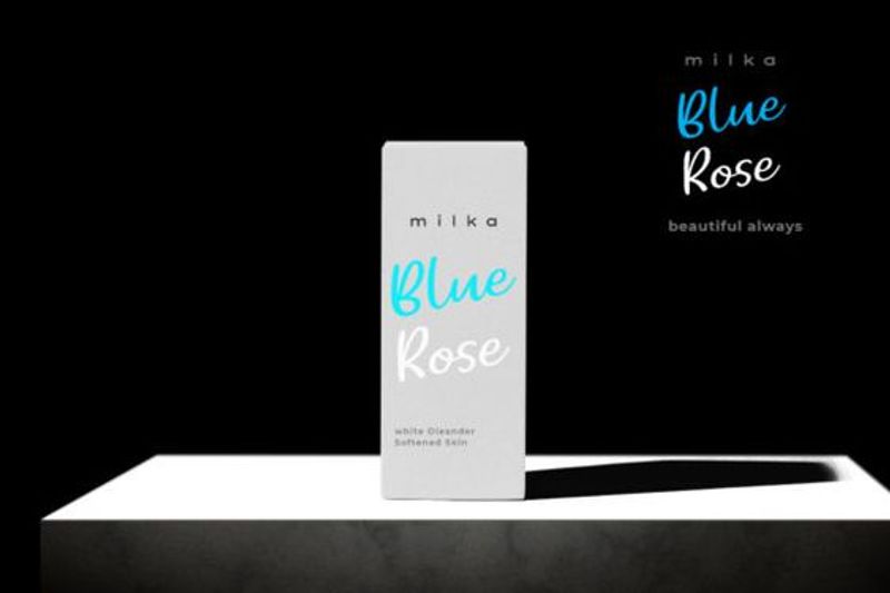
I can see the Burswood font style on record labels or album stickers. You can also picture out the Burswood font on stickers for gadgets or technology stores. Burswood is a marriage of formal and casual, with a slightly intimidating appeal. This makes it perfect to use for companies that want to establish authority in their niche.
9. Boldwell
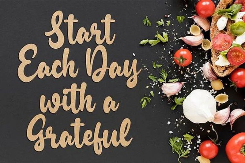
If you’re looking into creating stickers with inspiring quotes, then use the Boldwell font style. The moment you see the Boldwell font, you feel that amiable vibe it gives off. This is excellent for long text on stickers because it’s legible, even for small marketing materials. It’s bold and heavy, perfect for getting your message across through stickers.
10. Oh! Sweetnuthin
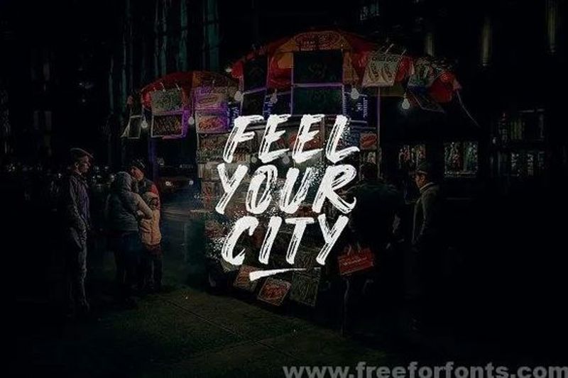
The Oh! Sweetnuthin font has a washed-out effect that seems ruggedly cool. It’s appropriate for nonprofit organizations or companies with a male audience demographic. Its overall appearance is somewhat masculine yet emanates a mysterious effect. If you want sticker fonts that grab attention, this font style is undeniably a smart choice. Place it against a darker background color or visuals to add more mystery.
11. Hiatus Brush
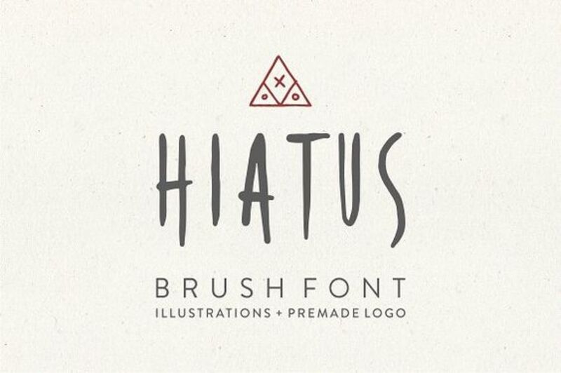
I can picture the Hiatus Brush on a horror movie sticker or a punk band sticker. The overall look of the Hiatus Brush leans more towards a gothic and grim tone. As you can see, the uneven lines at the bottom of the letters are reminiscent of dripping blood. Use this font style sparingly, as it might not work on lighthearted visuals.
12. Starlove Monogram
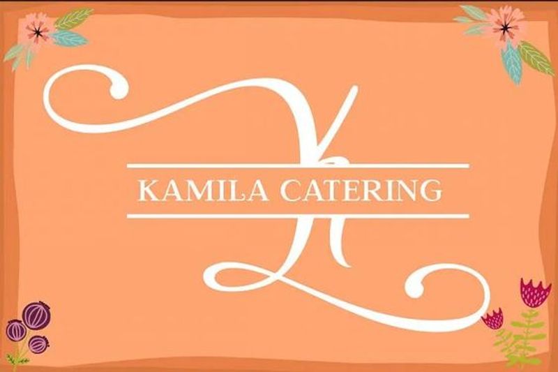
Serif fonts are typically used for companies that want to establish credibility and authority. Financial institutions, educational organizations, or old, traditional companies can use the Starlove Monogram to make their brand identity shine through. Even with a simple sticker font like this, the design can still look cohesive and complete — even without graphics.
Sticker Fonts Logo Examples by Penji
These are some fun logo designs from Penji, donning some artistic sticker fonts.
1. Toyland Delights
The Toyland Delights logo exudes a whimsical and inviting charm. The store’s name is elegantly scripted with a delightful candy cane swirl at the start, setting a sweet and enchanting tone. The “Candyhouse” font’s bright and candy-colored letters infuse the store’s identity with joy and excitement, making it an appealing destination for kids and parents alike. With its playful and friendly design, the logo encapsulates the spirit of a place filled with fun and imagination, where children can explore a wonderland of toys and create lasting memories.
2. Fun&Play
A sticker-like logo for “Fun&Play” exudes a burst of joy and whimsy. The store’s name is in a vibrant and playful font, reminiscent of the colorful, hand-cut stickers kids adore. The letters “Fun” and “Play” have a slightly different but harmonious design, expressing the diversity of toys they offer. Surrounding the text, cartoon-like characters, such as teddy bears, cars, and building blocks, add a delightful touch. The logo’s circular shape, like a sticker, completes the look. Plus, the bright, cheerful colors encapsulate the essence of a place where endless childhood adventures await.
3. Lick22
An ice cream company, Lick22, captures the essence of sweet indulgence. The company’s name playfully shows off a whimsical, handwritten font resembling frosting swirls. The “Lick” text is slightly curved, as if inviting a taste, and the “22” is bolder, resembling an ice cream cone. The color palette features cool pastels, like soft blues and creamy pinks, evoking the delight of ice cream. A playful ice cream scoop or cone illustration could accompany the text, making the logo irresistibly enticing. This sticker-like design symbolizes the joy of savoring sweet frozen treats.
4. The Extension
The Extension is a blues and jazz bar, and it shows off a logo that exudes a vintage charm. It features the bar’s name in a retro-inspired, curvy font resembling old neon signage. The text is presented in deep midnight blue and rich, warm gold tones, evoking the moody ambiance of a bluesy jazz club. Surrounding the text, musical notes and stylized instruments, like a saxophone and a guitar, would be playfully incorporated into the design, adding a touch of musicality. The logo would capture the essence of a bygone era, inviting patrons to experience the soulful rhythms and timeless melodies within its cozy and welcoming confines.
5. KoolieMosh
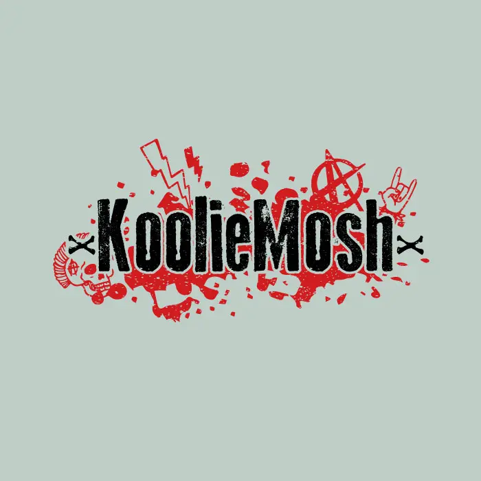
The KoolieMosh logo embraces the rebellious and energetic spirit of punk rock, apt for a punk bar such as this one. The bar’s name is crafted in bold, jagged, and grungy lettering, resembling the anarchic graffiti often found in punk culture. Vibrant, distressed colors like electric green, fiery red, and ink black accentuate the punk aesthetic. Surrounding the text, iconic punk imagery, such as mohawks, safety pins, and anarchic symbols, adds edgy character to the logo. The sticker-like quality gives it a raw, do-it-yourself appeal, perfectly encapsulating the vibrant and chaotic atmosphere of the bar.
Request Sticker Fonts and Designs from the Best
Design is crucial in sticker marketing to persuade consumers to stick them onto any surface. Stickers must be visually compelling. This is the reason why many people collect stickers in the first place.
Work with professional graphic designers for your marketing sticker designs. Request a sticker design from Penji for 30 days risk-free. We offer unlimited graphic design and revision at affordable flat monthly costs.
Here are some of our die-cut sticker design examples:
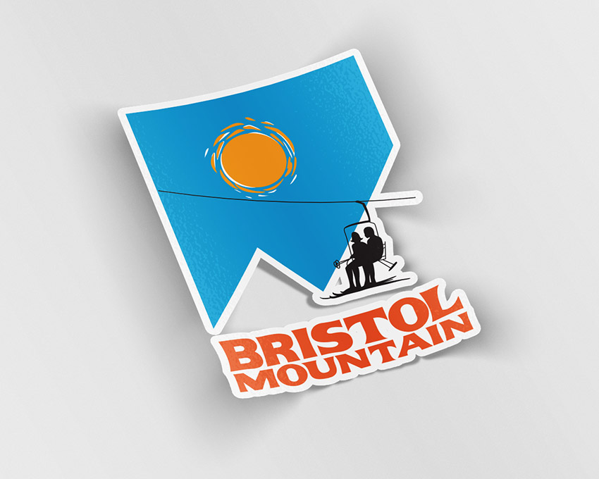
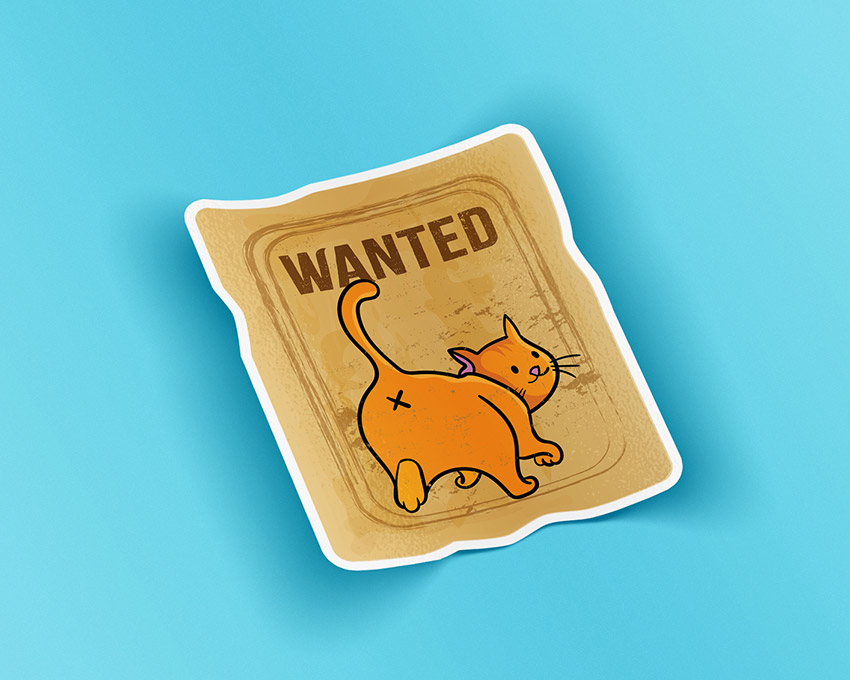
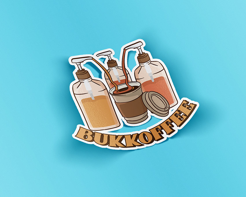
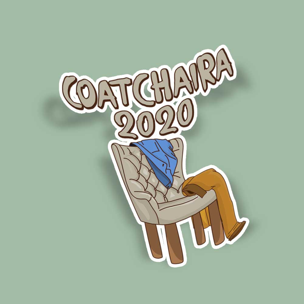
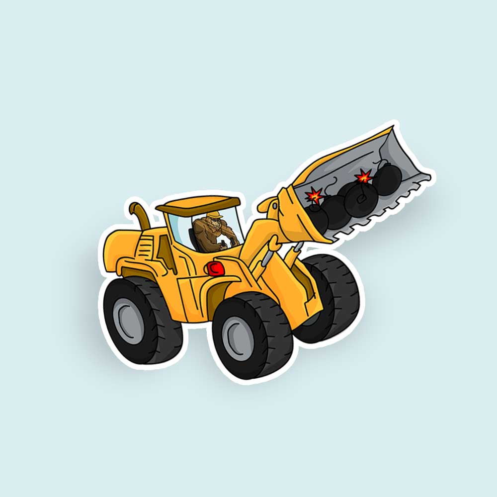
Sign up today for 15 percent off your first month. Avail of the 30-day money-back guarantee if you’re unsure about committing to a full month.
All images are from Sruthi Baiju’s Pinterest account.
About the author
Table of Contents
- 1. Candyhouse
- 2. Shipment
- 3. Claudira
- 4. Bubble Boom
- 5. Beloving
- 6. Tastify
- 7. Notice Things
- 8. Burswood
- 9. Boldwell
- 10. Oh! Sweetnuthin
- 11. Hiatus Brush
- 12. Starlove Monogram
- Sticker Fonts Logo Examples by Penji
- 1. Toyland Delights
- 2. Fun&Play
- 3. Lick22
- 4. The Extension
- 5. KoolieMosh
- Request Sticker Fonts and Designs from the Best


