When it comes to designing a school logo, it’s all about showcasing the institution in the best way possible. The logo is like the shining beacon that represents the school’s branding and identity. And here’s something interesting: it can even play a big role in students’ decision-making process when it comes to enrolling or not. So, you can see just how crucial it is to get that logo right when starting a school. It’s like the ultimate symbol that speaks volumes about what the institution stands for.
So if you’re on the verge of designing a school logo, don’t make any rash decisions. The right icons, colors, and typography should be integrated to make the logo an extension of the school’s identity. While logo design is now made easy through online design tools, graphic design services like Penji can deliver high-quality logos or just about any design project a school needs. We offer unlimited graphic design at a flat monthly rate or one-off logo designs, so you can choose the best option for your project.
But for now, take inspiration from these school logo design examples and know what makes them eye-catching.
Campion College
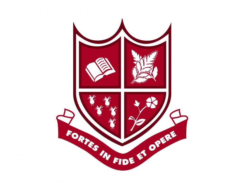
This school is pretty well known in the Caribbean, and the shield motif for Caribbean schools is rather popular. The choice of red is quite striking, especially since the school is Catholic in nature. This makes it not only eye-popping but symbolic.
American High School (California)
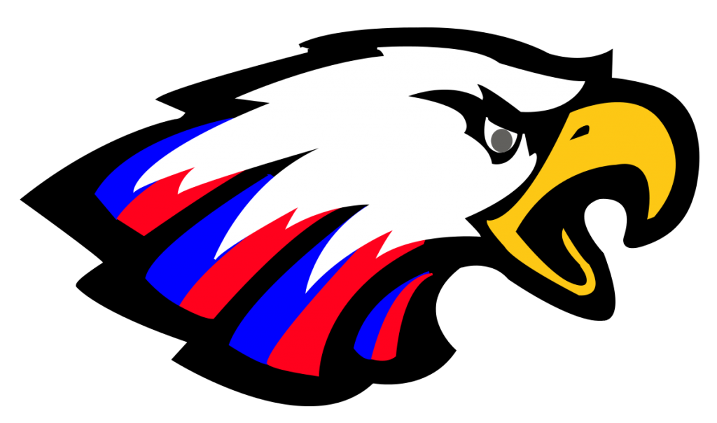
There’s nothing more American than the eagle, and AHS in sunny California captures it perfectly with its logo. Combining the colors of the flag with the fierce image of an eagle, I found this logo in particular to be both eye-catching and patriotic.
Phillip and Sala Burton High
Did anyone catch Black Panther? I sure did, and it was a great time! The feline in this image for the Phillip and Sala Burton Pumas may not be a panther, but it makes this logo just as epic. I love the compliments of the black, with blue as highlights. It really gives a sense of mystery and subtle ferocity.
Diving Career Institute

Now, this is a pretty cool school logo design. The merging of the octopus with the anchor to convey the deep-sea nature of the school just flat out works! Also, am I the only one who thinks of pirates upon seeing this?
Wizard Academy
Merlin would approve of this school logo design from the Wizard Academy. The school primarily is a business school, but strives to find the science in every art they pursue. So, I guess magic IS a form of science.
Arizona Empower Academy
There’s something about the owl that makes it appear mysterious, yet powerful to me, and the school logo design by the Arizona Empower Academy is no exception. Also added to this design is the contrast between orange and black, which really brings out the impact of the owl itself. And here I thought they were just quiet, nocturnal birds.
León After School

I found this school logo design to be pretty cute, and it hits the mark quite well, given the demographic that it’s trying to target. After all, it would be pleasant to look at in the eyes of a kid, right? Bright colors and a cutesy drawn animal conveys a sense of fun and energy that most children would be looking forward to after a long day of school. I know I would.
Shelly The Tutor

This is another school logo design that I like – notice the smiling child used in the logo? It shows prospective kids “See? Math IS fun!”. And that would be incredibly reassuring, because I can imagine that for every 10 kids in school, 8 of them either hate or are scared of math. This quirky logo tends to ease those fears.
Yale University

At this point, who DOESN’T know Yale? It’s one the world’s most recognizable colleges, and its logo is no different. It may be a simple shield with a book, but the name behind that shield is quite powerful. By the way, did you know that the reason there’s Hebrew writing on the shield is that Hebrew used to be a required course of study there?
City University of New York
It may not have graphics per se, but sometimes using initials or letters can be just as powerful in school logo design, provided that they’re used correctly. The CUNY logo gives a subtle, contemporary look which I feel fits right into the Big Apple’s culture. Besides, it’s pretty easy to remember.
University of Central Florida
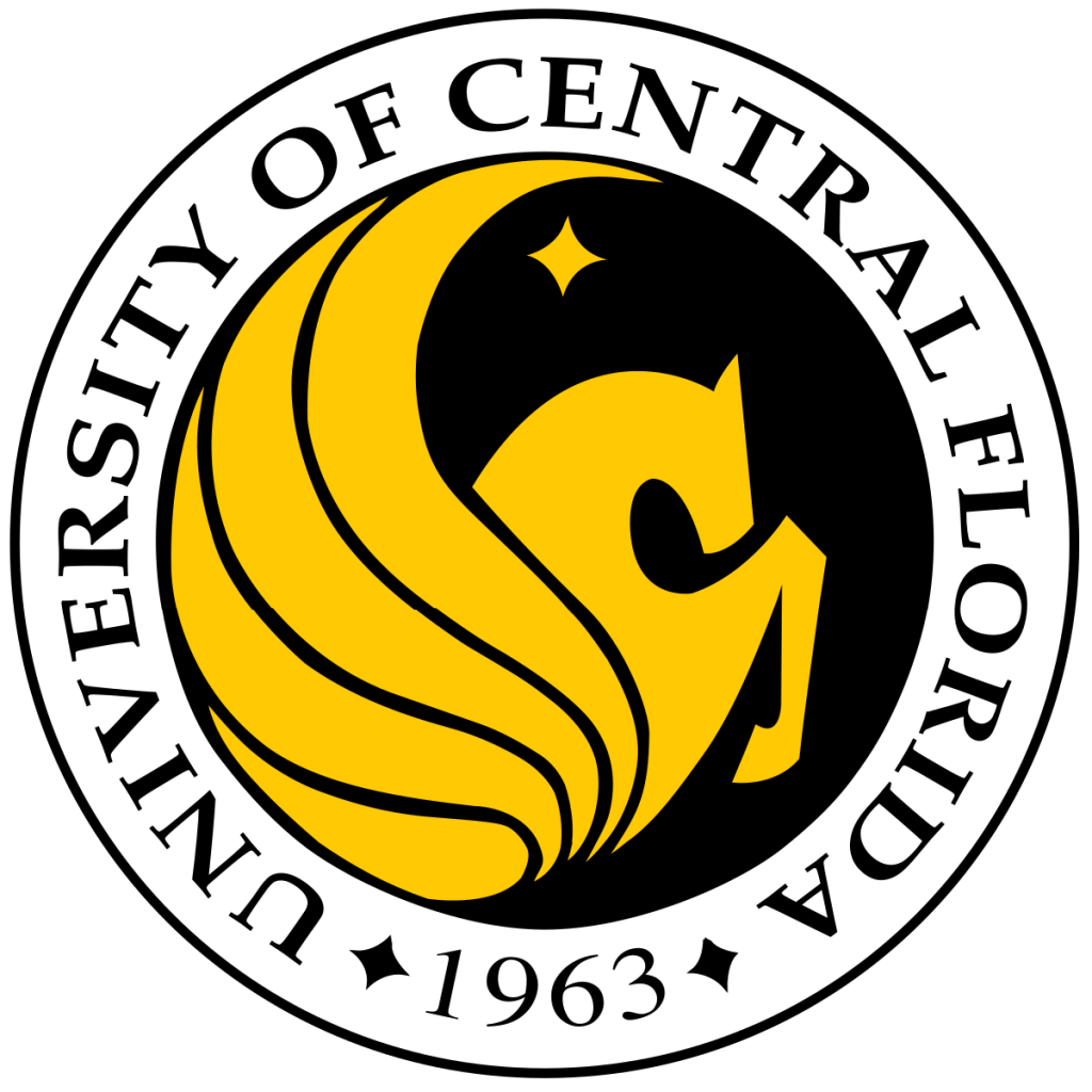
This school logo design features that of a Pegasus, which is pretty fascinating, given the fact that the mascot of the school is known as the Knights. Although, I don’t recall any medieval knights ever having winged steeds… Regardless, the wings convey a sense of freedom and mobility that most students would appreciate.
Irving High School

You know what’s more ferocious than an eagle? How about a tiger? With this school logo design from Irving High School, that becomes even more apparent. Tigers convey a sense of power. They intimidate. They dominate.
Nimitz High School
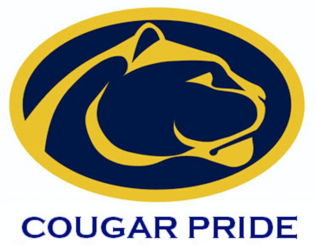
Is it me, or are felines of prey popular choices for school logo design? Nimitz High School features a panther of all things, which instantly makes me think of a certain Marvel character. Anyway, I like how the logo appears solemn, to give a sense of regality and dominance.
Durham Public Schools

You know what I think when I first look at the school logo design? The atom. And seeing as I like science, this simple, yet appealing logo really clicked with me. I also love the fact that different colors were incorporated into it. I can’t help but think that’s a subtle reference to different chemical elements.
Pembroke Public Schools

This school based in Massachusetts has a pretty nice taste in school logo design. If you look carefully, you can see that the logo resembles that of a Roman soldier’s helmet – perhaps Pembroke has some ties to ancient Rome?
Dade County High School

A mountain range, with a fierce glare. This instantly makes me think of the Rockies Mountains. Interestingly enough, this high school is nowhere near that famous range, but this school logo design is still great to look at.
Pender Public Schools

Is it me, or is this a rare opportunity I have had to see a dragon incorporated into a school logo design? Not only is this a nice change of pace, but this is also striking with the vibrant red. More dragons for logos, please!
St. Andrew’s School
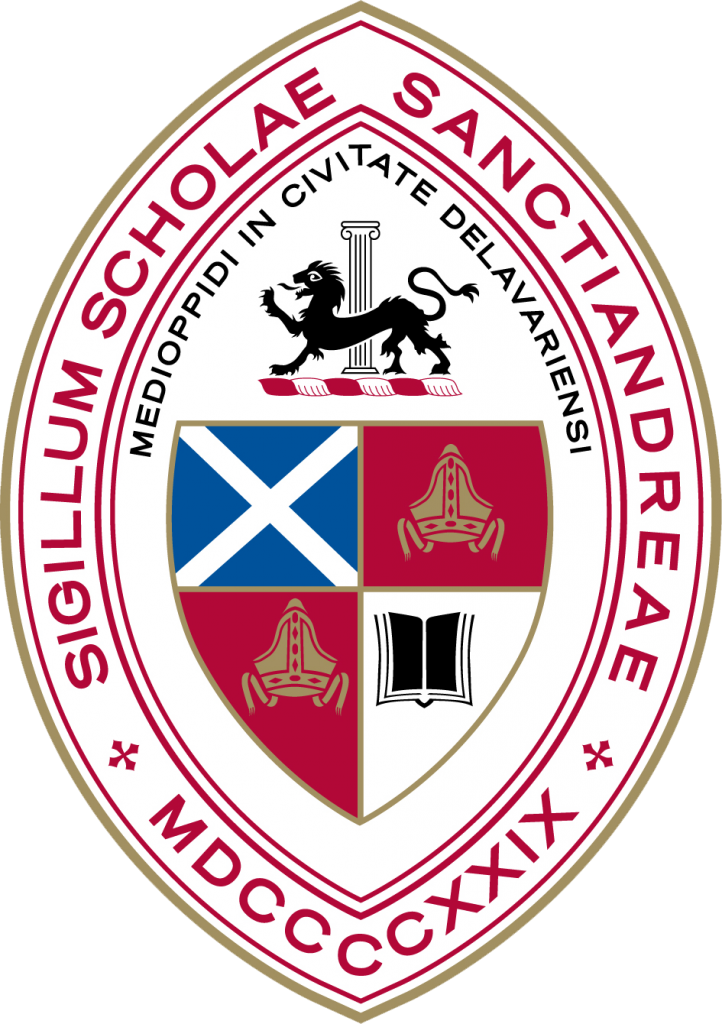
This may just be the first boarding school I’ve ever featured on this list, but the school logo design is just what you’d expect from such a noble institution. It may be the shield, the lion coat of arms, or the Latin inscriptions, but this logo is oozing with regality.
South Seminole Middle School
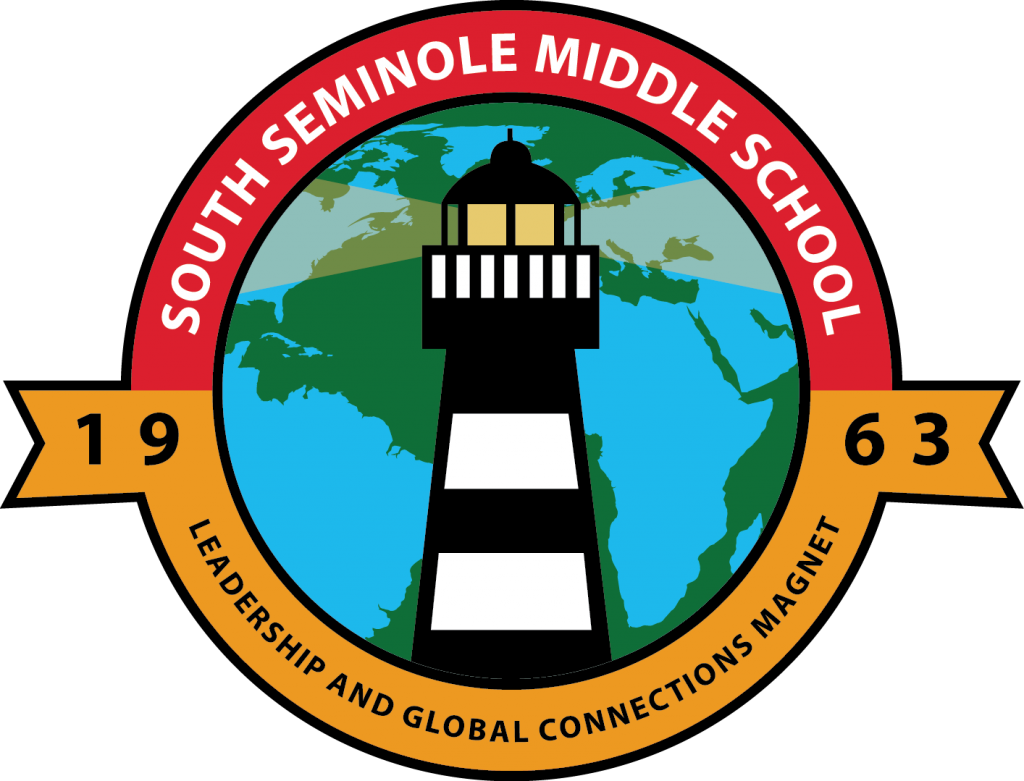
This is also another cool school logo design. The fact that it’s a lighthouse tells me that South Seminole is grooming its students to be beacons of light and hope for the world. A pretty powerful message from a subtle logo, if you ask me.
Southeast Park School District
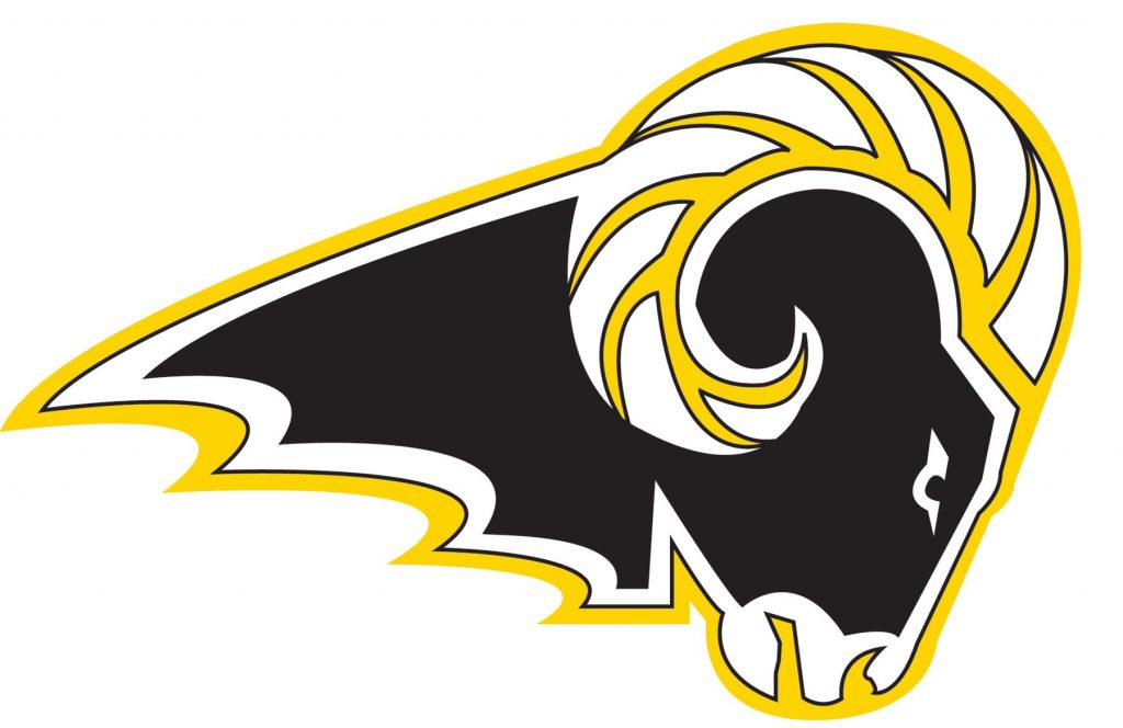
You know, when I think of rams, I think the truck brand. When Southeast Park thinks of rams, they imagine this symbol of their identity. This school logo design and the RAM brand of trucks may have one thing in common. They’re tough and unyielding. I get that from this school logo.
University of Edinburgh

The University of Edinburgh logo dons St. Andrew’s cross and Scotland’s national symbol — a thistle. The various colors create distinction and make each element apparent. I like how the icons and symbols are weaved together cohesively.
University of Amsterdam

At first glance, the University of Amsterdam logo might seem like an icon straight from your gadgets. But though simple, it represents essential elements in Amsterdam. For example, the three white crosses are that of St. Andrew’s. And the “u” is there to symbolize the university. Overall, the logo is inspired by Amsterdam’s coat of arms.
University College London

The small school’s symbol beside the school’s acronym is a striking tandem that creates versatility and memorability. And when it comes to creating a school logo design, that’s all you need to attract more enrollees. University College London’s simple yet effective typography is what makes its logo compelling.
Imperial College London
Typography logos work if consistency is used in all its marketing mediums and platforms. In this case, Imperial College London ensures that they only use the typeface from its logo. Plus, the logo should never be recreated, stretched, or even altered for any school project and activity. The logo is simple, which is reflective of a school that focuses on engineering, medicine, science, and business.
Sign up with Penji now, and get unlimited graphic design services or one-off logo designs.
About the author
Table of Contents
- Campion College
- American High School (California)
- Phillip and Sala Burton High
- Diving Career Institute
- Wizard Academy
- Arizona Empower Academy
- León After School
- Shelly The Tutor
- Yale University
- City University of New York
- University of Central Florida
- Irving High School
- Nimitz High School
- Durham Public Schools
- Pembroke Public Schools
- Dade County High School
- Pender Public Schools
- St. Andrew’s School
- South Seminole Middle School
- Southeast Park School District
- University of Edinburgh
- University of Amsterdam
- University College London
- Imperial College London

