

Nailing your presentation requires an amazing sales deck to get you funded. Here are 35 of the best sales deck examples we found that actually worked.
- Uber
- Airbnb
- Tiktok
- Keptify
- Zuora
- Front
- Sickweather
- Park Evergreen
- Contently
- Yesware
- Crema
- Purple Go
- DealTap
- Relink
- WeWork
- LinkedIn Sales Navigator
- DocSend
- Moz
- Amazon Advertising
- ReChack Docs
- LeadCrunch
- Mattermark
- Dwolla
- Richter
- ProdPad
- Snapchat
- AppsFlyer
- Office 365
- Yalochat
- Buffer
- Kimola
- Anatomy of a Persuasive Sales Deck
- The Deck On Sales Decks
What goes into a sales deck?
Before we get to the examples, let’s learn the criteria why the following made it to this list. Excellent sales decks will:
- Provide the solution your customer needs
- Let prospects know that you understand them
- Tell them why they know your pain points
- Detail how you’re going to solve their problem
- Why you’re better than the competition
- Prove your worth in the real world
- Present calls-to-action
1. Uber
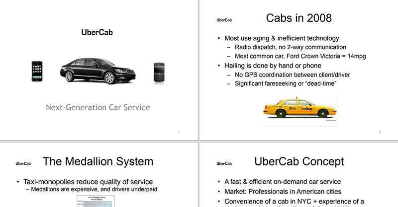
The example of Uber’s first sales deck was published on Medium by co-founder Garrett Camp in 2008. Although it’s heavy on text, which in today’s standard is a bit off, it still worked wonders. The information was presented in small chunks, which made it easy to digest.
What it did: The deck highlighted the inefficiency of cabs and Uber’s solution. The comparison made their service more appealing. They included vital data such as key indicators, scenarios, and case studies.
What it achieved: According to Business Insider, the sales deck earned Uber $1.57M in seed funding in 2010.
2. Airbnb
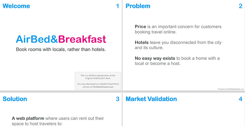
Simple and straightforward are what describe Airbnb’s sales deck. It explained the core information in the company’s business plan, which is rarely seen in most startups’ sales decks.
What it did: Airbnb’s sales deck clearly explained their business’ core plan in a simple and straightforward way. They kept the info to a minimum of 3 on each slide to make it look clear when seen from afar. They stuck to a blue color for the slide headings, which are displayed on the uniformly on the upper left corner.
What it achieved: Airbnb got $20k in just three months, and $600k in eight months.
3. TikTok
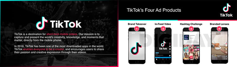
Available only to Digiday subscribers, this TikTok sales deck example was created with advertisers in mind rather than investors.
What it did: The sales deck wasn’t made available to the public, thus creating more interest. Design-wise, it used icons as visual anchors, which made the slides more engaging. Plus, the white against black background color makes every piece of information stand out.
What it achieved: According to Crunchbase, it raised $150.4M in funding back when TikTok was called Musical.ly, which was in 2014.
4. Keptify
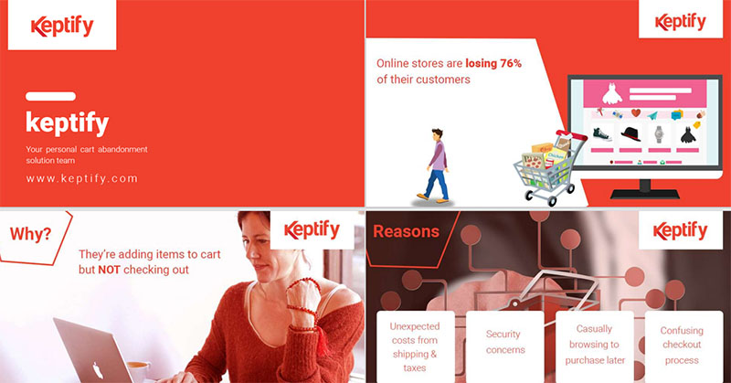
A shopping cart abandonment software, Keptify designed their sales deck to have more graphics than text. With only 11 slides in it, they successfully conveyed their message in an appealing and lively way.
What it did: The slides were never overwhelming. They were engaging yet thorough in their explanations about the company. This excellent example of a sales deck has all the characteristics of an effective one, as mentioned above. Moreover, they kept branding consistency all throughout by showcasing the logo and using the brand’s color. That said, always know the elements on how to create a sales deck that gets you funding.
5. Zuora
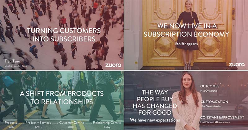
Author and NPR commentator Andy Raskin proclaimed Zuora’s sales deck below as “The Greatest Sales Deck I’ve Ever Seen.” And for good reasons.
What it did: Instead of talking about their company, Zuora set the stage first by telling them about a shift in the industry. It then proceeded to make the audience think about how the change affected them. Zuora’s storytelling was compelling, and coupled with visually appealing designs, no wonder it’s one of the best.
6. Facebook
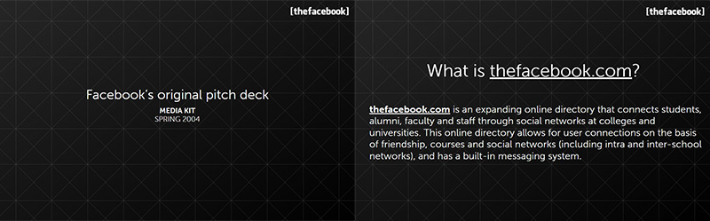
Everybody knows what Facebook is and how successful it is as a brand. However, their sales deck from when it was still called The Facebook is still one to note.
What it did: It presented the company’s history, its audience, and its services. It was simple and straight to the point.
What it achieved: Angel funding worth $500K from venture capitalist Peter Thiel.
7. Front
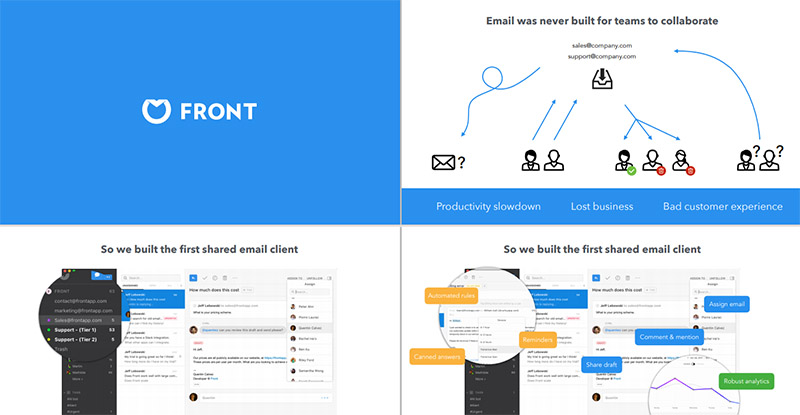
When you’re a customer communication platform, explaining what you do may be a complex matter. However, Front has done it perfectly in the sales deck shown below.
What it did: The sales deck has graphs, flowcharts, screenshots, magnified features, illustrations, and images that are simple and easy to understand. In addition, the solutions they offer are made clear to the slides’ viewers.
What it achieved: $10M worth of series A funding.
8. Sickweather
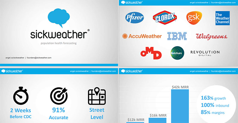
The company Sickweather is a developer of sickness forecasting and mapping software. The slides include statistics and data in graphs and charts, with a video as well.
What it did: Because the math was already done for the viewers, the numbers were easy to understand. The graphs and charts are easy to follow. The icons also serve as anchors to the data presented.
What it achieved: The entire sales deck made the numbers and info easily digestible. In return, they received $2.6M in funding, according to Crunchbase.
9. Park Evergreen
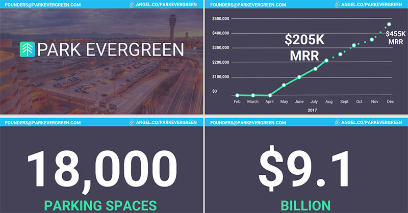
Park Evergreen (now named Plot) is an airport and city monitoring software that used this strategy to the fullest. To make the viewers understand what the company is all about, they created a sales deck filled with metrics.
What it did: Park Evergreen gave each metric its slide to make it easier to remember. It also has an uncomplicated design that is devoid of fluff. Plus, you can’t help but notice the use of huge, bold white text and figures, which makes the information stick.
What it achieved: With this sales deck, the company raised $400k in seed funding.
10. Contently
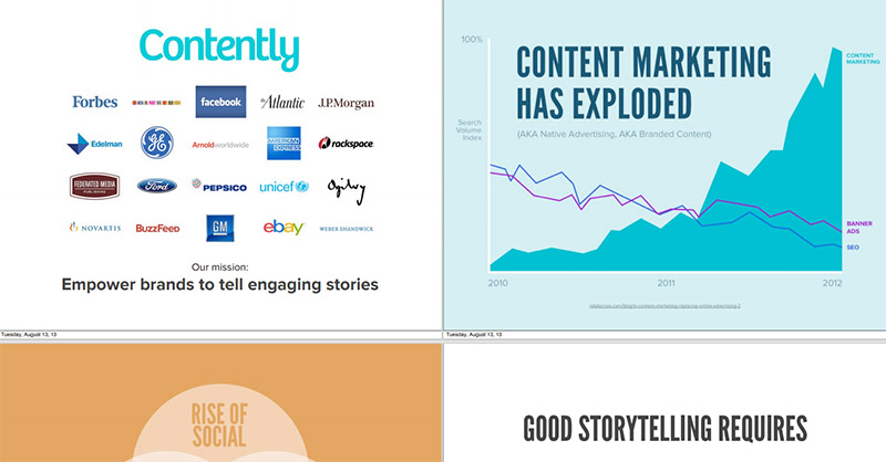
With success stories and case studies, Contently effectively gave their audiences reasons to trust them.
What it did: Contently showed viewers why and how they could solve their problems. They also showcased their happy clients. In addition to that, the slides provide various layouts and colors to make for a memorable design. Knowing the color theory is critical to also impart the right emotions to your attendees.
What it achieved: $19.33M in total funding and $25.5M in revenue as of 2017, says Craft.
11. Yesware
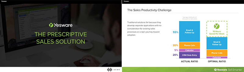
Yesware is another sales productivity company, with over 800,000 users.
What it did: The designs they used are clean, brightly colored, and use white spaces that enhance legibility.
What it achieved: To date, Yesware has raised $42.6M of funding and revenue of up to $10M in 2016.
12. Crema
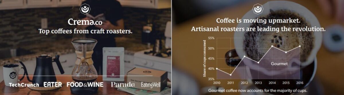
An online retailer of specialty, Crema was founded in 2015. It is a dedicated online marketplace for coffee and anything related to it. The sales deck example below shows precisely what consistency in design is.
What it did: The background images have an overall theme giving each slide a warm feeling throughout. It is cohesive and gives visuals to the metrics explained in each slide.
What it achieved: Crema raised $325K in seed funding in 2017, according to Crunchbase.
13. Purple Go
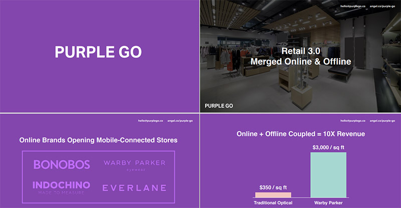
Providing sales and operations platforms to retailers, Purple Go’s sales deck is a noteworthy example. Their slides effectively drew attention to where they needed to. Research tells us that the company is generating revenue, but the amount and funding are undisclosed.
What it did: The slides used contrast, white space, and eye-catching images and graphics. They used their brand color, purple, as background to make the white text and graphs take center stage.
14. DealTap
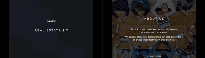
Using the Focusing Effect as their sales deck strategy, DealTap capitalized on our cognitive biases. This process is where humans tend to focus on one thing and one thing only, then ignore everything else.
What it did: DealTap asked viewers to select between two options. Then, it shows the clear winner, which emphasized the need for services such as theirs. Although using custom images is preferable, DealTap still made it work by blurring the image and making the text more prominent in the About Us section.
What it achieved: According to RocketReach, it has a revenue of $46M and funding of $2.7M.
15. Relink
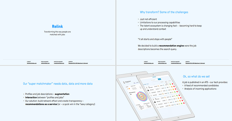
Online job portal Relink shows their thorough understanding of their industry. They use AI to connect job applicants to jobs and vice versa. In their sales deck, they showed their prospects their pain points.
What it did: Although the sales deck would look better with graphics, it was efficient in showing the problems and how their company can solve them. The use of bullet points and small chunks of information helped a lot.
What it achieved: Relink raised a total of $2.1M in funding from three investors.
16. Reddit
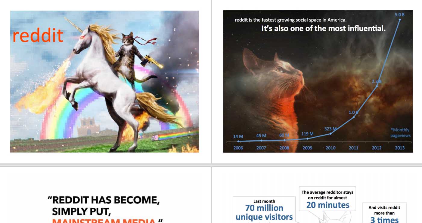
Published in 2008, the sales deck example from Reddit humble-bragged about their company. There is nothing wrong with it, though, as showing what you did and how you did it explains why people need your service.
What it did: Reddit showed how they became one of the fastest-growing influences to beat. They also included examples of how they helped their customers and other data to prove them right. Also, the bizarre and interesting graphics are a nice touch to the data presented.
17. WeWork
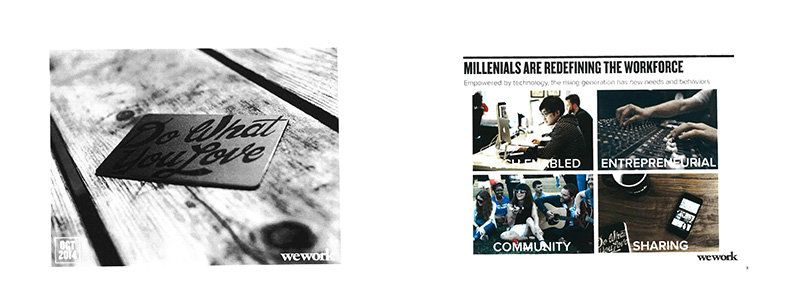
Despite some challenges WeWork faced (valuation drop, layoffs), they still manage to produce one of the best sales decks around. They nailed it when they explained to their audience why space as a service is an excellent work solution.
What it did: WeWork wasted no time when they shared the juicy details on page two. While others place the metrics at the later part of their slides, WeWork went in for the kill at the start.
What it achieved: In 2011, Crunchbase reports that WeWork got $6.9M in seed funding.
18. LinkedIn Sales Navigator
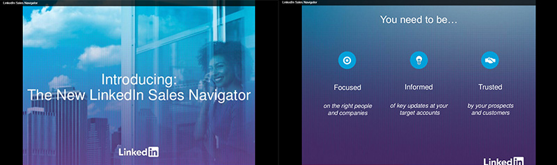
If you’re wondering what energy looks like in sales decks, look at what LinkedIn Sales Navigator did. They seemed to understand the benefits of using color psychology which is evident in their example below.
What it did: LinkedIn used colors to evoke emotions, such as red to stir up action, authority, and strength. The colors drew attention and guided their audience’s attention to the right emotions.
19. DocSend

Looking for ways to make their viewers go through the last of their slides, DocSend turned to storytelling.
What it did: DocSend meant what they said when they claimed storytelling is what will get people to view their sales deck all the way. So they started by putting an image of a castle on the second slide. The touch of humor is also a compelling way to grab the attendees’ attention.
What it achieved: $15.3M from nine investors seems to prove that an exciting narrative is the key to sales deck success.
20. Moz
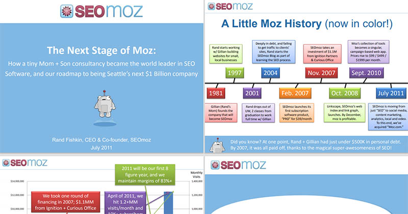
Speaking of emotions, this Moz sales deck started with a story about the company being formed by a mom and son duo. After that, the slides are simple and get straight to the point.
What it did: The key takeaway with this sales deck is that they weren’t shy about giving out CTAs. This is something worth copying as you never should let the viewers guess what they need to do next. Although some slides might don too much information, the use of various colors segregates the data and makes it easy to process.
21. Amazon Advertising

When you find your unique value proposition, use it every chance you get. This is what Amazon did when creating their advertising pitch deck.
What it did: They used images, charts, graphics, and statistics to instill in their viewers’ minds why they are the largest online marketplace. The yellow barrier that separates the text and images also provides an excellent layout all throughout.
22. ReCheck Docs
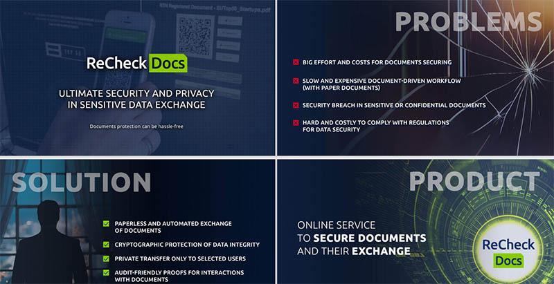
Specializing in document protection, ReCheck Docs is a blockchain platform. Their sales deck is one of the most simple and organized we found.
What it did: It uses bullet points and colored blocks to highlight specific information. The slides have minimal texts making them easy to read and digest. Plus, the dark background color with makes the text stick out like a sore thumb.
23. LeadCrunch
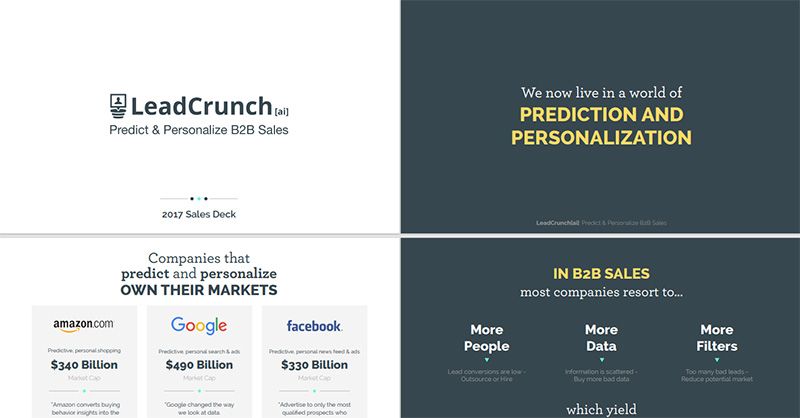
Using a different approach in designing their sales deck, LeadCrunch totally went out of the box, as seen below. They do know how to keep an audience hanging in suspense.
What it did: With 21 slides, they used the first ten for storytelling. Only on the tenth slide did they introduce themselves.
What it achieved: With three investors and $18.2M in funding, they are making waves in the sales development platform industry. Although it’s a text-heavy design, the structure is clean and uncluttered.
24. Mattermark
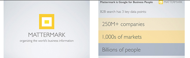
Another approach to sales deck design is what Mattermark did. They showed the problem and their offered solution quite well in each slide.
What it did: They used screenshots to show the actual problems people face in organizing businesses. This way, they highlighted the potentials of the products quite well by showing real-life situations.
What it achieved: Because of this, Mattermark received funding amounting to around $17.2M.
25. Dwolla
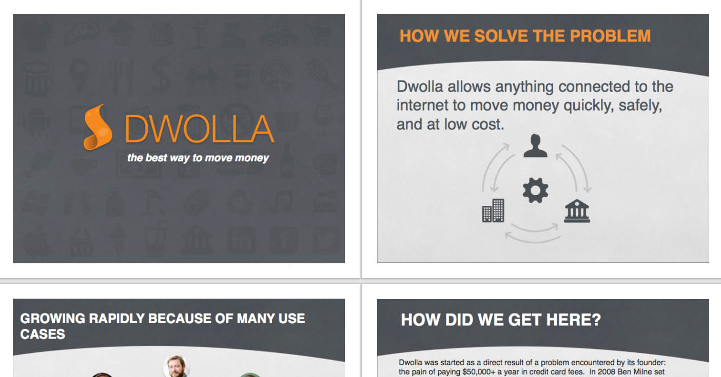
People love seeing how businesses started, especially if it is a well-known brand. Taking note of this, Dwolla did precisely this in their sales deck.
What it did: On the second slide, they explained their company in one short sentence. Engaging graphics and design aside, this one pitchy sentence was all it took to make the deck successful.
What it achieved: According to Des Moines Register, this sales deck resulted in $12M in funding.
26. Richter
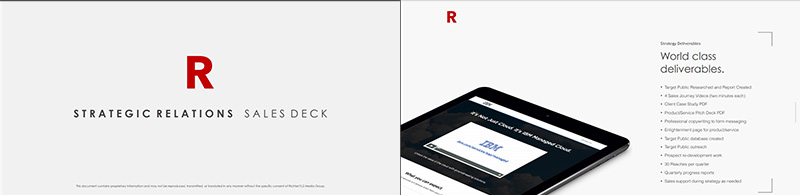
This example from Richter is one worth emulating. Their strategic relations sales deck has a consistent design making it cohesive and highly legible.
What it did: Richter introduced the problem, followed it up with their unique value proposition, and offered their solution. Moreover, then design is simple and straightforward with a good balance between text and visuals.
What it achieved: In 2020, LATKA reports that Richter gained $4.8M in revenues even with zero funding.
27. ProdPad
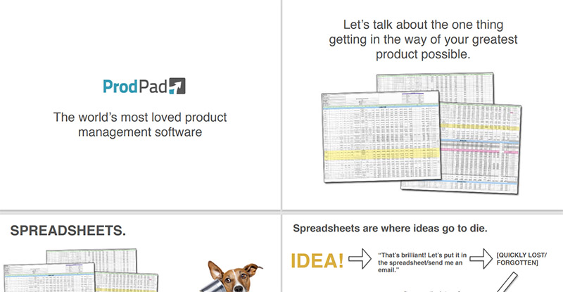
This product management platform understands that to get your viewers’ attention, you need to place them in the center. Prodpad knows what their customers need, and they made every effort to let them know in this sales deck.
What it did: In the 30 slides, the deck never once mentioned their accomplishments. Instead, they spoke in the second person, giving emphasis on what “you” as the customer will benefit from them. The company also featured snippets of their product on some slides, which is a good way to entice users.
What it achieved: In a Relay AMA, CEO Janna Bastow tells about the company’s decision not to get funding. A quick look at Growjo tells us that ProdPad’s estimated annual revenue is at $4.4M.
28. Snapchat
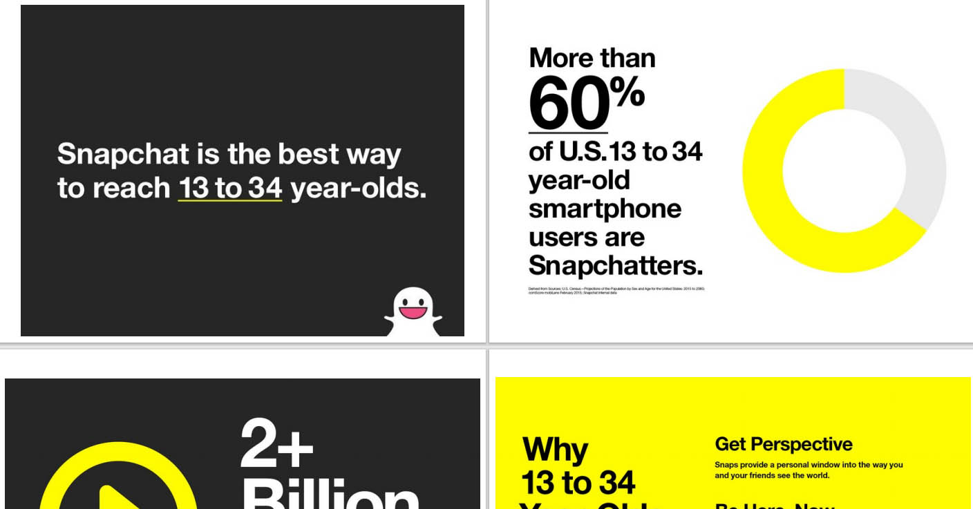
Right off the bat, Snapchat showcased how and why they are the platform to reach young audiences.
What it did: Snapchat has a beautifully designed sales deck showing off their growth and benefits from working with them. The bright yellow color combined with black and white text and colors is a smart choice for fusing the visuals in an uncluttered way.
29. AppsFlyer
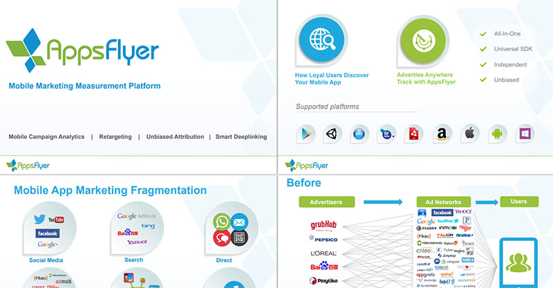
Analytics and attribution platform AppsFlyer showed their viewers what the industry would look like without their service.
What it did: AppsFlyer made people think with their before and after scenarios. Then continued to describe what the world would be when they use their services. The use of negative space makes this slide design works regardless of the information overload.
What it achieved: With their 12 investors, AppsFlyer received $293.1M in funding.
30. Office 365

Using vivid colors, crisp and clear images, and blocks highlighting the texts, this Office 365 sales deck is a work of art.
What it did: A close look will tell you that the colors the deck used were the same ones that their productivity apps carry. This creates consistency, harmony, and synergy.
31. Yalochat
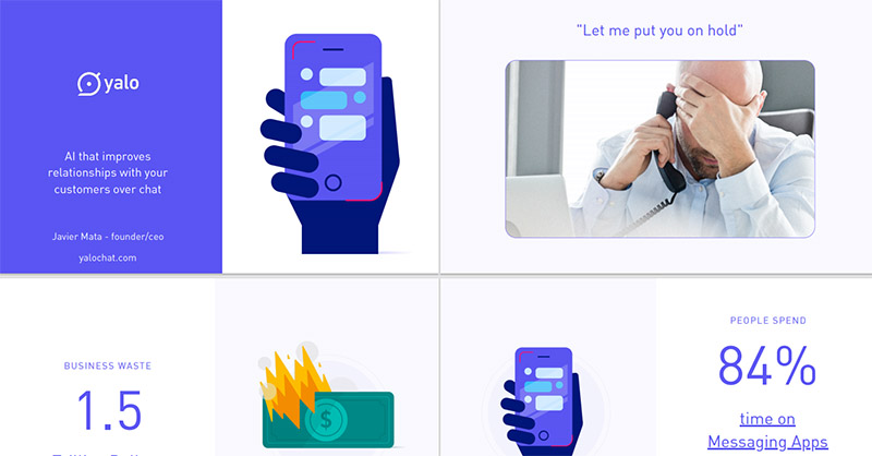
Illustrations can add impact to any design more than simple photographs. Yalochat knows this, as can be seen from their sales deck below.
What it did: The slides use illustrated icons that are beautifully rendered using colors that are consistent with the brand. It added to the context making the sales deck easier to absorb. Yalochat also ensured there’s visual hierarchy to show the most crucial information prominently.
What it achieved: According to TechCrunch, Yalochat received $15M in Series B funding.
32. Buffer
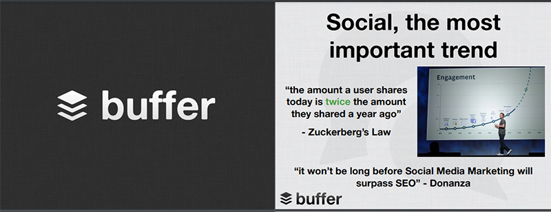
Having great traction makes raising funds more accessible. Buffer knows this and capitalized on it on their sales deck. It proved why this social media management software is an excellent market and product fit.
What it did: Buffer showcased their solutions by asking questions. They showed the situation with the industry landscape and why they are the best fit to handle it. The introductory slide with quotes from famous industry leaders is a great way to pique user interest.
What it achieved: Buffer co-founder Leo Widrich disclosed that they received $500k in funding. But Crunchbase tells us it reached $4M with 29 investors.
33. Kimola
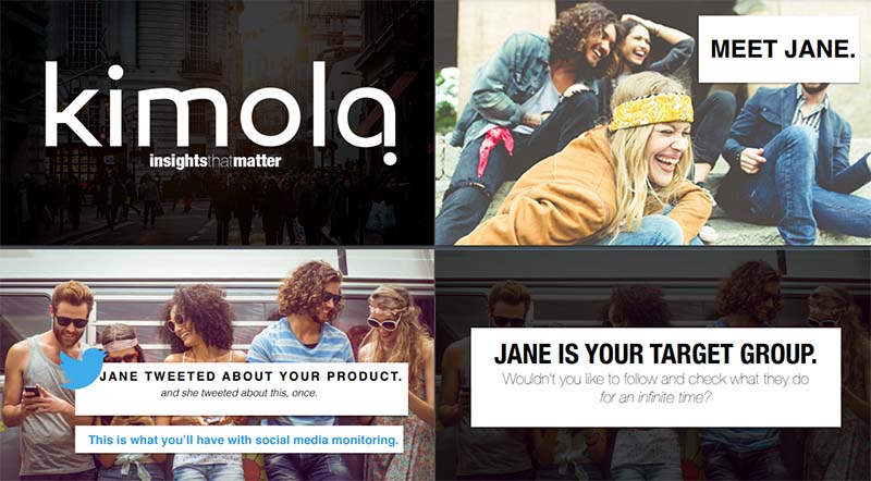
Data analytics company Kimola took their viewers on a trip that simulated what their company can do for you. They claim to work with two of their passions: linguistics and understanding people. Their sales deck tells us that this is indeed true.
What it did: They introduced a fictional character, Jane. Then they proceeded to set up a situation where you’ll see what Kimola can do for you. Overall, we’ll give this slide design a perfect 10 for storytelling.
What it achieved: Crunchbase tells us that Kimola received $225K in funding from three investors.
34. Anatomy of a Persuasive Sales Deck

This example from Steven Benson of Badger Maps is a great model of what a sales deck that works looks like. The slides command attention which makes the title more than appropriate.
What it did: It got rid of industry jargon that can confuse viewers. Second, it showed well how adaptation would keep businesses afloat. And lastly, it showed why the landscape is changing for most companies and that a solution is available. Also, the use of green, black, and white colors is a beautiful contrast to make the information stand out.
What it achieved: Badger Maps, of which Benson is CEO and founder, has $10M in revenue as per ZoomInfo.
35. The Deck On Sales Decks

Last but not least is the sales deck named The Deck On Sales Decks. Its 41 slides tell us what makes a sales deck an excellent one. Authur Gopak, CEO at AlphaGamma, created it.
What it did: The slides showed suggestions on how to create an effective sales deck, and of course, it practiced what it preached. It limited the texts it used, told a story, and encouraged conversations. Some slides used a chunk of text, which isn’t recommended. However, the bold phrases made the essential information stick out.
What it achieved: AlphaGamma, from The Netherlands, was named “Top 20 most promising Dutch companies” of 2020. It has $431K revenue, according to Apollo.
Need help designing a sales deck?
This list should provide more than enough inspiration for your own sales deck. And to help you create one that will impress your prospects and investors, work with us at Penji. Sign up today to get the design started.
About the author

Celeste Zosimo
Celeste is a former traditional animator and now an SEO content writer specializing in graphic design and marketing topics. When she's not writing or ranking her articles, she's being bossed around by her cat and two dogs.


