
The word rectangle comes from the Latin word rectus, which means straight or right. The shape is commonly used to convey a sense of stability, security, comfort, and peace. So, if you need to show these characteristics in your brand, our Penji designers created ten rectangle logo examples to inspire you!
If you’re curious about what else Penji can do for your company, watch our demo video here!
1. PayEats
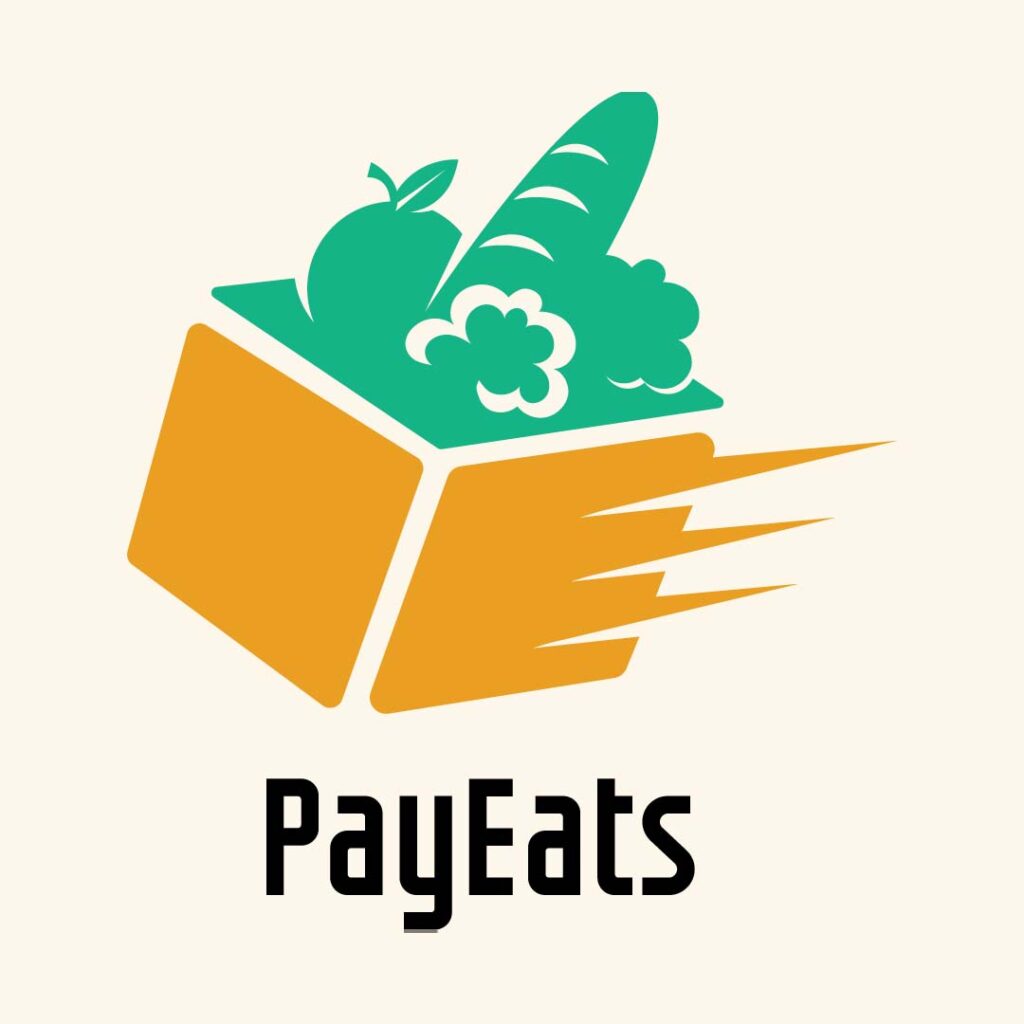
For the food delivery service PayEats, our designers used an image of a box with produce in it. It has speed lines on the side to signify its quick delivery services. The colors yellow and green are perfect in showing its products’ freshness. The brand name is written in a simple yet classy font without space between the words. The capitalization is enough to differentiate the two words from each other. For the typeface, black was used to avoid making the logo too colorful, which may be distracting to viewers.
2. Farm to Table Fast Food
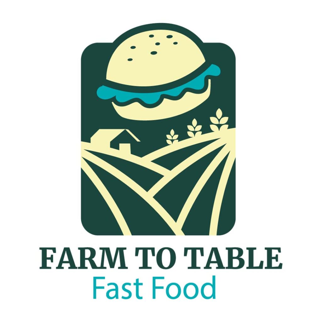
This eye-catching rectangle logo designed for Farm to Table Fast Food has all the elements it needs to look amazingly good. It uses varying shades of green which is the usual when you want to project clean and fresh products. What’s even worth noting are the illustrations of food, farm, house, and crops. These were made by Penji’s custom illustrators. If you want a unique take on your logos, illustrations are the best way to go about it.
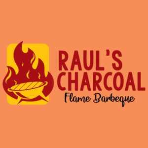
3. Raul’s Charcoal Flame Barbeque
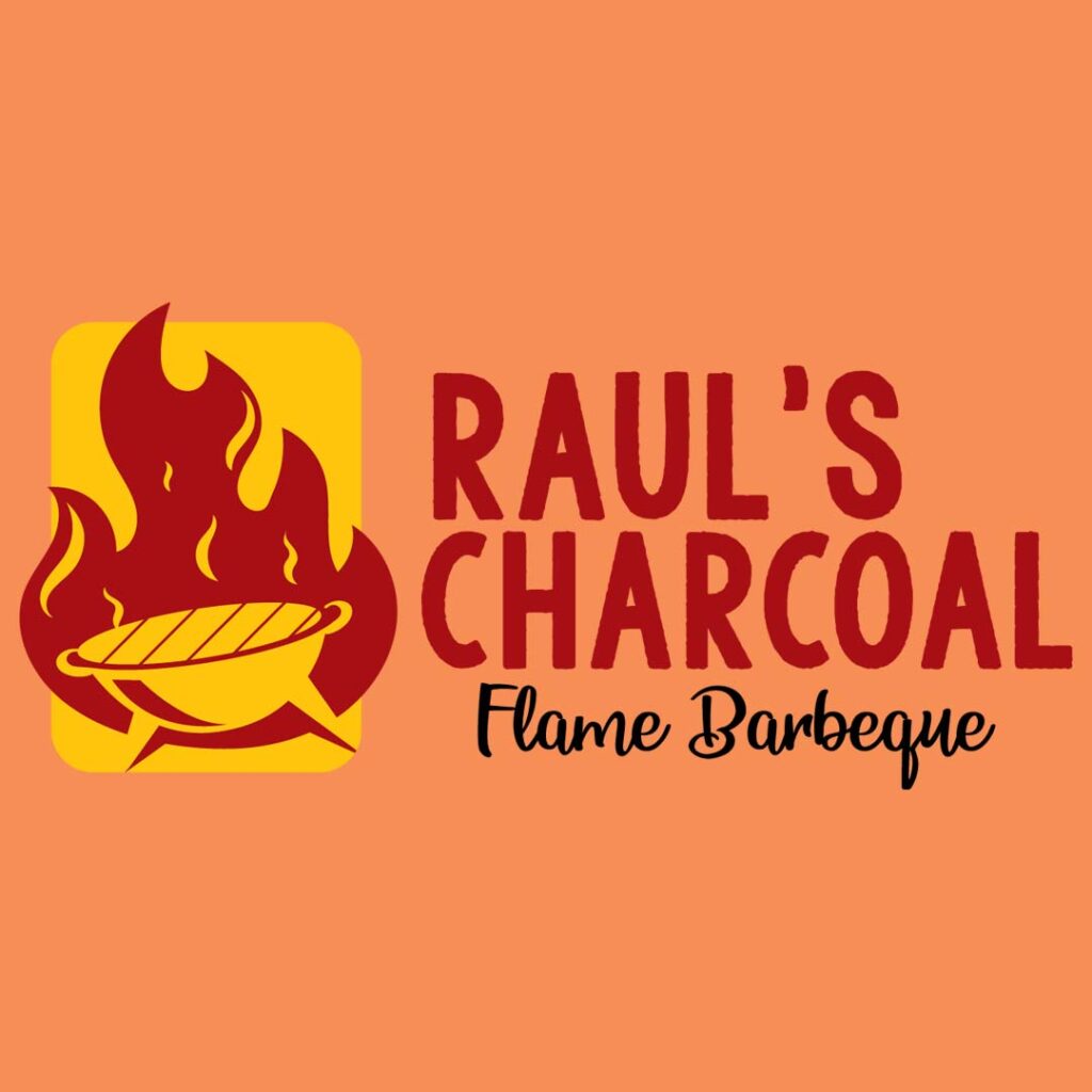
Everything about Raul’s Charcoal Flame Barbeque logo is screaming hot and spicy! It has a grill and fire encased in a rectangle which stands out well. The handwritten script for the brand name fits the design perfectly as it comes out as informal and easygoing. Even the secondary font gives the design a quirky appeal that is warm and welcoming. The color combination befits the design, showing a homey and relaxed brand persona.
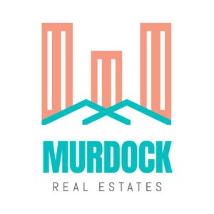
4. Murdock Real Estates
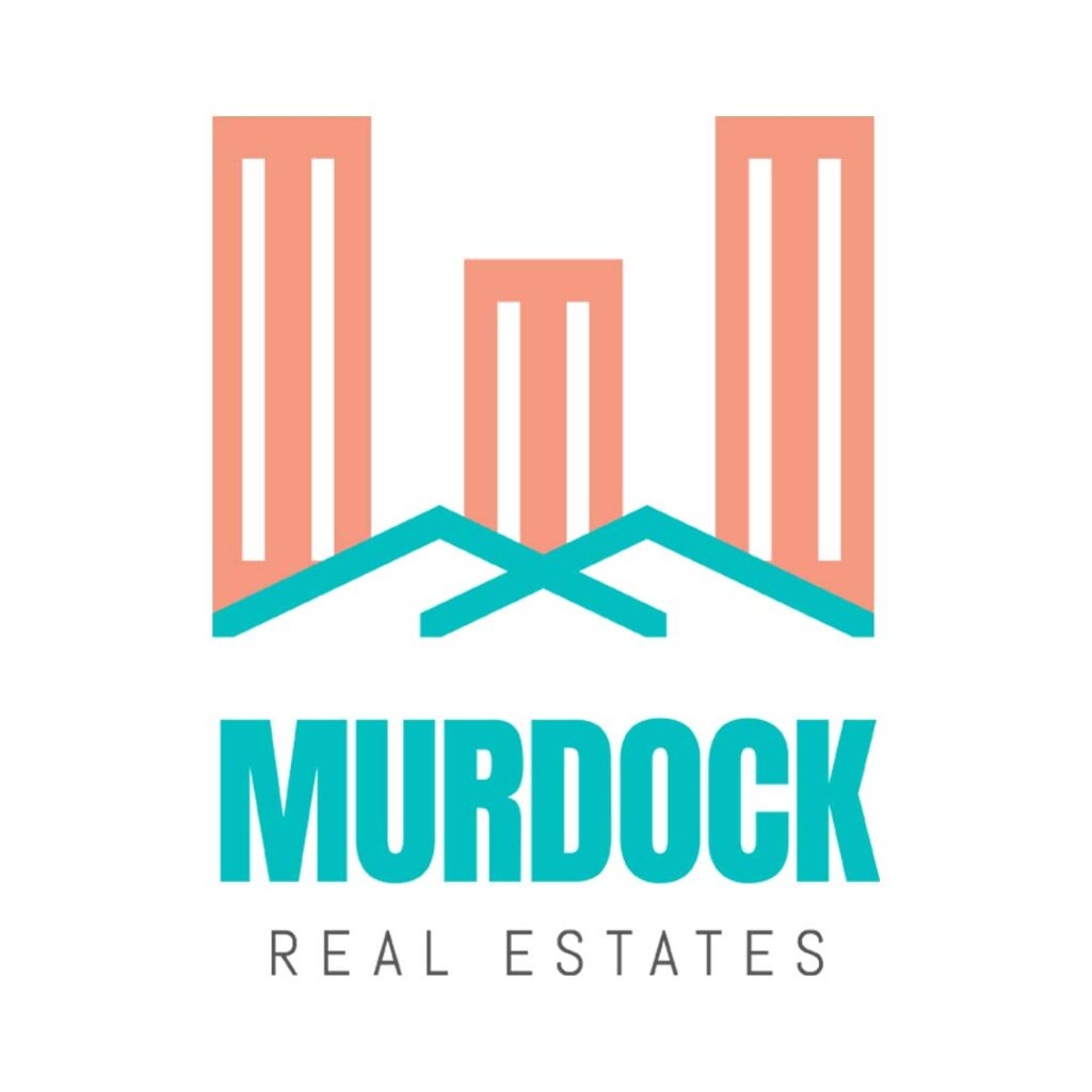
Using not just one but multiple rectangles, this Murdock Real Estates logo is an excellent example of a rectangle logo that suitably fits the brand. The rectangles are made to represent buildings, while the lines beneath symbolize house roofs. The designers decided to use soft, pastel colors to make it stand out from its competition which typically uses a darker palette. The fonts used were those that did not have many details on them to signify the seriousness of the business.
Is a rectangle logo the best shape to represent your brand?
Start a logo project with us


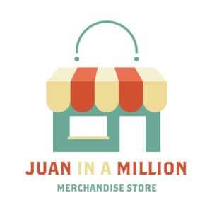

5. Juan in a Million Merchandise Store
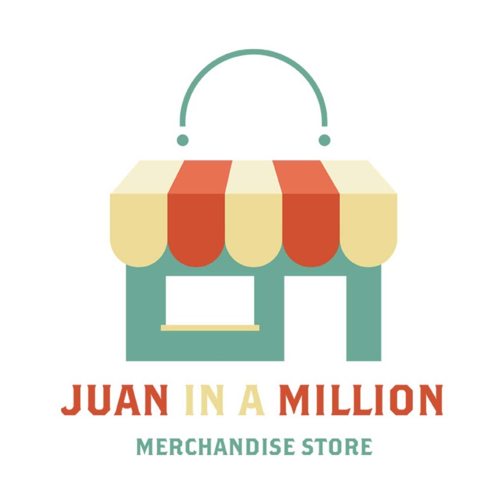
This rectangle logo designed for Juan in a Million Merchandise Store has hit two birds with one stone. It uses the shape as an image of a store and a shopping bag. The multiple colors it used create an atmosphere of joy, cheerfulness, and excitement: sentiments we commonly associate with shopping. The font that was used has serifs reminiscent of western movies but stylized. This gives the design a trendy and contemporary feel.
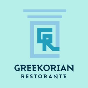
6. Greekorian Ristorante
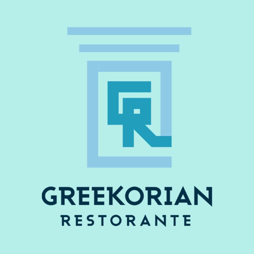
Designed to look like a Grecian pillar, this logo suits the brand Greekorian Ristorante so well. The first letters of the brand name G and R were incorporated beautifully into the logo. This is ideal if you want to use the image without the brand name. The color combination is primarily green, but the use of both dark and light provide excellent contrast. The font used has that contemporary Greek detail but is not overly decorated to look dated.
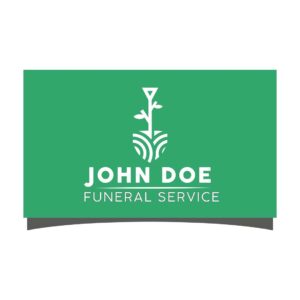
7. John Doe Funeral Service
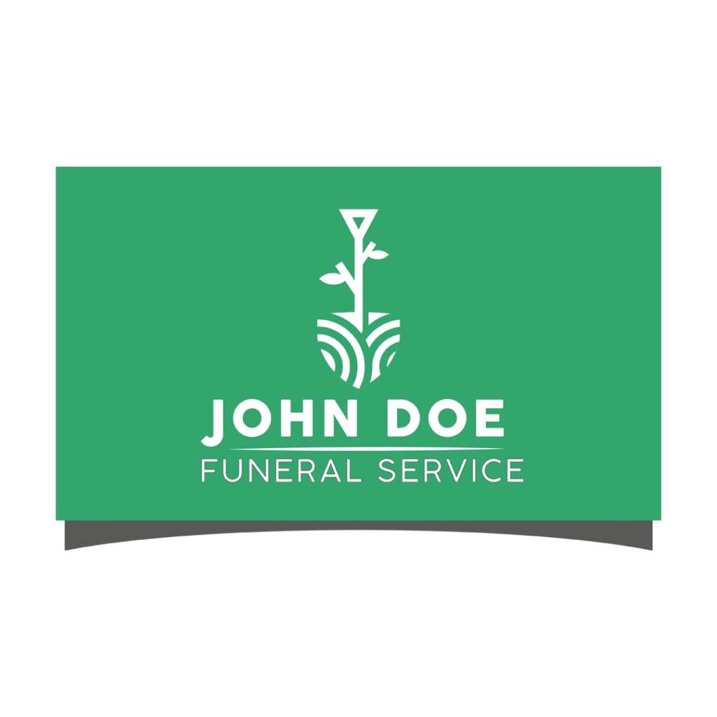
Funeral services and similar businesses usually use formal and somewhat rigid logos. The John Doe Funeral Service logo design is outstanding as it steered away from this norm. The design is upbeat but still retains formality that’s appropriate for its business nature. Instead of a dark color, it used a bright green and an image of a spade with tree branches sprouting—all of these point to a brand identity that is welcome to change and new beginnings.
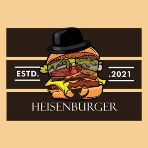
8. Heisenburger
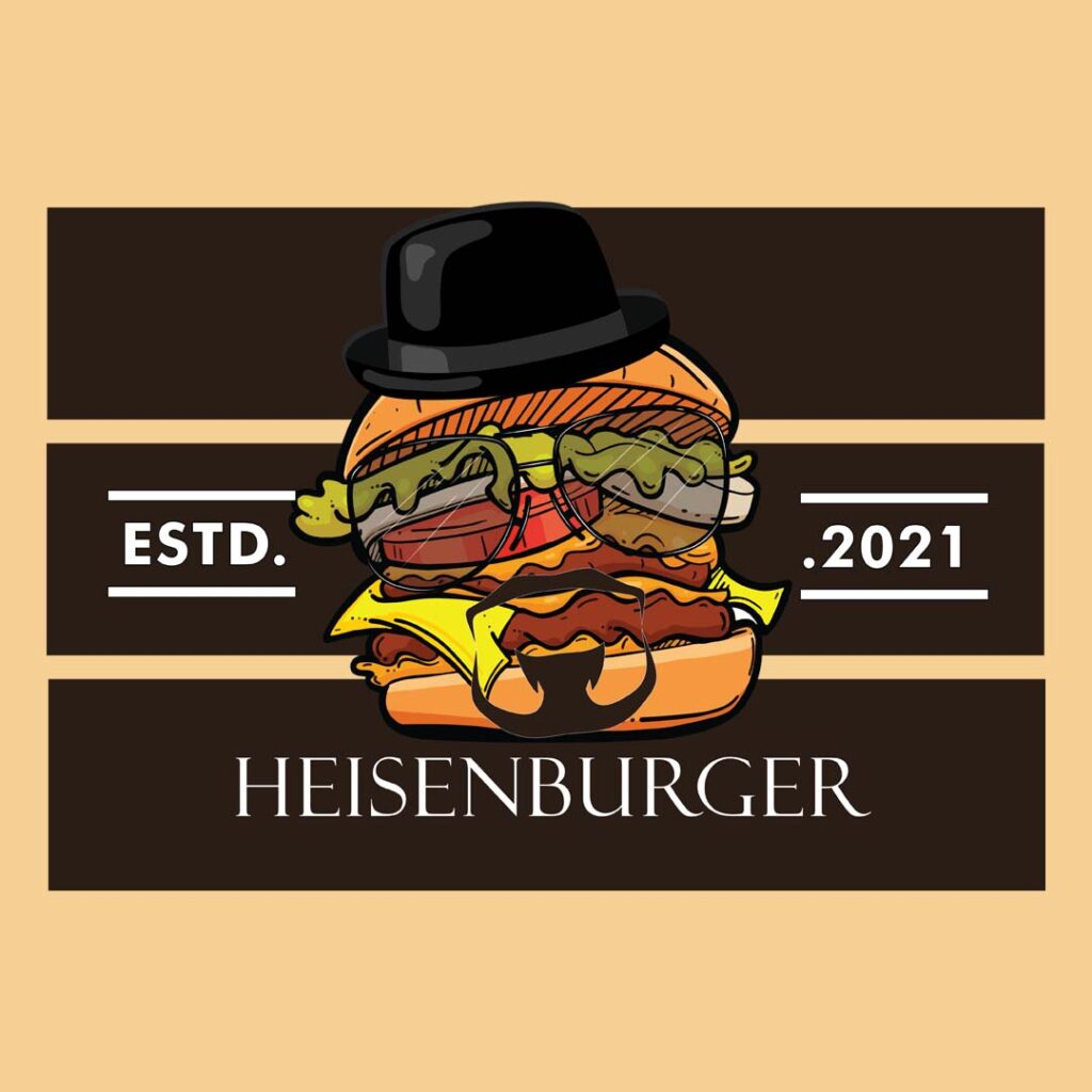
A play on a character’s name from a popular TV show, the Heisenburger logo stays true to its identity. The burger wears a top hat, eyeglasses, and a beard to complete the image. The brown and yellow palette fit well, but the addition of other colors genuinely brighten up the design. The custom illustration makes this logo unique, something you won’t get from an online logo maker.
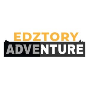
9. Edztory Adventure
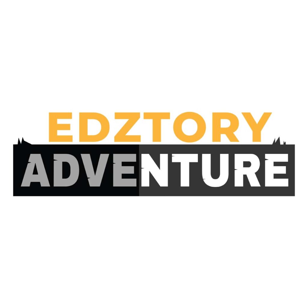
If you’re in the camping, sports, and leisure activity industry, this rectangle log created for Edztory Adventure is worth emulating. The rectangle was designed with spikes, while the Adventure text was given its cracks. All these effects make for a rugged and outdoorsy feel. Yellow was used for the Edztory to bring it out of the page, while the gray rectangle adds mystery to the design. The font choice is perfect as they are big, bold, and adventurous.
10. Allan’s AC Repairs
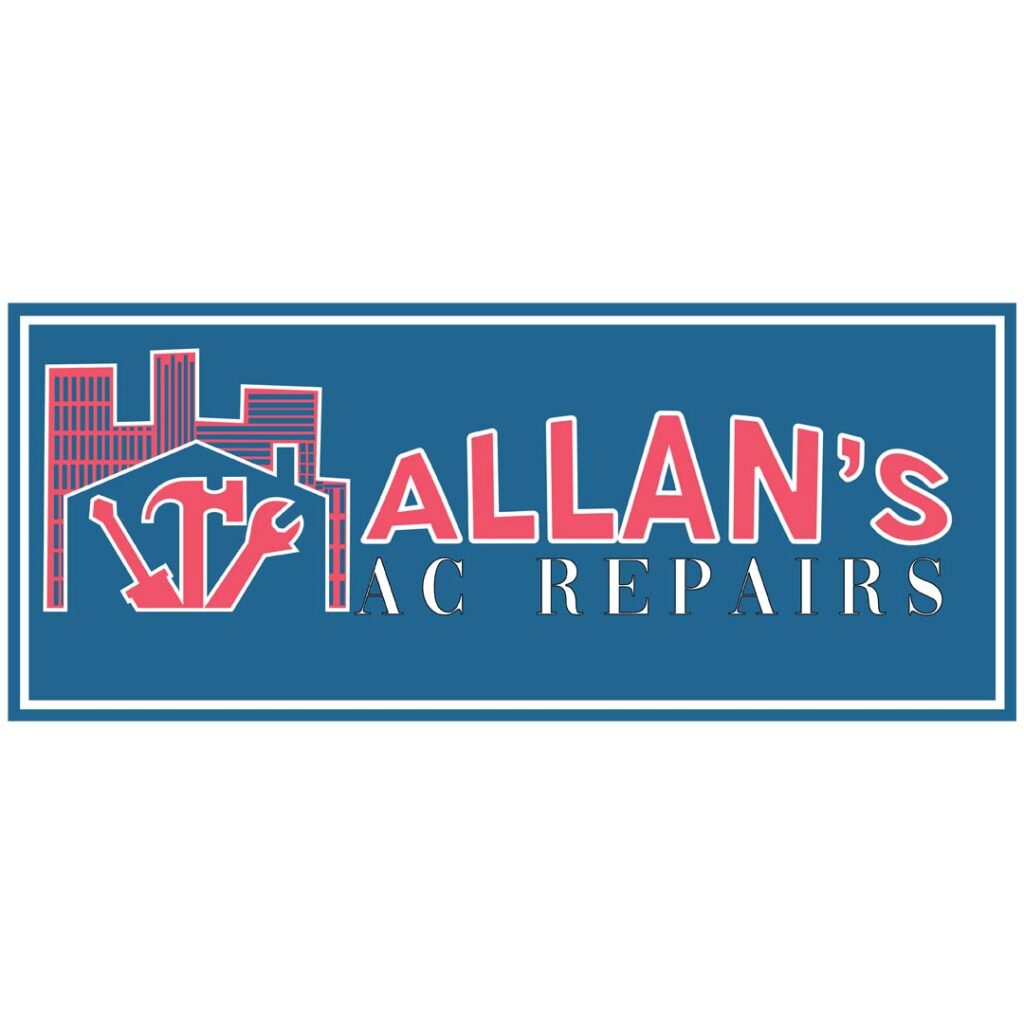
This rectangles within a rectangle logo is a cleverly-designed one for this HVAC company, Allan’s AC Repairs. It uses the shape for the buildings the same way the Murdock Real Estates logo did. It also has a house silhouette, which signifies that this company caters to commercial and residential customers. The red and blue color combination works well as it makes the brand name stand out.
Why Use a Rectangle Logo?
A four-sided shape, much like a square but elongated, a rectangle is a powerful choice for a logo. It can efficiently frame many design elements as it wastes no space. This means a rectangle can fit many other shapes and would still have enough white space.
Many brands use a rectangle logo because it represents balance, professionalism, and strength, among many other positive traits. When stacked together, rectangles give a sense of order and safety. If you can relate to these, a rectangle logo is an excellent shape to consider.
How to Design Effective Rectangle Logos
To create rectangle logos that get your brand the attention and recognition it deserves, follow these simple tips:
Keep it Real and Simple
Avoid adding unnecessary design elements to your rectangle logo. Include only those that serve a clear purpose. This helps keep the design simple and real, making it more memorable and easy to recognize. Your goal is to convey your brand message without overwhelming the viewer.
Focus on Your Core Values
Review your brand’s core values and make sure that they are represented in your rectangle logo. The design should explain your brand’s essence without the need for intricate details.
Check Your Proportions and Balance

Check what your rectangle logo looks like from all angles. When you rotate or invert it, it should keep its integrity and still look the same from any perspective. This ensures versatility and maintains its recognizability, whatever platform you place it on.
In addition, there should be a proportionate relationship between the different elements in your logo. These should have a harmonious balance. The text and symbol should complement each other in size and not overshadow one another.
Avoid using a compressed or stretched rectangle logo, as this can distort your message and make it less visually appealing. Make sure to preserve its intended size and look. This is a vital concern as the correct proportions result in instant recognition and convey professionalism.
Create Mockups
Use mockups to test and visualize your rectangle logo in different situations. This will help you find out any issues it may have with unbalanced proportions. Use a grid system, if you will, to maintain consistent sizes and proportions.
Choose Fonts that are Easy on the Eyes
Rather than choose ornate typography, select those that are easily readable even at smaller sizes. A logo loses its effectiveness if your audience struggles to decipher the text. Make sure to factor in spacing, legibility, and letterforms when choosing fonts for your logo.
Also, your font and the rectangle should give a sense of harmony, a feeling that they belong together. It should reflect your brand’s personality and remain consistent across all platforms. Fonts are typically what viewers see first, so make sure they count.
Establish Font Hierarchy
If your logo uses multiple lines of text, make sure to use various font styles and sizes to establish a hierarchy. This helps guide the viewers’ eyes to emphasize the most vital information. While doing so, don’t forget to factor in scalability to ensure your logo looks good on a mobile phone or a business card.
Use Colors that Magnify Your Brand
If you haven’t chosen colors for your brand yet, do so before designing your rectangle logo. Select those that align with your brand’s personality, vision, and values. If you’re unsure how to select the right one, consider the emotions you want your brand to evoke. Warm colors such as red and yellow signify passion and energy, while cool colors such as blue and violet can evoke calmness and authority.
If your business already has a set color palette, make sure to use them in your logo design. This adds to your brand’s consistency, further building recognition and trustworthiness.
Always Think Scalability
Your logo will appear in a multitude of platforms and settings. Make sure it will look good on a billboard, poster, social media account, or business card. Consider line thickness, avoid complex designs, and use vector graphics instead of raster images.
Get Feedback

To see if your rectangle logo is serving its purpose effectively, ask for feedback from people unfamiliar with your brand. This way, you can get unbiased reviews and insights on your logo’s overall appearance.
Final Thoughts
Now that you found inspiration for your business logo, you need a design partner to help you get the best one. Online logo makers will give you that cookie-cutter design that won’t help with differentiation. What you need is the help of professional graphic designers without spending a ton of money.
And that’s exactly what Penji is here for. By subscribing, you can request as many logos as you want! Plus, you can request other designs to solidify your branding identity! Subscribe now and try the Penji experience!
But we have launched our brand new Marketplace for one-off designs! And if you want to try our new feature, click here and get your logo in 1 to 2 days!
About the author

Celeste Zosimo
Celeste is a former traditional animator and now an SEO content writer specializing in graphic design and marketing topics. When she's not writing or ranking her articles, she's being bossed around by her cat and two dogs.
Table of Contents
- 1. PayEats
- 2. Farm to Table Fast Food
- 3. Raul’s Charcoal Flame Barbeque
- 4. Murdock Real Estates
- 5. Juan in a Million Merchandise Store
- 6. Greekorian Ristorante
- 7. John Doe Funeral Service
- 8. Heisenburger
- 9. Edztory Adventure
- 10. Allan’s AC Repairs
- Why Use a Rectangle Logo?
- How to Design Effective Rectangle Logos
- Keep it Real and Simple
- Focus on Your Core Values
- Check Your Proportions and Balance
- Create Mockups
- Choose Fonts that are Easy on the Eyes
- Establish Font Hierarchy
- Use Colors that Magnify Your Brand
- Always Think Scalability
- Get Feedback
- Final Thoughts


