

Have you ever remembered a brand simply because you’re using a pen, mug, or notepad with its logo on it?
If you answered yes, you’re not alone. In fact, a global ad impression study says 85 percent of consumers who received a promotional item will remember the brand they got it from. That means promo items offer a good return on investment, making them a great marketing tool for ventures of all sizes.
But here’s the catch: there are crucial promotional design mistakes you can commit, and you must avoid them at all costs.
What is Promotional Design?
Before we dive deep into the issue, let’s get definitions out of the way.
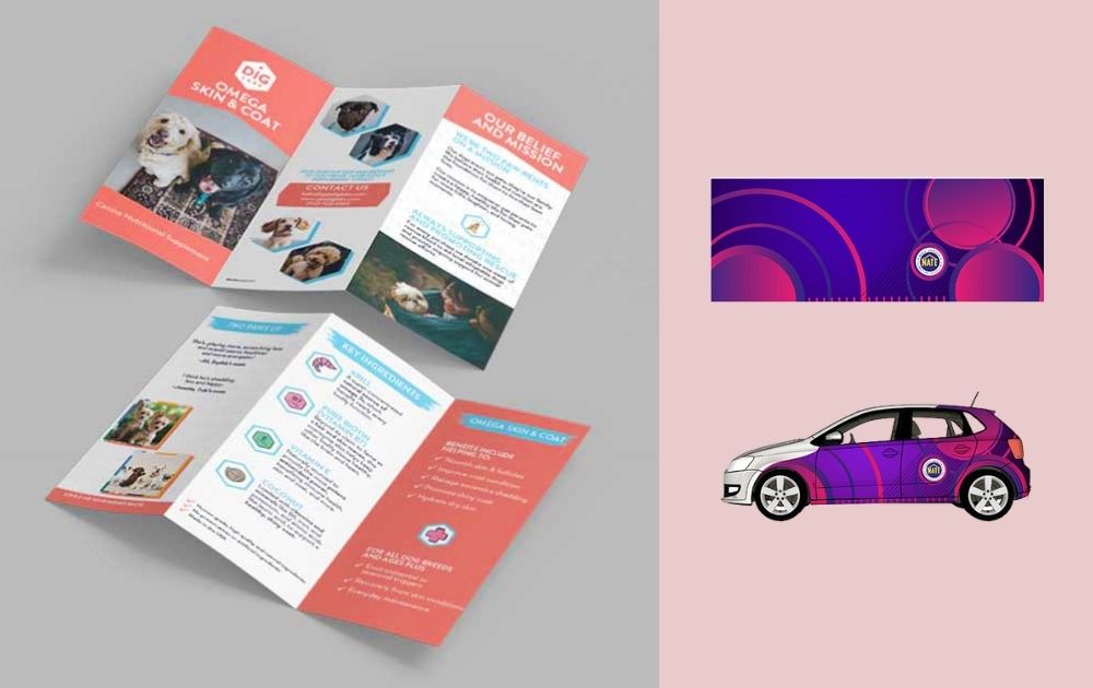
Simply put, promotional design refers to the design of items you use to promote your business. The examples I used at the beginning – mugs, pens, notepads – are part of this category. But promo design also includes other items apart from personal belongings. For instance, designs for vehicle wraps, posters, flyers, and brochures also fall under promotional design. Promo items typically include the company logo, contact info, and, sometimes, the tagline.
The concept of promotional design may seem simple, but it’s easy to fall victim to bad design that can harm your brand.
Mistake 1: Too Many Fonts
In promotional design, the text is supposed to deliver your message to your audience.
However, a design with too many fonts can overwhelm the viewer and look distracting. Aside from the number of fonts, a poorly-chosen font combo can also strain the vision. If you don’t plan your fonts well, your design will appear amateur – and that’s always a bad look for any business.
- How to correct: Pick a maximum of two to three fonts and ensure they complement each other.
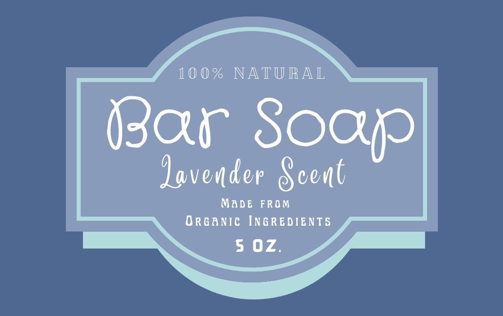
Mistake 2: Bad Color Combination
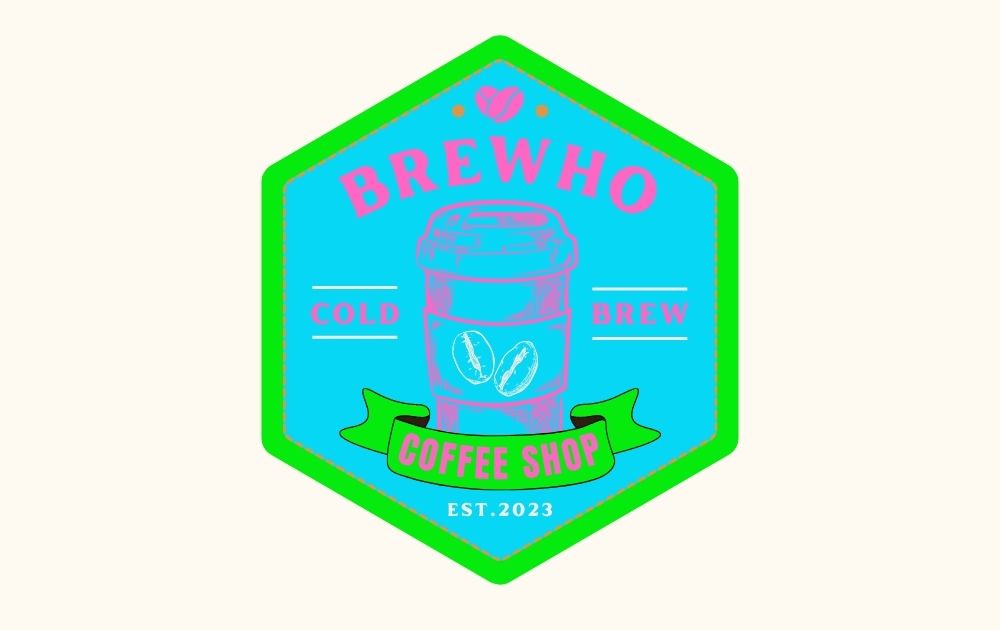
Some colors simply don’t mix.
Many businesses decide on color choices based on color psychology or other personal meanings. However, don’t pick a color one by one and simply expect them to work together. Clashing colors can make designs like branding mockups look outdated or, worse, tacky.
- How to correct: Be particular when picking your brand colors (you can use HTML color codes, for instance) and test to make sure they don’t cancel one another out.
Mistake 3: Wrong Color Mode
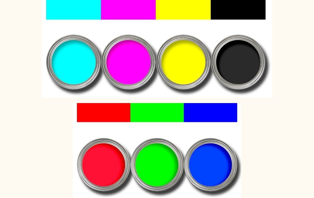
Once you’ve sorted color combinations, there’s also the color mode to consider.
There are two color modes to use: CMYK and RGB. CYMK, which means cyan, magenta, yellow, and key (or black), is typically for process printing. You can use this mode for flyers, menus, product packaging designs, and promotional designs like mugs, pens, and more. On the other hand, RGB is short for red, green, and blue and is used for designs that will appear on digital screens. You can use this for social media posts, website designs, and more.
- How to correct: Whatever graphic design editing software you use, ensure that you’re using RGB for promotional designs you need to print.
Mistake 4: Relying on Stock Images Alone

Using stock images is helpful for businesses until they aren’t.
Since just about anyone can use free stock images, relying on them too much can make your marketing materials look unoriginal, cheap, and unprofessional. You must remember that branding is all about building a unique identity. That’s impossible to achieve if you look like every other player in your industry.
- How to correct: Only handpick free vector designs or stock images that look most consistent with your brand and keep them to a minimum.
Mistake 5: Lack of Negative Space

Negative space is one of the most noticeable design elements that separate pros from amateurs.
Most design newbies feel the need to fill out the space in their design. And as a writer who needs to fill a blank sheet with words, I get it. However, loading every inch of space with lines, shapes, colors, and what-have-you can result in a noisy and cluttered promotional design. Though maximalism can be a compelling design principle in art, promo design is different. Clear and concise is always the best approach in marketing
- How to correct: Allow your design elements to breathe by having sufficient empty space between and around your subjects and texts.
Mistake 6: Not Enough Contrast
If your promotional design makes it hard for viewers to focus on the most important parts, you may have a contrast issue.
Contrast refers to the state of one item being strikingly different from another within the design. For instance, choosing a text color that doesn’t contrast enough against the background color can make an image dull. It also doesn’t allow the viewer to comprehend the design right away, making the design ineffective.
- How to correct: Ensure there’s enough contrast between various elements in your design, but be careful not to overdo it so as not to overwhelm the viewer.
Mistake 7: Poor Visual Hierarchy
One look at a great graphic design, and you’ll get its message right away.
On the other hand, if it takes you a while to digest and comprehend what the design is trying to say, then the designer failed to do their job. One common reason this happens is a poor grasp of visual hierarchy – the design principle of arranging elements according to their order of importance. Anchored on Gestalt psychology, this principle says elements with the highest contrast to their surroundings are recognized first by the mind.
- How to correct: Make sure that the most important texts or images are the biggest in the design.
Easiest Way to Avoid Promotional Design Mistakes
Let’s be honest: the easiest way to avoid promotional design mistakes is to leave the design to a pro. After all, as a business owner, you should be focused on growing your business—everything else you can outsource, including the design heavy lifting.
I could go on and on about the benefits of Penji’s unlimited graphic design and having the top designers work on your project. But it’s best to experience it yourself by signing up – there’s a 30-day money-back guarantee anyway, so there’s really nothing to lose.
About the author

Carla Deña
Carla is a journalist and content writer who produces stories for both digital and legacy media. She is passionate about creativity, innovation, and helping small businesses explore solutions that drive growth and social impact.
Table of Contents
- What is Promotional Design?
- Mistake 1: Too Many Fonts
- Mistake 2: Bad Color Combination
- Mistake 3: Wrong Color Mode
- Mistake 4: Relying on Stock Images Alone
- Mistake 5: Lack of Negative Space
- Mistake 6: Not Enough Contrast
- Mistake 7: Poor Visual Hierarchy
- Easiest Way to Avoid Promotional Design Mistakes


