
What makes a good outdoor poster ad? Is it a clever choice of font? Detailed art? Concise wording? Or is it purely trial and error?
In reality, it’s a little of everything. The colors, wording, shapes, and positioning you choose matters.
In order to create something successful, you must take inspiration from somewhere. Let’s have a look at some outdoor poster ads, from the small poster billboards to the massive banners. These advertisements tick all the boxes when it comes to OOH (out of home) marketing.
Tuscan Hills Winery Ad
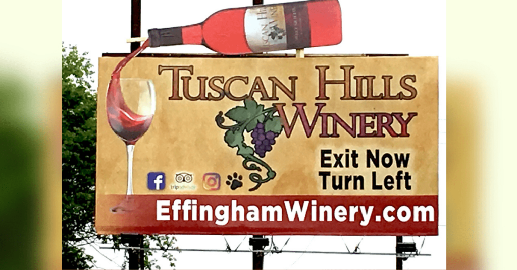
Perhaps it’s not the most professional poster here, but it certainly gets the job done. Sure, there definitely are a few things I would change about it. But overall, this Tuscan Hills Winery ad has an old, classic charm to it. The vintage font style, along with the hand-drawn illustrations is so rare to see these days. The cutout of the wine bottle and illusion of pouring wine gives it that extra spark, setting it apart from any other local winery.
This goes to show that even small businesses can achieve a nice outdoor poster ad.
Elm Grove Police Ad
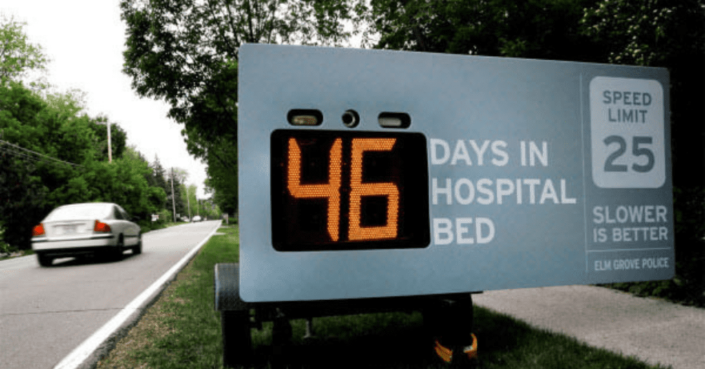
This outdoor poster ad speaks volumes on the issue of road safety. It simply says so much in an intelligent, creative way. Let’s start with the big yellow letters. This poster contains a motion detector which catches any vehicle going above the speed limit. Speeding on the road is such a dangerously common thing; sometimes you must remind people of the potential consequences.
To the right is a reminder of the road’s speed limit, along with the phrase; “Slower is Better” It gives drivers a lot to think about. Organizations that provide these important messages often receive high praise for their efforts.
[in_content_ads gallery=”logos” logo=”on” title=”Need graphic design help?” subtitle=”Try Penji’s Unlimited Graphic Design and get all your branding, digital, print, and UXUI designs done in one place.” btntext=”Learn More” btnlink=”https://penji.co”]
Coca-Cola Ad
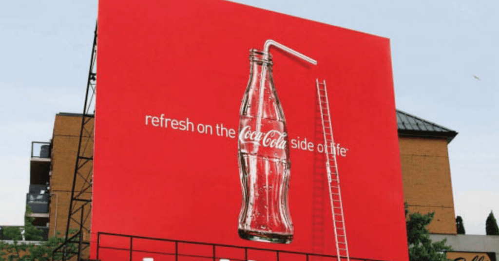
Here we have a classic Coca-Cola billboard. At least, it looks like a classic Coca-Cola ad when glancing at it. Of course, it doesn’t take long to notice that tall ladder leaning in this outdoor poster ad. Furthermore, the top part of the straw appears to be popping off the surface. It creates an interesting branch between 2D and 3D art. Finally, the bottle is empty, implying that someone with a billboard-sized thirst has passed by.
This advertisement is meant to convey the kind of lengths people will go to just to get that last sip of coke. The design contains a high-quality photo, along with a bright red color that alerts people.
Law & Order Ad
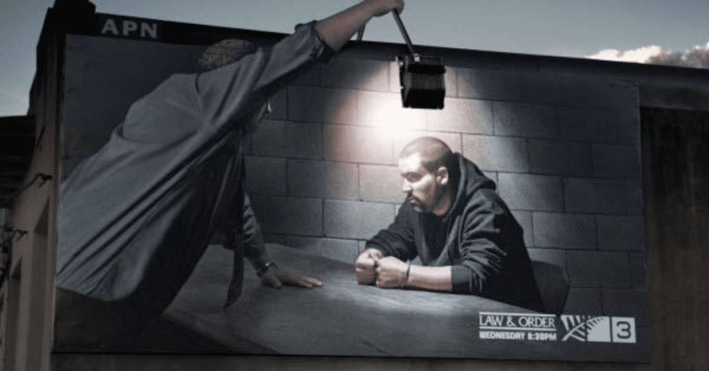
This Law and Order ad looks cinematic in the way it’s been executed. The haunting imagery portrays a suspect being questioned, with a light on his face. Speaking of light, let’s start with the obvious: this advertisement utilizes a cutout to make use of the street light. The outdoor poster ad is so mysterious, that it’s likely to provoke attention even in the night sky.
To top it all off, every logo is portrayed clearly, without cluttering the scene. In case you’ve got a lot of unanswered questions, it’s easy to take note of the show’s title, date, and channel.
IKEA Ad
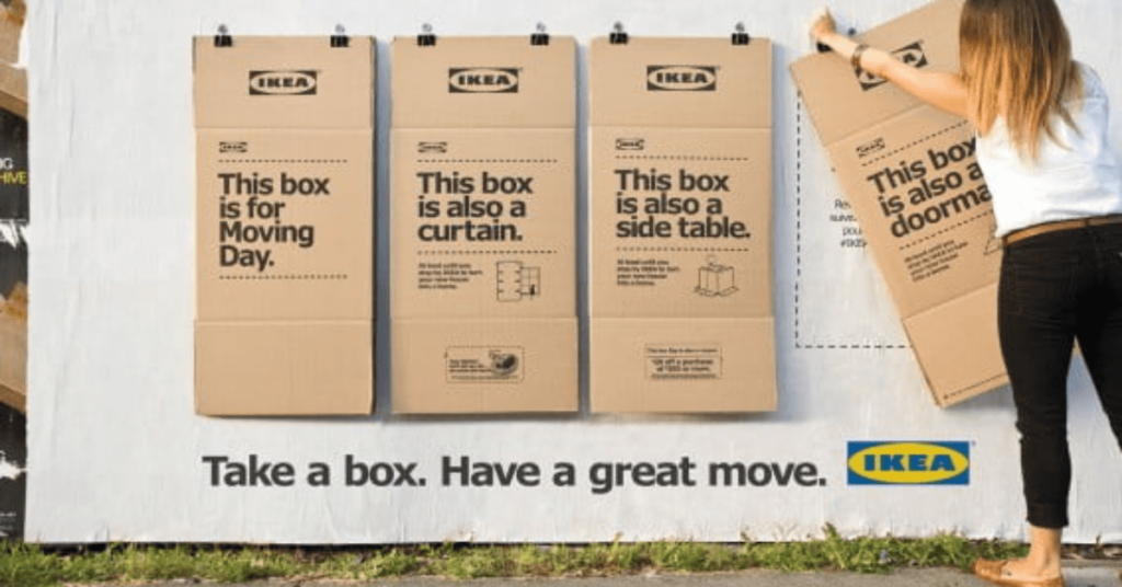
This IKEA advertisement had a perfect idea; why not give away free stuff? It’s a win for passersby, as they receive something helpful for their home. It’s a win for IKEA, as they gain more favorability and brand recognition.
You’ve probably noticed that this isn’t your typical outdoor poster ad. It’s also interactive, creating an engaging, innovative way to promote any brand. To top it all off, this can also triple as a form of wall posting. The different boxes function as their own individual poster, coming together to make one cohesive ad.
IKEA even crafted a thoughtful sentence to brighten your day. I don’t know about you, but the simple phrase “Have a great move,” gives me a warm, fuzzy feeling. It’s as if IKEA’s taking the role of a friendly neighbor, helping you move into a new space.
This goes to show that catchphrases and slogans don’t always have to be clever or humorous to work. They just have to invoke an emotional response.
Iced Coffee Ad
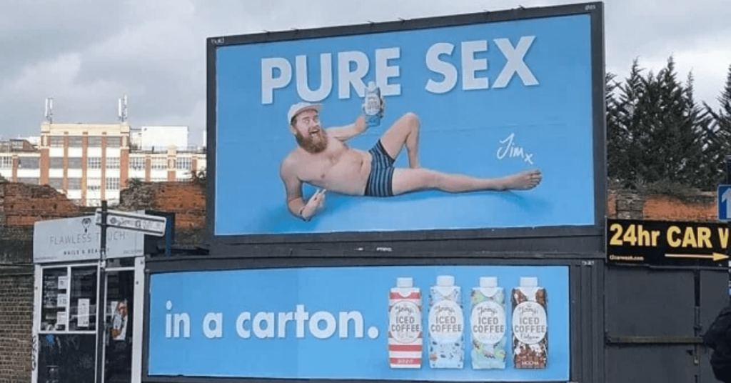
Hopefully, you chuckled as much as I did upon seeing this ad. Despite its humorous nature, there are many strategies involved here. You’ve probably heard the phrase “sex sells,” and that’s because it’s how people are hardwired. The topic of sex, in any scenario, is very effective in catching a customer’s attention.
The humorous imagery and wording is a nice touch that’ll make people remember this product. Not to mention the choice of a blue background, a color shown to build trust with the viewer.
Macallan Ad
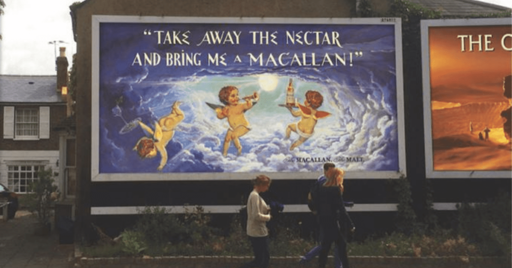
Here’s another use of a blue background, albeit in a different shade. The cloudy imagery paired with the angels is meant to arouse a calm feeling. This is exactly the feeling you want to inspire when advertising a beer. After all, people normally drink during recreational events, or after a long day of work. This outdoor poster ad gives them what they’re looking for.
I also want to note the sheer amount of creativity that’s put into this poster. The artwork and typography give off the appearance of an ancient Greek painting. This is known as nostalgia marketing, a method used to tap into positive, familiar emotions.
Google Phone Ad
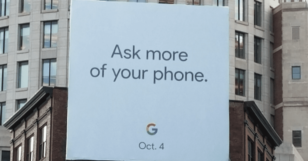
The Google ad is simple, but says it all. The phrase “Ask more of your phone” gives the viewer a sense of urgency. It inspires them to question the features on their current phone, and to become more demanding.
Notice how this sentence only contains five words. Especially when advertising to drivers, you want to convey a solid message in the span of a passing glance.
Pixel 4a
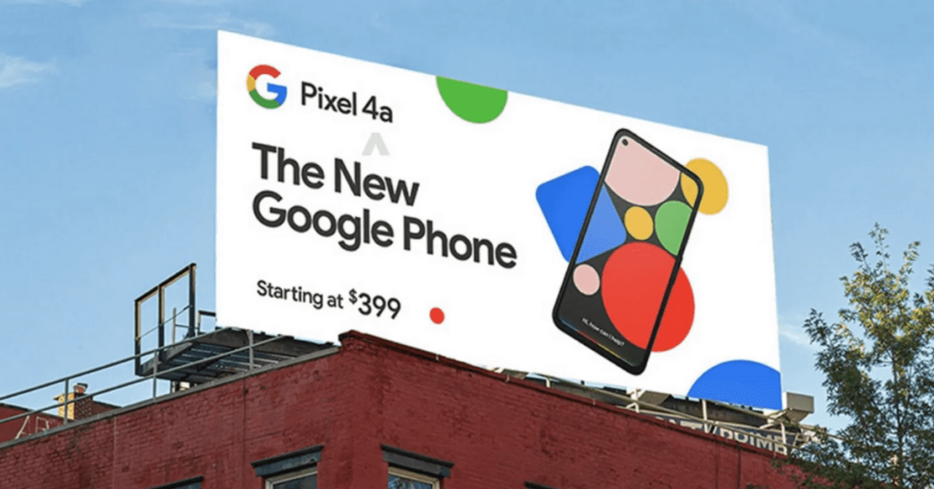
Here’s another, more vibrant Google phone ad design. This one also drives home its message with very few words. It contains an abundant amount of shapes and colors to make a splash against its white background. Still, it doesn’t get so elaborate that it distracts from the product.
Do you notice how this poster lists the cheapest price available? This strategy works to gain the customers’ trust, while also assuring them with an affordable price tag.
Rude Health Almond Drink
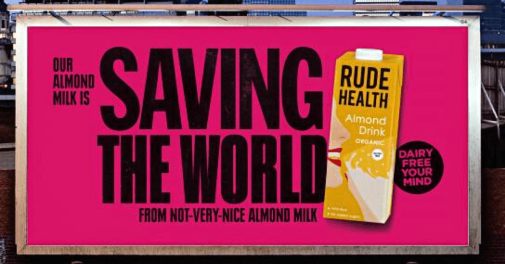
It seems that anything dairy-free, from cheese to carton milk, is very trendy at the moment. And that’s for good reason: it’s good for your health, it saves the animals, and it helps the environment. Though you’ve probably heard vegans and health nuts shouting this from the rooftops already.
This outdoor poster ad implies it all with a well-formatted catchphrase. At first glance, the average passerby will see the words “Saving The World” with an image of almond milk beside it.
When one stops to read the full sentence, they’ll find that this brand also makes good-tasting, quality almond milk. Not that bland-tasting, inauthentic stuff.
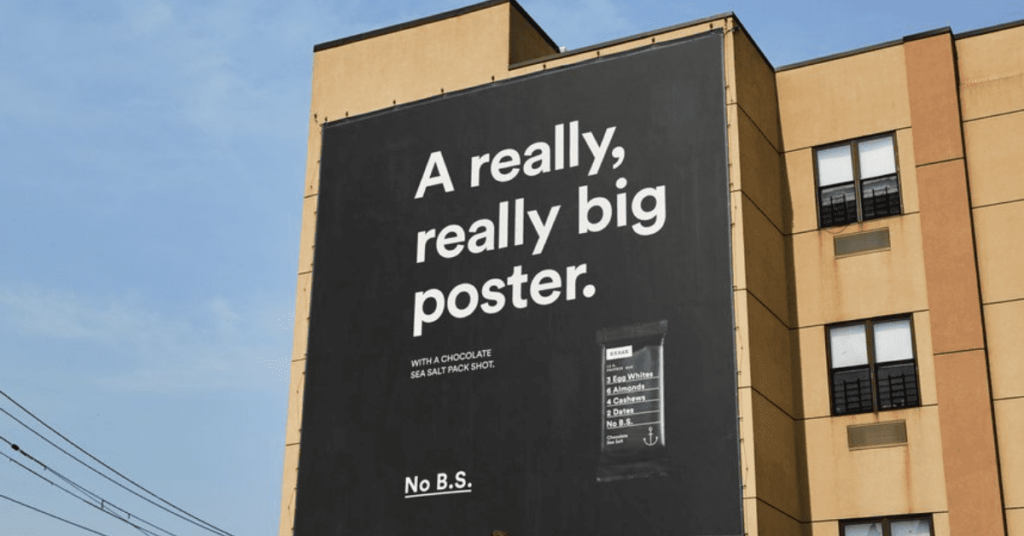
No B.S.
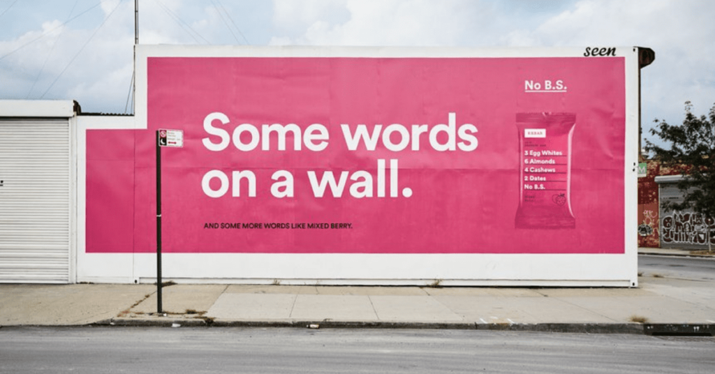
This poster may seem weird at first, but it effectively makes its presence known. No B.S. is a snack brand that provides healthy, simple snacks.
No B.S. advertises itself as something practical and straight to the point. It’s honest with what it has inside. Just look at the package: 3 Egg Whites, 6 Almond, 4 Cashews, 2 Dates. Nothing more, nothing less.
So, when they create outdoor poster ads, the brand decided to state exactly what it was: some words on a wall.
Another Ad From No B.S.
Here’s another outdoor poster ad from No B.S. Once again, it states exactly what it is. All on one poster. This campaign works well because it’s not afraid to get experimental.
Wii Sports
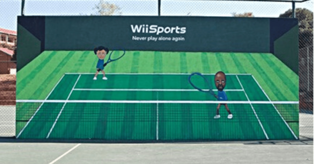
You may or may not recall the days of playing Wii Sports at home with the family. The Nintendo game may be old news in 2022, but it had a great advertising campaign. This is a poster planted within an outdoor courtyard.
The advertisement is not only engaging, but it targets people who are already interested in sports and outdoor recreation. It goes to show that location is everything.
Leica
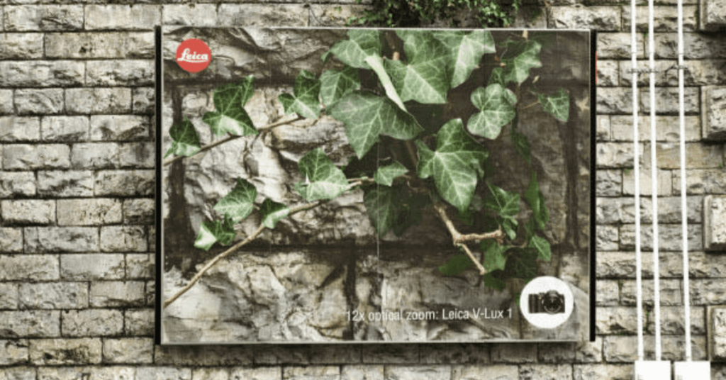
Take a look at this outdoor poster ad; it practically blends in with the rest of the wall. The unique camouflage design is enough to turn anyone’s head. Upon inspection, viewers will find that this is a camera advertisement; showing you exactly what the product does.
The amount of detail and quality in this photograph does all the talking. Sometimes, you simply must let the product speak for itself.
Apple + iTunes
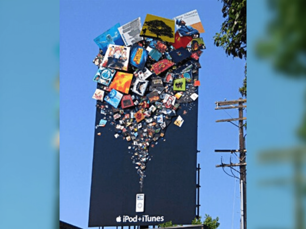
Of course, I’ve got to end this listicle on a hyper-creative note. Unlike other Apple ads, which sport a sleek and clean look, this one is an explosion of colors. It is noticeably artistic and innovative, made to stand out from a mile away.
Obviously, Apple could simply tell us that iPods provide an endless stream of music from various artists. Though they chose to show us in the most intriguing way possible.
It also uses recognizability as promotional material. Onlookers are bound to recognize some of these classic albums by Nirvana, No Doubt, The Notorious B.I.G., and more.
Get unlimited graphic designs on your schedule
Whether you need physical designs (eg. packaging, outdoor ads, business cards) or digital designs (eg. social posts, web or app designs), Penji has it covered. Our graphic design service radically improves your content output. If you’re ready to put your design process on autopilot, learn how it works here. There’s no risk and you cancel anytime without penalty.


