We Are Social revealed that over 70% of users shop on websites and apps. Big-name brands like Amazon and Etsy have become the go-to eCommerce platforms to buy and sell products. But your online store shouldn’t be overlooked by your target audience. You can differentiate yourself from the rest with a compelling logo! If you’re looking for online shopping logos, here are ten examples from actual brands. Plus, check out the logos our designers made too!
Additionally, here‘s how else Penji can help your business!
1. Moonglow
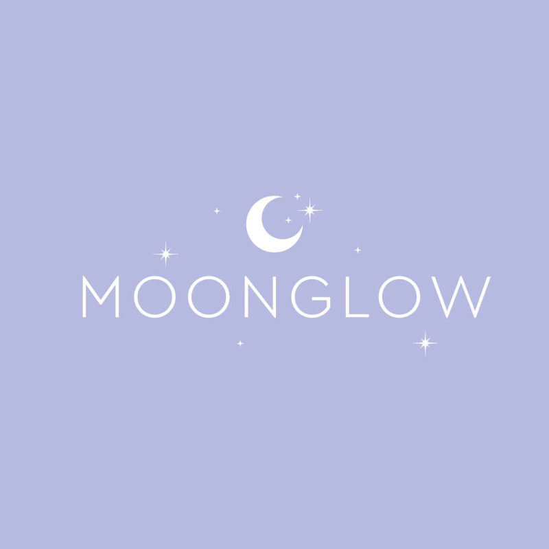
Make your logo look like it’s shining like this one for Moonglow. Although you might want to go for neon to achieve the glowy effect, adding starry elements like the Moonglow logo can still make your logo shine or dazzle. Going back to the Moonglow logo, the logo is relevant and simple too. Their logo also represents the products they sell: jewelry. While browsing through their products, the logo tells us that the person wearing any of their products will feel like they’ll shine or glow.
2. Clove
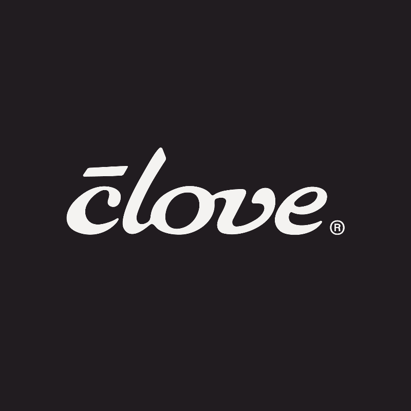
The Clove logo is a reminder that you should keep your audience in mind at all times. To describe their logo, you need to read their story. Medical professionals will understand that a horizontal line above the C means “with.” Their logo is a clever way of telling medical professionals that they have products specifically made and designed for them with love.
3. Effin’ Good Snacks
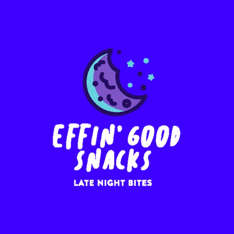
Your logo symbolizes your brand visually. And the Effin’ Good Snacks logo shows us what they’re selling from the get-go. Since they’re selling cookies as midnight snacks, the cookie in the logo is shaped as a moon with crumbs as little stars. Overall, it’s a relevant, unique, and simple logo that you can use as inspiration for your online store logo.
Do you want to see more creative online shopping logos? Check out what our Penji designers have done for our clients here!
4. JOI
Make someone smile with a logo like this one from Joi. It’s a great way to make a wordmark logo look dynamic and fun. It can increase intrigue, and they’ll want to learn more about what you can offer. And by having the soft curves in their logo, it could symbolize that they’re approachable, friendly, and trustworthy.
5. Field + Farmer
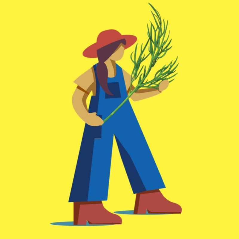
Food logos would usually have mascot logos to represent their brand. Wendy’s and KFC are two prime examples of those. Here’s another way to integrate a mascot or character into your logo and present your brand identity to your audience. The Field + Farmer mascot represents the people behind their products and their hard work to provide their consumers with a healthier alternative to most mass-produced food.
6. Pezzy Pets
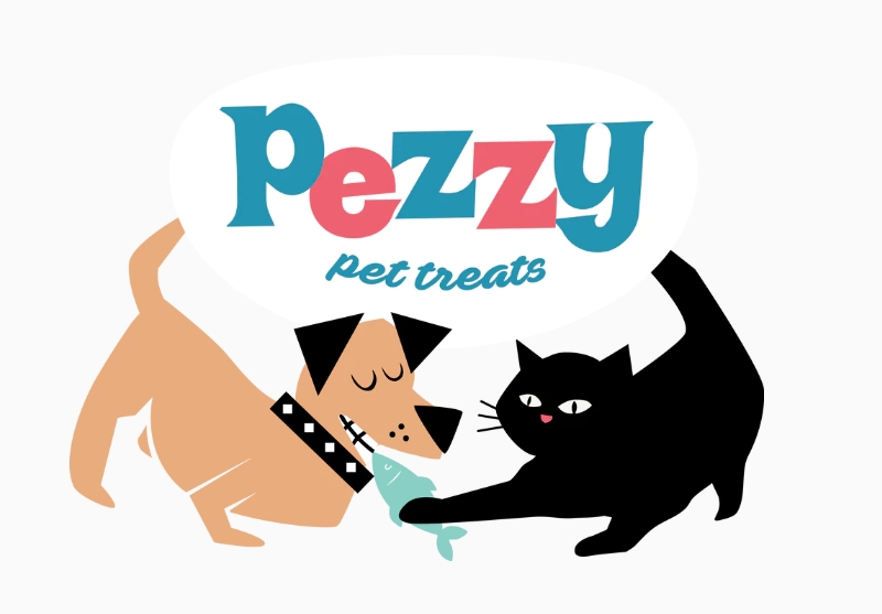
Great logos have the best stories to tell. Pezzy Pets is one of them. You’ll know at first glance that it’s about pets, but if you look closely, you’ll see that the cat and dog are fighting over fish. The fish represents the products they sell and the farmers that catch the fish. Their logo already creates a story that pets can’t get enough of their products.
7. A Dozen Cousins
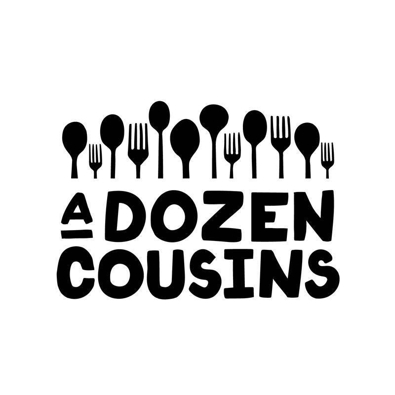
Here’s another logo with an interesting history, taking inspiration from their culture. A Dozen Cousins sells food. And to make their online store attract attention, they have a combination logo, using utensils and a wordmark of their name. The utensils represent the founder’s daughter and her 11 cousins, symbolizing their community and love of food. Plus, the logo font could signify their approach to sharing healthy and delicious food with many people and underserved communities.
8. Power Up Foods
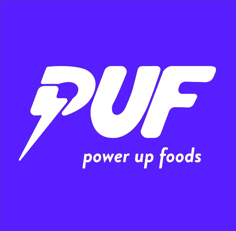
Get energized with this logo from Power Up Foods. With so many food products, whether online or in stores, you want one that will make customers stop and know what you’re offering. The Power Up Foods logo combines a wordmark and letter mark. But the letter mark has the symbol for lightning, making you feel like you’ll have a boost of energy even before you eat their food. Although red and orange would whet one’s appetite, Power Up Foods positions itself as a trustworthy brand for its cookies or brownies.
9. The Cushion Lab
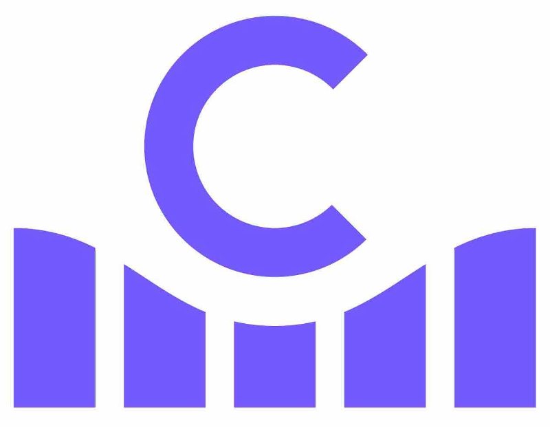
Provide comfort even in your logo like this one from The Cushion Lab. Their combination logo shows us that even before we use their products, one will feel relaxed or comfortable because of the imagery. The color further adds to this feeling since blue makes one feel peaceful or calm. And with this color, The Cushion Lab could represent that they are a reliable company and provide calm and comfort to their customers.
Want to know why many customers love and rely on Penji for their designs? Read here why over 1000+ clients love partnering with Penji!
10. The Very Best Cookie in the Whole Wide World
If your company name is long, most logos will go for a letter mark for their logos. But if you’re adamant about including all the words in your name in a logo, why not look at this unique logo from The Very Best Cookie in the Whole Wide World?
They lucked out with the name of their logo and the product they’re selling since they shaped it into half a cookie. And their logo stands out because they didn’t use any illustrations or drawing on their logo. They actually used a picture of their cookie on it. Overall, this is one of the few online shopping logos that caught our eye.
Online Shopping Logos Made by Penji Designers
Did you like looking at these online shopping logos? You should look at what Penji designers can do for your company. Here are some fantastic examples made by our very own professional logo designers.
11. Diamour
Go with an elegant yet minimalist style like this logo for Diamour. Most jewelry logos would also have the same style as the Diamour logo. But to catch your audience’s attention, you can make the diamond look more prominent with a luxurious look. This tells your audience that you’re selling luxurious jewelry. Plus, the font adds to its elegant style since serif fonts bring a classy look to any logo.
Want to see how you can get a logo on Penji? Sign up for a demo to see how easy it is to request a logo.
12. Geek Pad

If you’re selling electronics in your online store, why not use the Geek Pad logo as inspiration? The G in the logo looks like a mouse, representing the electronics the online store sells. Plus, the logo exudes a modern look, which you’ll see in most online store logos selling electronics. It’s a way to connect with the target audience and that they’re always selling the latest gadgets.
13. Home Haven

Most furniture logos would have the couch as their symbol, and it’s the best way to show it. However, you can make yours different with an abstract logo like this one for Home Haven. It still has the couch as the symbol, but it’s shaped in a different way. The added cursor tells us that Home Haven is online, and you can buy furniture with just one click on their website.
14. Outfit.ly
Clothing brand logos would usually be a wordmark logo. Most of the time, it would be the designer’s or company’s name. But to stand out from the rest, you can make it a combination logo like this one for Outfitly. And unlike most clothing logos, Outfitly uses yellow to stand out from the rest, and it would be easier to catch people’s attention with it.
15. Beauty Shack
If you’re selling beauty products, check out this logo for Beauty Shack. Femininity is a common theme in most beauty products, and this one’s no exception. There’s an image of a woman with long hair. This represents the products they sell, like shampoos or any hair products. This is another excellent example of a relevant and simple logo to deliver your brand’s message.
Here’s How Penji Can Help You
Did any of these online shopping logos inspire you to get one yourself? You can stop your search! Penji can design and produce logos for your online shopping business. Not only that, you can submit design projects anytime you need them! To do that, you need to subscribe. And you can select a plan here!
In addition, you can also visit our Marketplace to get one-off designs for your online business. Get your logo here today!
About the author

Katrina Pascual
Katrina is a content writer specializing in graphic design, marketing, social media, and technology. In her spare time, she writes monthly personal blogs to practice her craft.
Table of Contents
- 1. Moonglow
- 2. Clove
- 3. Effin’ Good Snacks
- 4. JOI
- 5. Field + Farmer
- 6. Pezzy Pets
- 7. A Dozen Cousins
- 8. Power Up Foods
- 9. The Cushion Lab
- 10. The Very Best Cookie in the Whole Wide World
- Online Shopping Logos Made by Penji Designers
- 11. Diamour
- 12. Geek Pad
- 13. Home Haven
- 14. Outfit.ly
- 15. Beauty Shack
- Here’s How Penji Can Help You

