When you’re starting a new business or brand, one of the initial things that pops into your mind is the logo. It’s like the building block of your brand identity. If you get it right, you’re already making a powerful statement to your target audience. However, logos aren’t set in stone. They should be enduring, but there may come a point when an update or change is needed. It’s really important to adapt your logo to stay current with the times. After all, trends do change!
Need an awesome logo for your brand? Check out Penji for unlimited graphic design services or one-off logo designs.
When to Change Your Logo?
Before we share with you the list of companies that changed their old logos, it would be beneficial to know when the best time is to change yours. Here are the top reasons:
It Looks Complicated
Is your company’s old logo too complicated? Do you see a lot of details and elements which are quite hard to scale down? If yes, then you might want to change yours to a simpler version. By doing so, it is easy to place and print your logos on different materials and merchandise.
It is Obviously Outdated
Take note that this is not an absolute rule. Using an outdated logo can sometimes be beneficial, most especially if your logo stood the test of time. Simply put, it depends on the nature of your business.
For example, if you are in the tech industry where things change really fast and the approach must always be updated, redesigning your logo must be considered. For other industries such as fashion, classic designs always work. Take a look at Louis Vuitton. Again, it depends on how strong your logo is and if it still conveys a strong message to its targeted market.
Are You Changing Your Market?
Another reason why you need to change your logo is if you are switching your market. Are you trying to serve a different location, or would you like to target younger generations? As always, you have to match your logo design with your demographics.
Companies That Changed Their Old Company Logos
Even established businesses and brands are updating their logos. Here are some of the most popular ones that made a mark.
Amazon


Amazon started selling books before it became the e-commerce giant we know today. Their first logo looked like an ‘A’ that resembles a river. But in 1998, they already took the direction of a simpler and more direct company logo design. Their newest company logo uses a thicker typeface with their iconic ‘smile’ at the bottom. It clearly sends the message “delivers smiles to doors”.
Apple
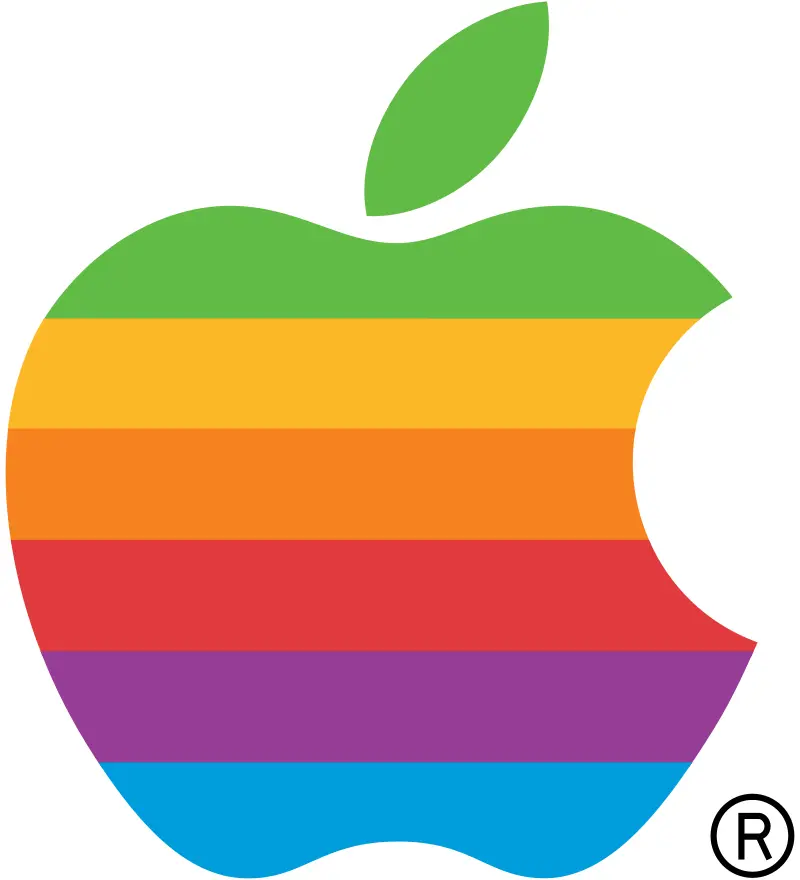
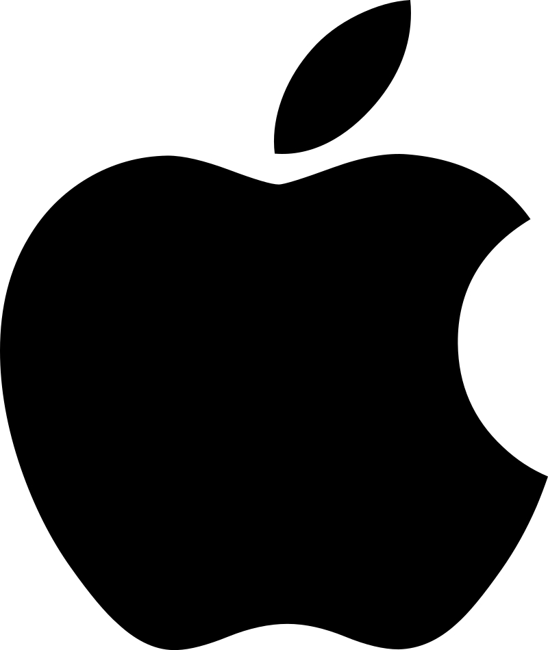
The bitten apple is a symbol of lust, knowledge, hope, and anarchy according to Jean-Louis Gassée.
Who couldn’t identify that logo, right? But did you know that years ago, the old company logo looked a bit different bearing various colors? This proves that you don’t have to make a drastic move if you want to change your logo. Changing its colors can already create a big impact. Apple opted for a monochromatic style that is smarter and sleeker. This is perfect for its target market.
Coca – Cola
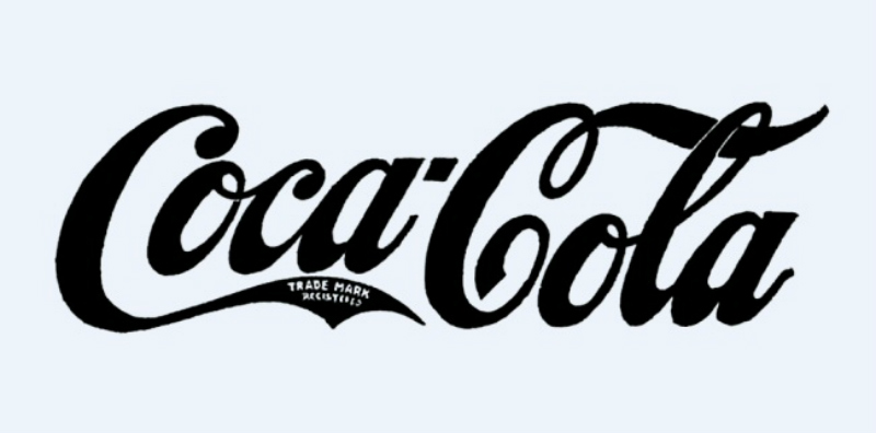

Coca-Cola is definitely one of the longest and most successful companies in the entire world. With more than 130 years under its belt, their logo has changed over time as well.
In 1887, the company has already used the familiar and iconic typeface. But they also attempted to make their logo dramatic. It failed and they changed it back after a year. Until now, the classic look of Coca-Cola remains, only changing bits of it depending on the trend and occasion.
Now, if your brand is anchored or has a rich history, it wouldn’t hurt if you use the classic version of your company logo. It definitely has a story of its own.
Lego
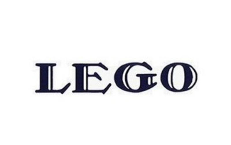
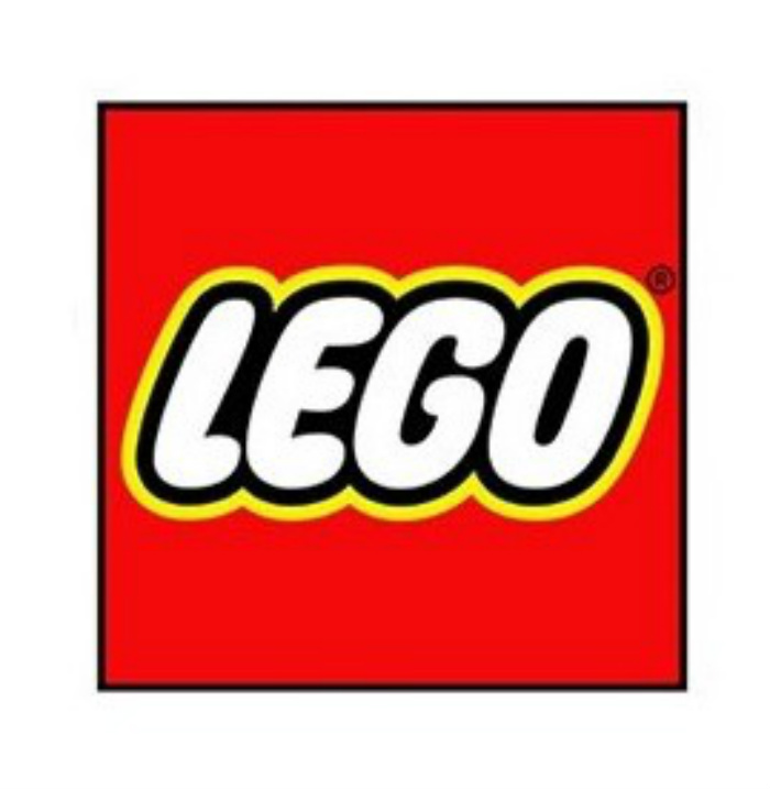
Lego’s logo (don’t get your tongue-tied) was far more different from what it originally was. Lego started with wooden toys, and their old-school design was timely at that period. However, as they changed their market and offering, they also had to redesign their old company logo. Obviously, their new logo looks more playful, childish, and appropriate for their demographic.
Mozilla Firefox


We’re pretty sure that everyone would agree that the first Mozilla Firefox’ logo was a flop. It is definitely a good move that they started being more creative. They made different elements fit into one strong logo. And according to sources, they are bound to change it to something even more stylish. We are pretty excited!
Nike
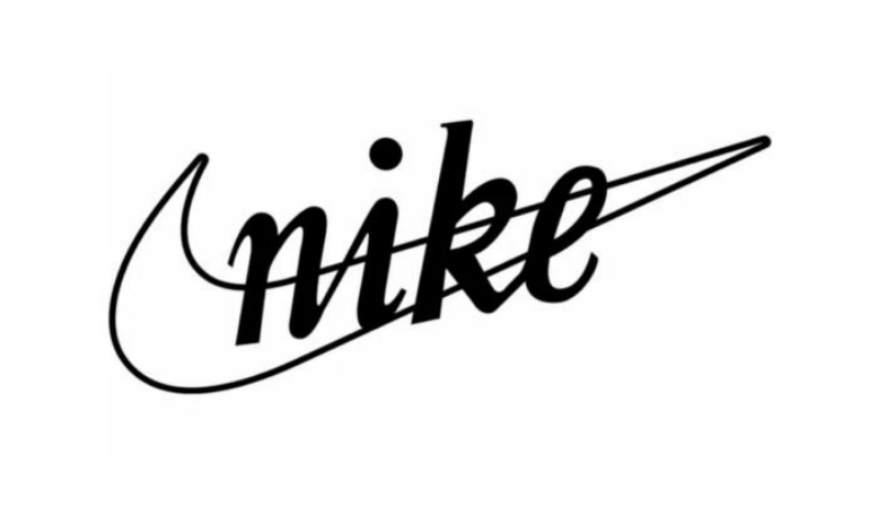
Did you know that the famous check we see on Nike has actually a deep story? It is believed that the symbol resembles the wings of the Greek Goddess of Victory. Over the years, they only changed the typeface and font to match the symbol. But what they didn’t change and probably won’t is the iconic ‘check’.
Nokia
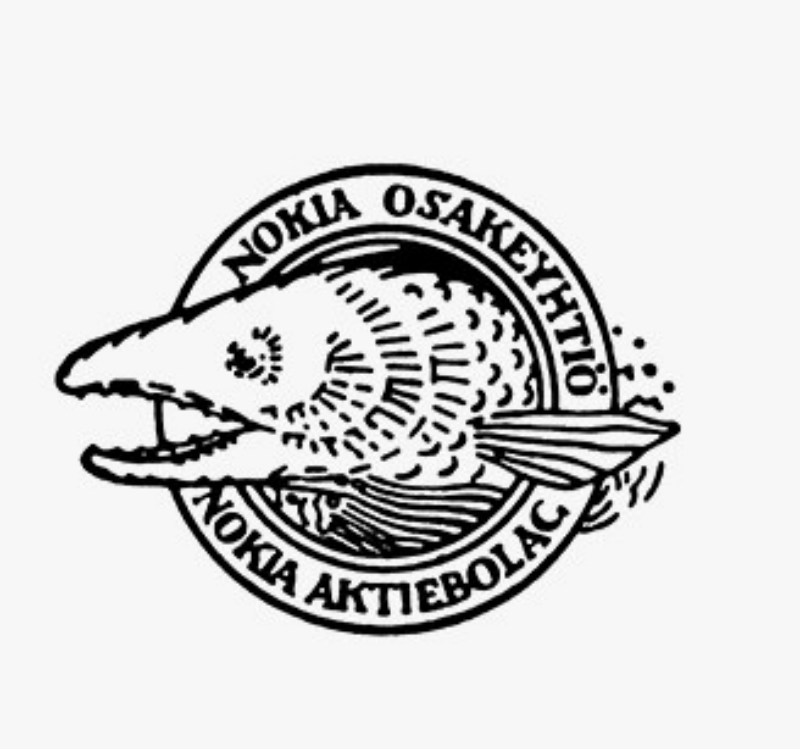
We are already in the age where simplicity and direct approach wins. When it comes to redesigning your new logo, the same principle applies. Take, for example, Nokia.
In the early days of the company, they had fish in their logo. Yes, you read that right – a fish!
According to experts, the fish is actually a reference to the river located near Nokiavirta. It manufactured paper at that time. But when things got bigger, they left the fish and focused on the name of the company. And if you notice, they used complementary typeface and fonts for the company name and their tagline.
Starbucks

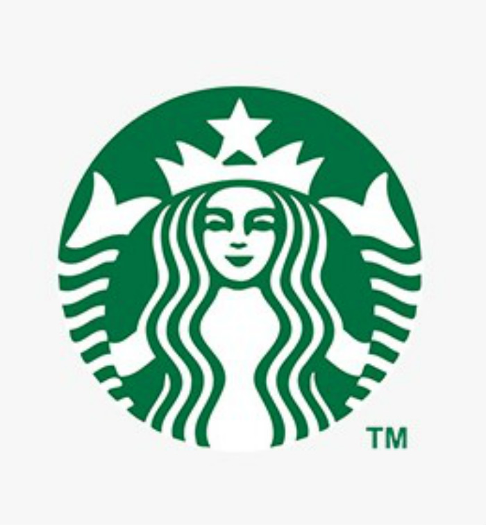
Starbucks was already using the famous mermaid in its logo even in the early years of operation. But during that time, it was bare, bold, and ‘breasts’! It was meant to be seductive. Fast-forward, they kept the mermaid but used a more modern and subtle approach in its design. Apart from that, they added color instead of a dull black one.
Take note though that a few years ago, Starbucks tried to use its original design but it proved to be a mistake. This teaches us to listen to the market. Perhaps you have a great vision for changing your logo, but if the market doesn’t like it, don’t push it.
What Have We Learned From These Logo Design Changes?
Logo redesign is always a possibility. Even if you are a big and established brand, your visual representation can actually affect your business. Thus, it is always good to watch out for trends, try new things, be experimental and listen to what your market thinks. If your new company logo doesn’t sit well, then think of it as just part of the process and conceptualize a new one.
New Logo Trends for Your Company
Speaking of trends, you might want to consider the following if you plan to redesign your company logo this year.
Cartoon Style
Most people today are attracted towards simple yet playful cartoonish logo. Flat designs and even doodles are good and timely as well.
Black and White Logo
This year, black and white will still be in. If you are not yet sure about using bolder colors, then creating a black and white logo might work best. Again, you probably need to think of an icon you can use for years. Think about Nike and Apple’s iconic images. This can definitely improve the visual appeal of your logo design.
Play with the Letters
You can always use the letters of your brand. But don’t forget to be creative when doing so.
Simple Geometric Logos
Minimalism is still here! Try to use simple lines and shapes when creating your logo. You might want to understand how shapes can influence people, similar to what colors can do to our perception.
Conclusion
Creating a logo is not just art. It should be logical and backed up by market research. A non-expert might have great ideas but it will take an amazing graphic designer to make it a reality. Now, speaking of graphic designers, Penji has a team of highly-skilled and highly-trained professionals that can help you improve your old company logo. Sign up now, and get unlimited graphic design services or one-off logo designs.
About the author

Barbara Anne Isla
BA Isla is a Content Writer and also an Events Host. She left the corporate world to do what she loves and to spend more time with her amazing kids. She hopes to bring valuable change to society with her words.


