

The New Year is a cause for celebration. Whether you’re hosting a small gathering or a big event, you want everyone to get pumped up to say hello to the year ahead. And if you want people to join in the festivities as we countdown to the start of the new year, why don’t you try using posters to promote your event? After all, posters are a cost-effective solution to advertising events. And to show you how effective New Year poster designs are, here are eight poster design ideas to get you started.
Plus, give your posters a great look with these FREE graphics from us. Give life to your New Year’s Eve posters with repeat patterns and character illustrations that ring in the New Year. And make your poster more festive and attract customers or event-goers. They’ll surely get in the spirit of the New Year once they see it. Download your freebies here.
1. Legible from a distance
Let’s start with the very basics. Posters generally inform and invite people to an event. So always ensure that you include the three most important details:
- What the event is
- When the event is
- Where the event is
Once you establish these, put all the information in an easy-to-read outline. Make sure that even someone from a few feet away can read the information. Legibility is the first factor that defines the effectivity of a poster. If your poster can stop someone in their tracks, then congratulations, you’re on the right path.
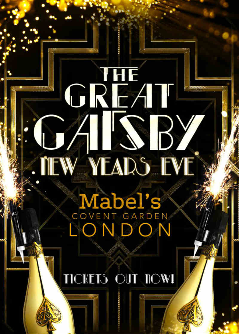
This New Year poster has a visual hierarchy on it. It ranks the information according to importance. First, the type of event, then when the event is, and below is the location. Despite that, the headline is still the most prominent over all the other elements.
2. Contrast to grab attention
There’s no rigid rule on choosing the right New Year poster colors. However, contrast does help to make the posters stand out. Pair bold and soft colors, thick and thin fonts, or plain and decorated background just like this example.
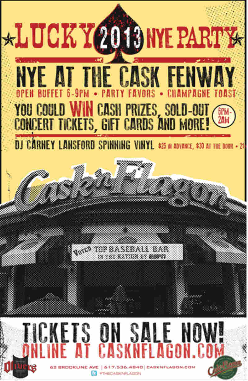
It has all the makings of a successful event. The use of contrast alone is staggering. From the red and black font against a yellow background to the divided solid background and image, the entire ensemble is eye-catching.
3. Colors to set the mood

New Year’s Eve parties are all about countdowns, flowing cocktails, and of course — fireworks. Set the mood right at first glance and bring out all the jovial colors that represent the season. If you put out a dull, monochromatic poster, it also gives the notion that the event is drab. And this might put partygoers off.
New Year events are supposed to be merry and explosive. This example made use of New Year elements like balloons, fireworks, and colors that evoke passion, energy, and excitement.
4. Eye-popping typography
Typography is essential in poster design making. Not only does it fasten the entire design together, but it also brings out the creativity of the design. Sure, you can use the mundane font styles and let the images speak for the texts. However, you can always amp it up through unique typography.
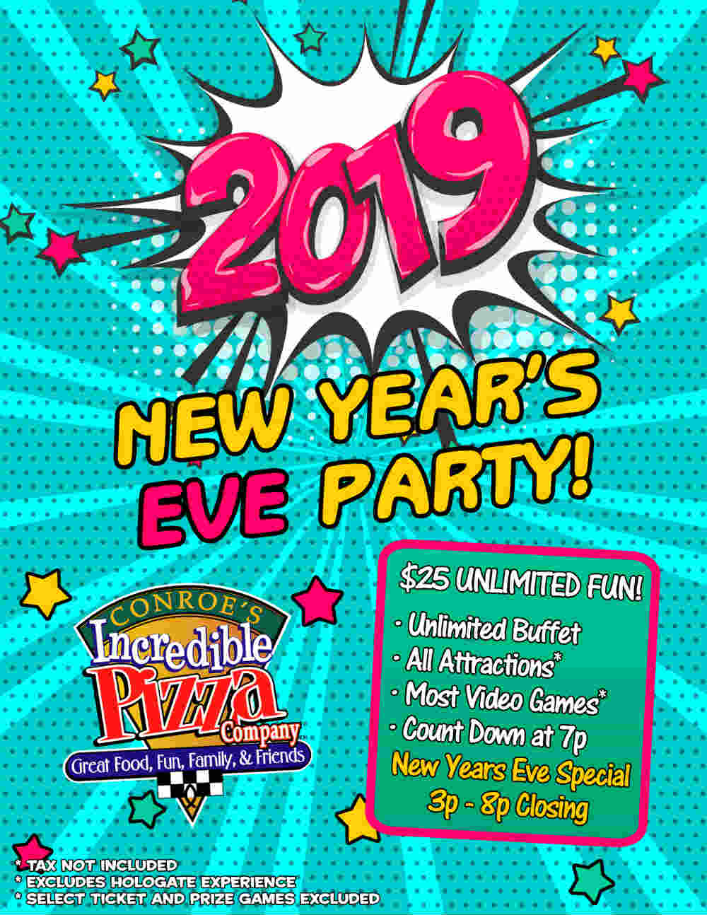
This template from VectorStock could be a fun way to integrate into your New Year poster designs. This type of font might be more suitable for formal galas and events. On the contrary, this Conroe’s NYE poster exudes a more casual vibe perfect for non-black-tie events.
5. Negative space to relax the eyes
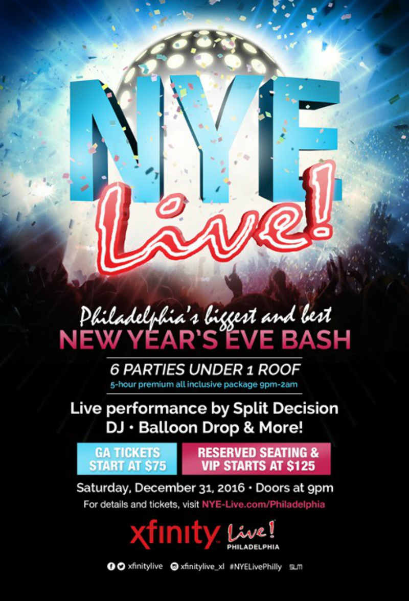
In general, negative space is essential in design. They allow for creative composition and subliminal messages. Take a look at FedEx’s logo. The company utilized a negative space between the ‘E’ and ‘X’ to form a small arrow. And as a courier service, an arrow is a quintessential symbol for fast, forward, or progress.
Another purpose of incorporating white space on your poster is to let the viewer’s eyes relax. And going back to your New Year’s Eve poster here’s one that uses white space under a handful of different elements. The disco ball, headline, details, and people all mesh well together because of the negative space. A viewer can quickly scroll down from the top to the bottom of the poster while still grasping the entire graphics.
6. Humor
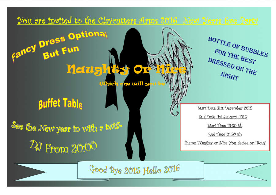
Set the party mood the right way and incorporate humor into your New Year’s Eve poster. Any funny question, remark, or word can incite positive emotions to your audience.
Take this New Year’s Eve costume party poster, for example. Although the font and the layout need a bit of tweaking, the poster emanates fun and excitement. The question, “Naughty or nice, which one will you be,” is a perfect way to make the guests ponder and get them interested in what they’ll possibly wear during the event.
7. Balance is key

Always ensure that the poster has perfect symmetry. When we say symmetry, the NYE poster doesn’t have to be the same on both sides. It means the entire layout should have a synergistic balance.
For example, one side shouldn’t have all the graphics or text. You may distribute all the elements on different sides as long as they maintain good harmony. The poster above is the ideal example of symmetry with a touch of creativity.
It may seem like the poster has an invisible verticle division. However, the positioning of the texts on the right and the image on the left creates a harmonious balance. Overall, the design is clean, uncluttered, and unique.
8. Include a call to action
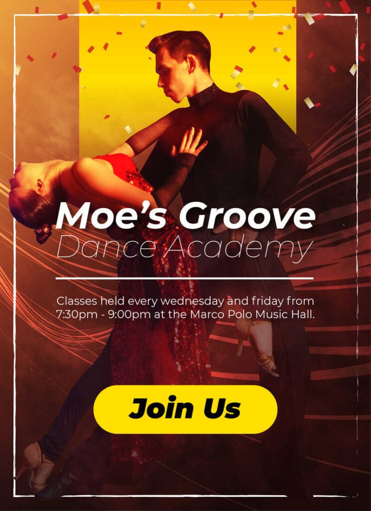
Moe’s Groove is a dance company that celebrates the arrival of the New Year with a vibrant salsa event poster that ignites excitement. This New Year poster design infuses festive colors, such as energetic oranges, lively yellows, and fiery reds to evoke the spirit of Latin dance. Moe’s Groove features a dynamic dance couple, immersed in the rhythm, that could dominate the center, exuding passion and movement.
The New Year poster design is illuminated with bursts of confetti and energetic swirls, conveying the joy of the occasion. The company was smart enough to employ sleek, modern fonts for event details, capturing the dynamic essence of salsa. This New Year’s poster promises a night of sizzling beats and spirited dancing, inviting revelers to welcome the year with a vivacious rhythm and color. Finally, the call to action that says, “Join Us,” in bold black text looks prominent against the lighter background color.
9. Create a visual hierarchy
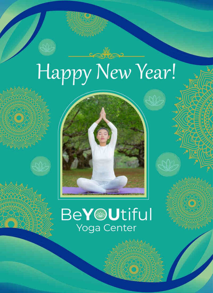
Celebrate the dawn of a new year with this vibrant New Year poster design from a yoga center, BeYOUtiful. The design exudes festive cheer through a harmonious blend of joyful colors like deep blues, calming greens, and energizing gold accents. Employing a thoughtful visual hierarchy, the poster prominently features a serene yogi in a celebratory pose, radiating positivity and well-being.
Surrounding details, such as softly floating mandalas and the yoga center’s emblem, gracefully complement the central image. With a perfect balance of festive elements and tranquil aesthetics, this poster invites individuals to embark on a rejuvenating journey into the new year at our welcoming yoga center. The heading at the top greets “Happy New Year!” to all of BeYOUtiful’s target audiences.
10. Create a dominant focal point
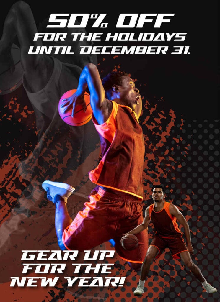
This is a New Year poster design for a sports and retail goods store promoting their holiday discount the entire month. A dark color palette sets a sophisticated tone, while vibrant New Year hues infuse energy. The focal point centers around an action-packed sports moment, showcasing several athletes in their element. The poster’s heading at the top is prominent and legible which reads “50% off for the holidays until December 31.”
Imagery captures the essence of athleticism and determination. Bold typography in contrasting colors heralds the arrival of the New Year and highlights special promotions. The synthesis of dark tones and festive accents creates a visually striking poster, inviting customers to gear up for a year of fitness and style. It’s a powerful blend of sporty vitality and seasonal cheer.
11. Choose huge visuals
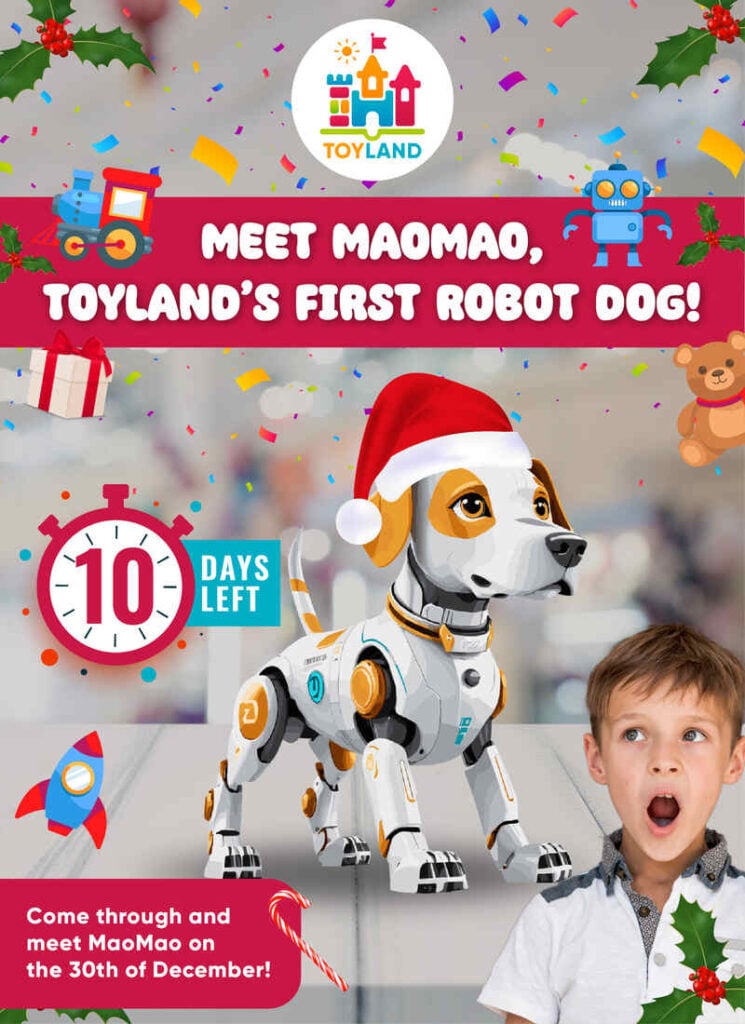
Ignite joy in the hearts of little ones with a lively New Year product launch poster for Toyland. This toy company for children launched its innovation, a robot dog. The robot dog is displayed dab smack in the middle of the poster, compelling viewers to look because it dominates the entire poster design. It features a whimsy design that looks playful, with the robot dog donning a festive hat. The heading at the top reads “Met MaoMao, Toyland’s first robot dog!”
A vibrant explosion of confetti sets a celebratory tone, mirroring the excitement of new toys. Bold, child-friendly fonts announce the event, promising a world of imagination and discovery. A countdown clock teases the unveiling of the latest additions to Toyland’s enchanting collection. This fun-filled poster promises not just toys but a gateway to a year brimming with laughter and endless adventures in the magical realm of childhood. Lastly, an invite to visit the store is written under all the graphics and text. The call to action says “Come through and meet MaoMao on the 30th of December!”
12. Consider a minimalist design
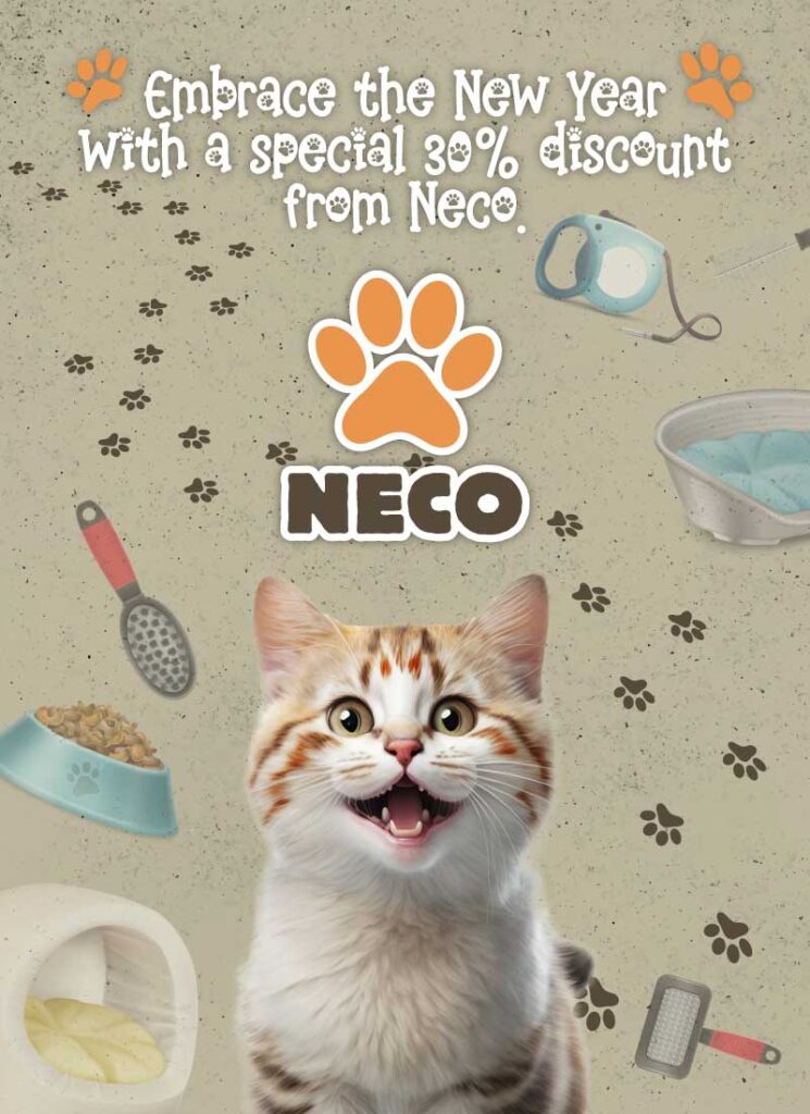
Celebrate a pet-friendly New Year with Neco’s sleek and minimalist poster design from Neco. Selling pet toys, supplies, and accessories, Neco creates the stage by adorning subtle paw prints forming a whimsical pathway. This pathway goes from the top to the bottom of the poster. The top heading says, “Embrace the New Year with a special 30% discount from Neco.”
Soft, muted colors evoke warmth and simplicity, ensuring the focus remains on the promise of a fresh start for pets. Neco’s New Year promotion, delicately hinted through understated elements, invites pet owners to embrace the coming year with style and thoughtful care for their beloved companions.
Final Thoughts
Give the New Year poster-making some thought before delving into multiple ideas. Always communicate with your graphic designer about the minor elements. This way, the process will go smoothly, and printing hundreds of them on paper won’t go to waste.
A pro tip is to keep your target audience in mind when creating the NYE poster design. This is to make sure that all the graphical features resonate with your target market and possibly make for a huge turnout.
About the author

Table of Contents
- 1. Legible from a distance
- 2. Contrast to grab attention
- 3. Colors to set the mood
- 4. Eye-popping typography
- 5. Negative space to relax the eyes
- 6. Humor
- 7. Balance is key
- 8. Include a call to action
- 9. Create a visual hierarchy
- 10. Create a dominant focal point
- 11. Choose huge visuals
- 12. Consider a minimalist design
- Final Thoughts


