
Let’s face it: when you’re marketing a tech product like an app, looking outdated isn’t an option. After all, you’re not just trying to sell a service. You’re marketing an innovation that’s supposed to make their lives more convenient and comfortable.
That said, modern UI design is not just a nice-to-have; it’s a must.
Data tells us that users spend 90% of their mobile time using apps. And with more and more brands launching well-designed apps every day, you need to step up your game if you want a slice of the pie.
In this article, we’ll discuss why high-quality UI design services matter and how UI coincides with UX (User Experience). We’ll also look at awesome UI design ideas, including those crafted by Penji’s graphic design services.
Let’s dive right in!
The Importance of a Good UI Design

Before we dive deep into beautiful examples of modern UI design, let’s tackle the importance of having one.
Aside from not looking outdated, as mentioned above, here are the main advantages of modern aesthetics:
- Making the Most Out of User Experience (UX) Design. You might have a modern UX wireframe in place. However, you won’t be able to make the most out of it if you don’t have a UI design that complements it.
- Keeping in Step with Competitors. It won’t help your brand a bit if your app looks like it’s straight out of a 2010 screen. You have to regularly update your app’s look to keep in step or, better, stay ahead of your competitors.
- Attract More Users. Users will download an app if it seems to offer a new way to help them with their everyday tasks. If the app looks old, it’s hard to believe that it will offer something new.
Get modern UI design by the world’s top designers
Unlimited graphic design at a flat monthly rate

UI Design Principles to Consider
Here are a few principles to consider if you’re aiming for a modern UI design. These principles are based on Lucy Lockwood’s approach of usage-centered design.
- The Structure Principle. Generally speaking, there should be a purpose and meaning for organizing your elements within the UI. The models must be consistent so that they’re easily recognizable to users. For instance, related things should appear together to make it easier for users to choose among options and process info.
- The Simplicity Principle. No one would want to use your app if it’s too complicated. After all, the very reason why they’re using it in the first place is that they want to make their lives easier and simpler. That said, shortcuts and straightforward designs are ideal.
- The Visibility Principle. Everything that a user needs must be instantly visible. In short, it’s not enough to give them the right tools – you must also offer easy access to those tools. Yes, the design must be beautiful, but it shouldn’t overwhelm.
- The Feedback Principle. When you do an action within an app, you usually see a box confirming what you just performed. This is part of the feedback principle. The user must be informed of any errors, exceptions, or actions.
- The Tolerance Principle. This principle has to do with allowing the user to commit mistakes. How? By offering features that allow them to undo or redo. In the same vein, it’s also crucial to interpret actions to help the user avoid mistakes.
- The Reuse Principle. Users won’t find the app convenient if they need to learn a whole new way of navigating it. So, it needs to be able to reuse existing systems and principles common within apps and digital products.
All these principles are crucial in a modern interface. In addition to the concepts mentioned above, the visuals must be sleek and responsive. And most of all, it should work to optimize UX.
15 Modern UI Design Examples to Inspire
Here are 15 modern UI design examples to inspire you as you plan for your app:
1. Minimalist
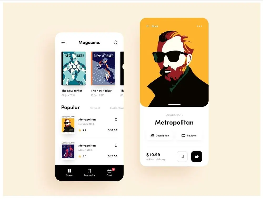
Image Credit: Daniel Moss for Brave Wings
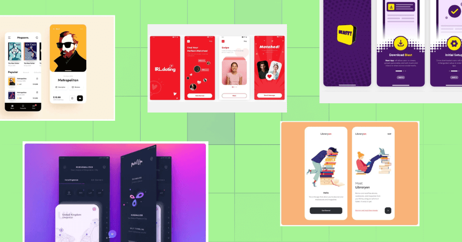
If you’re selling items that may already be colorful or intricate, it may be best to use a minimalist design just like this one by Daniel Moss for Brave Wings. Since the magazine covers are meant to be visually noisy, the app’s design offers a white background, a clean layout, and a black, sans serif typeface.
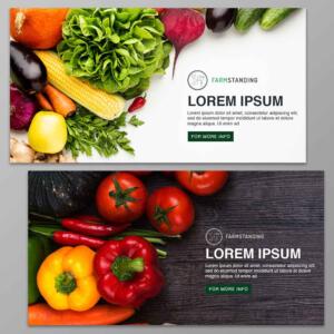
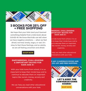
2. Bold Red Simplicity

Next in our UI design ideas is this example by Penji, which shows how simplicity can create an emotional impact. With a punchy red color scheme and a clear step-by-step flow, the design uses clean illustrations, profile avatars, and direct CTAs to guide users through the dating experience. It’s a perfect case study for UI design services that focus on user flow and emotional design.
This kind of streamlined onboarding process prioritizes both intuitive functionality and brand identity. Whether for lifestyle apps or ecommerce, this layout showcases the kind of clarity and polish delivered by top-rated web design companies.
3. Custom Illustrations
Image Credit: Outcrowd
Illustrations are always a great element to create a modern UI design app appeal, whether you’re aiming for android app design or iOS design. This UI made by Outcrowd features cute illustrations that fit perfectly with an e-book and audiobook subscription service.
4. Pastel Over Dark
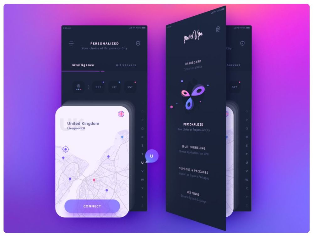
Image Credit: uixNinja
Not all UI designs need to be light and colorful. n recent years, dark mode has become a staple in modern UI design, with many apps offering darker interface options to reduce eye strain and create a sleek, premium look. For example, design by uixNinja offers a dark background complemented by pastel elements.
5. Comic Pop Color

This design by Penji delivers a punch of personality using comic-style visuals, halftone gradients, and contrasting purple and yellow hues. It’s one of the UI design ideas where every screen is cohesive—from download to sharing—and cleverly aligns with the app’s fun, expressive purpose. It demonstrates how graphic design services and UI/UX design can merge to enhance user engagement.
This UI also shows how creative brands can benefit from unlimited web design for businesses, allowing them to keep experimenting with visual storytelling. For those exploring how to use AI in UX design, this style is a great baseline to automate personalization while maintaining a playful aesthetic.
6. Fun App to Use
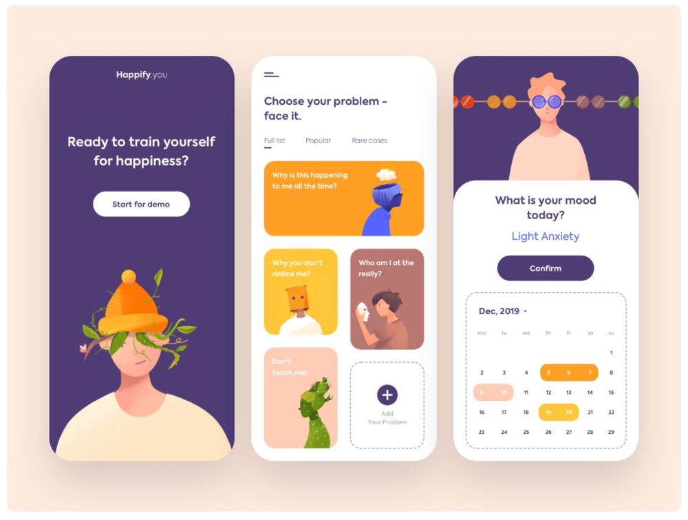
Image Credit: Outcrowd
If you check out modern UI design for websites, you’ll see that a lot of them offer fun features. That’s also the case for mobile apps. For instance, this design by Outcrowd uses interactive features such as a mood selector and a problem selector that uses cute cards.
7. Gray Tones With a Color Pop
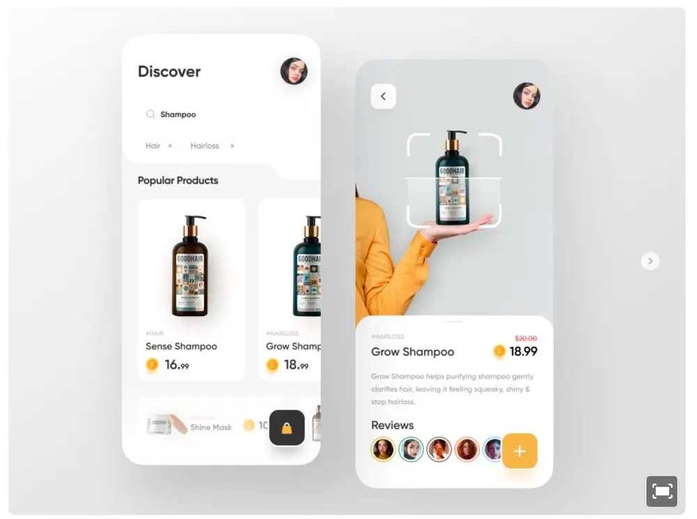
Image Credit: Sajon for Fireart Studio
A background with gray tones is superb if you want to draw attention to your selling product. However, with this color palette, it can go from fab to drab quickly. That said, to prevent your UI from looking dull, add a pop of color just like this design by Sajon for Fireart Studio.
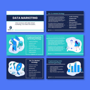
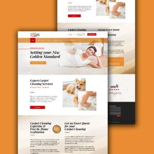
8. Organized Dashboard

This app design is a masterclass in clean and scalable dashboards. The interface uses a crisp grid layout, blue highlights, and smart spacing to deliver complex stats like sales data and user trends in digestible chunks. If you’re aiming to offer the best web design services, this is a great example of balancing form with function.
It also highlights the importance of web design vs. web development explained—while development builds the system, it’s the design that keeps users coming back.
9. Energizing Hue
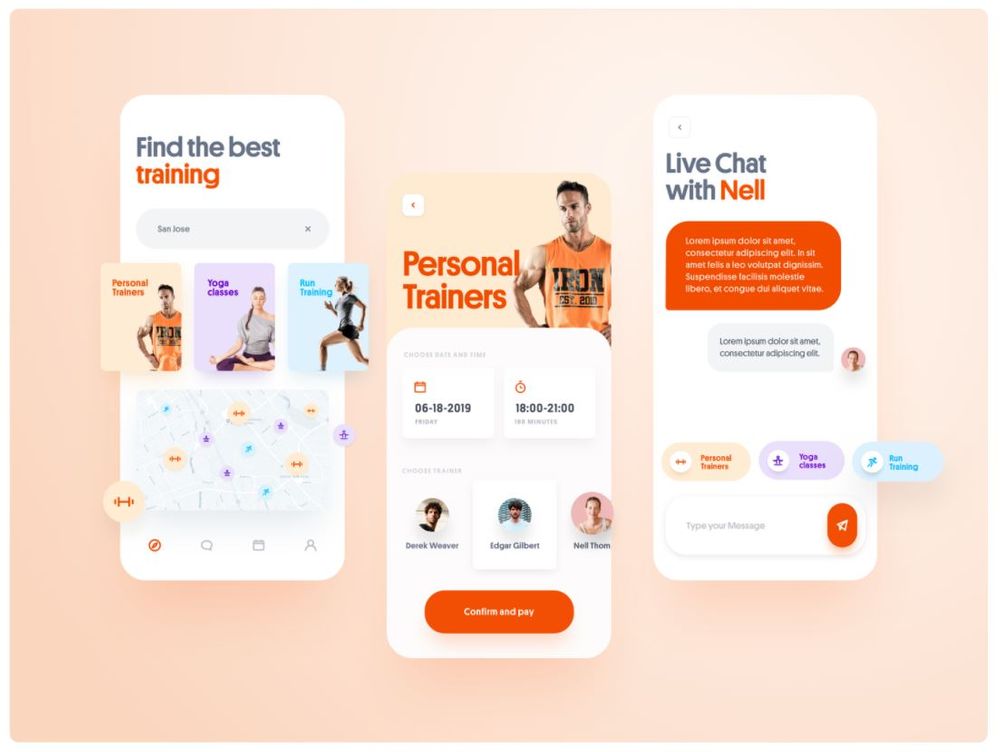
Image Credit: Martin Strba via FClass
According to color psychology, orange encourages energy and encourages feelings of enthusiasm, excitement, and warmth. In relation to that, this design by Martin Strba in FClass is very suitable for a workout app. Except for the orange hue, the design uses softer pastel colors that don’t clash with the strong main hue. The white background makes the design easy to digest and use even while exerting physical effort.
10. Time Element
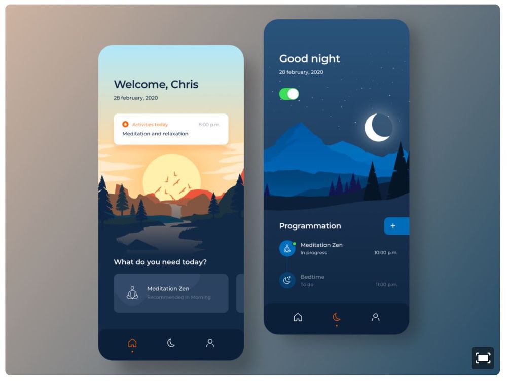
Image Credit: Angel Villanueva for Orizon: UI/UX Design Agency
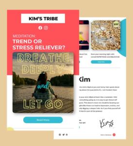
Here’s another thing you can do if your app has something to do with time. You can incorporate the visuals’ time element, just like this design by Angel Villanueva for Orizon: UI/UX Design Agency. The meditation app features a relaxing sun scene when opened during the day, as seen from the image. In the same vein, it offers a serene moon-over-the-mountains view when used at night.
11. Abstract
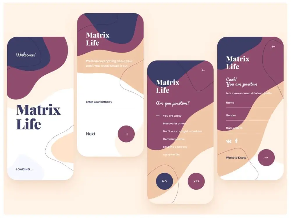
Image Credit: uixNinja
You can always count on an abstract design to add pizzazz to your UI, just like this design by uixNinja. The image features wavy lines and shapes using indigo, plum, apricot, cream, and white. In addition to that, the main button shape is a circle, which is a great choice because it complements the roundness of the wavy shapes. The typography is also simple, aside from the serif brand wordmark and the cursive font accent that appears once in every screen. The result is a remarkable combination of young and sophisticated.
12. Tabs
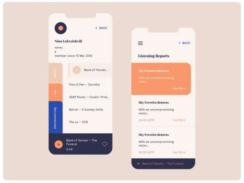
Image Credit: Nino Lekveishvili
If you’re looking for a unique navigation approach that doesn’t go against the Structure Principle, what about using tabs? This design by Nino Lekveishvili is a gorgeous example of a design that uses the look of old-school notebook tabs. In addition to that, the tabs also offer another way to showcase a beautiful branding color palette. As a result, not only does the tabs make for amazing visuals, but it also boosts brand recognition.
13. Creative Color Palette
Image Credit: evren yılmaz
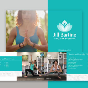
Modern design doesn’t always have to be minimalist. This UI design by evren yılmaz is a great example. It uses creative images and an interesting color palette of blues and pinks over canary yellow background. As a result, the design instantly jumps out and offers a stunning and artistic appeal.
14. Monochrome
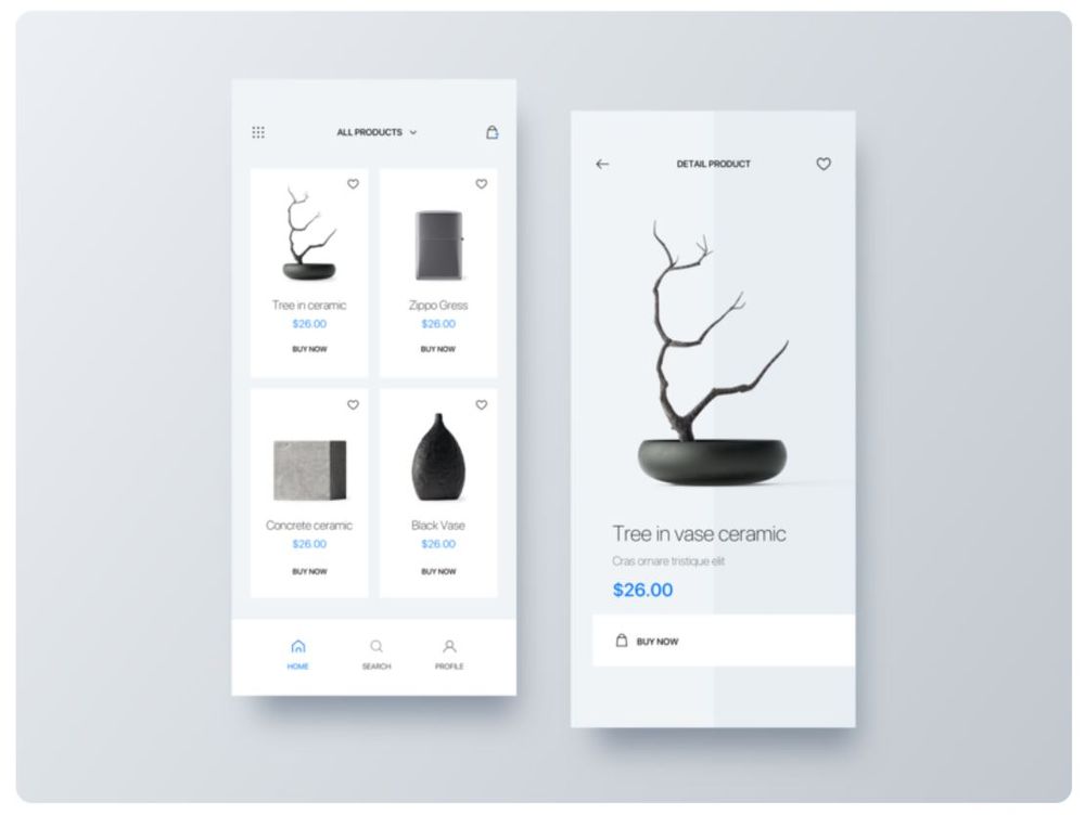
Image Credit: Angel Villanueva for Fireart Studio
If you think a black and white palette is boring, think again. This interface design by Angel Villanueva for Fireart Studio shows how a straightforward palette can lend an elegant appeal to an app. This looks perfectly well if the items offered are dark-colored. And as seen from the example, the background is excellent, whether it has a simple or intricate shape.
15. Filtered Image
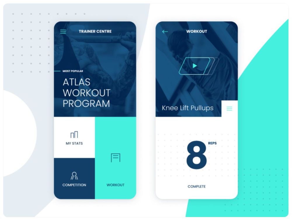
Image Credit: Stian for unfold
Many examples of modern UI design use images bearing the same hue as the rest of the color palette. For instance, Stian’s design for unfold features artistic workout photos with a cobalt blue filter, perfect with turquoise. As a result, the image offers a dose of interest without being overwhelming. It also goes well with the simple blocks, dynamic lines, and sans serif typeface.
The Bottom Line
Whether you’re designing a mobile app or refreshing your brand’s website, great UI design ideas don’t happen by accident—they’re crafted with intention. From typography and layout to color and motion, every detail plays a role in user experience. That’s where Penji comes in.
We offer professional web design services that blend visual appeal with functionality, ensuring your users stay engaged and your brand message remains clear. And it doesn’t stop at UI—we also provide expert graphic design services for everything from social media graphics to marketing materials.
Need proof? Take a moment to see Penji’s design portfolio and explore real work from real brands. You can also watch a short demo to understand why brands choose Penji—for consistency, creativity, and unlimited design support from top-tier talent.
Like what you learned? Share this article with your team!
About the author

Carla Deña
Carla is a journalist and content writer who produces stories for both digital and legacy media. She is passionate about creativity, innovation, and helping small businesses explore solutions that drive growth and social impact.
Table of Contents
- The Importance of a Good UI Design
- UI Design Principles to Consider
- 15 Modern UI Design Examples to Inspire
- 1. Minimalist
- 2. Bold Red Simplicity
- 3. Custom Illustrations
- 4. Pastel Over Dark
- 5. Comic Pop Color
- 6. Fun App to Use
- 7. Gray Tones With a Color Pop
- 8. Organized Dashboard
- 9. Energizing Hue
- 10. Time Element
- 11. Abstract
- 12. Tabs
- 13. Creative Color Palette
- 14. Monochrome
- 15. Filtered Image
- The Bottom Line


