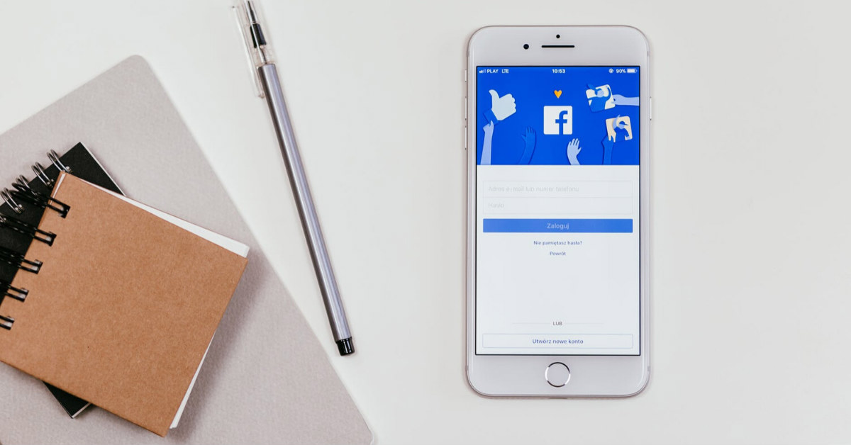
A mobile dashboard UI is crucial because it allows your users to see the most important information while using your app. People nowadays always want to have real-time data to make instant decisions whether on a business or personal scale. As for a developer or a designer, you can leverage on that need. Whatever app you plan to work on, a good dashboard essentially improves a user’s overall experience.
Remember, creating a mobile dashboard UI is not limited to the visual appeal of the app. It’s a fusion of art, logic, and science. It takes an expert designer to identify which layouts and elements will work best for your market. This is where the Penji team can help you. Our services have helped numerous app builders in creating an effective dashboard. That way, you get to have more downloads and people will enjoy using your app.
Examples of Mobile Dashboard UI
If you are looking for great inspirations for your mobile dashboard UI, we have here 9 of the best ones. These samples have different purposes so you can choose one that will work for your app design.
1. Marketing
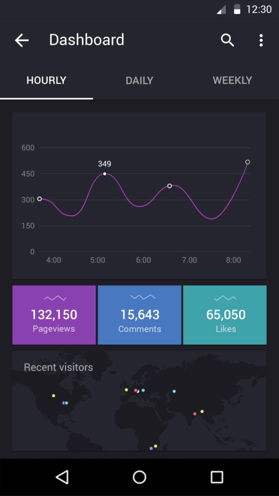
First one on our list is for marketing. Take a look at the dashboard’s straightforward layout. If you are working for a marketer, the design can help them identify if the company’s current strategy is working just by seeing the number of signups. In addition, they can pinpoint which geographic location they need more marketing efforts for.
2. Sales
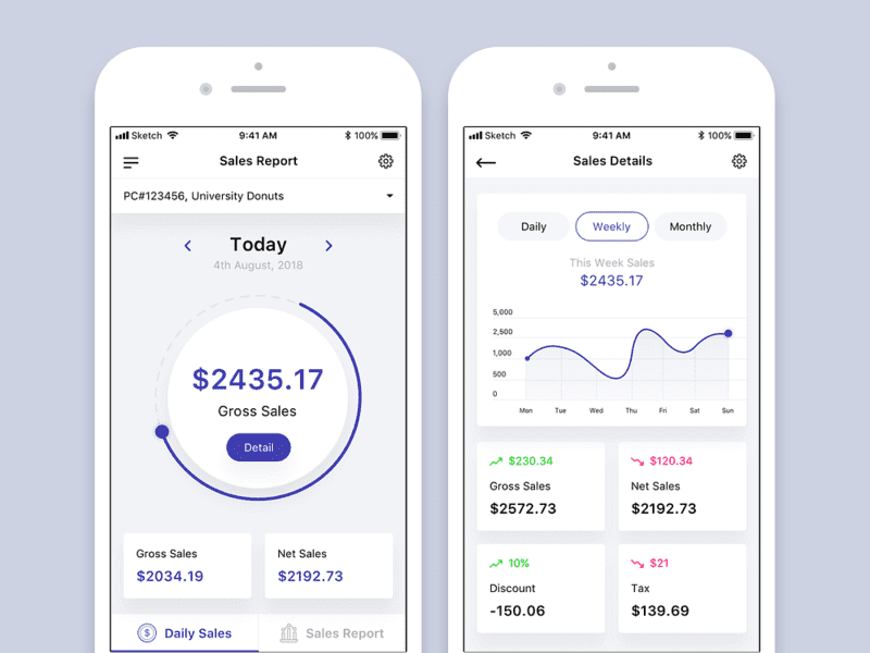
Managers and business owners can take advantage of using apps showing sales reports. If you will notice, there are similar features or data that can be seen from the previous example. However, it could also highlight the total revenue, current orders, and actual closed sales.
3. eCommerce
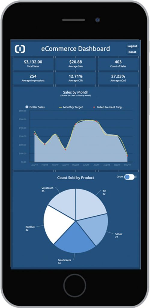
Aside from showing the total sales and signups, there are apps created specifically for eCommerce. Take a look at this good mobile dashboard UI example where they included a pie graph. This shows the sales generated by each product or brand. The feature alone gives you an idea which products will likely provide the business more income. As a result, one can increase the inventory for that item.
4. Order Tracking
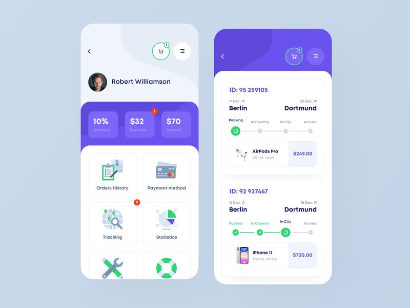
Now let’s talk about a mobile dashboard UI that is beneficial for consumers. If you always order online, you would want to have an app that tracks your order or purchase. In just a quick glance, you need to see if your package is already in-country or within your city. We have here an inspiration that could help you with your design.
5. Financial and Expense Management
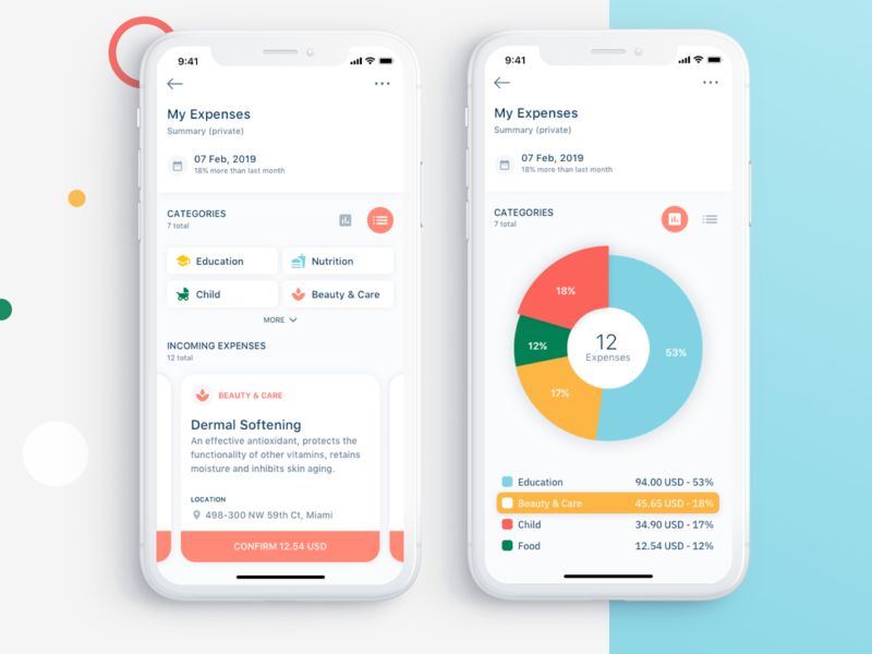
To date, there are a lot of individuals who enjoy using apps that provide financial or expense reports. These apps are not exclusive to businesses anymore.
So if you are an end-user, you would want your mobile dashboard UI to show where you spent your cash. In this sample, you can already identify the categories as they used different colors for each. While most of the prior samples used limited colors or shades in their dashboard, this one is more user-friendly and ideal for average users.
If you are going to follow this lead, you need to be extra cautious. Using multiple colors on your dashboard is risky and can be overwhelming, most especially if you are not familiar how to match these. Color psychology plays a huge role as well. Thus, working with design teams such as Penji can truly help. With us, we ensure that your dashboard is playful yet designed to be functional.
6. Car Status
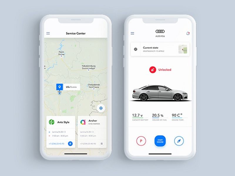
The automotive industry is also changing over the years. A few well-known brands are using apps in order to improve their after-sales support. Others are taking it to the next level where you can already control your car through your smartphone.
Whatever the purpose is, similar apps should readily provide pertinent information for the car owner. This includes the car details, GPS showing the nearest service centers, and current status of your car. It is a supplement to the actual dashboard that you can find in your vehicle.
7. Weather Report
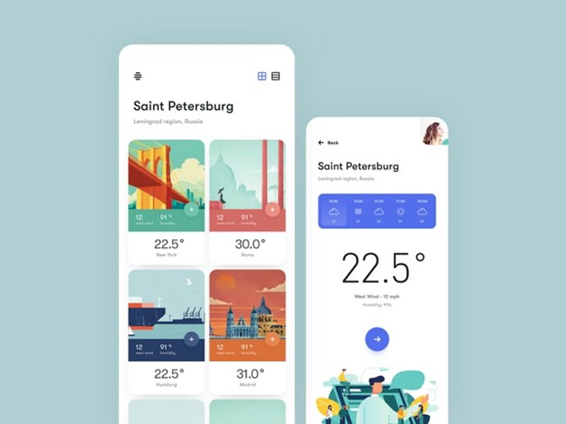
If you are working on an app that shows the weather information across the globe, you will appreciate this design. It’s not your usual dashboard where you only get to see the name of the country plus its corresponding temperature for the day. Instead, they added icons that can help you identify a specific location right away.
Your mobile dashboard UI doesn’t have to be overly playful or bold with lots of design elements. Nevertheless, adding some illustrations that support the features could help boost the overall experience.
8. Fitness App
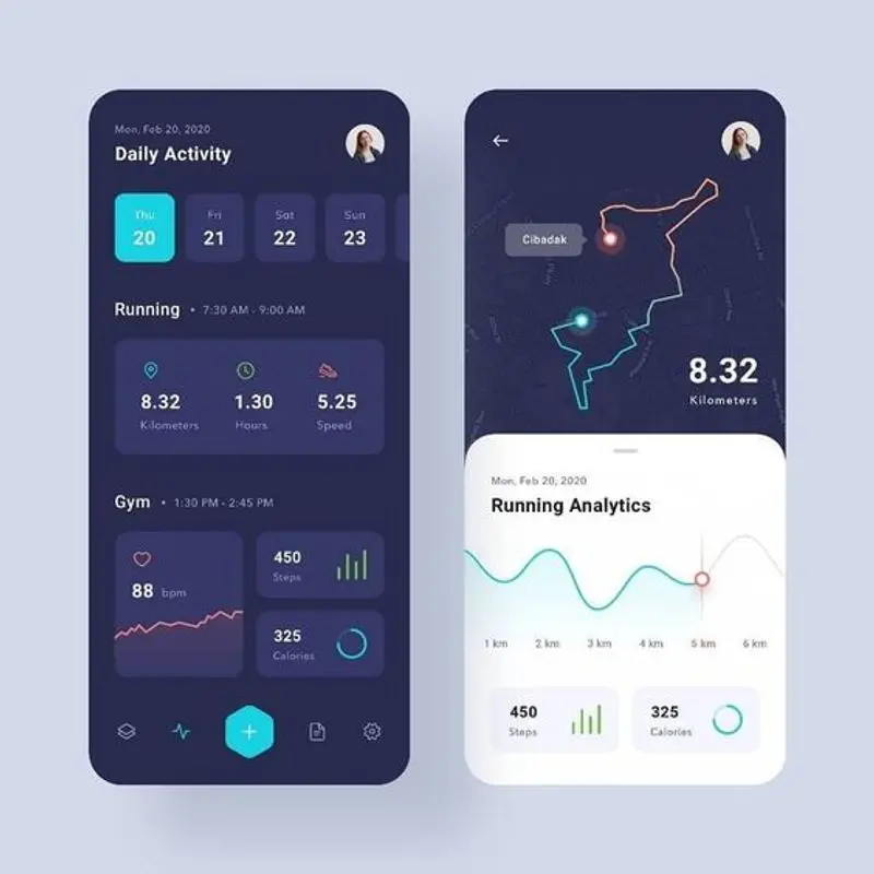
Throughout the years, more people are now cautious about their health. And while most of us are too lazy to track our daily activities, fitness apps today use simple yet effective mobile dashboard UI.
If you plan to design one, make sure that you add the distance, speed, and even the actual route. These details are essential if the end-user is following a strict program. With this, they will know if they are on track or they need to level up the game.
9. Smart Home App
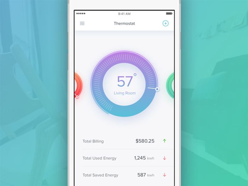
And lastly, we have a sample design for a smart home app. Some of us are already automating our homes and the only way we can maximize it is if we have a good mobile app at hand.
In this prototype, you can see your home’s temperature. From there, you can decide if you will adjust the thermostat. This is handy if you are coming home from the office and you want to ensure that your house’s temperature is properly regulated.
Final Thoughts
Apart from brainstorming on the best features for your app, it is also essential that you consider what the mobile dashboard UI will look like. More often than not, this is what your user will first see. If it looks disorganized, it will leave a bad impression. Worse case, they will just uninstall your app right away.
Get more people to use the app by improving their experience. This could be achieved by having a functional mobile dashboard UI. Again, leave this task to design experts like Penji. While it is a specialized skill and usually costly, the Penji team has created affordable plans perfect for startups. Learn more about our design services right now.
About the author

Barbara Anne Isla
BA Isla is a Content Writer and also an Events Host. She left the corporate world to do what she loves and to spend more time with her amazing kids. She hopes to bring valuable change to society with her words.


