Hey there, sleep enthusiasts! Did you ever think mattress logos could be such a big deal?
Well, with the global home bedding market lounging at $74 billion in 2020 and set to skyrocket to a dreamy $147 billion by 2028, it’s clear as day.
It’s not just about a comfy mattress anymore—it’s about branding it right. And in this booming market, a creative mattress logo isn’t just a design choice—it’s your ticket to standing out and soaring high.

But before you focus on email marketing ideas or coming soon landing page design, you need to prioritize the visual asset that represents your brand: the logo.
What are the best brands with excellent mattress logos?
Here are ten mattress brands with logos that sufficiently express brand identity.
1. Nectar
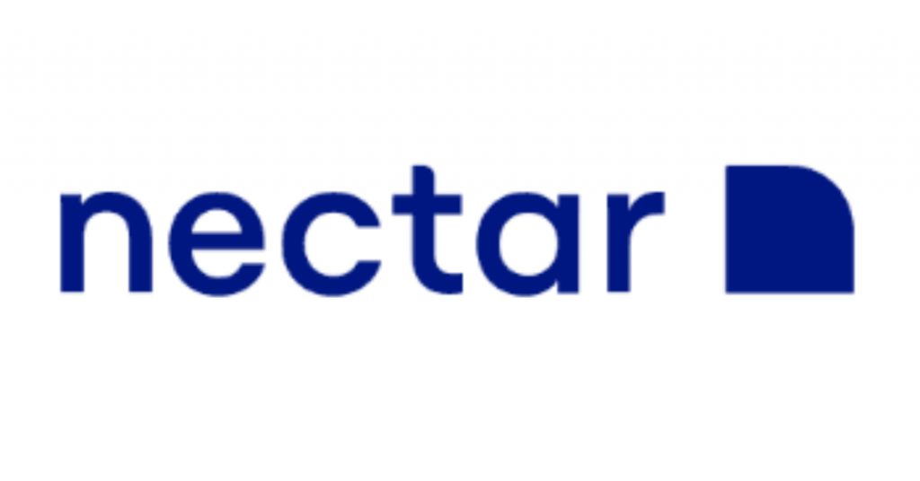
First on the list is Nectar. The brand’s logo features a simple sans-serif font with clean edges and a touch of softness. There’s a square image with a rounded corner on the top right. In fact, It’s somehow reminiscent of a blanket laid out on a bed, with one edge turned down.
According to their About page, their branding gears towards one goal. “We’ve aligned all our efforts around one simple promise: The best sleep of your life, guaranteed,” the page said. The midnight blue hue of the logo somehow reflects this commitment. The white background gives the logo a quiet, minimalist look.
2. Layla
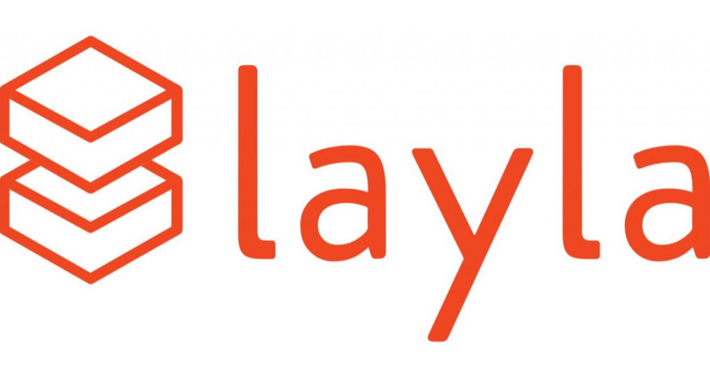
Next on the list is Layla. This brand’s logo is made dynamic and vigorous by its orange-red hue and its laid-back text. On the left side of the company’s name is an illustration that features two rectangular cuboids on top of each other. As unique as its logo is, the brand’s product offering – its copper mattress that’s purportedly excellent for “back sleepers, side sleepers, and twisted into a pretzel sleeper.”
3. Nolah
Nolah’s symbol might be one of the most playful mattress logos out there. Veering away from traditionally serious and straightforward mattress signs, the brand went for a fun and dynamic look. Furthermore, the text logo is written in a longhand typography, ever so slightly curved. Plus, it has a quarter moon-shaped line below, resembling a smile that reflects the branding.
The sign goes very well with the brand’s tagline, “Start Waking Up Happy.” The business’ brand identity is contrarian and creative. However, instead of focusing on falling asleep or the process of sleeping, they put a greater emphasis on what customers can experience upon waking up.
4. Purple
This boxed mattress brand describes its product as “the bed that broke the internet.” Moreover, Purple says it’s a bed designed for everybody and can adapt to each user’s unique body, offering comfort and support at the same time. Purple’s identity as a fun and youthful brand can be seen in its logo. Aptly colored purple, the text logo features P’s that overlap with the next letter, suggesting creativity and going beyond typical lines.
5. Tuft & Needle
Tuft & Needle’s symbol is as minimalist as they come. The text logo features all capital letters in a sans-serif font and with minimal letter spacing. The ampersand serves as the center and highlight amid the straightforwardness of the text. The design elements of the bed-in-a-box brand fits very well in its plain and straightforward website. It dons a neutral color scheme and just a tinge of mint green accent.
6. Leesa
Take one look at Leesa’s logo, and you’ll know it’s a company that specializes in bedding. The logo features the brand’s name, written in a bold, sans-serif typography. Below it is a horizontal line with little bars on each end, resembling a bed. Additionally, the image looks professional but lively in a teal hue.
This bed-in-a-box brand offers a branding identity that’s as fresh as its logo design. According to their About page, the venture was initiated by founders who grew tired of over-promising but under-delivering mattress companies. The frustration pushed them to take on a direct-to-consumer, online mattress business.
7. Saatva
Saatva’s logo may be plain, but the design elements are nothing short of sleek and elegant. The text logo features modern-looking text with almost perfect circles for the letter A’s negative space. The logo, just like the accents on the company’s website, looks classy in tan. The expensive look of the logo reflects the venture’s identity as a premium brand. Their website blatantly says, “This is not a bed in a box… Hand-delivered and set up in your home, never stuffed in a box.”
8. DreamCloud
Next on our list is DreamCloud, which sells mattresses, bases, and bedding. They offer premium services, including a lifetime warranty, free shipping and returns, and a 365-night trial. In addition, they also highlight their formula that uses innovative sleep science. Components like gel memory foam, a quilted Euro Top, and an innerspring coil system are to name a few.
It goes without saying that the identity of DreamCloud as a business that offers premium and luxurious offerings is encapsulated in its logo design. In addition, DreamCloud is written in all capital letters in unadorned sans serif. On the left-hand side of the text is an illustration of curves that subtly resembles a cloud. All in all, the image makes for a strong impression that doesn’t over-impose.
9. Nest Bedding
Also included in our list is Nest Bedding, which offers fresh and organic visual branding that reflects its tagline, “Love where you sleep.” As seen in the image, the black and white logo design uses a lettering font with excess strokes here and there. In short, it makes it look like it was hand-crafted. On the left side of the text is an image of a tree. Added to that, the logo complements the photos used on the website, mostly showing parts of a Scandinavian-style style home with plant accents.
10. Recover Mattress
Last but not least is Recover Mattress. This brand’s logo designmight be one of the simplest but most visually effective mattress logos in the industry. Recover Mattress aims to target a market of young, active people. Moreover, the brand is anchored on the premise that muscle growth and repair diminish when one doesn’t get adequate sleep.
Plus, this bed-in-a-box brand also has offers that would appeal to its market, including “off to college” specials. The brand’s logo displays a youthful feel that’s easily relatable to its audience. Lastly, despite the fresh look, it doesn’t look overdecorated and unprofessional.
Design Tips from Logo of Top Mattress Brands
Here are a few pointers we can learn from the most popular mattress brands:
- Simplicity is Key. A logo design for mattress brands should be easily recognizable and memorable. Avoid overly complicated designs. The best logos are often the simplest.
- Color Matters. Choose color schemes that evoke feelings of comfort, relaxation, and trust. Soft blues, calming greens, and neutral grays are popular choices for the color schemes of mattress brands. Also, learning how to use the color wheel will help a lot.
- Typography Speaks. The typography style you choose can convey a lot about your brand. Opt for fonts that are legible and reflect the comfort and reliability of your mattresses.
- Symbolism. Consider using symbolic design elements that represent sleep, comfort, or dreams. Clouds, moons, stars, or even a stylized bed can be effective.
- Stay Relevant. Ensure your logo reflects the current design trends but also has timeless design elements. You don’t want to revise your branding every few years.
- Versatility. Your logo design should look good in various sizes, from business cards to billboards. It should also be effective in both color and black and white.
- Convey Quality. A mattress is a significant investment for many people. Your logo design should convey the quality and durability of your products.
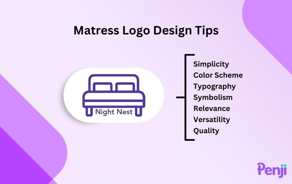
As seen from the examples, the mattress logos can say a lot about a brand – and influence how prospects feel towards the business.
Need an expertly-made mattress logo for your brand? Penji can help! Sign up today and get unlimited graphic design from the top 2% of graphic designers at a flat monthly rate.
About the author

Carla Deña
Carla is a journalist and content writer who produces stories for both digital and legacy media. She is passionate about creativity, innovation, and helping small businesses explore solutions that drive growth and social impact.

