In a world where first impressions are everything, your box packaging design plays a crucial role in shaping your customer’s perception of your brand.
In fact, a survey reveals that more than half of consumers are more inclined to make a repeat purchase from a retailer if their order is delivered in high-quality, premium packaging.
Ready to learn how to make your packaging stand out? Let’s dive into the art of creating eye-catching, functional mailing boxes that will leave a lasting impression.
What is a Mailing Box?
Before we tackle mailing box design, let’s discuss what it is exactly. As the name suggests, mailer boxes are meant to hold products being shipped out.
Here’s what makes a box packaging design different from other types of product boxes:
- It has interlocking flaps and wings that can securely close the box.
- The box has double-sided walls, allowing it to hold up better in transport compared to other types of packaging.
Needless to say, not all ventures need mailer boxes for their business. Here are types of businesses that benefit from using mailer boxes:
- Ecommerce ventures. You have to make sure that they get to your customers in one piece. That said, it’s crucial to use the best packaging options to protect the product during handling and transport.
- Subscription boxes. Subscription-based eCommerce or “subcom” ventures provide recurring deliveries of niche products. Often, these items come from different suppliers and have separate package branding. A box ties everything together under one brand.
- Gift boxes. Similar to subscription boxes, gift boxes often contain several items. A box unifies the elements together into one unit.
- Businesses with fragile products. Even if you’re not shipping or offering multiple products, a mailer box would be practical for fragile items. A mailer box gives the product that extra protection as they transport it home. It may be a simple gesture, but your customers will surely love you for it.
Related Post: Creative Packaging That Caused Products to Sell Out
Mailing Box Design Examples to Inspire
Here are a few mailing box design examples to spark up your creativity as you brainstorm for yours.
1. Crazy with Colors
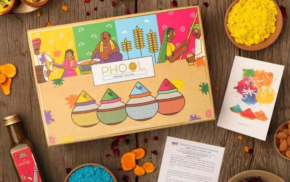
If you’re looking for ideas for cute box packaging design, there’s no better example than this box for Phool Organic Ghuaal designed by Tanuja Mathur and Shubhakshi Seth. The brand offers gulaal or colored powders traditionally used for Hindu rituals like Holi or the festival of colors.
Fittingly so, the box shows a great mix of vibrant colors. The imagery also shows traditional customs such as dancing to the tunes of a “dhol” and an Indian confectioner preparing sweets for Holi. The stunning mix of patterns adds an extra dose of interest to the box.
If you’re offering products that are as colorful as these, then going for an eye-candy mailer box is surely ideal.
2. Beautiful Inside and Out
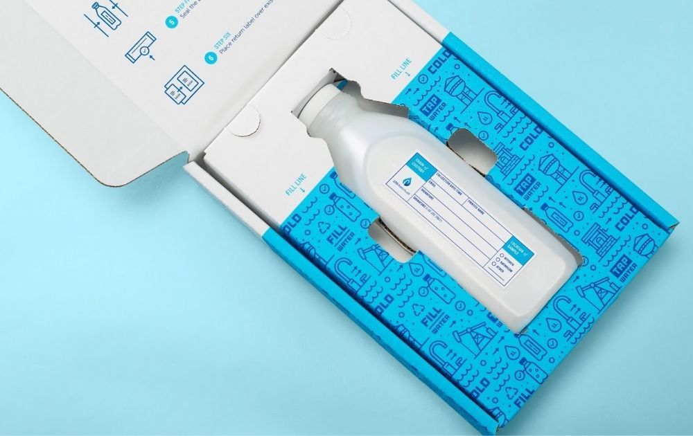
Who says your creativity should be limited to the exterior of the box? This box for 120WaterAudit designed by Co-motion Studio, shows just how vital it is to sustain the recipients’ interest even after opening the box.
The product is a water testing service for businesses and consumers. That said, the kit includes a bottle to collect the water sample, a sticker for lab processing, a box seal for return mailing as well as two swag stickers.
Clearly, the brand made it so simple to use their service. In fact, the copy and visuals on the box might even excite users to fill the bottle, replace it on the box and send it back for testing.
3. Hues on Kraft
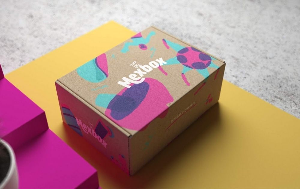
Who says corrugated box packaging design needs to look plain and boring? In fact, this example designed by Menta Picante for Ik Mexbox proves just the contrary.
The brand is an NYC-based subscription box company offering Mexican food and treats. That said, the design for their mailer spells fiesta without being overwhelming. The patterns, colors, and typography all work together to create a lively feast for the eyes.
4. Print Over Print
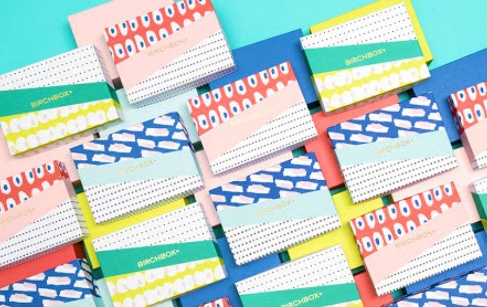
Birchbox is one of the most popular and early forerunners in the online monthly subscription box industry. Focusing on the beauty, makeup, and personal care, the brand has been around since 2010 and knows it needs to shake things up to sustain customer interest.
One of their most notable mailer gift boxes is this design from their March 2015 release. The design features various combinations of colorful prints that all look Spring-ready.
5. Emphasized Logo
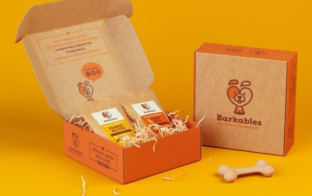
This box from Barkables designed by Openmint is a good inspiration if you’re looking for custom packaging boxes with a logo.
The brand offers a monthly subscription of CBD treats for dogs, but there’s a much deeper story behind the business. According to their website, the brand was born out of pet owners’ love for their dog – a German Shepherd named Nessa who was diagnosed with a serious illness. Regular meds didn’t work, but thankfully, CBD treats made her better.
Once you know the story, you’d see how genuine the brand’s logo is – a dog face in the shape of a heart. That said, it’s surely a good visual to emphasize on the box facade as it tells the story of the brand and all it stands for.
6. Monochrome Charm
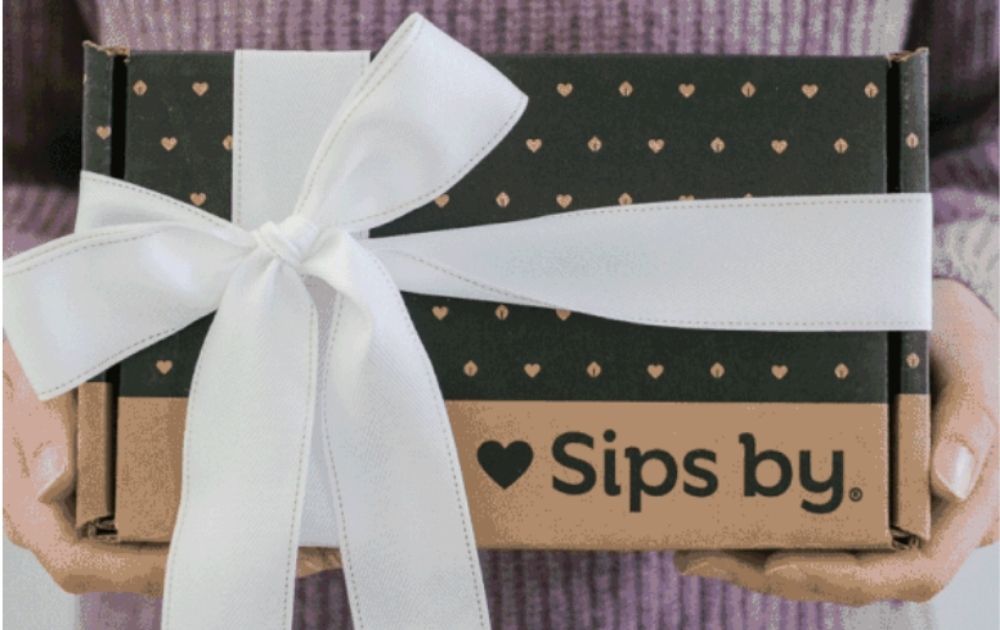
There are times when you just want to stay in, relax, and sip a nice warm cup of tea to ease your stress. On those days, receiving this box packaging design from Sips by (photo grabbed from their website) will be a comforting surprise.
The brand offers patrons four teas based on their preferences. And according to their website, the female-founded startup makes it easy for tea lovers to discover various types of teas from across the world.
The box print is uncomplicated – black ink on kraft cardboard. Despite its sheer simplicity, however, it looks cozy, friendly, and fuss-free – much like how you’d want your night-ins to be.
Related Post: 15 Amazing Tea Packaging Designs From All Over the World
7. Project Brand Identity
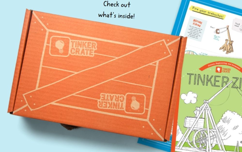
If you’re offering products for kids, then you might want to take a cue from this box design for KiwiCo’s Tinker Crate. The brand offers various hobby crates for different age groups. This one, in particular, was designed for nine to 16 years of age and taught users about science and engineering.
The box design reflects the product identity; it’s called Tinker Crate, so it looks like a crate. In addition to that, the visuals look young and cute, reminiscent of Nickelodeon branding. As a result, the box seems inviting, especially for young people who are keen to take on a fun project.
8. Rustic Elegance
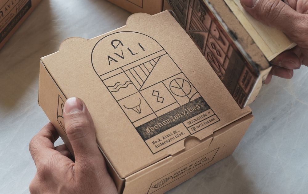
Who says digital printing is required to make boxes look pretty? Take a look at this box, for example. Albeit for food takeout and not for shipping, this box designed by Karmano studio for Avli Restaurant shows an alternative way of doing box branding.
Instead of the usual print, it uses a black ink stamp to transfer the design to the kraft box. The result is a simple visual that looks rustic, personal, and elegant.
9. Fresh Palette
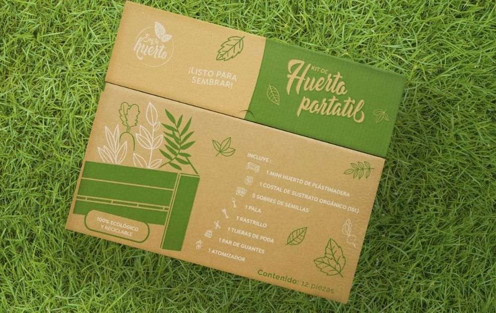
One look at this box by Soy tu Huerto by Armatoste, and you’ll know that the product has to be related to nature.
The product is a portable garden kit that makes it easy for anyone to develop a green thumb. As seen on the list printed on the box, the kit comes with a planting crate, a sack of planting medium, seeds, shovel, rake, trimmers, gardening gloves, and an atomizer.
As the contents are printed on the box, you know exactly what to expect the moment you have it on your hands. The green and white print on natural kraft project a fresh and natural visual. As a result, the recipient will surely get excited to start planting.
10. Mother Nature-Approved
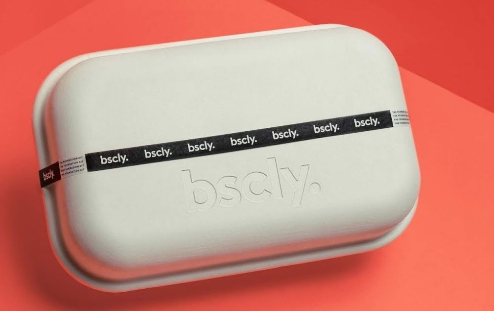
If you’re looking for custom shipping boxes that are a lot kinder to the environment, check out this mailer box from Bscly.
The business is a direct-to-consumer brand that offers stylish and sustainable clothing kits. Each kit comes with pieces to mix or match, including a sweatshirt, a t-shirt, and a pair of pants. Needless to say, the idea is to empower customers to get dressed in seconds so they can focus on stuff on their plate without having to worry about their wardrobe.
True to its brand identity, the business delivers the clothes through an earth-friendly sugarcane box. It’s biodegradable and 100 percent compostable. And don’t you think it adds to the charm of the package?
Related Post: Top Product Packaging Designs That Push The Envelope
Mailing Box Design Elements
As seen from the examples above, there are various elements you need to consider when designing your mailer box. Here are a few essentials to help you get started.
Mailer Box Sizes
Though there are standard box sizes, their availability could vary depending on your supplier. For medium-sized boxes, here are some of the common sizes you’ll encounter:
- F23 (9.2 x 9.2 x 5 cm)
- F33 (11.8 x 14 x 8 cm)
- F44 (20.7 x 15.6 x 9.1 cm)
- F45 (23.1 x 14 x 8 cm)
F23 and F33 are typically used for jewelry, small accessories, and gadgets. F44 is big enough to carry four cupcakes, while F45 can hold bulkier items like stationery.
The good news is, you don’t have to be limited by these sizes. Most box providers offer custom-sized boxes with a minimum order quantity.
How to Find the Right Box Size
Whether you’re ordering standard or custom size shipping boxes, you need to make sure that your items will fit. To do this, take a large piece of paper (a deconstructed grocery bag will do) and measure out the box’s interior width and length with a ruler. Using a pen or a marker, draw the measured square or rectangle. Then, arrange the products that you intend to put inside the box. Next, place your ruler upright on the side to see if all the items fit below the box length.
PRO TIP: You’ll most likely use filling material to keep items from banging with one another during shipping, so make sure to provide an extra allowance for that.
Box Material and Colors
Mailer boxes are made of corrugated cardboard. Though natural recycled cardboard is the most common, some providers also offer add-on features like glossy or matte finishes.
Here are typical colors box providers may offer:
- White cardboard
- Colored cardboard
- Printed cardboard
- Kraft cardboard
Out of the options above, kraft cardboard may be the most practical and versatile. For one, it costs less than the white, colored, and printed boxes. Despite its plain appearance, you can achieve a similar aesthetic using box sleeves or stickers. As a result, you can get a beautiful mailer without having to break the bank.
Filling Material
As mentioned above, you’ll need filling material to give your products extra cushion during handling and transport. Here are a few options you can choose from:
- Packing nuts (this also comes in biodegradable form)
- Tissue wrapping paper
- Cardboard or styrofoam inserts
- Crumpled paper
- Bubble wrap
- Air pillows
- Paper shreds
- Eco-friendly alternatives (green wrap, mushroom packaging, etc.)
Related Post: Here’s How Packaging Design Can Increase Your Sales
The Lowdown
Mailer boxes’ number one function is to protect your products during shipping. However, that doesn’t mean you should only focus on function alone. Going the extra mile of making your mailing box design beautiful is surely a great way to foster brand trust and encourage repeat orders.
Need help creating mailer box designs that will make your audience fall in love with your brand? We, at Penji, can do the design heavy-lifting for you! We offer unlimited graphic design at a flat monthly rate. So, you can have all the graphic designs you need without breaking the bank. From digital illustrations to ad designs, we’ve got you covered!
We have the top 2 percent of designers, so you can rest assured that we can help you come up with a design that puts your brand in the best light. Sign up now by clicking this link to enjoy 15% off the first month of any plan. And the best part? You can try any of our packages risk-free for 15 days.
Note: Product packa ging images were grabbed from Packaging of the World unless otherwise noted.
About the author

Carla Deña
Carla is a journalist and content writer who produces stories for both digital and legacy media. She is passionate about creativity, innovation, and helping small businesses explore solutions that drive growth and social impact.

