
Marketers can bring home the bacon by creating the most riveting and attention-grabbing landing page layout. If you want to let your audience warm up to your brand, lead them to your website. However, if you want to achieve a particular business goal, guide them to your landing page.
Many ventures, from startups to large enterprises, turn to Penji whenever they need great landing pages that convert. Our clients love our hassle-free system that gets them exactly the designs they need to generate leads and increase sales. Stick ‘til the end and we’ll show you how to get your own landing page designed.
Here are a few ways landing pages can help you with your goals:
- Generate email addresses
- Fill out a form
- Fill out a survey
- Download a voucher
- Schedule a free trial
- Download an eBook or free video course
- Purchase a product or subscribe to a service
Your landing page is the tool that can push your leads further down the sales funnel. So make the landing page layout count to attain maximum results!
Before we give you several landing page layout examples, we’ll tell you why landing page design matters.
Why Landing Page Design Matters
Your landing page design will attain an email exchange, a download, an appointment, or a sale. So yes, your landing page layout and design matter because it incites a psychological response from your leads.
A landing page that is full of distractions means you’re leading prospects to other parts of your website to explore. While this might increase your time-on-page metric and decrease your bounce rates, this is NOT the result you want.
With landing pages, you want to generate or convert leads. For instance, there shouldn’t be a navigation menu to prevent leads from veering away from the task at hand. Secondly, the hero image should be compelling enough to make leads scrutinize the landing page more.
Moreover, the landing page layout should be designed to lead the user’s eyes from one element to another. The users must end up on a form or call to action to lead them to the next stage of the sale process.
Overall, the landing page design must be skim-friendly, streamlined, simplified, and straightforward. And that is how you can increase your conversions with landing pages. But if you need help with landing page designs, hire a web design from Penji. Penji’s unique subscription-based model makes it perfect for startups, small businesses, agencies, and corporations. Know why Penji could be the best design partner you’ll ever have!
Get Your Own Website Designed
If you think requesting a landing page design is hard and costly, think again. With Penji, we have fixed monthly rates in exchange for unlimited graphic designs, illustrations, landing pages, and app designs.
Penji’s web designers, graphic designers, and illustrators are in the top two percent of the industry. We vetted their skills, so our clients don’t have to. That being said, subscribing to our affordable plans means you’re getting high-quality landing page designs that convert.
Creating a convertible landing page layout takes various design elements that can urge users to take action. And with Penji’s skilled designers, you can get your own landing page designed. Here are a few elements of a high-converting landing page:
- Killer headline and subheadline
- Hero image
- Features and benefits
- Social proof
- Forms
- Call to action
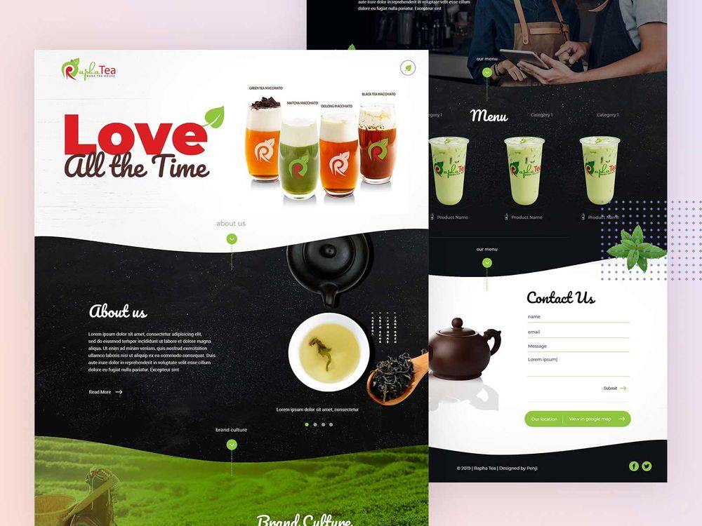
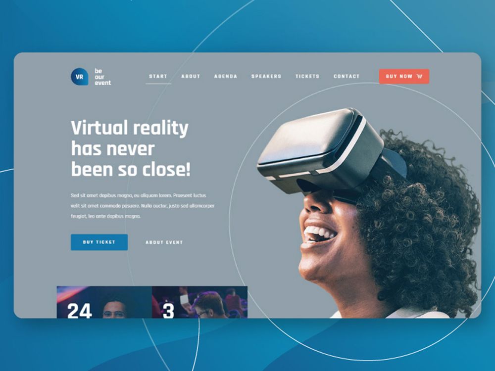
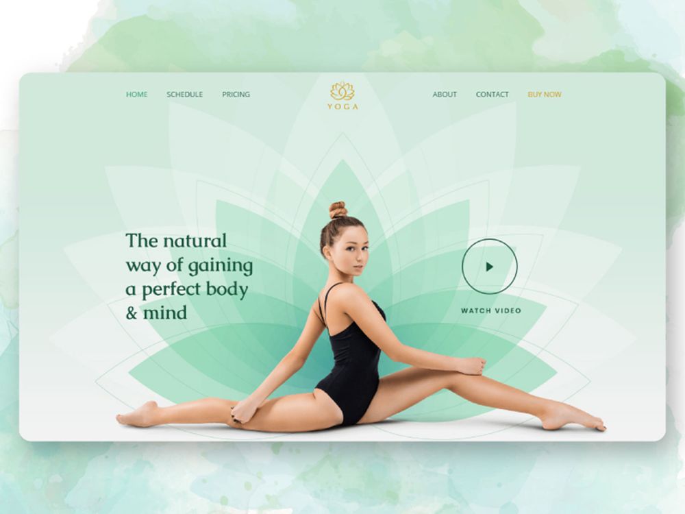
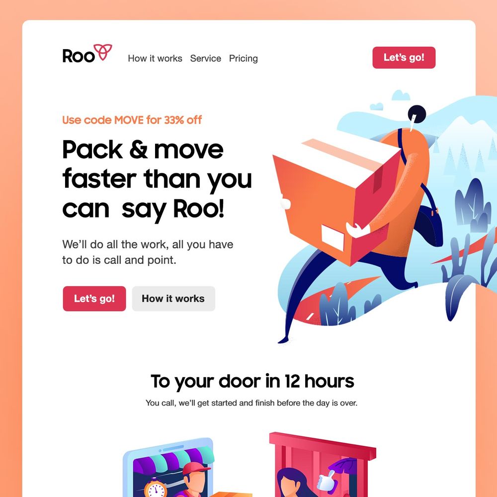
Check out some of Penji’s landing page work samples.
Example #1:
Example #2:
Example #3:
Example #4:
Requesting a landing page design from Penji is streamlined, fast, and easy via Penji’s bespoke platform. All it takes are three simple steps to have a landing page worthy of showing off to your audience:
Step 1: Create a new project
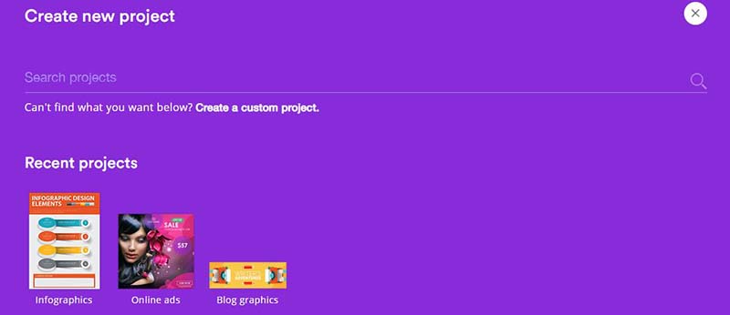
Once you’ve signed up for your preferred Penji plan, you can now proceed to your dashboard and submit your first design request. On the dashboard, click on the “Create new project” button.
Scroll down to the UX/UI category and select “Website design.” Then fill in the details of the project and provide as many as you can to create a clear design brief. If you can provide images and links for inspiration, then all the better.
Step 2: Review and revise
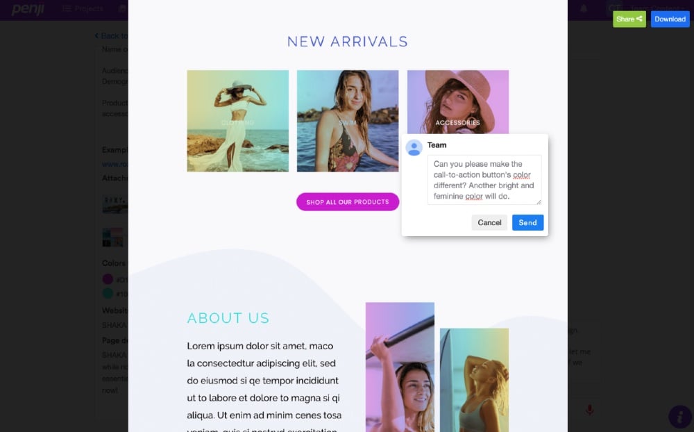
After 24 to 48 hours, expect to receive the first draft. You can then ask for revisions if you’re not 100 percent satisfied with the design. The benefit of using Penji’s platform is that you can point and comment on the design itself for the revisions.
When you subscribe to any Penji plan, you can also request for as many revisions as you want. Unlike other design services, revisions come with extra charges. With Penji, we’re offering you revisions at ZERO COST.
Step 3: Download the design
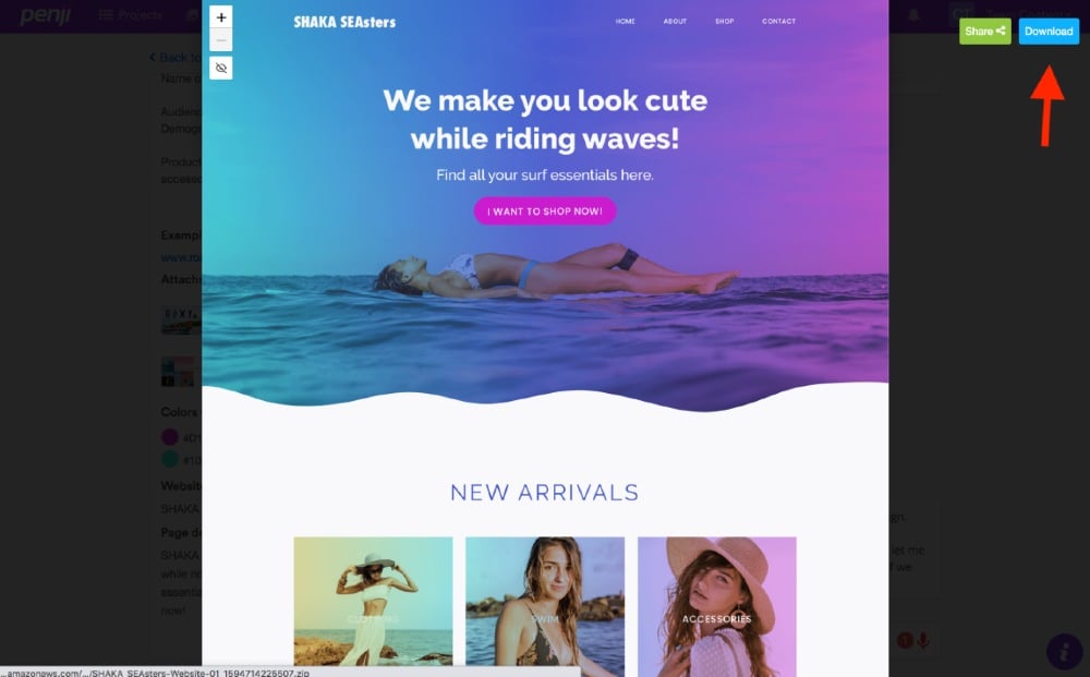
Once you receive the revised design, you can now download it from the platform directly, and it will be saved automatically on your computer. You’ll have the option to organize all your designs according to categories, so it’s easier to track your design inventory.
You’ll have all rights and licenses to all landing page designs created. Last but not least, we’ll store your designs in our system for 90 days. That way, they’ll be here waiting for you if you decide to try out other design services.
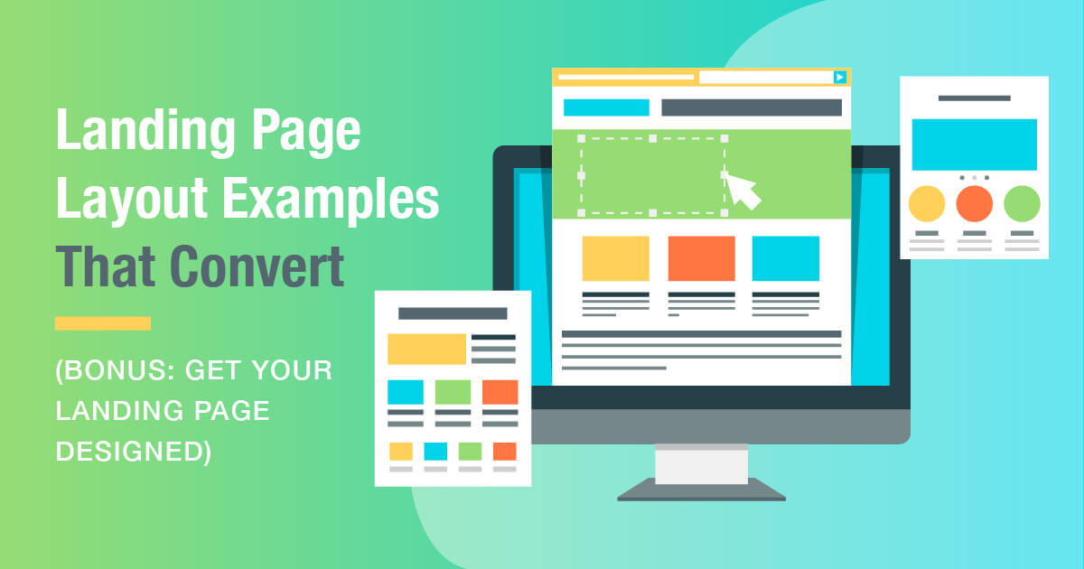
13 Landing Page Layout Examples that Convert
If you’re still unsure what goes into an excellent landing page layout, here are eight of the best landing page design examples to inspire you:
1. Moz
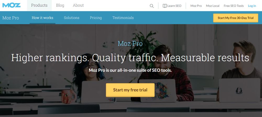
Your landing page must not beat around the bush. The moment your prospects land on it, they must immediately know what you offer in the first three seconds. Determine what your unique selling proposition (USP) is and concisely explain it on your heading. And Moz did that in six words. The headline is short, sweet, and punchy. It explains the benefits of what their customers get when subscribing to their service.
2. CareChoice
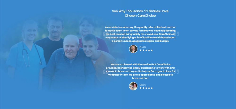
Another landing page technique that can generate more leads and conversions is by displaying social proof. Whether you showcase company achievements, success stories, case studies, testimonials, or star ratings, social proof adds credibility. This CareChoice landing page layout contains social proof with ratings. Overall, this can reel in more customers because testimonials are considered authentic recommendations in digital marketing.
3. EZBind
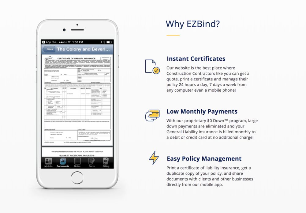
EZBind took a different route in presenting their offering. The white background makes the icons and texts pop. The heading is eye-catching and straightforward and in question form, which can lead users down to the subheading for answers. The subcategories also explain briefly the reasons why clients should choose EZBind. Plus, the icons beside it depict what the features and benefits are. If you want to quickly explain something, using illustrations is efficient in doing so.
4. Lyft
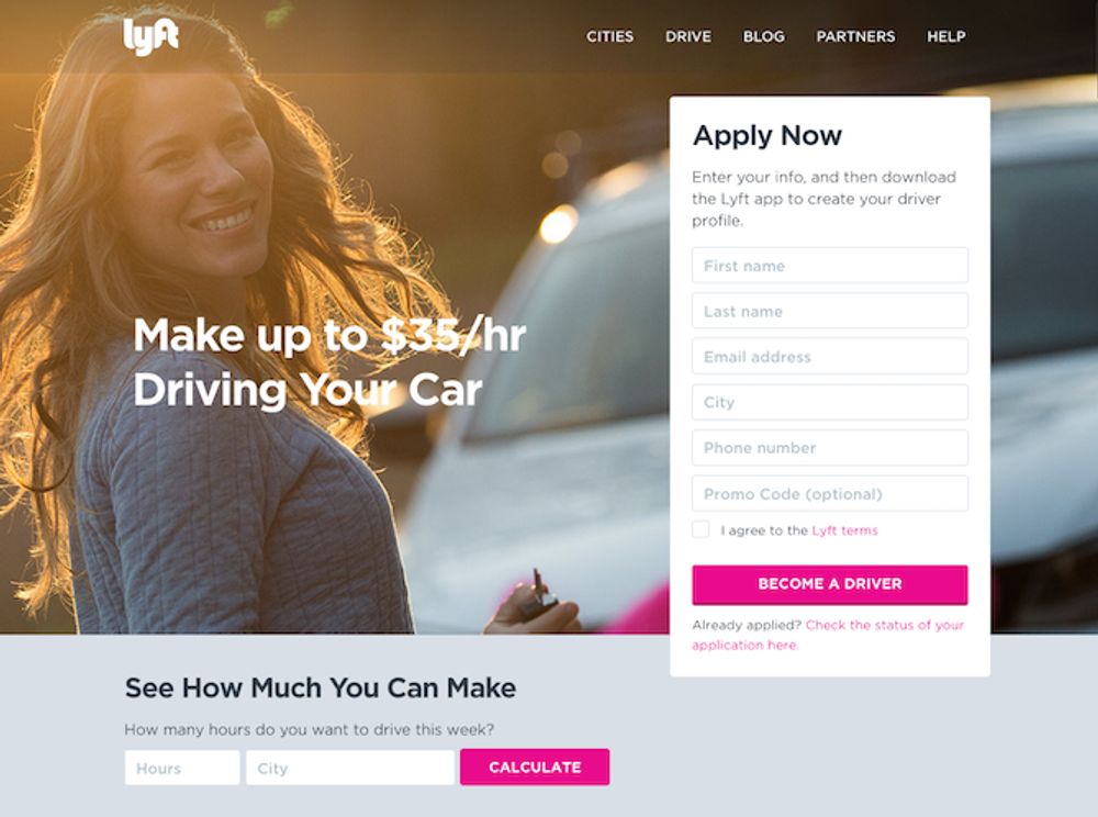
Lyft’s landing page layout is built for quick conversions. The two techniques that drive conversions are the short “Apply Now” form and the fields where drivers can calculate their possible earnings. This landing page focuses on motivating drivers to earn quick and easy money. We, at Penji, are well-versed with the techniques to convince prospects through visuals and we can help you get landing pages that convert.
5. Muck Rack
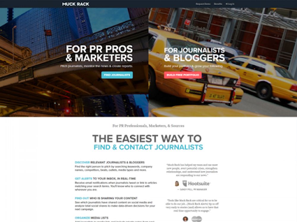
This Muck Rack landing page example is very laser-focused on converting both their audiences: PR pros/marketers and journalists/bloggers. The landing page layout also offers digestible information, which is easy to scan. When you choose and click on one of the options, a form instantly welcomes you to guide you to the next sale process. Moreover, the visuals are also very appealing and add depth to the layout.
6. Flickr
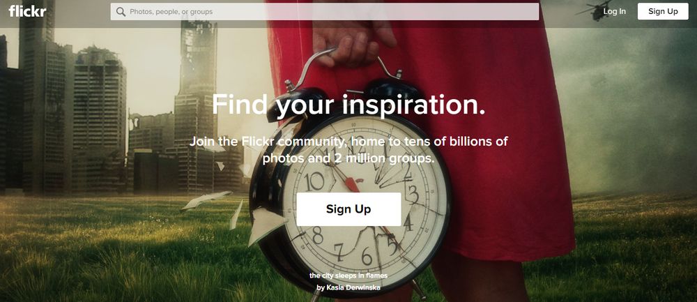
A hero image is one way to captivate your prospects. And for a website that offers stock images, they have displayed their products front and center. The image of a woman carrying a clock with a broken glass exudes a dreamy appeal. The beautiful tones in the background make the bright red color pop. This implies how graphic design is an essential factor that can make or break your landing page’s success.
7. Codecademy Pro
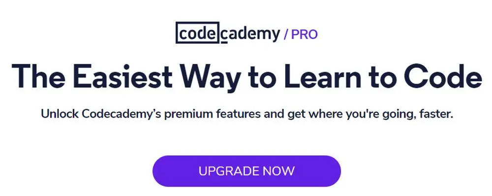
If you’re targeting existing customers, sometimes it’s best to go for the no-frills approach like what Codecademy Pro did. Simplicity is also another element of an effective landing page. And it doesn’t get any simpler than Codecademy Pro’s landing page design. Using texts alone is effective as long as the copy is compelling. And this hits the nail on the head by using a concise heading and a brief subheading. Last but not least, the call-to-action button sticks out like a sore thumb due to its vibrant purple color.
8. Stripe
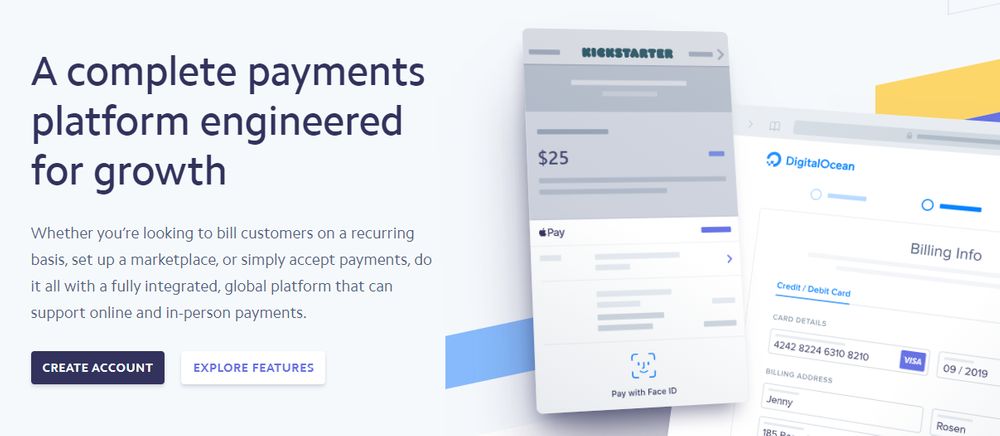
One of the most crucial components of a landing page layout is the call to action. It must be evident and clear to urge leads to take action. And Stripe didn’t just dwell on one call to action, but two! The two contrasting colors on the button are also an effective way to make them more prominent. One is in a dark color with white text, and the other is in a white background with a blue font. The two calls to action also provide options for visitors, while leading them further down the sales funnel.
9. Joinery
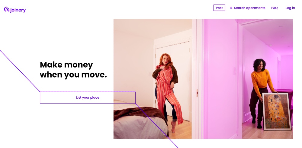
Asymmetry has been an ongoing design trend, and it will stick for a while. And if you’re thinking of applying asymmetry on your landing page, check out how Joinery did it. Typically, you would see the call to action buttons appear on one side of the screen. Or it isn’t disruptive. Theirs is placed on top of the image and below the headline. It will allow the visitor to dart their eyes to the button and maybe even click on it. Plus, the directional cues (diagonal lines) are a nice touch too. This allows the visitor to follow the lines and scroll down further.
Get a landing page like this when you subscribe to Penji. The designers will ensure that you’ll receive a landing page that is both engaging and different.
10. Unis Shoes
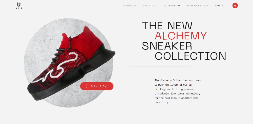
As previously mentioned, you need a call to action on your landing page. And this one from Unis Shoes is different from among the others. Most call to action messages would say “Shop Now” or “Sign Up”, but if you want to capture your audience’s attention, follow how the site applied theirs. Aside from that unique call to action button, notice how they use white space. This will enable them to focus on the copy and the image.
11. Cometeer
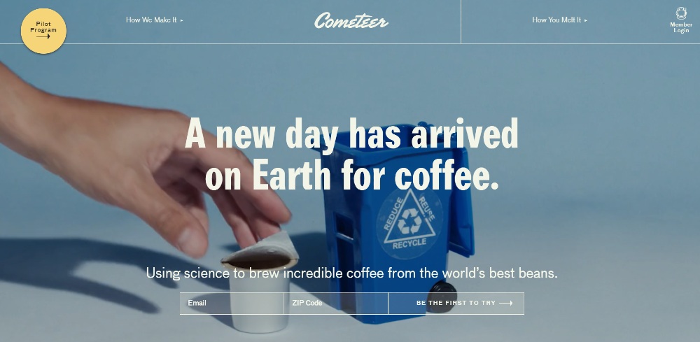
Most landing pages would use a solid color background and add an image or illustration. But look at how Cometeer used video and transparency when they published their landing page. If you want to tease your audience with your new product or service, it’s good that you show a process. Apart from that, if you’re going to view their product, they have a circular yellow button on the left side of the page. It’s a contrast from the background of their videos and the transparent buttons, allowing the visitor to visit their product page.
12. Acid League
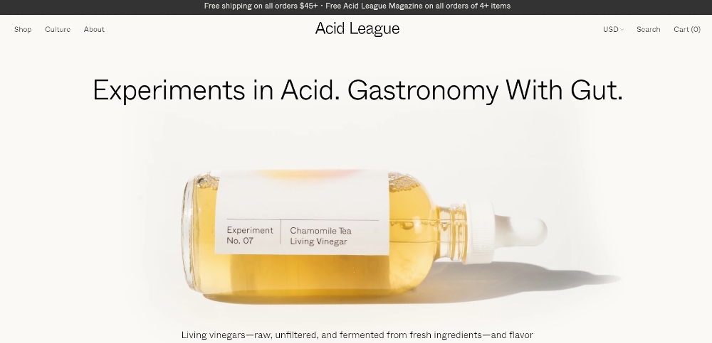
Sometimes, keeping it simple can be your ticket to getting sales. All you need to do is post a high-quality hero image and use visual hierarchy. Check out this no-fuss landing page by Acid League. As you can see, a minimalist landing page doesn’t have to be boring. You can engage your audience through a compelling copy. Plus, the call to action button doesn’t have to be in a rectangle. Use an arrow to redirect them to the product page.
13. Brewbike
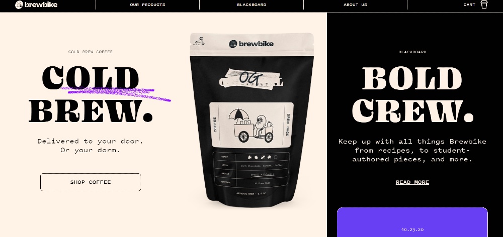
Split screens aren’t a widely used technique on landing pages. However, when done right, it can reduce bounce rates on your site. Look at how Cold Brew applied the split-screen technique. On the left side of the screen, you can see a typical landing page design layout. On the other hand, the right side has a scrollable feature where you can view updates. You would rarely see something like this on most landing pages. But it’s not a bad thing to execute if you want to entice the visitor to stay longer and learn more about your product or service.
Conclusion
If you need help with your landing page design, try Penji’s services for 15 days. For only $499/mo, not only will you get a website and app design, request marketing, advertising, and print designs. But you can get all types of graphic designs your business needs.
We don’t hold our clients with a contract, so you can cancel anytime if you no longer need our service. You can also watch the demo video of how seamless requesting landing pages are with Penji. If you want a landing page layout that converts, then Penji is the perfect design partner.


