TDLR: The perfect landing page is simple and easy to navigate. It uses simple text, non-distracting yet pretty visuals, and simple yet attention-seeking Calls-To-Action (CTA). Ideally, the perfect landing page is designed to guide traffic in one sole direction, to create trustworthiness and a greater conversion rate from the get-go.
When designing a website, first impressions matter so you must make it worth exploring. Your website, and specifically your landing pages, are often the first interaction potential customers have with your brand. At Penji, we understand the power of captivating design, intuitive user experiences, and professional graphic design services that strengthen brand perception.. The second step is getting them to convert.
A landing page design agency or service plays a huge role in whether customers trust and respect your offer. But what exactly makes a landing page sure to convert? That’s what we’ll walk you through in this article.
Landing Pages that Convert
we'll tailor a landing page to your exact specifications

Types of Landing Pages
Many experts find there are 10+ types of landing pages. Let’s discuss the 10 major types you can publish when promoting your business.
1. Squeeze Pages
A squeeze page is considered a lead generation landing page, allowing businesses to get a lead’s email by incentivizing them. Usually, the purpose of this page is to let a lead download a resource in exchange for their email. A simple squeeze page would include the following elements:
- Headline
- Form
- Resource information
2. Splash Pages
Many experts have different takes on what a splash page should have, but typically, these are attention-grabbing landing pages. A splash page can generate leads, introduce visitors to what the brand is, and promote your product. For instance, a splash page can feature your product or models using your product. Another example is when there’s a pop-up window for a limited-time offer.
3. Long-Form Landing Page
Another landing page design type is the long-form version. This is a mix of sales and education since it aims to inform and let the visitor know more about the product or service in depth. This is ideal when you want to hard-sell your product. However, when creating a landing page like this, you should ensure that your visitor is engaged from the first copy up to the last. Make sure to combine the following elements:
- Photos
- Video
- Social proof
4. Click-Through Landing Pages
A click-through landing page is another way of increasing sales in one click. From that one click, the visitor will go to another page to become a customer! Usually, this page entices customers to click on the product or try the service for free. From there, they learn more about the product perks or sign up for the service. It has a call-to-action and engaging copy. Sometimes, these landing page types have a form!
5. Thank You Landing Page
Say thank you to your visitor or lead when they download a resource. This is another way to capture leads and offer more downloadables to engage the user more. It’s a great way to enhance your relationship with your potential customers!
6. Unsubscribe Landing Page
Unfortunately, some subscribers will no longer want to get offers via email anymore. That’s okay! However, you can still make a landing page when they unsubscribe to your email newsletters. This is an opportunity to let them choose their preferences or allow them to unsubscribe. Plus, ensure that you validate that they unsubscribe.
7. 404 Landing Page
Sometimes, you have to conduct a website audit and delete a page. When that happens, it’s the perfect time to show off your creativity with a 404 Landing Page. It usually informs the visitor that the page they are visiting is no longer available, which is a great opportunity to tell them to browse the website.
8. Pre-Launch Landing Page
Give your audience a tease about a new product or service with a pre-launch landing page. This is the best way to generate early sign-ups so potential customers can be notified when the product or service is available. It’s a plus when you can show a sneak peek of what it is so more visitors are inclined to leave their email. Additionally, this could also be used as an event landing page, especially if you want the general public to attend an “event” to your new product launch.
9. Get Started Landing Page
Another way to promote your products is with a Get Started landing page. It’s an excellent way to let visitors try your product before they commit to a subscription. Additionally, you can use a Get Started landing page by leading your visitors to your product page so they know what they’re getting into when they use your product or service.
10. Pricing Landing Page
The final type of landing page is the pricing landing page. This is ideal when you have a sale and want to let your visitors know that your prices have dropped! It’s important that you have all the inclusions for your plans and know what advantages your potential customers will get when they subscribe to your plans.
The 15 best practices for creating landing page designs that captivate your audience.
1. Keep Your Landing Page Design Simple
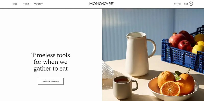
The power of landing pages – as opposed to home pages – resides in their simplicity and focus. Rule number one for landing pages is to be concise and straightforward. And that goes for design as well.
Good landing page design is minimalist and to the point, like this one from Monoware. Get rid of all the noise that might confuse or distract your prospect from your core message. Choose one purpose for your landing page and make every piece of your design serve that purpose.
2. Make Your Design Eye Comforting
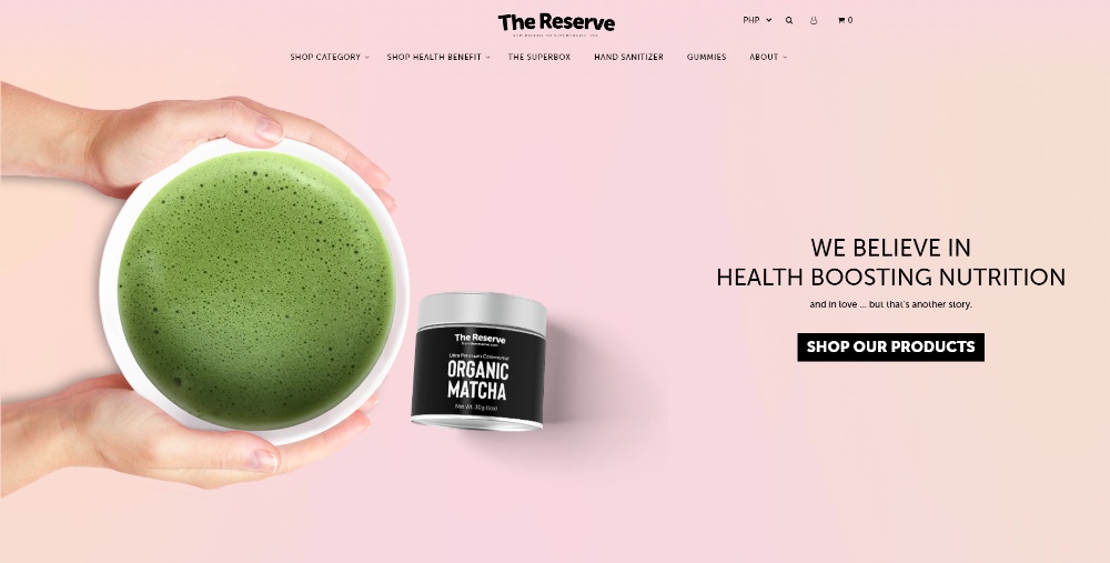
The most captivating designs are those that comfort our gaze. Everyone enjoys a soothing visual. Your landing page should have the same effect.
A combination of colors, typography, and layouts can help you achieve that relaxing effect. Don’t be tempted to fill every blank space on your page. Make peace with whitespace, and embrace thin and simple fonts. As an example, get inspired by this landing page from The Reserve.
Symmetry and alignment are also great ways to make your design more graceful and neat. People are naturally attracted to order and organization. It’s “oddly satisfying” and it inspires trust and authority.
3. Use Contrasting Colors
The choice of colors is a very important component of any design. Colors have a strong impact on our senses and for that reason, shouldn’t be picked arbitrarily.
In landing page design, colors can play a big directional role. Using complementary and contrasting colors can direct the attention of the user to the right place.
Color contrast also allows you to put certain elements under the spotlight. For instance, your CTA. Your call to action button should always be in a color that pops out of the overall decor. That change of color draws more attention to the CTA and compels people to click on it. Here’s a sample web page created by our Penji designers. As such, explore other samples our landing page designers have produced for our clients.
4. Don’t Ignore Text Formatting
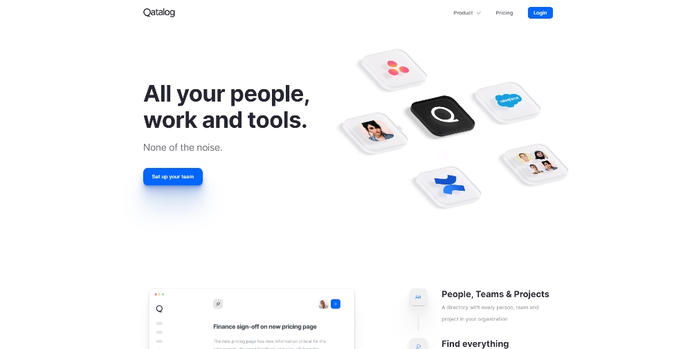
A good landing page design service knows that clutter is the enemy. And that goes for both text and graphics. As important as text can be on a landing page, its efficiency relies heavily on how well it’s presented. A condensed and long paragraph is unattractive and in most cases, repelling. Similar to headlines, keep your landing page brief with around 250 to 300 words. The shorter the text, the easier it is to read and understand. So, keep it simple and direct.
With the short attention spans and the endless distraction sources, you can’t risk having a cluttered paragraph in your landing page. Make sure that your text is concise and to the point like this example from Qatalog. Every single word should earn its way in your landing page. And of course, use bullet points.
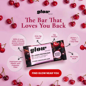
5. Make Your CTA Stand Out
Your Call to Action is the center of your landing page. If your user clicks on your CTA, you reach your goal. Therefore, all your design effort should be focused on leading your visitors to your CTA.
One way of directing the attention of your prospects to your CTA is through the design of the CTA button. Your CTA button should be noticeable, visually pleasing, and should look highly clickable.
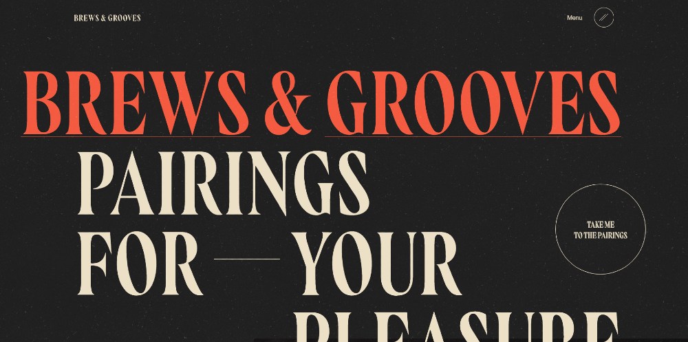
You can even put in some extra design effort in your CTA like color change or animation. Anything that makes your CTA attractive and fun to click on is a plus. Check out this one here from Brews & Grooves. Even if the font stands out, they use the CTA button in an unconventional way.
6. Use Compelling Images
Images, generally, have a stronger impact than words. Using an image on your landing page can stimulate emotional reactions from prospects. And yes, emotional reactions are good. In fact, if you can trigger a positive emotion, a customer is 7 times more likely to convert.
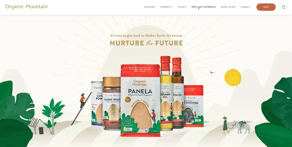
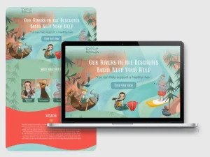
Besides emotions, a beautiful image enhances the aesthetic value of your landing page, making it more visually soothing. Make sure to use high quality and relevant images. If the visuals don’t make sense in your landing page, your prospects will get confused. And we all know that a confused prospect is a lost prospect. To illustrate, here’s the landing page from Organic Mountain.
7. Cut Down Distractions
It’s important that your landing page serves one unique purpose. Anything in your design that doesn’t directly contribute to achieving that same purpose should be removed from your page. And that includes links or navigation bars.
Distraction is anything that deviates your prospect from completing your desired action. If the function of your landing page is promoting an online course, don’t include links to your blog post. Soapply does a great job of following this tip.
Links to other parts of your website are distracting. Some would think that traffic is traffic but that’s not quite right. Each campaign should earn its own traffic.
8. Optimize for Mobile
By now, it’s pretty obvious why you shouldn’t overlook mobile design. You simply don’t get to choose the device your prospects use. Mobile optimization is crucial for your landing pages just as it is for your website.
It’s critical for a landing page design service to create responsive pages that load correctly on mobile devices. A high converting landing page is a page that looks great, loads fast, and offers a remarkable experience on any device. This is sometimes easier said than done.
9. Include Visual Branding
It’s very important to keep your brand at the top of the minds of your prospects. Remember that most of your future customers don’t know your company or brand yet.
Also, keep in mind that traffic can come from all traffic sources, including ones without context. If a prospect clicks on an ad on Twitter, they most likely don’t know who you are.
It’s important that your landing pages include your logo and reminders of your brand, like this one from Sundaze Skincare. Don’t make your logo or brand the center of your design. Just make sure it’s in a strategic placement that people can’t miss.
10. Make Your Headline Impossible to Miss
Besides the overall feel of your landing page design, your headline is one of the first elements that grabs people’s attention. It’s the very first text they read. Remember first impressions? The headline plays a huge role in making a good first impression.
It’s important to understand that the headline is more than just text. Your headline structures the layout of your page. It helps your readers skim through your landing page easily. Here’s another sample landing page design created by one of our designers.
Think of including subheadings as well if you have long text. They are the backbone of your landing page design.
11. Be Consistent
You need to be consistent in two ways. First, your landing page offer should match your ad’s promise. And second is visual and brand consistency.
Visual consistency is all about maintaining a layout that your prospects and customers are familiar with. Partnering with a landing page design service allows for consistent branding. If people see your designs repeatedly, they will start to remember you.
Now, this is not about having the exact same layout in all your landing pages. Feel free to get creative in your designs, but make sure to include elements that remind people of your brand. For example, putting your logo in the same place, or using common colors in different landing pages, like this one from Vitl.
12. Establish Trust
Landing pages are generally your first contact point with your prospects. More often than not, people who visit your landing pages don’t know anything about you or your business. And that is why your landing page should inspire trust and credibility before anything else.
Do you know what people blindly trust? Other people’s reviews.
If you want people to trust you and your business show them what other people say about you. Social proof is a great way to get indecisive people to convert. See how Tower28 added social proof in their design. Aside from reviews, you can also use media shout outs or certifications.
13. Use Video or Gifs
Videos and gifs are like glitter to landing pages. They add a fun element to your page.
Videos are known to increase engagement in general. Their ability to stimulate emotions and their entertaining nature make them irresistible. In landing pages, videos can increase your conversions rate by 86%. Here’s how you can use video on the landing page in a sample created by one of our designers.
Keep in mind to include a video or gif that’s highly relevant to your landing page. Don’t add videos for the sake of entertainment. Your video should add value and showcase your value proposition.
14. Add Scarcity Elements
The fear of missing out can serve as a great motivator to take action. Adding scarcity elements to your page pushes people to act fast.
Many times, we come across a webinar that we want to attend or an ebook that we would love to read but we just leave it for later. We all know that later never happens. And this is why timers and one time offers are great. You can take inspiration from this one by The Coconut Cult.
15. Run Tests
The more experimentation you run on your landing page design, the more targeted your page will be.
Following what works best for other people is not enough. What matters is finding out what works for your own audience. And the only way to get there is through A/B testing.
Create various versions of your landing pages with subtle differences. Make sure to A/B test one element at a time. Gather as much data as you can and continually optimize your landing page for better results. You could try A/B testing like how Hubspot does it with their landing pages.
How Can Penji Help with Landing Page Design
Penji’s expertise in web and graphic design services makes us the ideal partner to help you reach your marketing goals. As a design as a service platform, Penji offers flexible and efficient solutions that let you get high-quality designs without the hassle of hiring in-house. Landing pages are one of Penji’s specialties, letting you convert leads into customers by following web design principles and trends. It’s easy to get a landing page from Penji! All you need to do is provide a design brief containing everything that should be included in the design, such as hero images, copy, and landing page design type! Within 2 days, you should get a killer landing page design that’s aligned with your branding and engaging for your audience!
Get Unlimited Designs (Including Landing Pages!)
Crafting a captivating landing page design is crucial for driving conversions, engaging visitors, and achieving your desired goals. By combining an aesthetically pleasing layout, persuasive copywriting, intuitive navigation, and clear call-to-action buttons, you can create a seamless user experience that leaves a lasting impression.
Acquire more leads and convert them into customers with well-designed landing pages. Through Penji’s design as a service model, you can access unlimited design requests web page designs, app designs, illustrations, and more for only $499/month. Sign up today and request your first landing page design.
Try Penji risk-free for 30 days and get all your design projects done
Try Penji risk-free for 30 days and get all your design projects done


FAQ’s
1. What are common landing page mistakes?
Common landing page mistakes are cluttered aesthetics, weak and vague CTAs, lagging page loading speed and other elements that divert from the brand’s necessary intention such as extra text and links.
2. Does a landing page need SEO?
Yes. Many landing pages are curated for paid campaigns, however, having the landing page SEO’d will help get it found in the organic realm as well. This includes using relevant keywords, meta tagging and hierarchy of the web page.
3. How long should a landing page be?
It depends. If you want someone to take a simple action (like sign up for an email list) then a shorter length is better, however, if you’re offering a product with nuanced details that require explanation, a longer landing page is better for this.
About the author

Nada Allouch
Nada is an aspiring writer and a content marketing enthusiast. Her writings aim to help people reach their business goals and attain their full potential.
Table of Contents
- Types of Landing Pages
- 1. Keep Your Landing Page Design Simple
- 2. Make Your Design Eye Comforting
- 3. Use Contrasting Colors
- 4. Don’t Ignore Text Formatting
- 5. Make Your CTA Stand Out
- 6. Use Compelling Images
- 7. Cut Down Distractions
- 8. Optimize for Mobile
- 9. Include Visual Branding
- 10. Make Your Headline Impossible to Miss
- 11. Be Consistent
- 12. Establish Trust
- 13. Use Video or Gifs
- 14. Add Scarcity Elements
- 15. Run Tests
- How Can Penji Help with Landing Page Design
- Get Unlimited Designs (Including Landing Pages!)
- FAQ’s