In the world of healthcare, a logo serves as more than just a visual representation of a hospital or medical institution. It has the potential to convey a powerful message, evoke emotions, and instill trust in patients. While we often associate hospital logos with common symbols like the first aid cross or the Caduceus, there are numerous hospitals that have taken a creative approach, crafting logos that break away from tradition.
Join us on a captivating journey as we explore hospital logos that defy the norm, delving into the meanings and stories behind their unique designs. Prepare to be inspired and amazed by the symbolic ingenuity that lies within these remarkable healthcare brands.
Looking for awesome logos for your brand? Check out Penji for unlimited graphic design services or one-off logo designs.
1. Cedars-Sinai

Before Cedars-Sinai landed on its current and modern-looking logo, it underwent three other changes over the past six decades. Cedars-Sinai explained that their logo looks like an infinity symbol because they’ll be on every patient’s journey all their life. Plus, they added it’s to become an innovator while looking at the past.
2. Mount Sinai
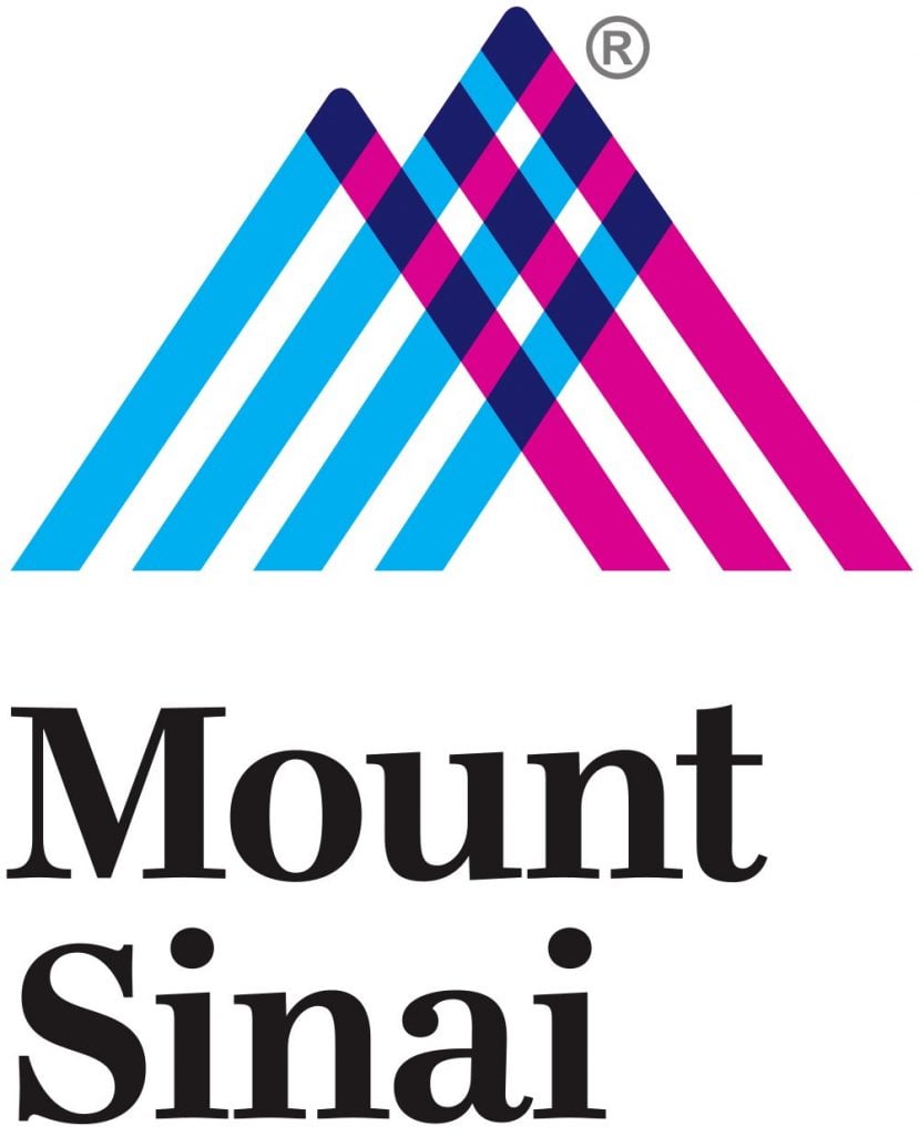
If hospitals want to stay relevant and up-to-date, they, too, should consider a rebrand. With the help of Siegel+Gale, Mount Sinai has become a hospital for the modern age. Their logo represents momentum and integration. Not to mention, hospital staff and patients may feel that Mount Sinai would have a clear and consistent brand with the new logo. And it will also reflect their experience with the hospital.
3. University of Texas Health East Texas

As the lone star state, K2MD wanted to create a logo that paid homage to that nickname. As you can see on the logo, there’s a lone star in the middle of the orange shield. Shields are a common symbol found in most healthcare logos. In addition, orange is the official color of the University of Texas, which further strengthens the university’s brand in its logo.
4. Children’s National
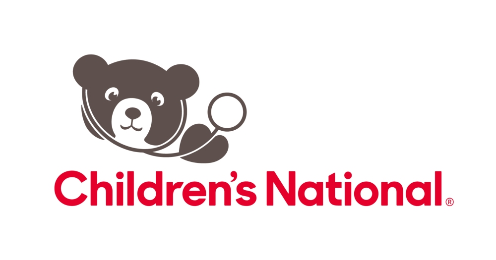
Since the name of this hospital includes “children,” a mascot logo would fit well. For one, the bear doesn’t look intimidating. Besides, the bear may also indicate some form of comfort, like how children would carry teddy bears. Meanwhile, red in color theory may indicate love, playfulness, or happiness, which children may represent as well.
5. Humber River Hospital

Here’s an example of a much-needed rebrand so the hospital would have a stronger identity. The designers, Central Station and Dave Rodgers, explained that the plus symbol had a double purpose: one was to represent first aid, and another was to position the hospital as a forward-thinker. Adding the H in there gives the logo to create balance.
6. Krishnai Hospital

It’s unusual to see hands as the logo of any hospital, but this one by Phi Agency makes it work. According to the agency, the hands depict care provided by the staff. Not only that, but they also mentioned that the hands also symbolize trust.
7. The University of Tokyo Hospital

Sometimes, simple is good. But it’s great you have a hidden message that depicts the overall values and vision, and mission of your hospital. At first glance, the University of Tokyo Hospital logo may seem like a wordmark with an abstract mark. However, the hospital explains that the abstract mark (the 2hs) means human and hospital (healthcare). Plus, if you look close enough, there’s a T in between them. They even mention that the 2hs appear as chairs, and the T is the University of Tokyo Hospital (the institution), bringing healthcare providers and patients together.
8. CarePoint Health

Hospital logos may need rebranding to become modern or due to acquisitions or mergers. Here’s an example of a hospital that needed rebranding because of a merger. Their logo is clear and straightforward and reflects their new name. Not only that, but DeSantis Breidel explained their overall branding. The square represents the patient, while the circle is a never-ending source of care brought to the patient.
9. Matilda International Hospital

If you want to demonstrate that your hospital is giving high-quality care to its patients, you can show it through your logo. This one created by Stepworks for Matilda International Hospital provides a minimalist approach to their logo. The agency mentioned that the mountain icons represent both its locations in Victoria Peak and the letter M.
10. East Visayas Medical Center
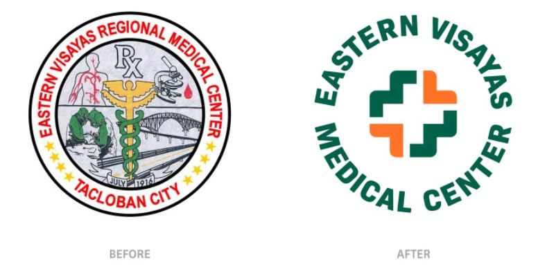
Here’s an example of a hospital logo that went with a familiar icon but tailored the design to its hospital. Plus 63, the agency responsible for creating the rebrand, used the hospital’s initials and incorporated them into the cross. While not implemented yet, it’s one of the hospital logos that can make a historical institution into becoming a modernized one.
11. LCMC Health

Blue and green are the traditional colors associated with hospitals. While LCMC Health has those colors in their logo, it doesn’t mean it’s not dull. They made it bright to show their dynamism. After all, they did mention in their brand video that they will bring more to the table. Plus, the logo doesn’t show only a heart. It shows people hugging as well because they say anyone who walks into their hospital is their family.
12. UNC Health
When UNC Health changed its name, it had to have a consistent brand and logo that reflected all the hospitals under their system. Their logo represents the “transformational change” they aim to do while providing quality care for their patients. In fact, WRAL reported that their logo rebrand cost them nearly $1,000,000.
13. Cincinnati Children’s Hospital

The Cincinnati Children’s Hospital tapped Landor for their rebrand. Its old logo showed children with raised arms. Plus, the text may no longer look “modern.” Landor updated their logo and branding, showing an adult and child about to hug. Meanwhile, the colors represent diversity.
14. Sparrow

Based on the brand video produced by Nue Creatives, Sparrow wants to position itself as a hospital that wants to take steps forward. Plus, they aim to be at the forefront of healthcare in their area. The green interlocking symbols in their logo represent their continuous commitment to change and growth.
15. Denver Health

Here’s another logo that needed to change its look because of a growing city. Denver Health wanted to change its look to demonstrate that its hospital will be the premier center for patients. Meanwhile, the colors represent their emergency teams working hard every day to ensure high-quality care for patients.
Requesting Healthcare and Hospital Logos from Penji
Healthcare and hospital logos don’t have to stick to their usual green and blue motif or health symbols. It must also reflect the core values and vision, and mission of the hospital and ensure that care is reflected. And you want graphic designers to do that job for you.
Enter Penji.
You can guarantee that Penji will take care of your branding needs. From logos to other visual assets like marketing and advertising assets, Penji designers will be with you every step of the way. Leave the designing work to us while you manage your hospital. Sign up with Penji, and get unlimited design services or one-off logo designs.
About the author

Katrina Pascual
Katrina is a content writer specializing in graphic design, marketing, social media, and technology. In her spare time, she writes monthly personal blogs to practice her craft.
Table of Contents
- 1. Cedars-Sinai
- 2. Mount Sinai
- 3. University of Texas Health East Texas
- 4. Children’s National
- 5. Humber River Hospital
- 6. Krishnai Hospital
- 7. The University of Tokyo Hospital
- 8. CarePoint Health
- 9. Matilda International Hospital
- 10. East Visayas Medical Center
- 11. LCMC Health
- 12. UNC Health
- 13. Cincinnati Children’s Hospital
- 14. Sparrow
- 15. Denver Health
- Requesting Healthcare and Hospital Logos from Penji

