Logos play a vital role in branding. They’re like a signature that helps customers instantly identify a brand. But in order for companies to really make an impact, they have to think outside the box. That’s why some companies hire design agencies or freelancers to bring their unique visions to life. What sets these logos apart is the hidden message they carry, adding an extra layer of meaning to the brand. It’s pretty fascinating, don’t you think?
Through this, they’re able to incorporate branding and make themselves stand out from other companies. It gives them an edge due to the logo’s creativity because it sticks in people’s minds. Plus, it’s fun to learn about the history or background of some logo designs, especially if there are other trivia that’ll make the logo much more interesting.
Need an awesome logo for your brand? Check out Penji for unlimited graphic design services or one-off logo designs.
In this article, we examine 10 famous logo designs and the hidden messages behind it.
BASKIN ROBBINS
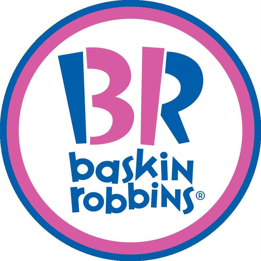
Baskin Robbins has one of the famous logo designs in the world. It’s easily recognizable because of its complementary blue and pink colors. But, what many may miss is the emphasis on the B and R in the logo.
The curvings on the B and the stem on the R place an emphasis on the number 31. It’s the number of flavors available in stores. According to Baskin Robbins, the number represents the number of days in a month.
The Baskin Robbins logo executes the hidden message in its logo perfectly because it piques one’s interest as to why 31 is significant. Also, maybe Baskin Robbins was lucky that it was easy for them to integrate the number 31 through the letters: BR.
TOBLERONE (MONDELEZ INTERNATIONAL)
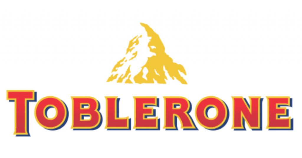
Toblerone, one of the most famous chocolate bars in the world, makes the list for having a hidden message in their logo. The mountain doesn’t seem to hide anything until you look closer on the mountain you’ll see a bear. It’s as if that bear was climbing that mountain.
According to 1000 Logos, the bear seems to climb the Matterhorn Mountain in the Swiss Alps. Furthermore, it seems the founder, Theodor Tobler, integrated Bern where Toblerone originated. With this in mind, Bern is also called the City of Bears, which further establishes the branding of the beloved chocolate.
Their logo is an example of blink and you’ll miss it. You’ll need to inspect the logo carefully so you can spot the bear silhouette.
TOSTITOS (PEPSICO)

Tostitos is a brand under the PepsiCo company. Their chips and dips are famous all over the world, yet many fail to notice a small but subtle detail in their logo.
1000 Logos says if you look closely, the T’s in the middle look like two people holding a nacho chip, while the title (the dot over small letters i or j) is the salsa. Also, it’s as if the two people on the logo are having fun or partying while eating chips and salsa.
Chips and salsa are the staples in most parties, and Tostitos did a wonderful job in presenting that in their logo. In that regard, it earns the reputation of having one of the most famous logo designs in the world.
CONTINENTAL

Continental is a manufacturing company that sells tires. For them to become remembered by customers, their logo shows the product that made them famous.
The manufacturing company explains that its logo could present a friendly facade. Equally important is the C and O in their logo. Their spacing signifies harmony and ease in usability. Not to mention, the horse also represents their registered trademark product, hoof buffers. Also, on their logo, the copy, “future in motion” is present. It affirms what their company is about.
Many, however, notice that the C and O on their logo forms a tire. The C is the rubber while the O is the wheel disk. Continental doesn’t explicitly state it, but the tire look does appear on their logo and it’s befitting their brand. The hidden message in their logo adds more meaning and depth.
FORMULA ONE

Formula One (F1), the most prestigious racing company, had a logo makeover in 2017. F1 tapped Wieden+Kennedy to redesign its already recognizable logo.
It’s one of the companies that used a hidden message in logos. Their old logo also had a hidden message because the number one signifies speed, which is a huge part of racing. On the other hand, their new design recaptures the element of speed through the curvature in the letter F but made it sleek and modern. It may also mean the race tracks in many F1 races seen on TV.
Speed is of the essence in the Formula One logo and Wieden+Kennedy doesn’t take that out of the branding. The creative agency further enhanced the Formula One logo to make the racing company relevant in the modern age.
CISCO
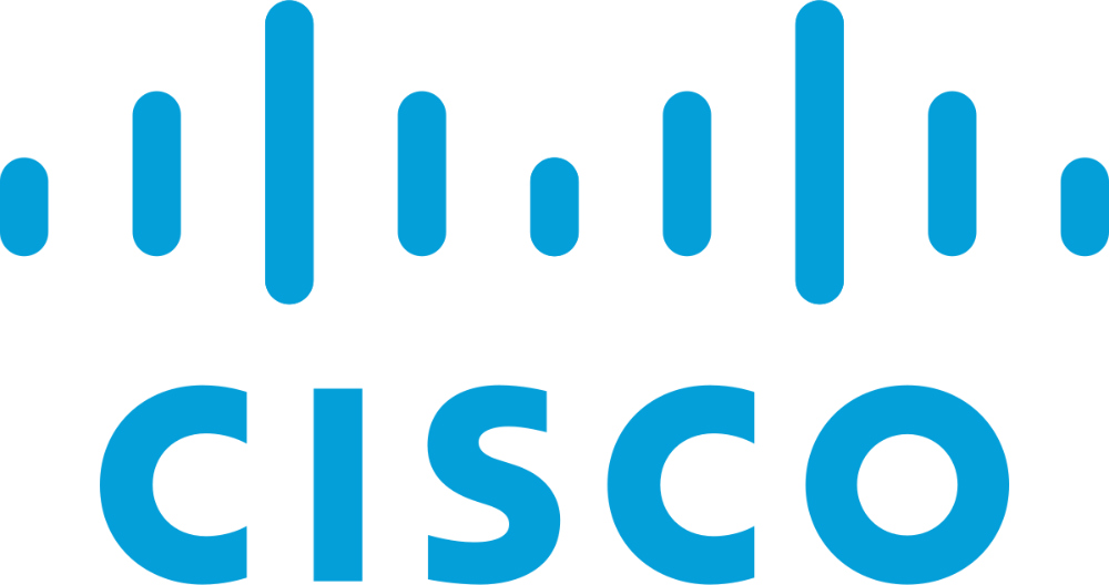
Cisco is a technology company that sells hardware and software for communications and networking (e.g. routers, wireless). Its name was inspired by San Francisco, where the company started. As such, even the logo has the most famous landmark in San Francisco: The Golden Gate Bridge.
As one sees the logo, they’ll find lines of different sizes. To some, it may not make sense. But, Cisco used the outline of the Golden Gate Bridge to create its wavelength-like logo. It’s one of the cleverest uses of a hidden message in logos because you’ll need to know the backstory and get more context out of it.
QUIKSILVER
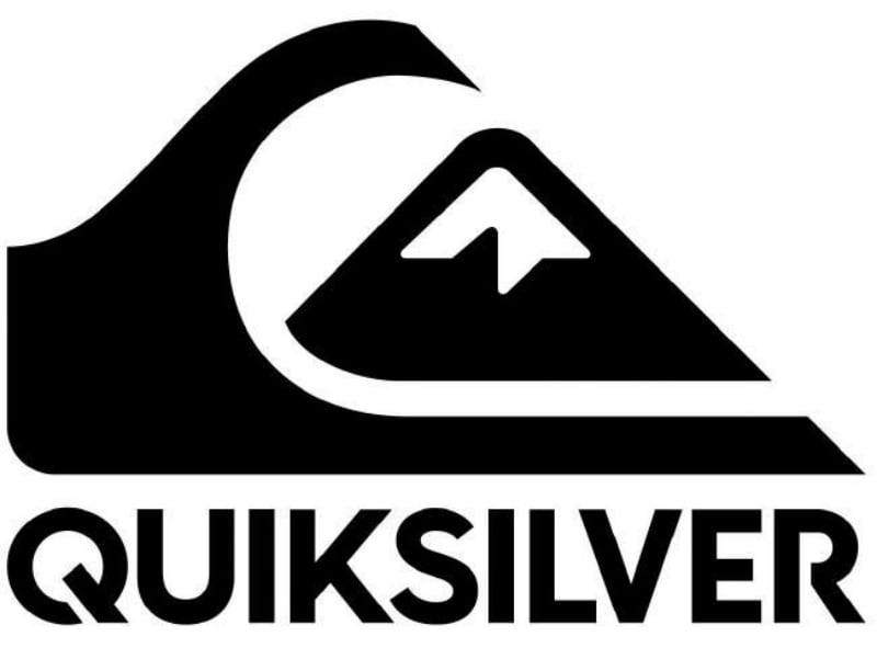
Quiksilver is a company that sells surf, swim, and snow wear and accessories. Their logo reflects their company by showing the huge wave for surfing and swimming, while the icy mountain represents the snow wear division.
However, the logo has much more meaning than that. According to Quiksilver, its logo was derived from a popular Japanese woodcut. Coincidentally, the woodcut showed a typhoon wave and Mt. Fuji, which represents the brand’s types of apparel (i.e. surf, swim, and show). It was a coincidence since they introduced snow wear in 1990, while Quiksilver had the logo since 1973.
If you’re also familiar with Roxy, Quiksilver expanded its apparel to accommodate female surfers. The Roxy logo is also derived from the Quiksilver one, but it adds a heart. In this case, Quiksilver establishes branding consistency for enhanced recognition.
ADIDAS
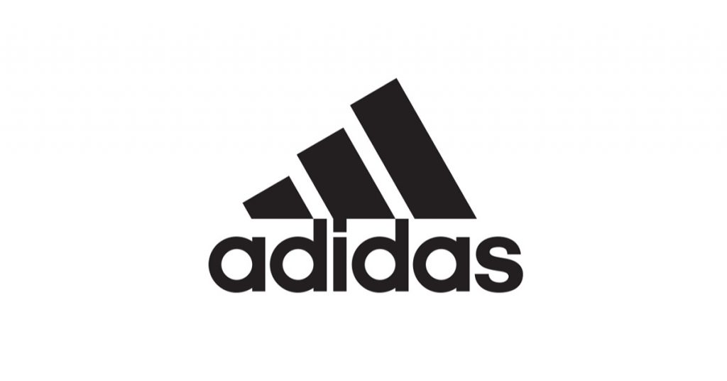
Adidas took a while to land on its three-striped logo. There wasn’t any distinguishable logo up until 1971 when it finally introduced the Trefoil. It did change its logo in the ‘90s to the famous three stripes that everyone recognizes. It redesigned its logo twice until 2005, but the mountain logo is still front and center.
Based on Logaster, the three-striped logo signified a mountain. It symbolizes the challenges faced by athletes. The same goes for those who look to be active or are just casual fans of the shoe brand. It’s to push one’s limits. While the explanation isn’t explicit, Adidas seems to innovate by enabling athletes to make themselves one step further.
NBC
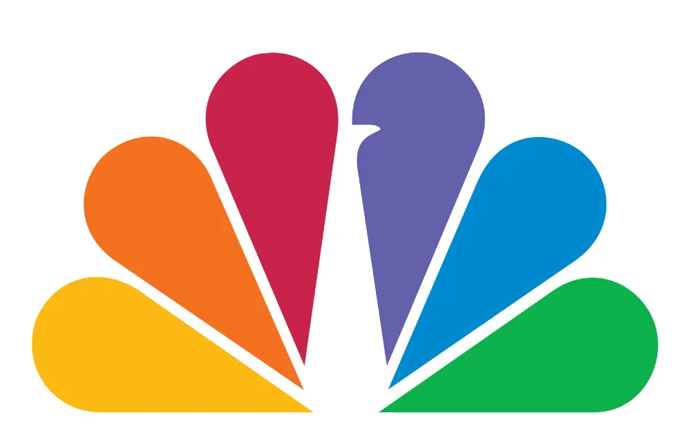
The NBC logo has undergone different logo makeovers over the years. Through Chermayeff & Geismar & Haviv, NBC enhanced its logo to emphasize the peacock branding. The design agency decided to make the peacock look right for readability purposes.
According to Web Design Ledger, with the peacock looking right, the TV network aims to move forward always to align with their motto. The hidden message in logos goes beyond than just hiding symbols. It also shows that hidden meanings also incorporate other company elements like vision and mission or mottos. Through that, it encompasses branding in just one visual asset.
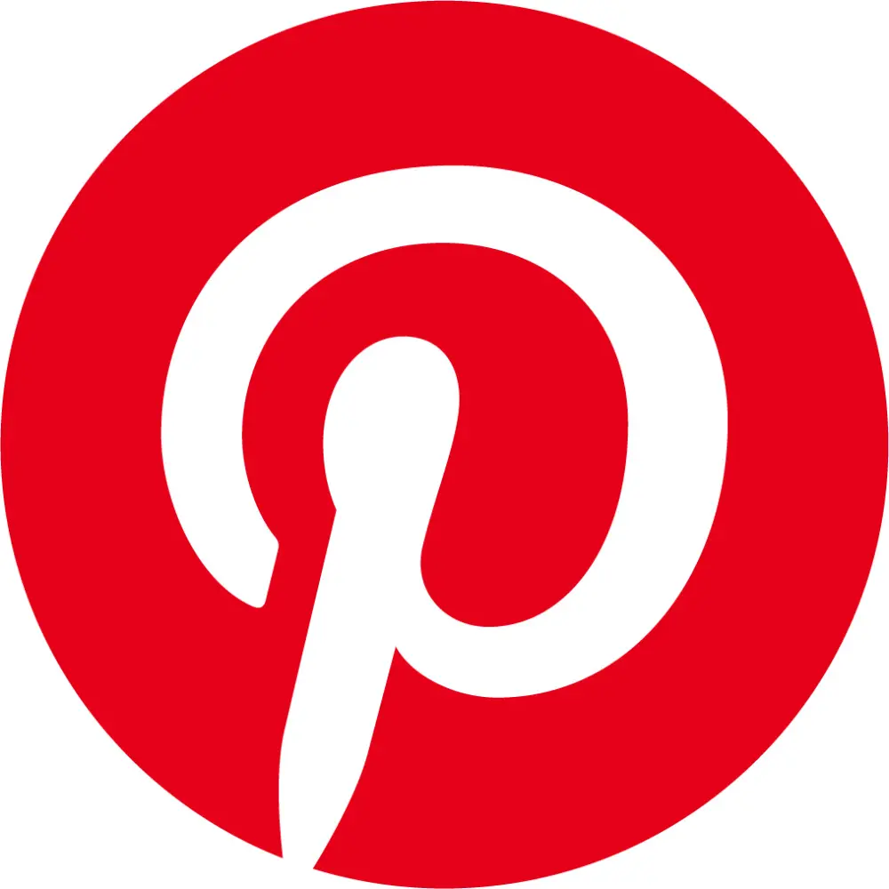
Pinterest is a known social media site that lets users pin their favorite photos. It acts like a scrapbooking site and allows users to create albums of their favorite things to share. It has become one of the most visited sites and one of the most famous logo designs on the web.
Their logo looks simple, but upon closer inspection, the P doesn’t only act like the letter P.
It’s also a pin.
CNBC interviewed the designer of the Pinterest logo, Michael Deal. He stated that the P wasn’t supposed to look like a pin. However, over time, it seemed to lean in that direction. It seems that despite efforts of not wanting to make it look literal, the P in Pinterest managed to become the pin it truly was meant to be.
The hidden message in logos doesn’t have to be obvious. Sometimes, it just happens, just like with Pinterest.
KEY TAKEAWAYS
Through the hidden message in logos, brands are able to communicate elements of their company. It’s a way for their customers to know them at first glance. This list demonstrates that design is key in creating the perfect logo for the company or brand.
Creative logos can give brands an edge because it will remain in people’s minds. However, if the brand wants to make itself known, their logo should have depth. A generic one can break them.
So, if it wants to become a memorable brand, creative logos should integrate branding and message. It’ll be nice to provide background about the logo too because it’ll make the brand more interesting to learn about.
If you’re looking to have a logo designed from scratch or give it a makeover, schedule a demo with Penji and discover how your logo can make you stand out. Sign up now, and get unlimited graphic design services or one-off logo designs.
About the author

Katrina Pascual
Katrina is a content writer specializing in graphic design, marketing, social media, and technology. In her spare time, she writes monthly personal blogs to practice her craft.


