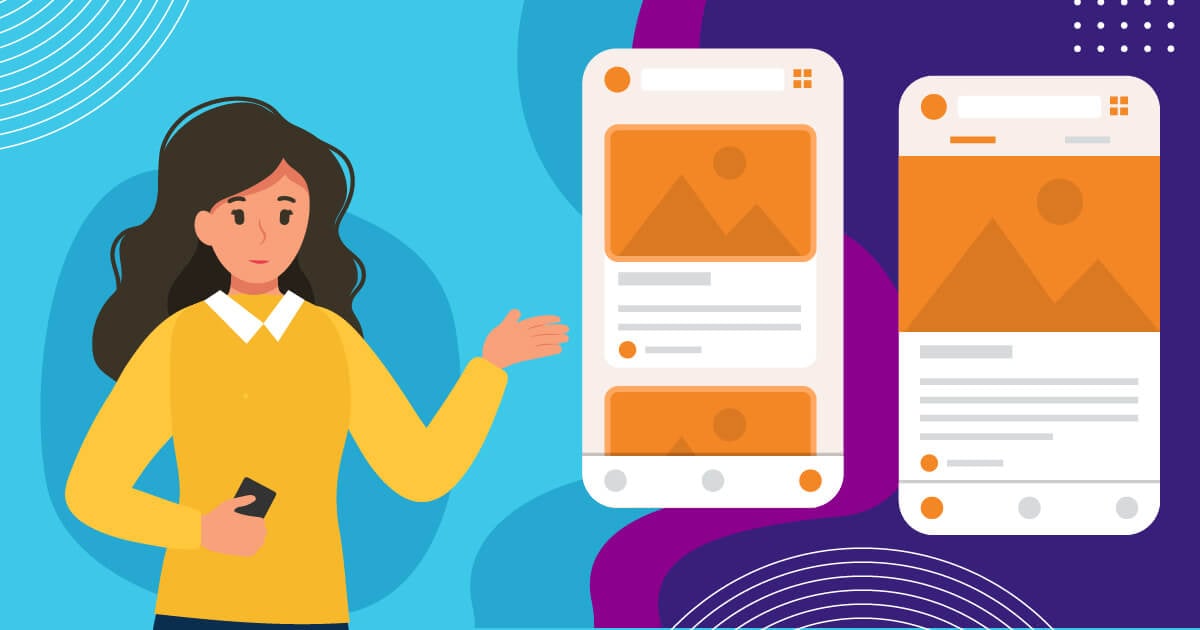
Millions of apps exist in the Play and App Stores. But, on average, only 80 apps are installed on one user’s smartphone. And to be part of the coveted 80, you need a well-functioning and good app design to have a longer lifespan on one’s phone. But how do you produce a good app design in the first place? Here’s how:
Keep it Clean and Simple
Keeping your app simple is probably the cardinal rule when designing an app. As much as you want to showcase creativity, there’s little room for that. You see, our online behavior changes depending on the device we use. Your mobile phone activities are far more different when you use your desktop or laptop.
This means you can’t directly transport all the design elements you use on your website to your app. Remember, you now have smaller screens to fill. Everything should be organized and easy to look at. Otherwise, people will uninstall your app.
Apart from that, you have to keep processes simple. Think about the user by being in their shoes. Would you want to fill out a neverending form on your app? Do you want them to click on several buttons before getting to the right page? Of course not, right? Your app only has limited space, but you can still maximize it. As Idea Theorem suggests, have 1 or 2 main actions on any page. You don’t want to overwhelm users with too many complex processes. Consider going minimal.
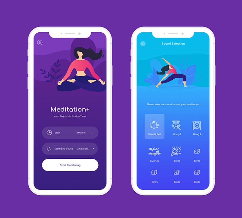
But mind you, creating a simple design is not as simple as you thought. Thus, you need an expert such as the Penji team to help you. Our goal is to provide our clients with designs that are organized and functional. See our sample for a meditation app with a straightforward design, bearing only the most essential features.
Color Scheme and Contrast
When you are creating an app for an existing brand, you should follow the same color scheme. Marketers understand that this is essential for brand recognition. But you have to be cautious too. Your color scheme might not work well on smaller screens, and your designer will need to refine the style more. Instead of using your brand color for the entire screen, they could use it for only a part of the app such as buttons or headers.
Contrast is also important in good app design as you would want your users to easily read texts like the product descriptions and even prices.
Design Consistency
An excellent app design values visual, functional, and external consistency. Let us explain each briefly for further appreciation.
Visual Consistency
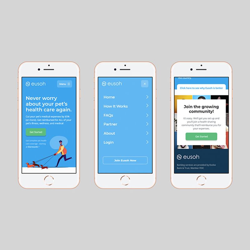
When we say visual consistency, you will design your app following a single theme throughout. For example, your team has decided to use 2D images. Make sure that it’s the same for all your app’s pages, and don’t switch to 3D. If you are using rounded corners for your call-to-action buttons, then do so for everything. The design consistency includes sizes and fonts as well.
Functional Consistency
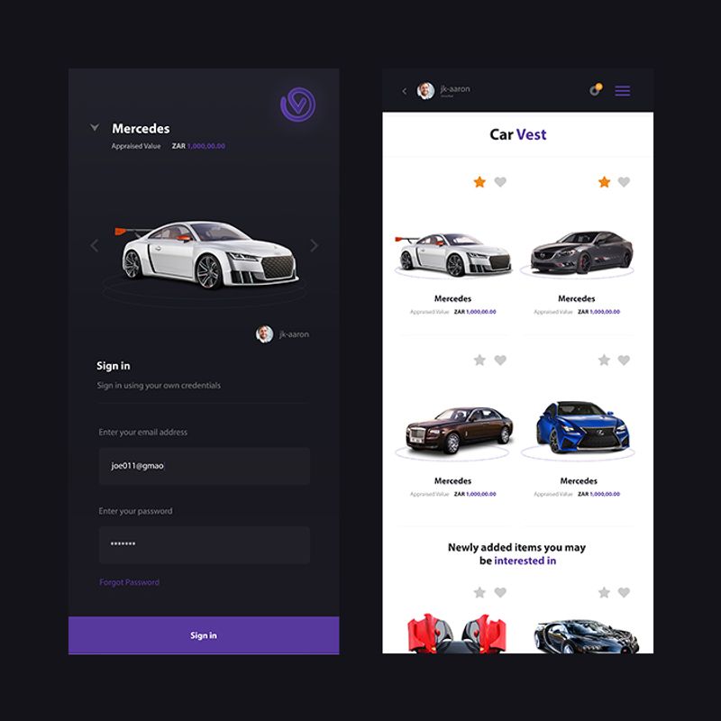
On the other hand, functional consistency means that all the app mechanisms should work or respond the same way even if you go to the next pages. Your users do not have to figure out how to navigate a specific page because it’s basically the same throughout. Simply put, you can already predict what to do next. This is beneficial, most especially if you are introducing a new feature or page.
External Consistency
And lastly, external consistency plays a huge role as well for a good app design. It means your design is cohesive to other products like your website.
Add Compelling Visuals
Unless you are building an app that requires reading, you should limit the texts to your design. If you want to persuade your users to navigate more, the solution is adding the right visuals, including icons and real images.
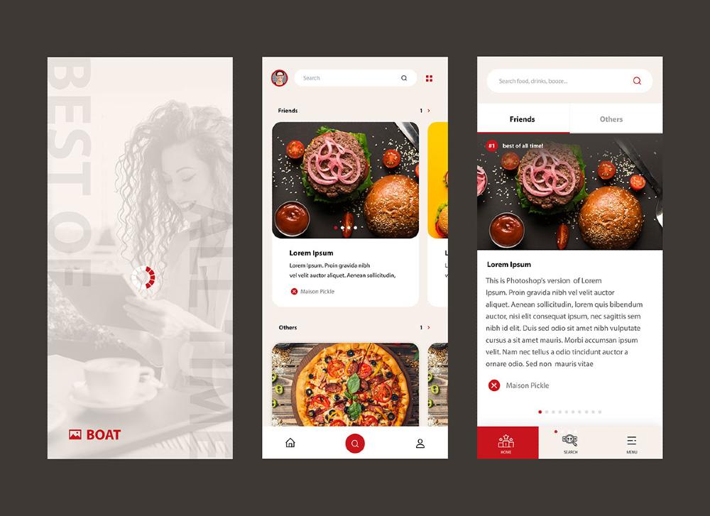
Take a look at this sample from Penji. Apps for restaurants and other food services should use their best photos on their menu. It isn’t enough to list down your food offering, and hope that your customers will understand what those are. You need to give them an overview of what to expect when they order from you. The same goes for other eCommerce apps where you have to include actual images of the products.
As an alternative to photos, app designers would use illustrations as well. It has been a common trend to make it more engaging for users. Plus, it could even make them stay on the app. After all, illustrations are a visual representation of text. You can save on space when you use illustrations as opposed to explaining them through copy.
Apply Visual Hierarchy
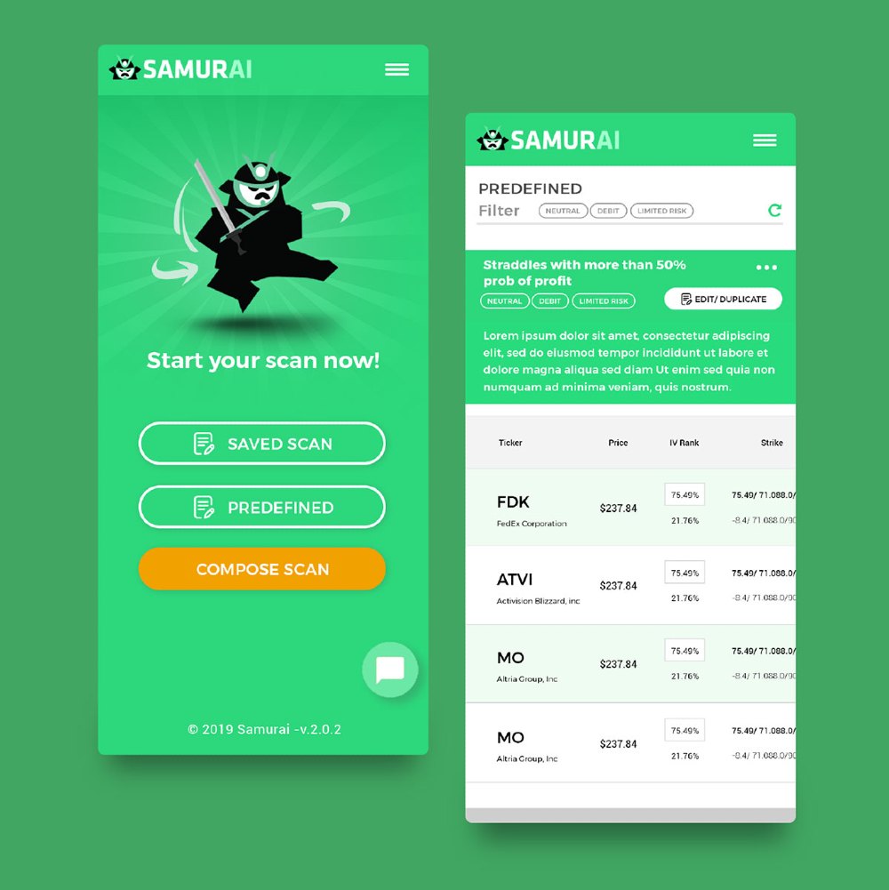
You want to make sure that your users will follow a flow as they use the app. A visual hierarchy will make this happen. You want to make sure that users view the most important parts of your app first. But it doesn’t just apply to how you present information to users.
Visual hierarchy refers to some of these concepts as well:
- Text
- Color
- Space
- Contrast
- Alignment
If you keep visual hierarchy in mind, you’ll eliminate confusion and might even increase retention rates.
Adhere to Guidelines
Even if you have a unique idea for an app, make sure that the overall design will follow the guidelines set by app stores. That way, you can get your app into the stores and increase the number of downloads.
If you must know, Google’s Play Store and Apple’s App Store review everything. An amateur designer might not be aware of these standards as they tend to get overly creative when designing an app. The expert designers with years of experience under their belts know better. They are even equipped with the latest app trends so they can use it when designing yours. Working with them is your best option.
The Apple App Store even provided pointers that will get your app approved:
- Touch controls
- Hit targets
- Contrast
- Spacing
- High resolution
- Text size
- Distortion
- Formatting
- Alignment
- Organization
Follow Grids and Layouts
Since you know that apps have limited space, you need to use grids. You have to remember there’s no one size fits all regarding app design because smartphones have different sizes. That’s what you need to consider when creating your app.
As mentioned before, you don’t want users zooming in and out. Grids can address this issue, making it seem your app would fit on any screen. Plus, by using grids, you can align and organize elements of your app correctly.
Find a UI Designer
When all else fails, hire a UI designer to do the work for you. After all, they have the know-how. Plus, they have the resources to create a good app design that won’t increase uninstall rates.
Even if you pass on the work to a UI designer, the designer will ensure your vision is fully realized on the design. But your designer may have to make some tweaks here and there, so it’s a functional app. This way, your users will keep the app on their phones. Plus, it will raise the most important metric for apps: retention. According to Upland Software, the mobile app retention rate is 29%. And a good app design may do just that. But where can you find a UI designer?
Luckily, you don’t have to leave the comfort of your home to hire a UI designer. You can find one through a simple search. While the search engine may yield great UI designers for the job, the best ones are working for Penji ready to take on your design request. All you need to do is sign up, subscribe, and submit your first design request. No more hiring, no more contracts. Watch a 10-minute free demo video to see how the Penji platform works.
Final Thoughts
To execute a good app design, one must have a clear understanding of its purpose. Marketers have this information at hand. And it would help if they work closely with the app designers to provide the market research. That way, the team can brainstorm on a design that will work best for your specific audience.
Again, it is crucial that you choose a designer who has already proven their worth. Fortunately, Penji only employs the best and offers affordable app designing services for a fixed fee every month. With us, you are sure to get quality apps and nothing less. If you want to learn more, check out our website today.
About the author

Barbara Anne Isla
BA Isla is a Content Writer and also an Events Host. She left the corporate world to do what she loves and to spend more time with her amazing kids. She hopes to bring valuable change to society with her words.


