TL;DR: Color psychology and typography work together to shape how people respond to your brand. Getting these elements right means your designs communicate the exact message you want.
Color psychology influences emotional response, while typography affects readability. Together, they form your visual language that works before anyone reads a word. Choose warm colors with bold fonts for energy, or cool tones with clean typography for trust.
When you look at a design, you feel something before you think something. That reaction happens in milliseconds, driven by color and type working together.
Color psychology explains why certain hues make you feel calm while others get your heart racing. Typography either welcomes readers in or pushes them away. Research published in Management Decision found that visual appearance accounts for approximately 90% of snap judgments about products, with color being a primary factor in purchase decisions.
You wouldn’t wear a tuxedo to the beach or shorts to a board meeting. The same logic applies to design choices. The colors and fonts you pick need to match the message you’re sending and the audience you’re reaching.
How Does Color Psychology Shape Design Decisions?
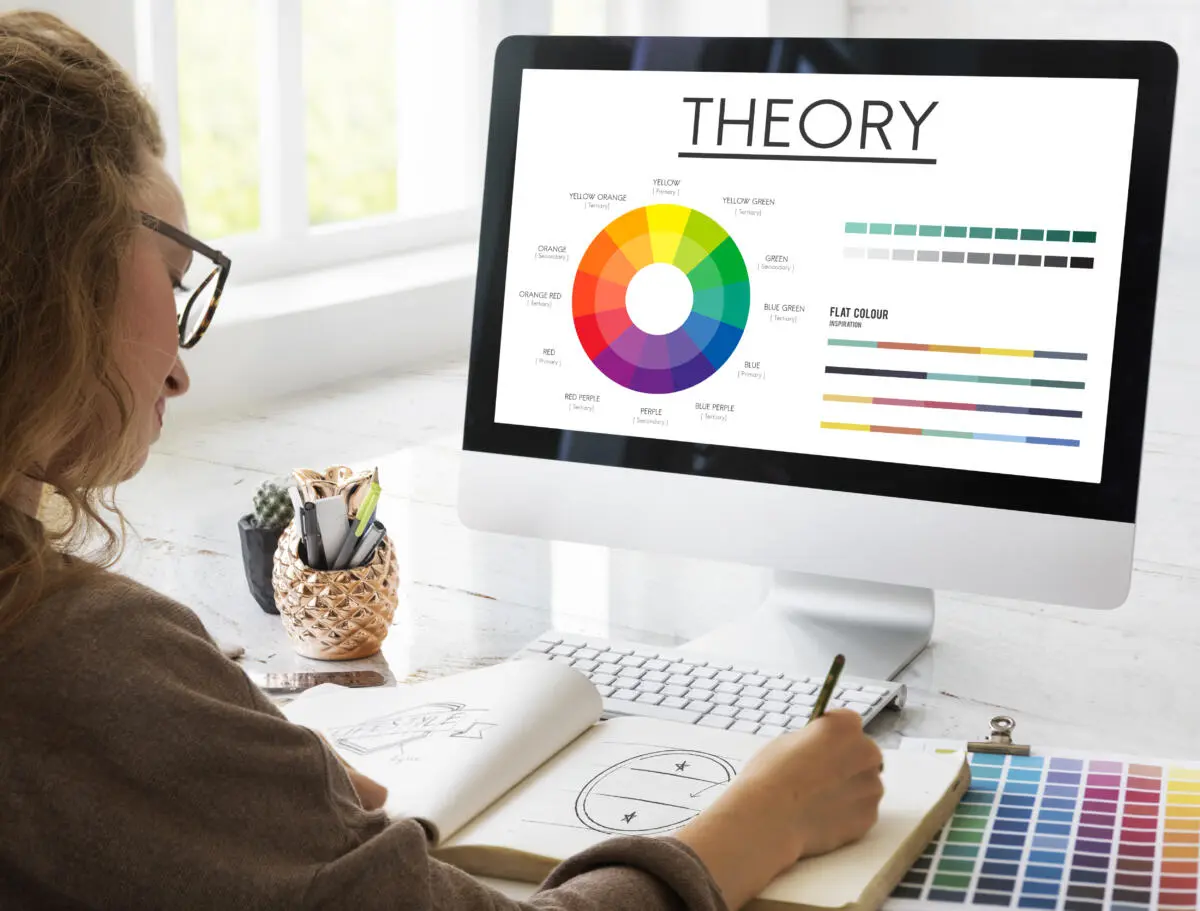
Colors aren’t just pretty. They’re psychological triggers that tap into emotions and cultural meanings we’ve built up over lifetimes.
Understanding Color Emotions
Each color carries specific associations that affect viewer behavior. Blue creates feelings of security and trust, which is why banks and tech companies love it. Red pumps up energy and urgency, perfect for sales and food brands. A study published in the Journal of Business Research found that red can increase heart rate by up to 13.4%, creating feelings of excitement.
Green connects to nature, health, and growth. Yellow radiates optimism and grabs attention fast. Research from the Color Marketing Group shows that yellow is processed by the eye faster than any other color, which explains why it’s used for warning signs and attention-grabbing elements.
Context matters though. That same red that works for a fast food chain might feel aggressive for a spa. According to research by Hallock, color preferences also vary by gender: 57% of men and 35% of women say blue is their favorite color, while 35% of women prefer purple compared to just 1% of men.
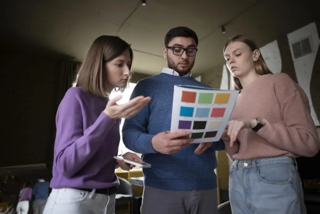
Custom design services that understand these subtleties help brands avoid embarrassing missteps. A graphic design service worth their salt will ask about your target market before suggesting a palette. You can explore more about strategic color use through resources on brand color wheels and psychology of colors in logo design.
Why Does Typography Matter as Much as Color?
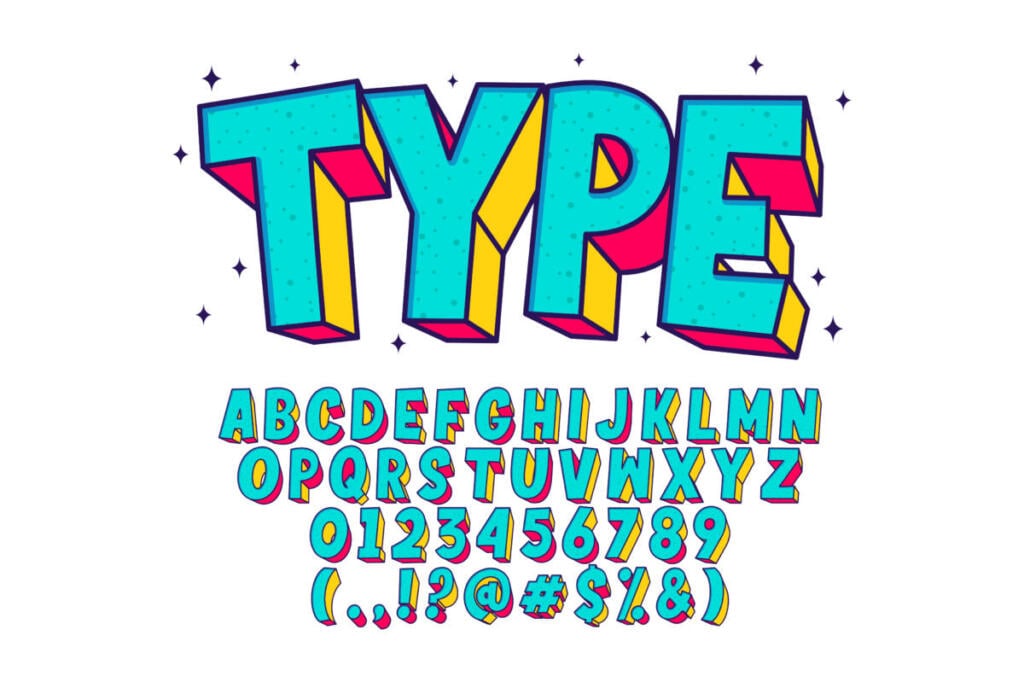
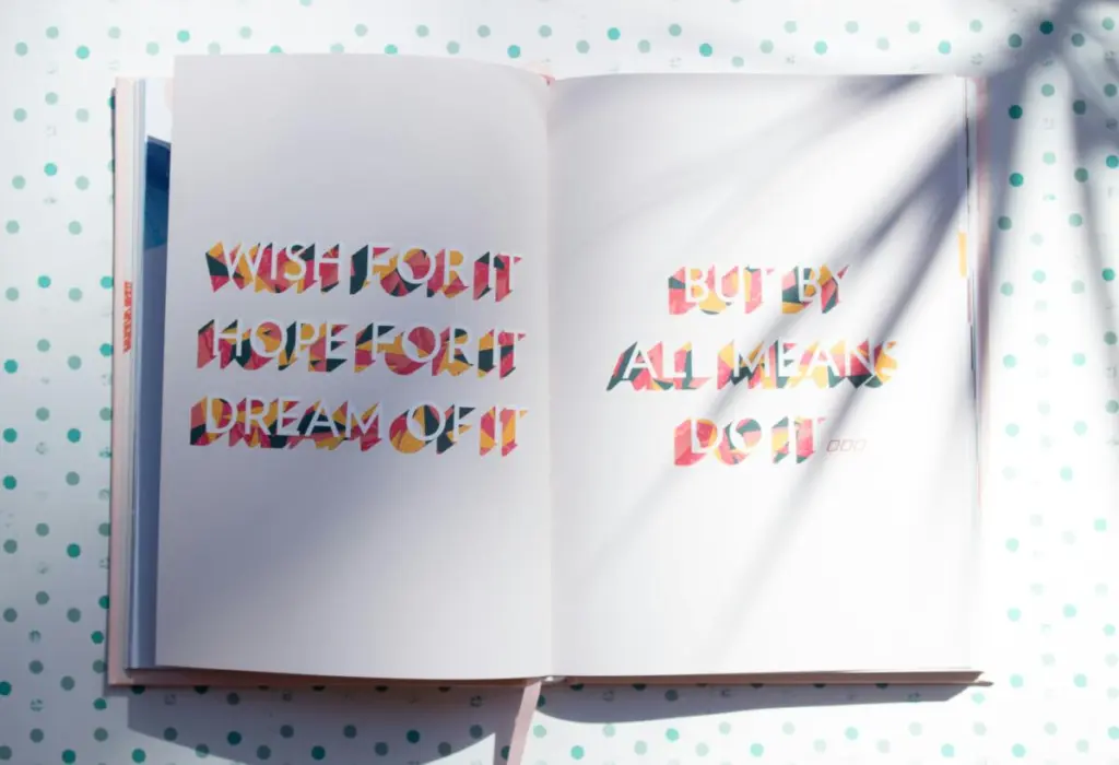
Fonts have personalities too. The typeface you choose speaks volumes about who you are as a brand, sometimes louder than the words themselves.
Serif vs. Sans Serif: What’s the Real Difference?
Serif fonts (the ones with little feet on letters) feel traditional, authoritative, and trustworthy. Think newspapers and law firms. Sans serif fonts are clean, modern, and approachable. Tech startups and contemporary brands lean this way.
A study published in the journal Computers in Human Behavior found that good typography can improve online reading comprehension. The Software Usability Research Laboratory discovered that readers perceive serif fonts as more trustworthy for financial information, while sans serif fonts are rated more modern and innovative.
The key is matching the font’s personality to your brand’s character. Typography design choices should reinforce your message, not fight against it.
Readability Trumps Creativity
A beautiful font that nobody can read is worthless. Body text needs high legibility, which means appropriate size, spacing, and contrast with the background.
Research from MIT’s AgeLab shows that good typography made readers feel the content was easier to read and took less time, even when actual reading time remained the same. Studies published in the journal Visible Language found that optimal line length (50 to 75 characters) can improve reading speed by 11%. Following rules of typography ensures your message gets read instead of skipped.
Can Color and Typography Work Against Each Other?
Yes, and it happens more often than you’d think. Even beautiful elements can clash when they don’t speak the same visual language.
When Visual Elements Conflict
Picture a playful, bouncy font in serious corporate blue. Or elegant script typography in neon orange. These combinations send mixed signals. Your brain processes the playful font and expects fun, but the serious color says otherwise.
Research on cognitive load from the University of Basel shows that when visual elements conflict, processing time increases by 23% and message retention drops by 18%. This is where graphic design services become valuable. Professional designers spot these conflicts and align every visual element to support your core message.
The Contrast Problem
Low contrast between text and background tanks readability. Studies from the Nielsen Norman Group found that poor color contrast can reduce reading speed by up to 40% and that users spend 38% less time on pages with poor text contrast.
Web Content Accessibility Guidelines (WCAG) specify minimum contrast ratios: normal text needs at least 4.5:1 contrast, large text needs 3:1. These standards are based on research showing that roughly 8% of men and 0.5% of women have some form of color vision deficiency. Test your combinations with actual users, especially for accessibility.
What Makes a Visual Language Cohesive?
Cohesion means all your design elements feel like they belong to the same family. They speak the same visual dialect.
Creating Design Systems
Design systems establish rules for how colors, fonts, spacing, and other elements work together. They’re like style guides that ensure consistency across every touchpoint.
Research from Lucidpress shows that consistent branding increases revenue by 33% on average. Companies with strong visual consistency see 3.5 times better visibility than those with inconsistent branding. Penji helps brands develop these cohesive systems through unlimited design services.
Studies from the Journal of Consumer Research show that presenting a brand consistently across all platforms increases revenue by up to 23%. Check out how marketing visuals and visual communication strategies reinforce brand identity.
How Do You Choose Colors for Different Industries?
Industry norms exist for good reasons, but knowing when to follow or break them gives you an edge.
Healthcare and Wellness
Healthcare brands typically use blues and greens to communicate cleanliness, trust, and healing. Research published in the Journal of Environmental Psychology shows that blue environments can reduce patient anxiety by up to 25% and help lower blood pressure.
Technology and Software
Tech companies love blues (trust), blacks (sophistication), and bright accent colors (innovation). Analysis of Fortune 500 tech companies shows that 33% use blue as their primary brand color, while 29% use some variation of gray or black. Explore how digital design services approach this balance.
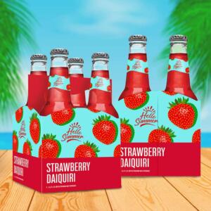
Food and Restaurants
Red and yellow dominate food marketing because they stimulate appetite. A 2015 study in the International Journal of Hospitality Management found that warm colors like red and orange can increase impulsive food purchases by 20% compared to cooler colors.
Finance and Law
Traditional blue dominates because it signals stability and trust. Research on financial service branding from the Corporate Branding Research Institute shows that 60% of banks and insurance companies use blue as their primary color. Another study found that consumers are 42% more likely to trust financial institutions with traditional color schemes over those using unconventional colors.
How Can You Apply Color Psychology in Real Projects?
Theory is great, but application is where rubber meets road.
Start With Strategy, Not Preference
Your favorite color doesn’t matter. What matters is what works for your audience and goals. Research from Kissmetrics shows that targeted color choices can increase conversion rates by 24%. One famous case study from HubSpot found that changing a call to action button from green to red increased conversions by 21%.
Create mood boards that explore different color directions before committing. Working with best brand design firms can guide this strategic process.
Use Color to Guide Attention
Bright colors naturally draw the eye. Heat map studies from Eyequant show that contrasting colors for call to action buttons can increase click through rates by 35%. Research on visual hierarchy from the Baymard Institute shows that strategic color use can reduce the time users need to find important information by 40%.
Boost your business with unlimited graphic design
Try Penji risk-free for 30 days & get unlimited custom designs
What About Accessibility in Visual Design?
Beautiful design that excludes people isn’t actually good design. Accessibility should be built in from the start.
Research from the World Health Organization shows that 1 in 12 people have some form of color vision deficiency. Studies from WebAIM found that good contrast can improve reading speed by 45% for all users.
Typography accessibility matters too. Research published in Dyslexia journal shows that 16px is the optimal minimum font size for body text on screens, improving readability by 30% compared to 12px text. Studies also found that mobile users spend 51% more time on sites with larger, more readable text. Resources about why choose Penji highlight how professional designers balance aesthetics with accessibility.
How Do You Test Visual Language Effectiveness?
Design isn’t about opinions. It’s about results.
Research from VWO shows that companies regularly A/B testing design elements see an average improvement of 49% in conversion rates. Eye tracking research from the Missouri University of Science and Technology shows that users form opinions about websites in 50 milliseconds and that first impressions are 94% design related.
Sites with poor visual design see bounce rates 38% higher than those with optimized visuals, according to Adobe research.
Bringing Color Psychology and Typography Together
Your visual language is bigger than any single design. It’s the consistent application of color psychology and typography design across every touchpoint, creating recognition and reinforcing your message before anyone reads a word.
The research is clear: color increases brand recognition by up to 80% (University of Loyola), improves readership by 40% (Xerox), and accelerates learning by 78% (3M Corporation). Good typography increases reading comprehension by 40% (Computers in Human Behavior journal). When you combine these elements strategically, the impact multiplies.
Companies with strong visual identities see 33% higher revenue (Lucidpress) and 3.5 times better brand visibility than competitors with weak or inconsistent visual language.
Ready to develop a visual language that actually works for your brand? Penji’s custom design services give you unlimited access to professional designers who understand how to translate your brand personality into cohesive visuals. From color psychology to typography design, every element works together to tell your story.
Start your Penji subscription and get consistent, professional designs that speak your brand’s language fluently.
Frequently Asked Questions
What is color psychology in design?
Color psychology studies how different colors affect human emotions and behavior. In design, it’s used to trigger specific feelings: blue for trust, red for urgency, green for calm. Research from the Institute for Color Research shows that color influences 62% to 90% of initial product assessments.
How do I choose fonts that match my brand?
Start by defining your brand personality with adjectives, then find fonts that embody those qualities. Studies show that serif fonts are perceived as 12% more trustworthy while sans serif fonts are rated 17% more modern.
Why does typography matter for business?
Typography affects readability, emotional response, and brand recognition. Research shows that improving readability can increase website engagement by 124% and that typography accounts for roughly 40% of how consumers perceive brand personality.
What’s the difference between custom design and templates?
Templates are pre made designs you adapt to your needs. Custom design services create unique visuals specifically for your brand. Research from Stanford University shows professionally designed brands are perceived as 73% more credible than DIY designs.
About the author

Flore
Flore’s passionate about turning ideas into clear, useful content that connects with people and performs on search. From blog posts and landing pages to full content plans, her work is grounded in purpose and always aligned with a bigger picture.
Table of Contents
- How Does Color Psychology Shape Design Decisions?
- Why Does Typography Matter as Much as Color?
- Can Color and Typography Work Against Each Other?
- What Makes a Visual Language Cohesive?
- How Do You Choose Colors for Different Industries?
- How Can You Apply Color Psychology in Real Projects?
- What About Accessibility in Visual Design?
- How Do You Test Visual Language Effectiveness?
- Bringing Color Psychology and Typography Together
- Frequently Asked Questions