
Blue Notes Records is one of the crown jewels of jazz’s storied history. It began in 1939 when Jewish immigrants Max Margulis and Alfred Lion founded the label, inspired by the creative innovations being made by Black American artists.
Eventually, it rose to levels of notoriety and prestige, showcasing some of the most brilliantly artful minds of the 20th Century. Now, over 80 years after its inception, its name has become synonymous with the uniquely American form of expression.
The original intent of Wolf and Lion was to document the traditional jazz music being played at this time. But around 1947, they began to adjust the labels lense, now focusing on hardbop, a newly emerged style of jazz with a more raw, emotive style to it. Hardbop became the dominant style of jazz between 1955 and 1965, and it was this pivot that led Blue Note to become one of the most prolific, influential, and respected jazz labels of the mid-20th century.
One of Blue Note’s most heralded contributions to the art world can be found in its visual identity.
You can typically spot a Blue Note release a mile away. And this is due in part to the efforts of photographer, Francis Wolf, and graphic artist, Reid Miles, whose innovative design style helped create a potent visual counterpart to the music’s forward-thinking approach.
Blue Note’s album art became known for its two-tone color combinations, candid photography, and striking typography.
The latter will be the focus of this article, which will outline 9 typefaces commonly found in Reid Miles’ and Blue Note’s work.
[in_content_ads gallery=”logos” logo=”on” title=”Need graphic design help?” subtitle=”Try Penji’s Unlimited Graphic Design and get all your branding, digital, print, and UXUI designs done in one place.” btntext=”Learn More” btnlink=”https://penji.co”]
Haas Inserat-Grotesk
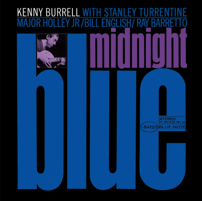
After thumbing through a crate of old Blue Note records, it becomes apparent just how much of a debt Ried Miles owes to the Swiss Style of Typography. The use of bold, geometric shapes, negative space, and a clean, gridlike layout finds its way into some of the most well-known Blue Note releases.
Another Swiss import we see on many Blue Note records is brutal, sans serif typeface. These are also known as grotesque typefaces. They are noted for their low-contrast brush strokes, simple, and geometric letterforms.
At the time of many of these golden-era Blue Note releases– the ’50s and ’60’s— this style of typography was still relatively novel, having been developed only in the late 19th and early 20th Centuries.
Ultra Bodoni
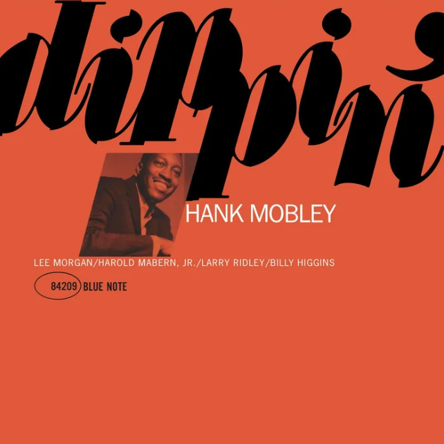
This particular expression of Ultra Bodoni undergoes a fragmented effect, where the letterforms appear as though cut and pasted in a jagged, haphazard manner.
Bodoni has a modern flair to it, but its origin goes back further than you may think.
It’s the development of 18th Century typographer, Giambattista Bodoni. But it’s been revived numerous times since. The mid-1900s, in particular, saw Bodini flourish, and Blue Note was among the purveyors of this trend.
Clarendon

This entry is important for a few reasons. For one, it’s considered an absolute hard-bop gem. It is also the only Blue Note recording by Coltrane as a session leader.
As it relates to graphic design, this entry showcases what would become a calling card for Reid Miles and Blue Note: The use of two-tone colorization. Here we can see John Coltrane shrouded by a blue tint.
Additionally, it deploys heavy usage of Clarendon.
Caslon 540

Blue Note typography includes a heavy reliance on empty space. Again, this is in large part due to the influence of the Swiss style of design on Reid Miles.
Typically, Francis Wolf would supply a contact sheet of photographs taken during recording sessions or live appearances. It would then become Miles’ task to hone in on the right one, choosing from a multitude of potential album art material.
Oftentimes, as you can see from many of the records included on this list, the photograph would be relegated to a supporting role to the text.
Art Taylor’s “A.T.’s Delight” sees the high-contrast serif font Caslon 540 do the heavy lifting.
Helvetica
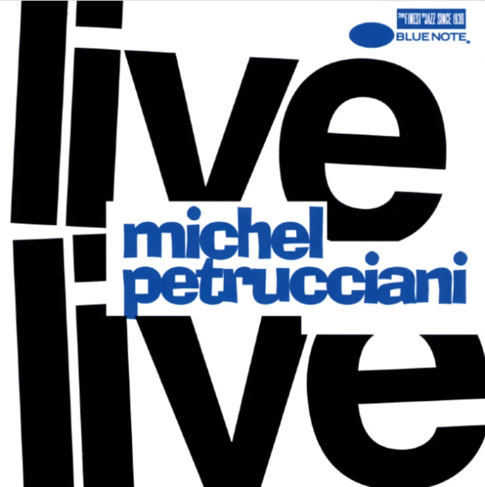
You aren’t going to be influenced by Swiss style and not have a heaping dose of Helvetica in your designs. And Blue Note is no exception. It’s strong, legible, modern, and effortlessly cool.
Many of Miles’ contributions saw the inclusion of Helvetica and Helvetica-like typefaces, but this particular record cover has the real deal. You can just feel how this would lurch out at a passive record-store goer in the early 1960s.
Trade Gothic (Extended)
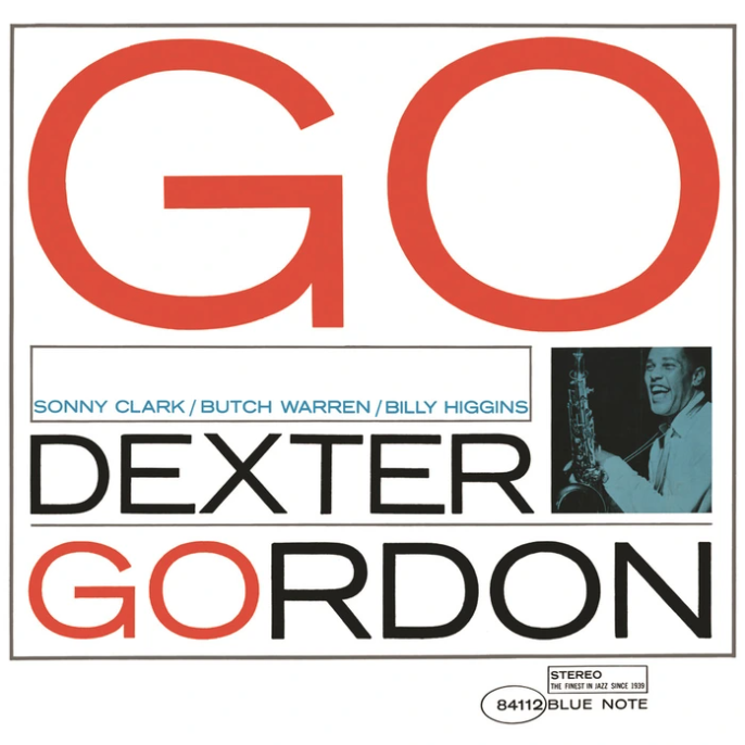
Trade Gothic was something of a staple in Reid Miles’ repertoire. It was typically adorned by artists’ credits. In fact, you’ll see it as the secondary font used on many designs featured in this list.
But in addition to being used for more practical purposes (such as needing the artist’s name to be legible), you will often find it featured as the primary typeface on many Blue Note records.
Here it is in its Extended style on Dexter Gordon’s 1962 album, “Go!”
News Gothic
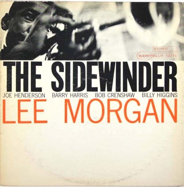
News Gothic is another typeface typically resolved for the more practical deployment, such as the back cover, which would contain information like credits and descriptions. You want something immediate. Something accessible. Legibility is key in these instances.
But, on certain occasions, New Gothic would find its way to the front, adorning both the album name and the artist name.
Franklin Gothic
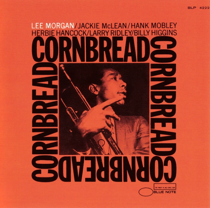
This hardy typeface just feels like the Jazz age. It’s a simple bold sans serif with tons of character. Blue Note certainly agreed and decided to double down (or quadruple down, to be exact) by having Franklin Gothic furnishing the album night multiple times on the front cover.
Beton
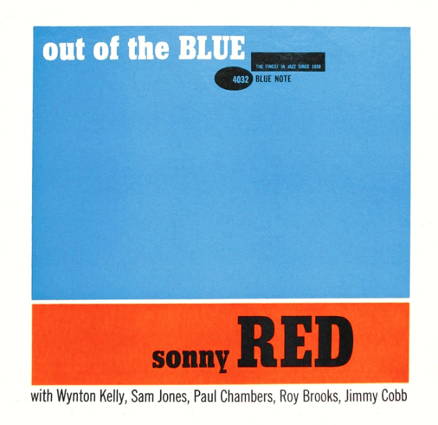
Beton is a slab serif with a refined class. It appears in droves up and down Blue Note’s discography. But perhaps none more aggressively than on the front cover of Sonny Red’s 1960 album, “Out of the Blue.”
As you can see, Blue Note would sometimes forgo photography altogether. Instead, they relied on the typographic genius of Reid Mile.
Done-for-you designs – unlimited!
Have you ever felt overwhelmed trying to create the perfect design for your project? Choosing typefaces can be a tedious task – along with all the other little details of designing for your business or project.
With Penji’s unlimited graphic design subscription, you can get all the help you need. As a user, you’ll have access to a team of experienced designers who will help you create stunning visuals in no time. From logos and illustrations to web designs and print materials, Penji has got it all covered. So if you’re looking for an easy and affordable way to get professional design assistance, try out Penji today!


