

A grotesque font is a type of typeface that is characterized by its stark, geometric lines and angular shapes. It is one of the oldest and most popular fonts used in the world. The grotesque font style has been around since the 18th century and is still widely used today in magazine ads, newspapers, books, websites, logos and other forms of printed material. It is a great choice for those looking to create a modern yet classic look.
There are two accepted ways of using “grotesque” in regard to typefaces.
Broad View: The Sans Serif
The first of which is generally for sans serif typefaces. In the early 1800s, type designers began experimenting with letterforms. Prior to this period, most typefaces keep to the classic serif style, which is notable for its use of “little feet” at the ends of characters.
As type design developed, we eighty-sixed the serifs for a more casual look. Typically, when people refer to grotesque fonts, this is what they’re getting at.
Specific View: Sans Serifs circa 1815
Font nerds (like myself) might be quick to correct the previous definition in favor of a more specific one. We’ll humor them (and me) with the inclusion of this subsection.
“Grotesque” technically refers to one of the earliest iterations of the sans serif style, though not the earliest. (Don’t worry, we’ll provide an easily digestible historical trajectory of sans serif fonts later in this article.) But it’s also worth knowing that when I say grotesque, I’m referring to the broad view. I.e. all sans serifs. For more information regarding the specific era of grotesque typefaces, check out this resource.
[in_content_ads gallery=”logos” logo=”on” title=”Need graphic design help?” subtitle=”Try Penji’s Unlimited Graphic Design and get all your branding, digital, print, and UXUI designs done in one place.” btntext=”Learn More” btnlink=”https://penji.co”]
Where did Grotesque typefaces come from?
In order to answer this question, we actually need to provide a little background for the Grotesque’s older brother: The serif typeface.
These little feet, which we call serifs, mimic a style of stone carving. The actual origins of serifs are without consensus, and there are a few theories as to how they found their way into our letterforms.
The most broadly accepted story takes us way back. Back before computers. Before movable type, even— at least a good few decades before the 1960s, I assume. Back when letters were primarily produced by being chiseled into stone.
Roman letters were first painted onto stone, then the stone carvers would chisel, following the paint marks. But this chiseling would cause flaring at the end of strokes and corners, resulting in the serif. Another theory posits that serifs helped to neaten the ends of lines as they were chiseled.
Why do we call them “Grotesque” fonts?
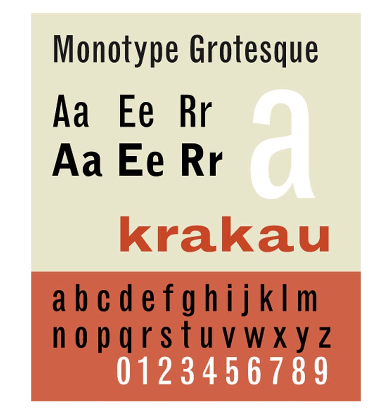
Image Credit: Wikipedia
Whatever the origin, serifs were the norm for hundreds of years. So comfortable were folks with this style that when the younger, hipper sibling arrived on the scene in the early 19th century, they were referred to as Grotesque.
That’s a little intense, right? I mean, the definition of grotesque is “comically or repulsively ugly.” This is how we’re greeting a positive typographic revolution? You can just imagine how difficult it was to be a comfortable white person in the 1800s. Anyway.
Over time, people eased up. Hardly, honestly– but enough to at least properly integrate sans serifs into their design repertoire. As time prattled on, the grotesque style became associated with modernity. It became the future. Which, given the allusiveness of its nature, is quite a hard thing to become.
And what do we do when we develop a new, modern creation capable of bettering the collective? We find a way to sell it. And if we can’t sell it, we make it a means of selling. And that’s just what we did.
Grotesque fonts would soon become the type style of choice for marketers. Its condensed, bold, and abrupt shapes easily caught the attention of consumers. It was quick to its point. And with its sharp edges and geometric quality, points were aplenty. Additionally, this type style was perfect for headlines in newspapers and magazines, while body copy was still relegated to the serif treatment.
But the evolution continued, and different substyles would emerge.
4 Classifications of Sans Serif Typefaces
Grotesque
As previously stated, grotesque fonts are among the earliest sans serif creations. As a result, they tend to have the most similarity to serif typefaces. Minus the serif.
Some notable examples include:
Two Lines English Egyptian
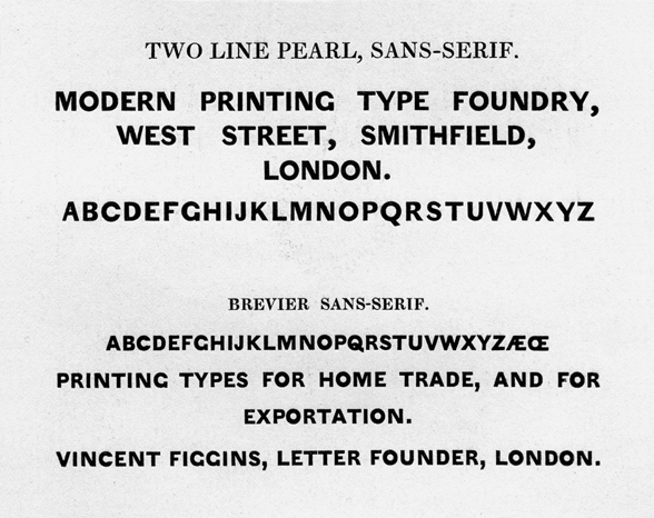
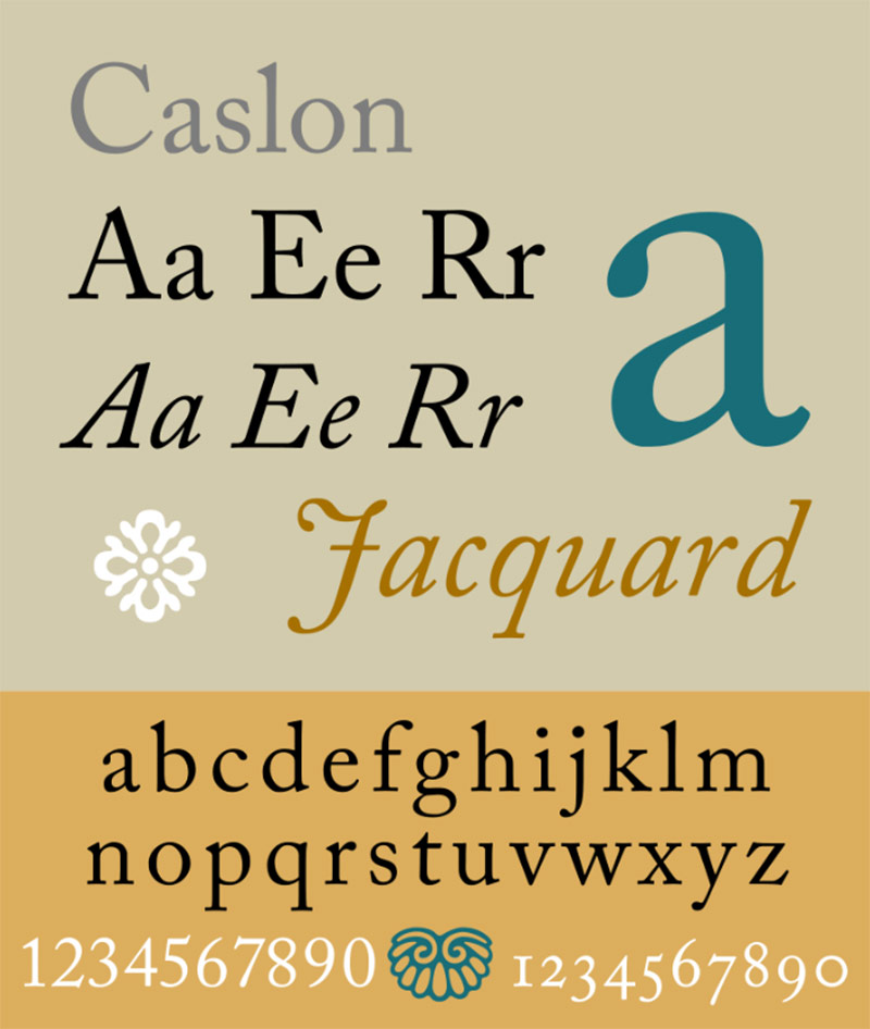
Aka Caslon Egyptian. This typeface, designed by the Caslon foundry, is credited as being the first general-purpose sans-serif typeface in the Latin alphabet. It’s relatively classical in style and only offers upper-case letters.
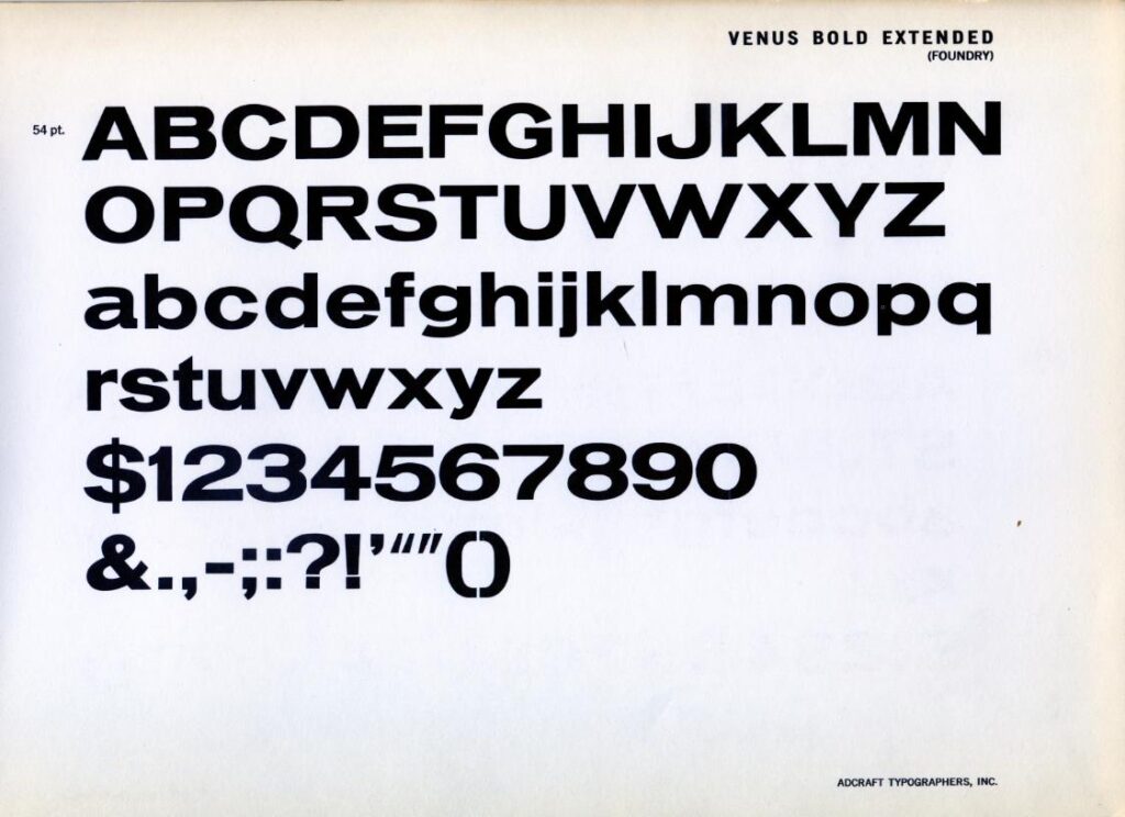
Venus
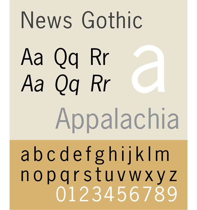
News Gothic
Neo-grotesque
Starting in the 1950s, designers again pushed the style forward. Taking influence from the International Typographic Style – or Swiss style – they sought a more neutral tone. They tend to be relatively straightforward. Unlike earlier grotesque font styles, the neo-grotesques were often issues with large-type families.
Some notable examples include:
Helvetica
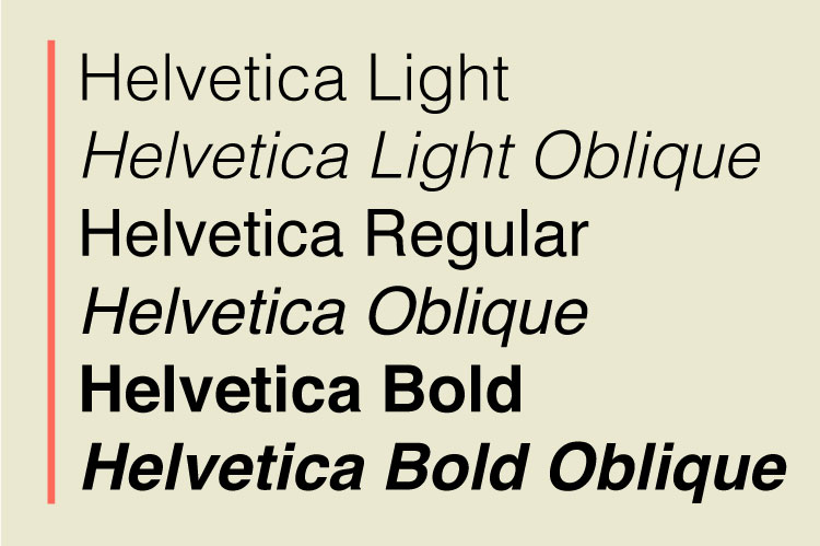
This typeface has been referred to as “the benchmark sans.” Helvetica is a classic grotesque font that has been used in countless logos, advertisements, and other printed materials since its release in 1957. It is considered to be one of the most popular typefaces of all time, and it has been used across many different industries.
Univers
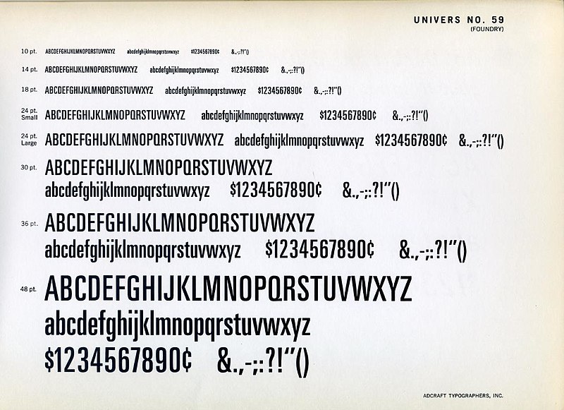
This typeface was designed by Adrian Frutiger and released by Deberny & Peignot in 1957. Milligram font has been used by many companies and organizations for their branding and design projects due to its versatility and easy readability. The font is available in both regular and bold weights, as well as italic versions.
Milligram
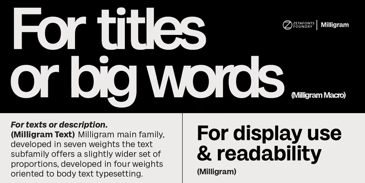
Milligram is a newer design influenced by Akzidenz Grotesk and designed by Cosimo Lorenzo Pancini with Andrea Tartarelli.
Humanist
Frutiger
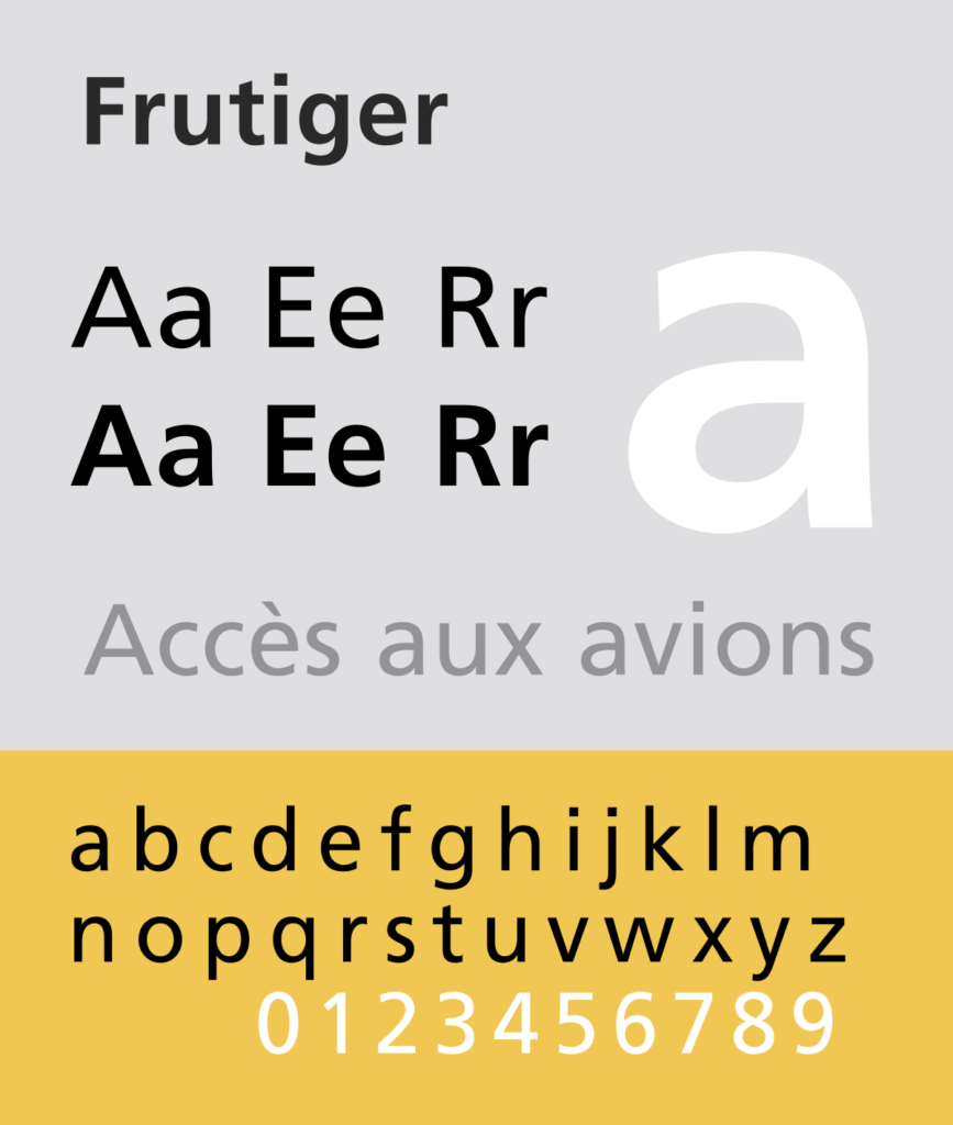
Designed by Adrian Frutiger, it was created in 1968 and has been used in various applications since then, from signage to corporate identity systems. The font is characterized by its clean and modern look with an emphasis on clarity and legibility. It is also known for its versatility, as it can be used in both small and large sizes.
Gill Sans
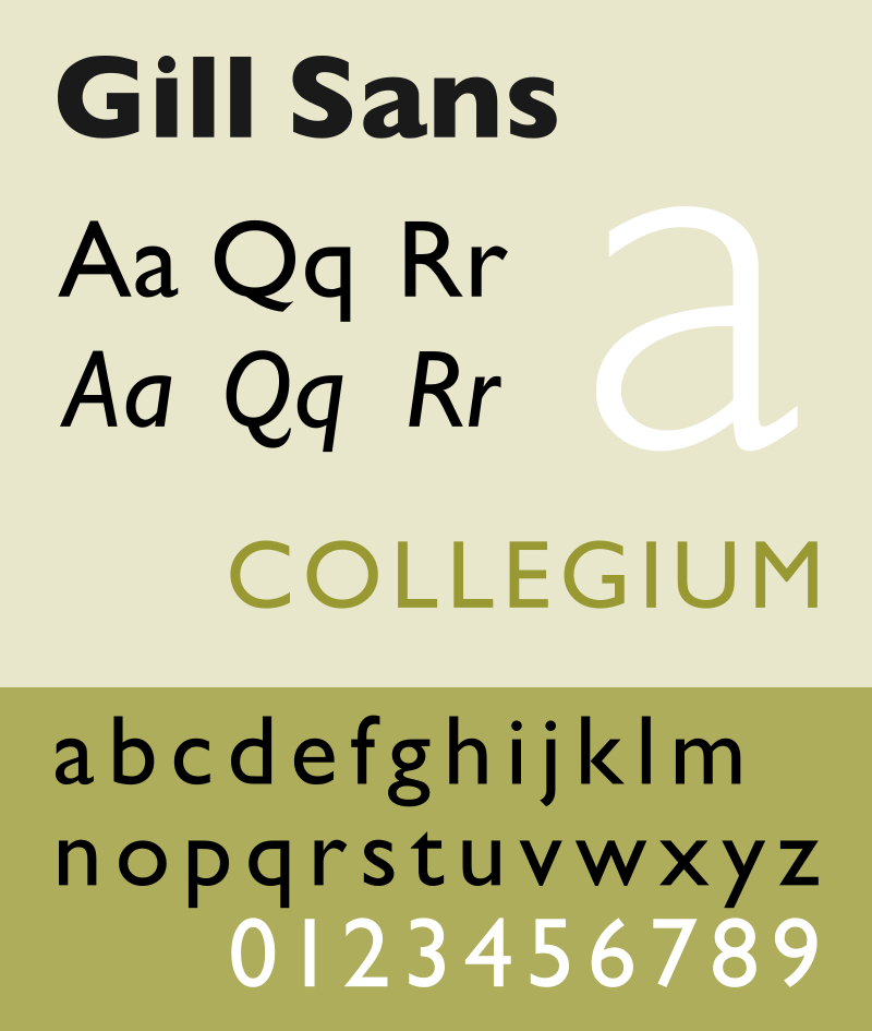
Gill Sans was designed by Eric Gill and released by Monotype in 1928.
Optima
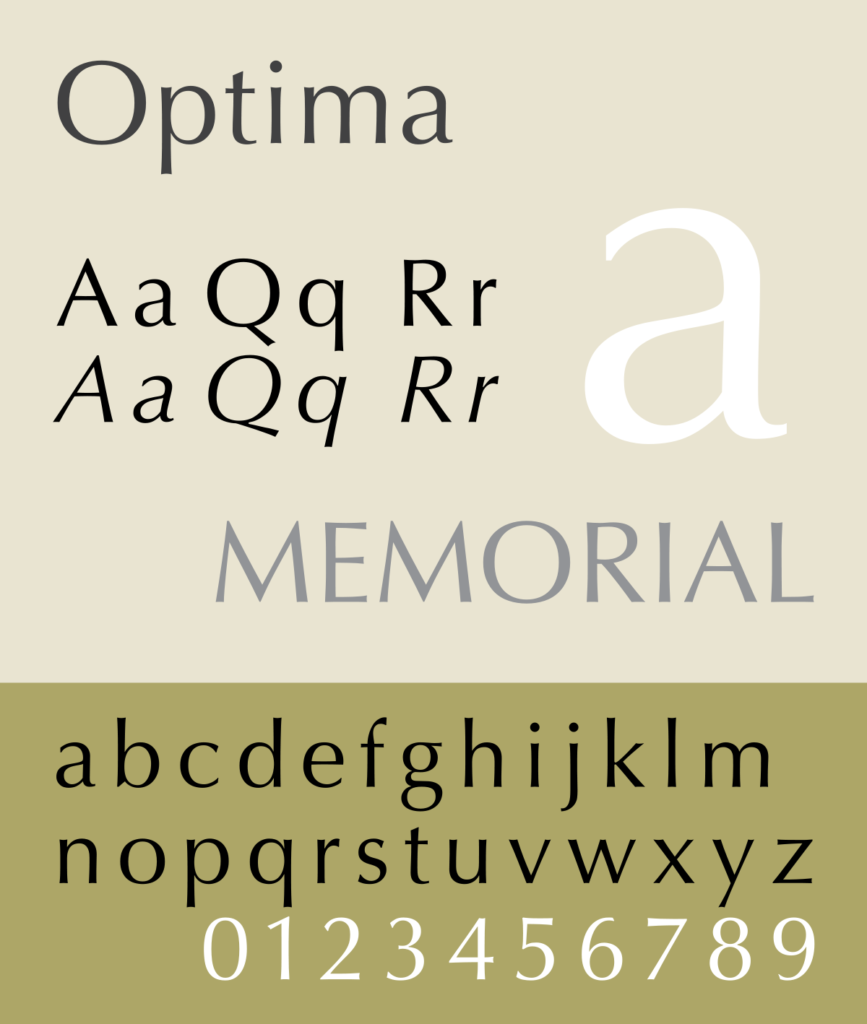
Optima is a design by Hermann Zapf and released by the D. Stempel AG foundry in 1958.
Geometric
Futura
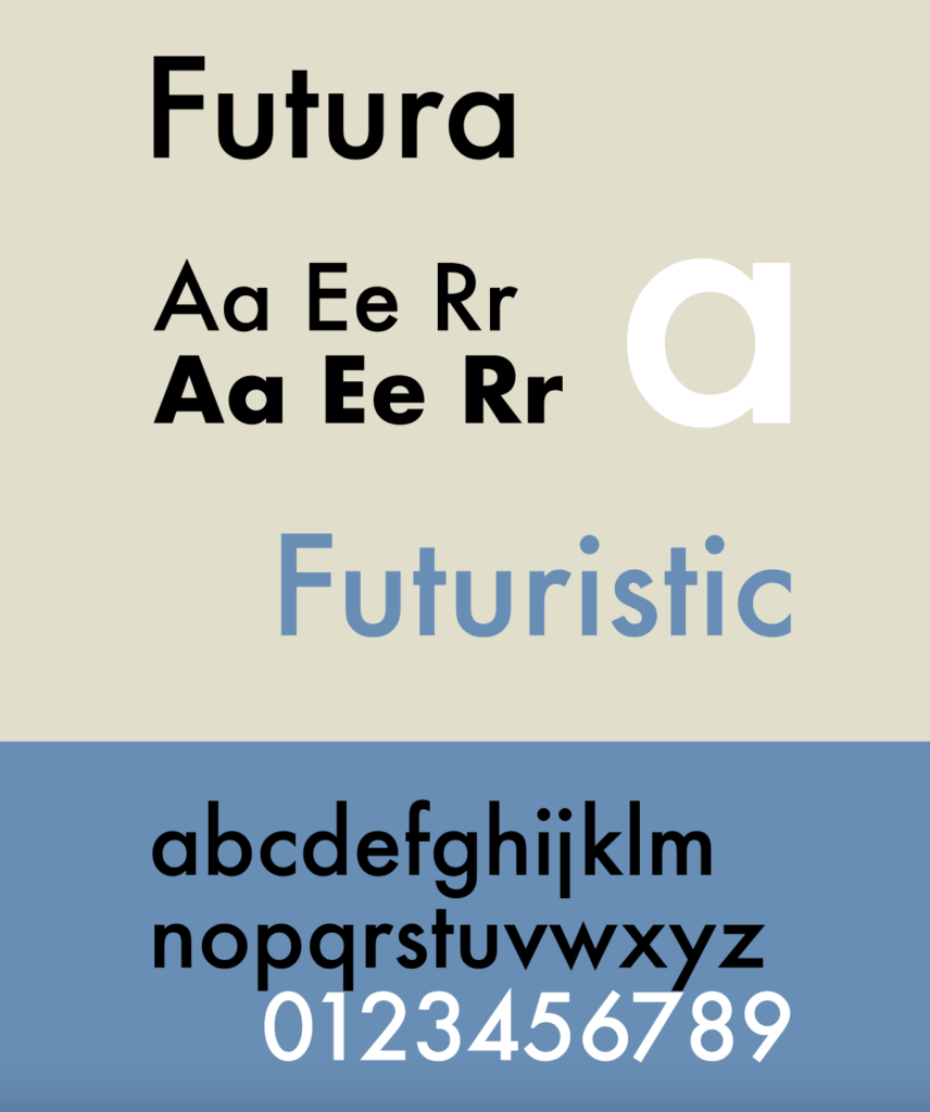
Futura was designed by Paul Renner and released in 1927.
Avant-Garde Gothic
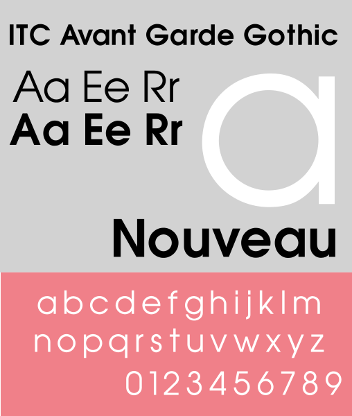
ITC Avant Garde Gothic is based on the logo font used in the Avant Garde magazine.
Century Gothic
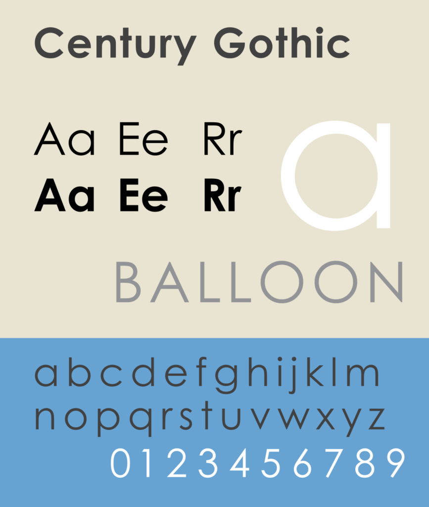
Century Gothic was released by Monotype in 1991.
Let our design team handle all your graphic design needs year-round
Don’t wanna nerd out on fonts with us? Rather someone else handle the whole damn thing?
No matter the industry or the look you’re going for, our graphic designers can create the perfect custom graphics for your brand. With our expertise in font selection and design, we can help you create a unique and memorable brand identity. T-shirt designs, merch, packaging, product labels, social posts, digital ads, and more! You can be sure you’ll get crisp, clean designs every time.
Let us help you create a distinct look for your business that stands out from the competition.


