
Using Facebook as a marketing tool isn’t something new. This is the reason you’ll find more than 200 million businesses using it to promote their brands. So, to stand out from all that noise, you need to get ultra-creative with your pages. Here are examples of Facebook page designs that will help you attract attention:
1. The Balanced Approach
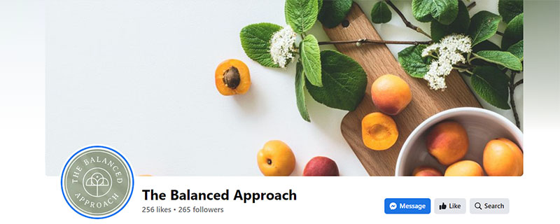
With a clean and minimalistic aesthetic, the Facebook page design of The Balanced Approach is truly noteworthy. It has a green, orange, and white color scheme that symbolizes health, wellness, and nature. The design features fresh fruits and leaves against a white background, creating a visual representation of the company’s focus on healthy and natural living.
The use of white space effectively balances the design and makes the graphics stand out. It also gives the page a spacious and airy feel. The overall design gives the impression of freshness, simplicity, and professionalism, aligning well with the company’s mission and values.
2. Huffington Post
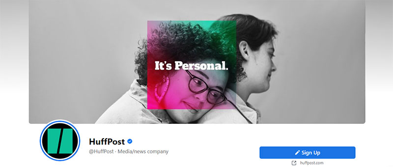
Featuring a visually striking image of two women on the cover photo, HuffPost’s Facebook page design tells a compelling story. With the phrase “It’s Personal” written in bold, eye-catching lettering, it emphasizes the company’s commitment to producing content that is relevant and meaningful to its audience.
The overall design of the page is modern and sophisticated, with a focus on bold colors, clean lines, and easy-to-read typography. The design effectively communicates the company’s brand identity and mission, which is to provide news and information that is thought-provoking and engaging.
3. Audi USA
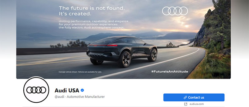
The hashtag “Future is an attitude” is used by Audi USA on their Facebook page to emphasize their focus on innovation, sustainability, and forward-thinking. With a picture of one of its latest models, they aim to communicate the message that it is a dynamic brand. One that is always looking to the future and embracing new technologies.
It screams the company’s goal of design concepts that create vehicles that are not just highly functional but also beautiful and sustainable. By incorporating this hashtag into its social media content, Audi USA is able to communicate its brand values and mission to its audience in a memorable and impactful way.
4. Vera Bradley
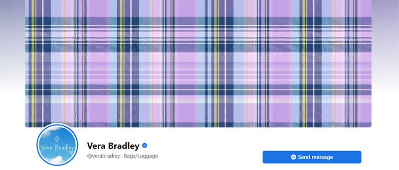
A popular fashion and lifestyle brand, Vera Bradley is known for its vibrant and colorful designs, so a cover design featuring only a plaid design would be a departure from its usual aesthetic. However, a plaid design could be a nod to traditional, classic styles and could appeal to those who appreciate timeless, versatile patterns.
Overall, a plaid-focused cover design for Vera Bradley would be a bold choice that could appeal to those who appreciate classic style and understated elegance while still maintaining the brand’s commitment to vibrant and eye-catching designs.
5. Adobe Express
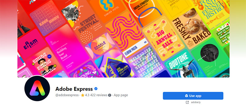
The design of Adobe Express‘ Facebook page features a visually striking collage of works created using its various software. It effectively describes the types of edits and design elements that you can create using Adobe Express, such as photo retouching, graphic design, and more. This provides a visual representation of the capabilities of the software and helps communicate its value and benefits to potential users.
It is a great way to showcase the many possibilities of Adobe Express and engage new prospects. From bold and graphic to soft and romantic, showcasing the versatility of the software and its ability to support a wide range of creative expression.
6. NALU
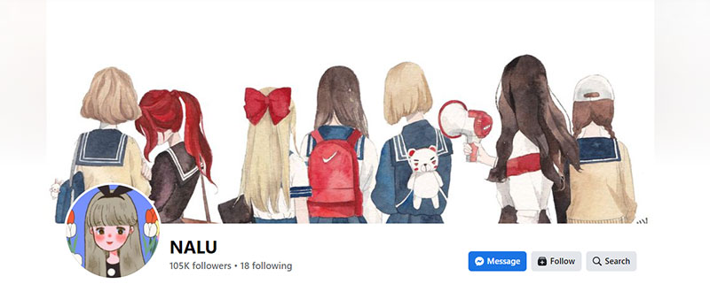
The Facebook page for NALU features fictional characters created with a watercolor finish, all facing away from the viewer. The watercolor finish gives the characters a soft, dreamlike quality lending the page a playful and imaginative personality. The characters and their presentation seem to be well thought out, as it evokes a sense of nostalgia and playfulness.
The overall look and feel of the page are successful in capturing the spirit of anime and its aesthetics, attracting attention from potential customers and fans.
7. The New York Times’ Modern Love
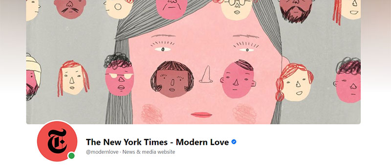
Clever, witty, and so engaging, The New York Times’ Modern Love’s Facebook page design features cartoon faces all over one large central one. It was designed in a simple and expressive style, with bold outlines and bright, eye-catching colors. All these elements help convey the themes of love, connection, and human experience at the heart of “Modern Love.”
The overall page design is inviting and dynamic, reflecting the upbeat and positive tone of “Modern Love” and The New York Times. Bright colors, cheerful font choices, and interactive features are excellent assets when creating an engaging experience for your visitors.
8. Starbucks
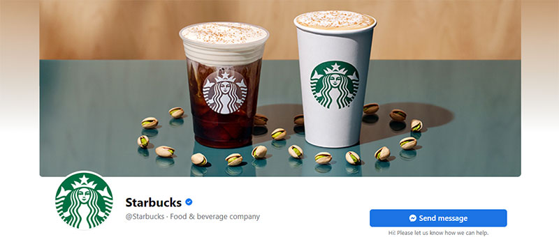
Evoking a sense of luxury and freshness, The Starbucks Facebook page design features two of its new drinks with pistachios scattered about. The background is kept neutral, allowing the focus to be on the drinks and the pistachios. The crispness and clarity of the photos show the brand’s commitment to incorporating unique and high-quality ingredients into its offerings.
A good thing to remember when designing your company’s social media graphics is to add rich visual content. This is an excellent way to project your brand as an authority as well as having a progressive personality.
9. EasyLunchboxes

Filling a wide space with your products is a great way to design your business Facebook page. Take a leaf out of EasyLunchboxes’ book and feature a collage of multiple lunchbox designs, each filled with colorful and appetizing food items arranged in a visually appealing way.
The design is sure to attract the attention of customers who are looking for convenient, functional, and healthy meal-packing solutions. The page efficiently conveys a message of quality, innovation, and ease of use, making it a compelling choice for customers looking to streamline their lunch packing routine.
10. Rebundle

Featuring a dreamy image of a woman with braided hair, eyes closed, and face towards the sky, this Facebook page designed for Rebundle is worth emulating. The words “More comfort, less waste” completes the serene scene. The design exudes a sense of comfort and calm, aligning with Rebundle’s mission of promoting eco-friendly products that prioritize self-care.
The simple and organic color palette ties the design to Rebundle’s brand identity. The page design appeals to those seeking sustainable products that also enhance their sense of well-being.
11. Intrepid Travel

With over 643,000 likes, Intrepid Travel has seemed to master the Facebook page design game. If you’re one of these followers, you’ll know their cover image is always interestingly beautiful. The page has all the info you need if you want to avail of its services.
One of the most notable things you’ll see up front is the Book Now tab. This makes getting its service easy and direct. And with all those wonderful pictures they regularly post, it’s no wonder the brand is a success.
12. Shopify
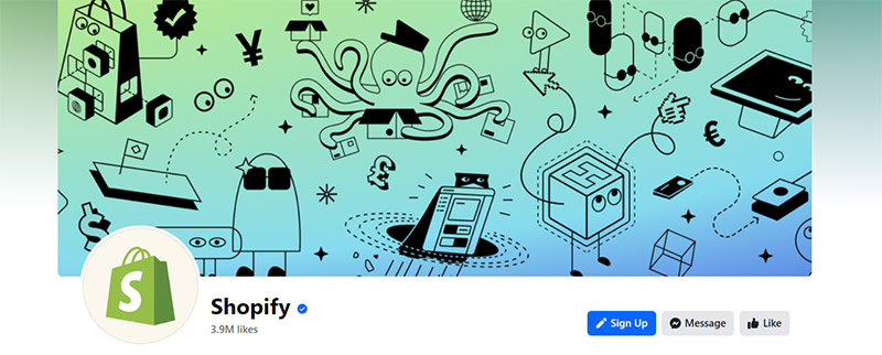
A big name in the e-commerce industry, Shopify is expected to have an excellent Facebook page design. And they don’t disappoint. The cover image is creative, and the posts are colorful, informational, and vibrant.
An effective Facebook page isn’t just about having great content, but it also has to have engaging graphics, videos, and images. If you want to know how Shopify garnered 3.9 million likes, follow their page.
13. Malibu Rum
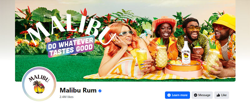
One essential factor you need to prioritize when designing for your brand is knowing your brand personality. Malibu Rum is aware of this, as can be seen from this Facebook page design example. It exudes fun, excitement, and high energy that represents the brand identity quite well.
The posts are harmonious with the cover image and website design, making it easily recognizable and memorable. The design uses plenty of bright and contrasting colors that are ideal if you want to get attention quickly and easily.
14. Essence
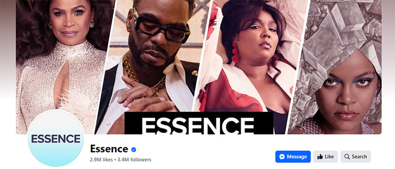
Media and news company Essence has a Facebook page design that knows how to get attention. They use images that are captivating and charismatic. They always add links to their website articles to entice readers to head on to the website.
If you want to know how to lead viewers to your website, this is how you do it. Capture their attention using crisp images and interesting entertainment and pop culture articles. Make sure to post regularly to get your followers to engage and boost traffic to your site.
15. Dang Foods
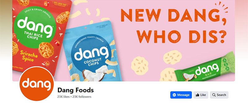
One of the keys to getting attention on social media is to keep your page and posts new and fresh. This is what Dang Foods has successfully achieved. Their posts consist mainly of content that is as dynamic as their brand identity.
Creating content on Facebook needs that extra push of creativity to ensure that your competitors won’t overshadow you. Most of Dang Foods’ posts focus on how they differ from other brands. The overall design looks put together, exciting, and engaging.
16. Nike
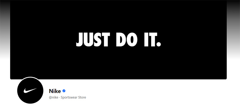
It’s a given that when a big-name brand advertises, it makes a buzz. And so, it’s no surprise that Nike has an amazing Facebook page design. It is a study in using negative space so well. It is also about showing little but speaking in volumes.
Neutral or negative space is a great way to direct your viewers’ attention to where you want to. In this case, the only thing you’ll notice is the slogan, which the brand has been using since time immemorial.
17. Jeep

If you want to see action, sophistication, class, and energy in a Facebook page design, you should be looking at Jeep’s. The cover image features the automaker’s latest offering. For fans of this brand, this is what gets them up all night.
Jeep’s Facebook page posts many of the vehicles shown in stunning landscapes and endearing situations. While the current cover image may look serious and somber, the brand doesn’t forget how to have fun.
18. D&AD
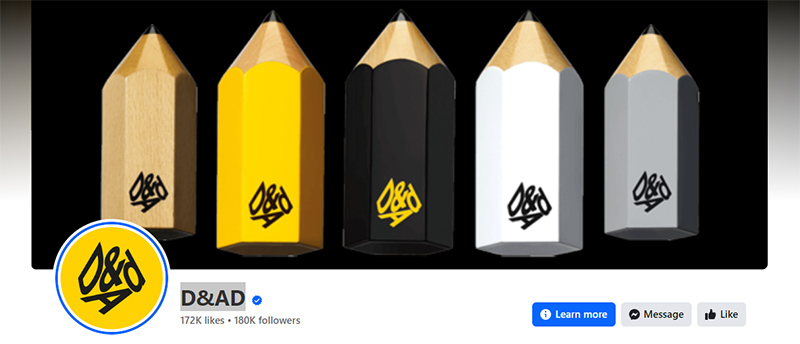
Even though this non-profit organization is based miles away (London, UK, to be exact), it still has caught our attention. D&AD’s Facebook page design is the epitome of style and modernity. It uses detailed pictures and videos that are all visually appealing.
It regularly posts compelling and relatable content, the main reason for its high number of followers and page likes. It has all the followers need to get information but has engaging content that makes them go to the website.
Final Thoughts
A well-designed Facebook page can play a critical role in establishing your business’s online presence and attracting new customers. By showcasing your products, services, and brand values, a well-designed page can help your business stand out from the crowd and establish a strong online presence. If you need to create a Facebook page design quickly and without breaking the bank, Penji is the best design partner for you. Click on this link to know more.
About the author

Celeste Zosimo
Celeste is a former traditional animator and now an SEO content writer specializing in graphic design and marketing topics. When she's not writing or ranking her articles, she's being bossed around by her cat and two dogs.


