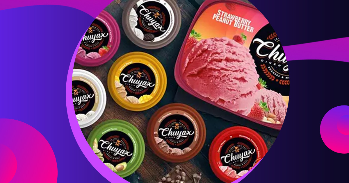
Think about the last time you went shopping. There you are: in the middle in a corn maze of products vying for your time, attention, and money. Each one deploys its own methodical technique for raising your interest. In any one aisle, a number of tactics are on display—and it can feel like a whirlwind when you actually become aware of it. But what you’re experiencing is packaging design.
Now more than ever, companies are brand aware. And since the first aspect of a product you come into contact with is the packaging, businesses make it a priority to use this space wisely.
What is product packaging?
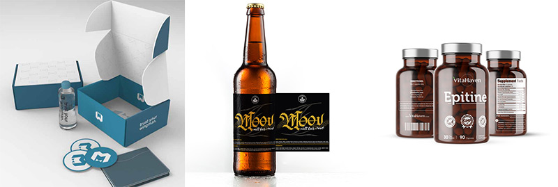
Product packaging refers to the designing of the exterior of a product. This includes material, color, typography, and any graphics involved. Packaging can be ornate or simple.
While this is a practical tool, it also represents your brand and product. This means paying full attention to detail in every facet of the packaging is important. Your packaging plays a large role in how people will perceive your company.
[in_content_ads gallery=”logos” logo=”on” title=”Need graphic design help?” subtitle=”Try Penji’s Unlimited Graphic Design and get all your branding, digital, print, and UXUI designs done in one place.” btntext=”Learn More” btnlink=”https://penji.co”]
Why does product packaging matter?
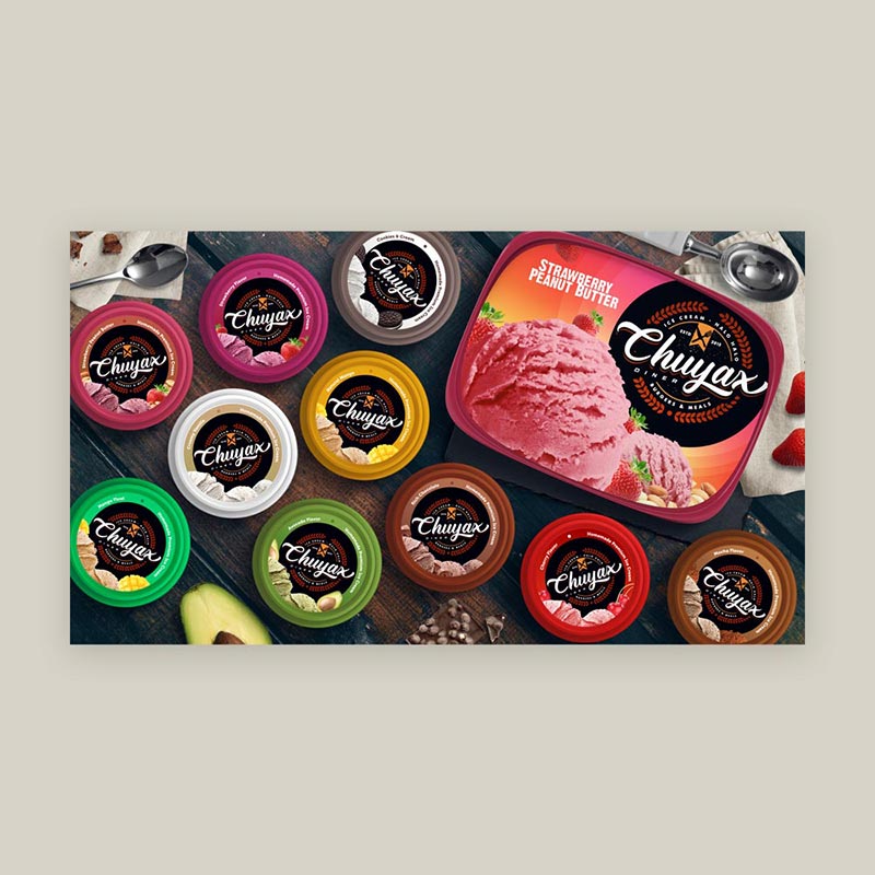
Packaging design is essential in attracting customer attention. It’s come a long way since the days of being purely functional. No longer are the only concerns of the package covered by the three Cs: containing, caring, and conserving.
Now, the art encompasses much more.
When done well— balancing practicality with creativity— a product package can help position your brand at the forefront of customers’ attention. Of course, this isn’t reduced to in-store instances only. A great number of people find convenience in online shopping.
As a result, it’s important to apply meticulous detail to how your packaging appears across all mediums.
3 Critical Questions for Packaging Design
There are a few crucial questions you will need to answer when planning your packaging design.
- What product is being sold?
- Who is buying the product?
- How are people engaging with the product?
Let’s dig into these questions a bit more.
What product is being sold?
You will want a package that works for your product. Understanding your product and your industry can help you come up with the perfect packaging design. How big is your product? What materials are involved in the making of your product?
Who is buying the product?
Knowing your audience is essential. Are you marketing to women, men, or both? Are you marketing towards children? Is this an affordable item or a high-end luxury?
Different demographics engage with products differently. They have different concerns and different budgets. Playing to your market demographic will ensure that you pique the right people’s interests.
How are people engaging with the product?
Are people buying your product at a supermarket? A boutique shop? Are they primarily purchasing this product from the internet? Answering these questions will bring you closer to knowing how to package your product.
Examples of Packaging Design
Here are 20 examples of brilliant packaging design. Each one deploys a unique take. Be sure to tailor your packaging design to your brand. These examples are here to get the ball rolling.
Use Patterns / Repetition
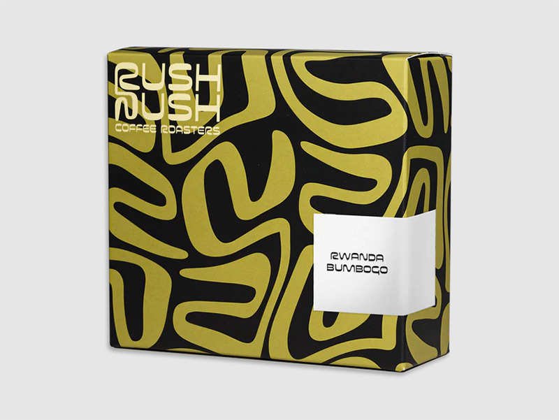
It can be as simple or complex as is necessary, but forming some sort of structure for your customer’s eyes to latch on to can be key.
You can see this approach in a number of brand’s packaging designs. It creates a visual texture that leaps off of a shelf and into the minds of would-be passersby. And it doesn’t have to be aggressive either.
Simple, two-color stripes, for example, can provide a confident, minimalistic pop to your packaging design.
Welcome Simplicity
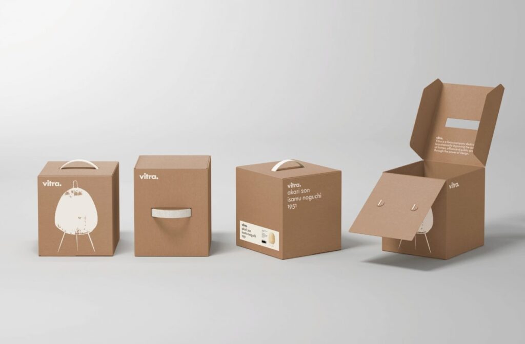
Speaking of minimalism: another effective approach is embracing the less-is-more philosophy. Certain products lend themselves to this stripped-down approach. There’s a modern sleekness to a simple packaging design. And it can be just the thing that helps you push your product into the frontlines.
Know your audience, here. Certain markets won’t appreciate a minimalist package. But less can certainly be more in the proper context.
Pair it with the Product
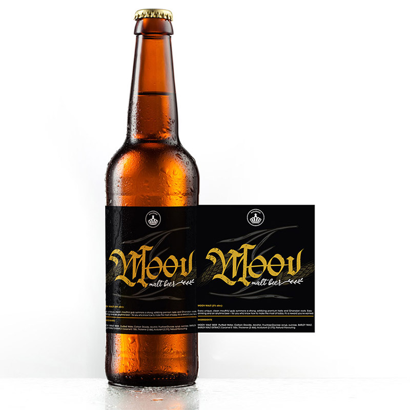
What’s the personality of the product? What are its most distinguishable traits and features? Having a healthy understanding of your product’s key attributes— and developing a package that directly relates to it— can help create a design combo made in heaven. Using the packaging as a pair can intrigue the eye and draw attention.
Compliment the Product
Sometimes, the product just comes first. It’s important to know when to not over-rely on your packaging. In this case, we see cured meats wrapped in brown paper packaging with a label wrapped on top.
The packaging serves the purpose of sealing the product. Besides that, it provides little structure. The shape of the package is the shape of the product.
Be Playful
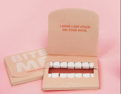
It’s not the newsiest statement: people love a goofy brand. If you can practically weave clever, playful humor into your packaging design without sacrificing clarity or immediacy, you’re likely to increase customer engagement.
Here we see the interior of this package deploying a cheeky, humorous design.
Be Bold and Maximalist
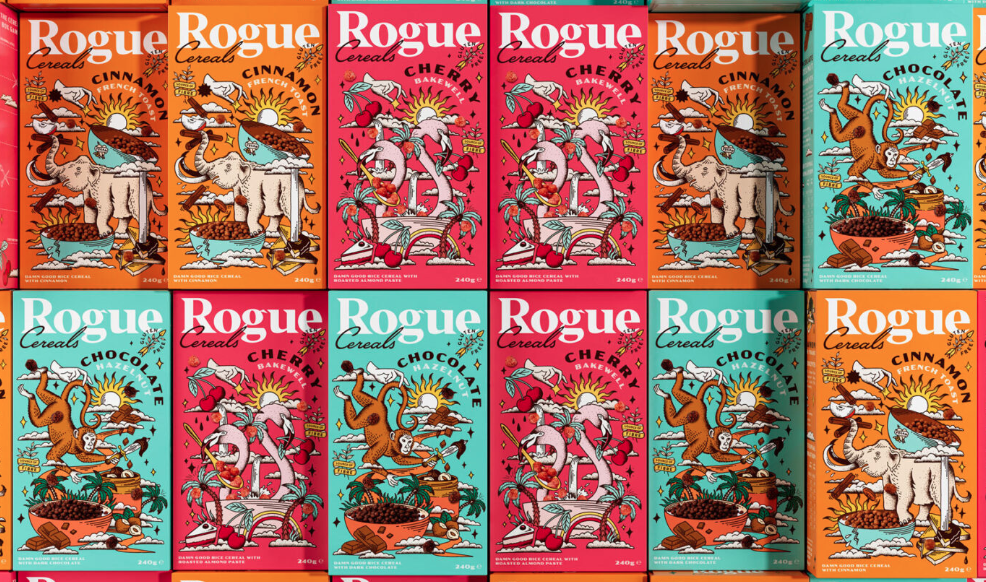
Using multiple colors and loud shapes is an interesting way of gaining attention. It’s important to be tactful with your approach here. Overly busy designs can seem confusing and amateurish. Working with an experienced designer capable of bringing your ideas to life in a bold, maximalist way can help achieve optimum results.
Be Daring
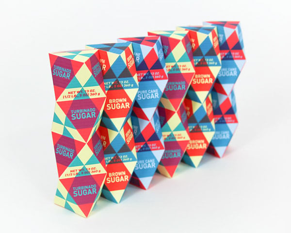
This is especially helpful for brands producing goods that a lot of other people produce as well. Setting yourself apart from the crowd with an innovative and distinguishing package can be the difference between a customer choosing you over a competitor.
Conduct some market research to get a handle on the packaging tropes in your specific industry, and be daring when it comes to your own product’s package!
Embody Modernity
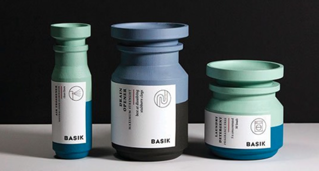
Simple and sleek. Knowing how to wield the tools of modernity can help you prepare to package sure to raise potential customers’ attention. Use clean lines, simple color schemes, and sans serif fonts. Additionally, utilizing geometric shapes— both in the designs on the packaging and the physical packaging itself— can bolster your modern style.
Be Bright
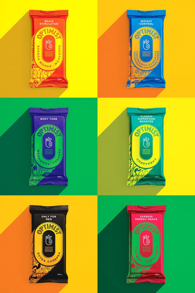
Candy might be the first object that comes to mind when it comes to bright packaging design. But this strategy can work for a number of different industries.
Surely not every product needs bright and popping colors. Depending on your industry and specific product, it could have a negative effect. But paired with the right product, a colorful approach can help your package pop off the shelf (and the screen!)
Represent Your Culture
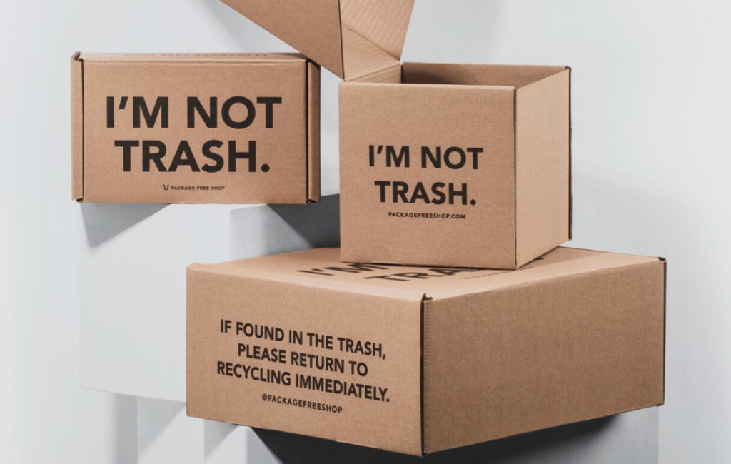
Use your packaging as a means to communicate your culture. Let this be where you highlight your values. This organic sweet basil company supports sustainable indoor farming. Their packaging reflects that through the use of simple, recycled paper packaging.
This approach can pique the interest of people with sustainable ideals.
Consider the Interior
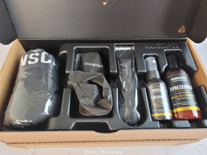
While the external packaging may seem paramount— and it is— the inside matters too. This approach works well with higher-end or luxury products. When a customer unboxes your package, you want them to be greeted with great detail every step of the way.
If your product includes multiple individual pieces, give each piece its own place. The unboxing phase should be a graceful, luxury experience. This interior of a Manscaped shows how you can make the unboxing a visually appealing process.
Think Outside the Box
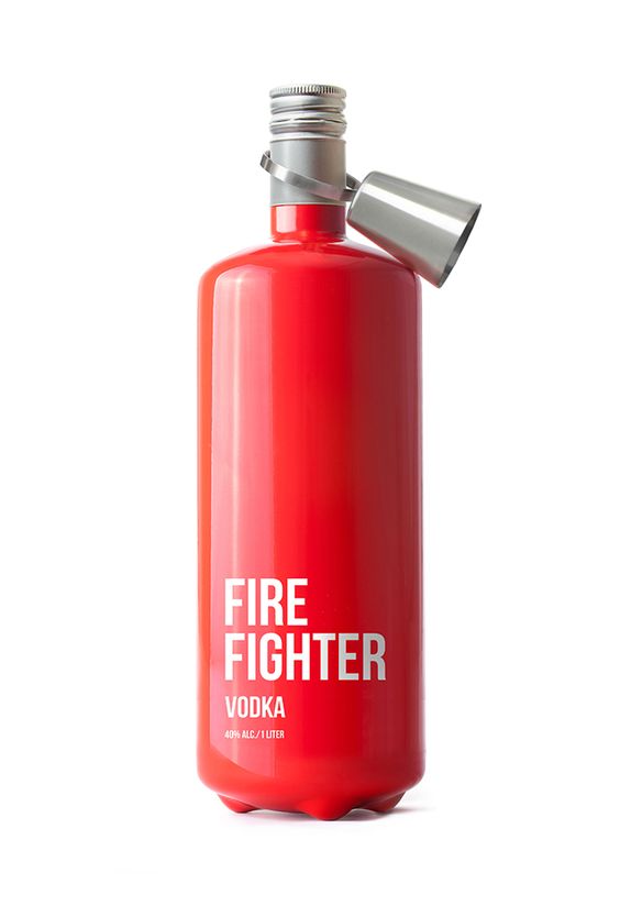
Sure, this may feel like a creative cliche. But certain customer bases respond well to a brand that’s willing to experiment with its packaging. Especially if it’s being done in a way that tastefully compliments your product.
This vodka bottle by Fire Fighter goes all-in on its brand name by creating a package inspired by a fire extinguisher. It leaps off of the shelf and immediately commands your attention.
Be Grandiose
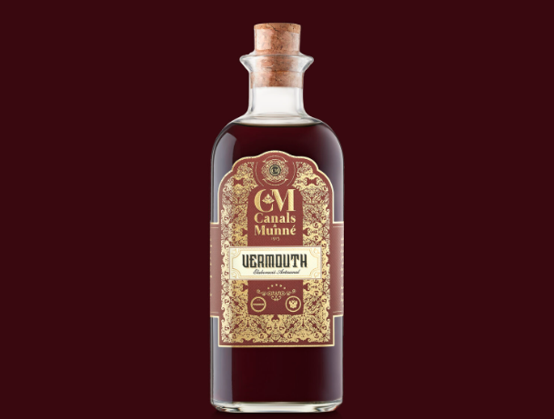
If you’re dealing in luxury goods, you can afford to be extravagent with your packaging design. This label for a bottle of vermouth deploys a highly ornamental, art-deco-inspired design. It’s fancy. Highfalutin. And it’s a perfect capsule for the beverage it contains. But, know your market and avoid frivolous design tropes.
Include a Bit of Texture
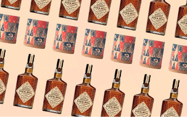
Not only can you include visual texture, but physical texture is also capable of bringing your customers just a bit closer to your product. It’s an underused method, but appealing to people’s sense of touch can provide a unique experience.
Of course, such a physical feature is limited to those capable of touching the actual product, so this won’t necessarily land if you’re selling primarily online.
Restrict Your Use of Resources
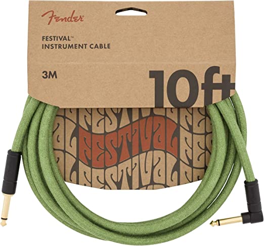
Don’t package more than you have to. Simple and efficient works. Not only does this minimal packaging effectively contain its product, but it does so in a cost-saving manner. What a balance.
Not every product can get away with this type of package design, but it is actually quite a bit more versatile than you might think. Objects from guitar cables to soap can benefit from this packaging design.
Be Transparent
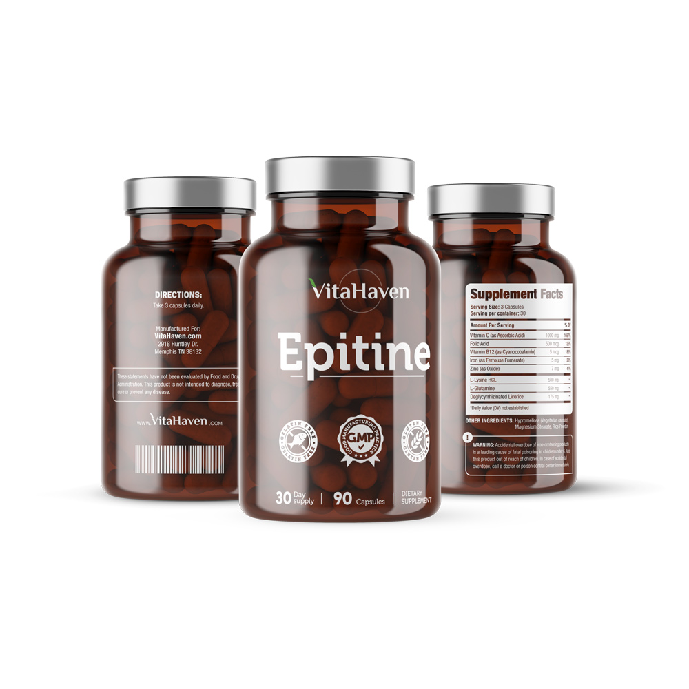
Customers like getting a glimpse of the product they’re about to purchase. This is especially prevalent among decadent baked goods, but you’ll find this approach in a number of industries. It’s welcoming, honest, and brings people closer to your product.
Sometimes, a fully enclosed package feels distant, manufactured, and, well, closed off. Having a transparent film through which people can visually experience the product can help a potential customer make their decision in your favor.
Welcome Trends
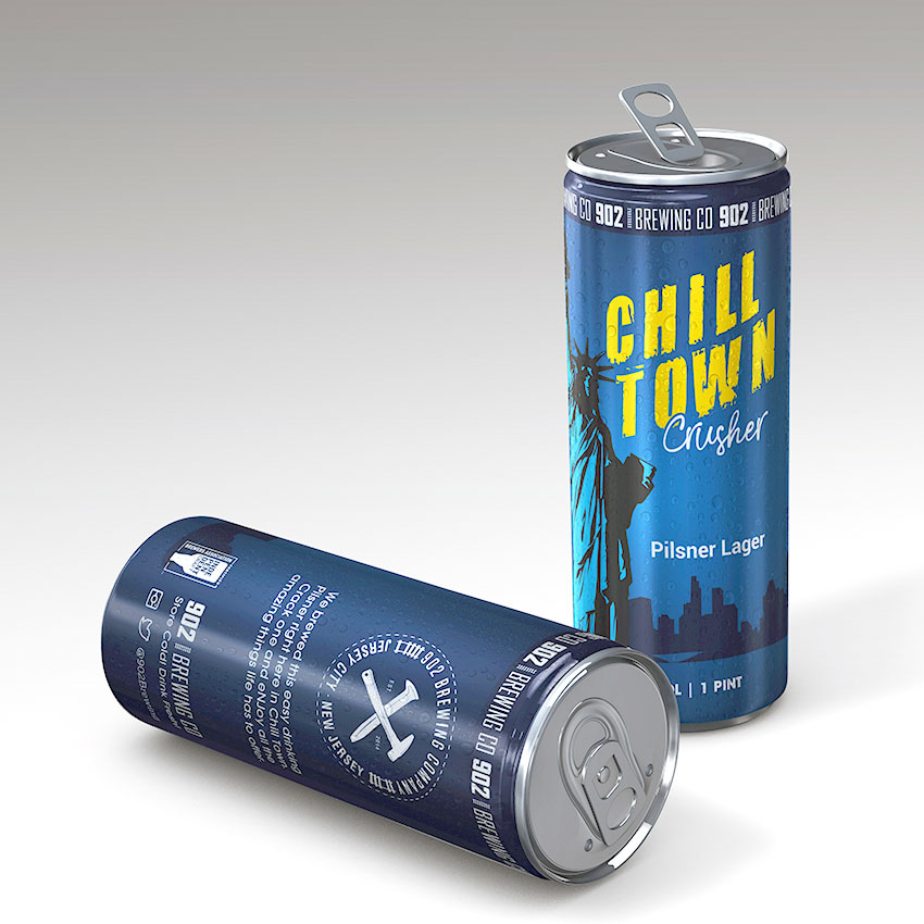
Sometimes it can feel too easy to cash in on design fads. But they become trends for a reason; they’re effective. It’s important to have a judicious eye so you can afford gimmicky looks that will only dissuade customers.
Clean lines and toned-back simplicity is all the rage among package designers looking to appeal to a younger, more hipster audience.
Go Eco Friendly
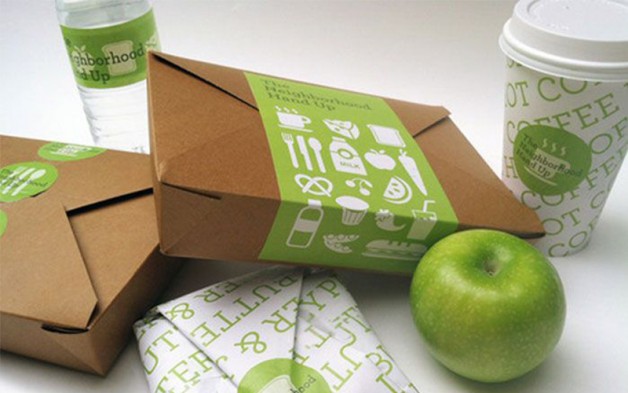
Now more than ever, many consumers are making an effort to consider the environment when making their decision. If you feel your industry lacks an eco-friendly niche— or is full of them— you may want to consider going green for your packaging design.
Using sustainably sourced packaging can be a surefire way of reducing the amount of waste in landfills, and preventing pollution by limiting the need to collect raw materials.
Go Tactile
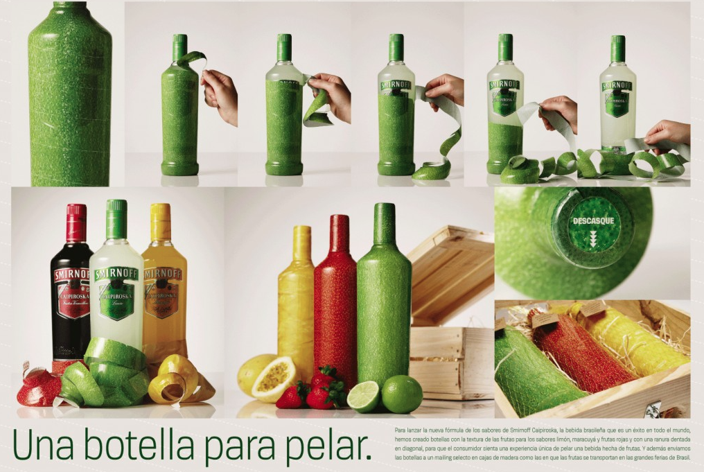
There’s something universally satisfying about a good unboxing or unwrapping experience. It seems to elicit a cocktail of childhood emotions. And it’s an effective marketing tool, even for adults.
Packaging your product in a wrapper that needs pealing, for example, is a way of appealing to your customer’s sense of touch.
Be Fearless
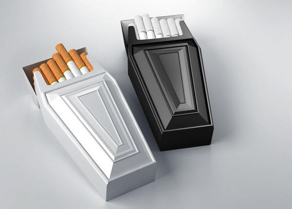
Don’t be afraid of experimenting. Package design is constantly subject to new fads, interesting ideas, and boundary-pushing efforts. Fortune favors the bold. The example above shows cigarettes packaged in a coffin-shaped contraption.
While this may not sound like the most appealing marketing ploy, it undoubtedly sticks in the head of consumers.


