Many of us are optimistic when it comes to welcoming a new year. Whether it’s in our personal lives or our businesses, we always strive for change. If you’re a business owner and want a new face and personality for it, here are the best ecommerce design examples to inspire you for 2023:
1. Bliss
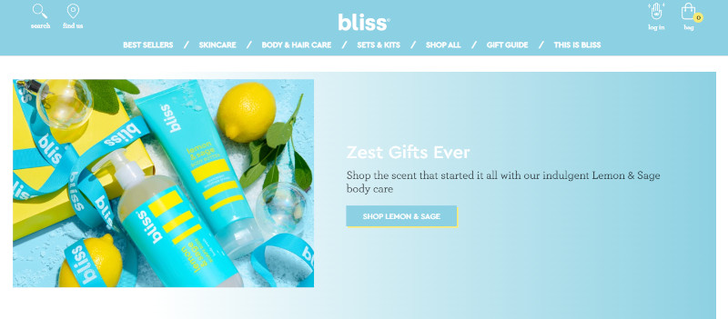
According to Architectural Digest, a vibrant color palette will be big in the coming year. This is what Bliss, a skincare company, has been doing and will continue to do so. The design includes a whole lot of color bursts giving the site spirited energy and life.
Navigating through the site is simple and easy. It gives refreshing vibes just by browsing through the colorful product packaging, which perfectly matches the brand identity. It also has ample white spaces, which makes it visually appealing.
2. Dick Moby
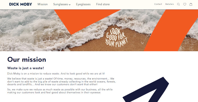
Sustainability isn’t going to be just a trend for next year, it should be a way of life. And it seems that many businesses are living it already, Dick Moby is one of them. They have successfully incorporated the company’s advocacy of sustainability in its website design.
They included a simple infographic of how they are creating a world without waste. The whole website design is a study in straightforwardness. They made everything easily accessible without losing sight of their company mission.
3. Fronks
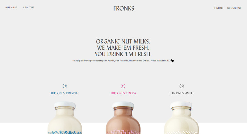
While bright colors are expected to take off in the coming year, clean and clear lines will still be a great design option. Fronks’ website design proves it. Take a look at what they did, and they will prove the forecasters wrong.
In the design, it’s clearly evident that the lack of elements can do more for your brand. The abundance of white space takes the products to center stage, which is the exact purpose of having a website.
4. Verve
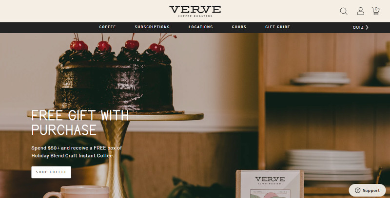
Stylish photography, bright color palettes, and custom illustrations are just a few ways the Verve website gets attention. All these assets make the site interestingly good that visitors would want to stay longer. Its use of customer reviews and gift offers is sure to entice viewers to make a purchase.
Verve’s website design is a beautiful blend of semi-vintage images and ultra-modern animations. This sweet pairing gives the site more for its customers to look at and enjoy. The laid-back atmosphere also adds to the brand’s personality quite well.
5. Hardgraft
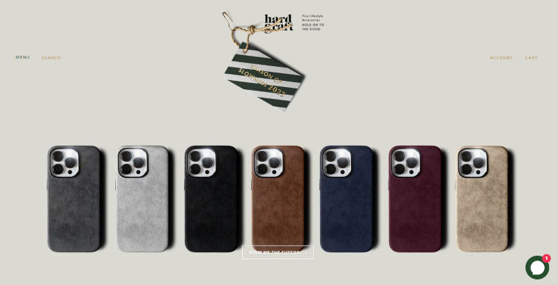
Believing in the concept of minimalism and sophistication in design, Hardgraft is an excellent site to get your inspiration from. Right off the bat, they tell visitors how, as creatives themselves, they advocate for purity, creativity, and personality in their products. This gives them an authoritative edge that’s essential in building a brand.
This is one of the best ecommerce design examples that perfectly shows how simplicity can get you further ahead. Using a predominantly brown color scheme also adds to its image of dependability, stability, and warmth.
6. Bon Bon Bon
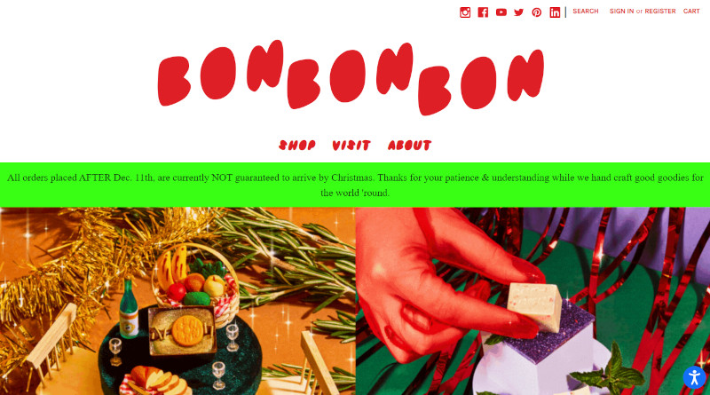
Already using bright and bold colors way before it was predicted to be the trend is Bon Bon Bon. This artisanal chocolate company does not shy away from any unique design style for its website. It has quite beautifully blended a great mix of quirky, vintage, modern, and retro, which is ideal for making themselves stand out.
Browsing through the website, you’ll notice how the products are listed in an organized way. This is what’s important, even if you want to go for a design that’s bordering on the crazy.
7. Modern Urban Jungle
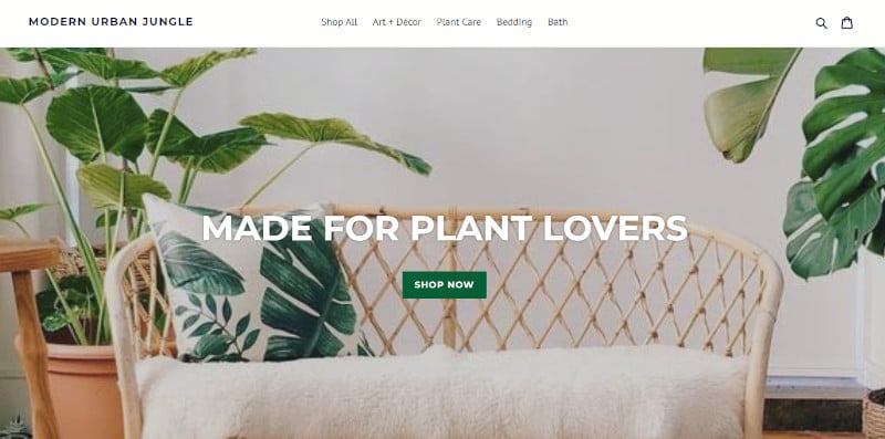
As its website says, “Bring the outside in.” Modern Urban Jungle is an excellent ecommerce design example, as it has a welcoming and refreshing look that perfectly fits the brand. From the colors to the product images, the site does a great job of bringing in the outside.
This website is an excellent example of having a harmonious and tied-down look. With the primary color green and a few neutrals, the site is visually appealing and a joy to the eyes. These characteristics are what make this a great site to emulate for your new year redesign.
8. Beardbrand
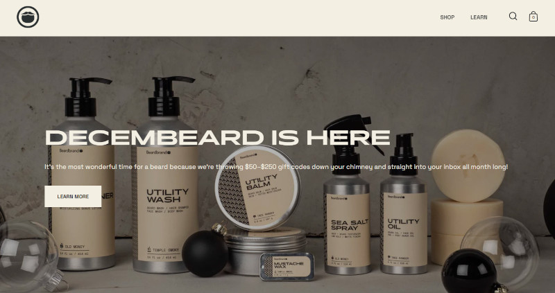
While vibrant colors are predicted to be the trend for the coming year, sophistication and class will always be in style. Beardbrand proves this, as you can see from its website design. Its Old World touch oozes elegance and class that’s perfect for presenting its products.
The monochromatic color scheme gives the site an enigmatic feel that’s also fashionable. This makes visitors go beyond browsing. The blog section offers exciting articles that make the viewers stay even longer.
9. Crossrope
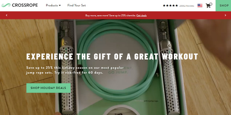
While Crossrope’s primary product is the jump rope, they are selling more than that. This ecommerce store sells a way to get fit and healthy. And it is pretty evident with every scroll through its website. In it, you’ll find clear and crisp images, white space, a superb layout, and engaging videos.
Instead of trying out a trend for the new year, it would be better to follow the best practices in designing your website. This ecommerce design example will show you exactly how.
10. Almond Surfboards
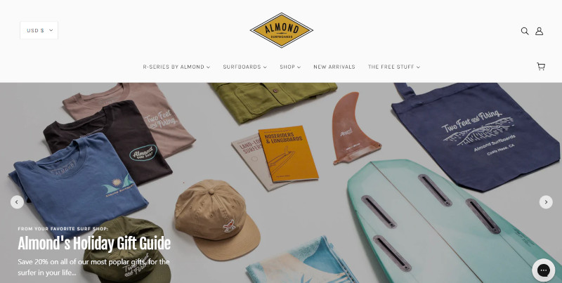
Whoever thought sporting goods could never go soft and elegant was totally mistaken. Almond Surfboards uses colors and tones that are both delicate and trendy. The whole website has subtle touches and is never loud or gaudy. The use of primarily neutral colors does not take any attention away from the main star of the site, which is the surfboard.
Thinking out of the box will always be the trend to follow. This will separate your brand from the competition and help you stand out. The key is to think of ways to be different and avoid doing the usual.
Final Thoughts
Having a business that sells products and services means constantly coming up with ways to differentiate yourself from the crowd. These ecommerce design examples will help you get an idea of what to do for the coming year. However, if you still don’t know how to do it, let the professionals do their jobs.
Our team of graphic designers, illustrators, and web designers can help you get the trendiest designs for your ecommerce store. Click on this link to learn more about what we do and how we can help you get ahead of designs for the new year.
About the author

Celeste Zosimo
Celeste is a former traditional animator and now an SEO content writer specializing in graphic design and marketing topics. When she's not writing or ranking her articles, she's being bossed around by her cat and two dogs.


