
The advent of email and online messaging apps may have led many to believe that snail mail is dead. On the contrary, it’s more alive now than ever. If you’re looking for a powerful strategy to boost your business, direct mail marketing is the way to go. Here are ten unique examples of direct mail marketing to start you off:
1. BMW
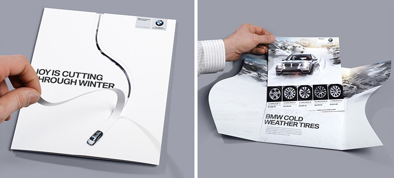
The “Snow Tires Cutting Through” direct mail campaign by BMW Canada in 2010 was designed to break the mold of traditional, conventional direct mail campaigns. Instead of sending a standard mailer with information about the company’s cold-weather tires, BMW took a more creative approach to engage their consumers.
They did this by applying an interactive design element to the mailer, where the recipient had to tear down a seam to open it. This interactive design enabled the recipient to engage directly with the mailer, resulting in a more personalized experience and a better response to the message inside.
2. Gusto
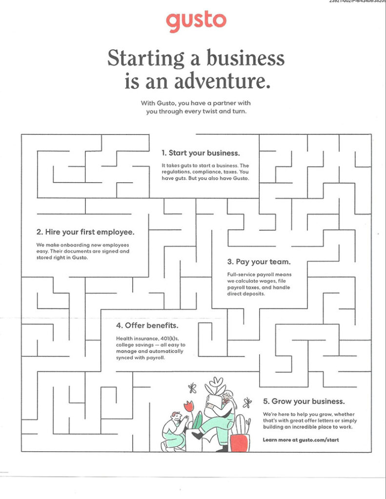
An online payroll and benefits services company, Gusto released its interactive direct mailer that features a maze. It was entitled “Starting a business is an adventure” to promote the company’s services. It communicates that starting a business can be a challenging but exciting journey, just like navigating a maze.
The interactive element of the mailer required the recipient to physically manipulate it to navigate through the maze and reach the end. This would have added a feature of fun and engagement to the campaign, encouraging recipients to interact with the mailer and learn more about Gusto’s services.
3. Theatre Academy in Bratislava
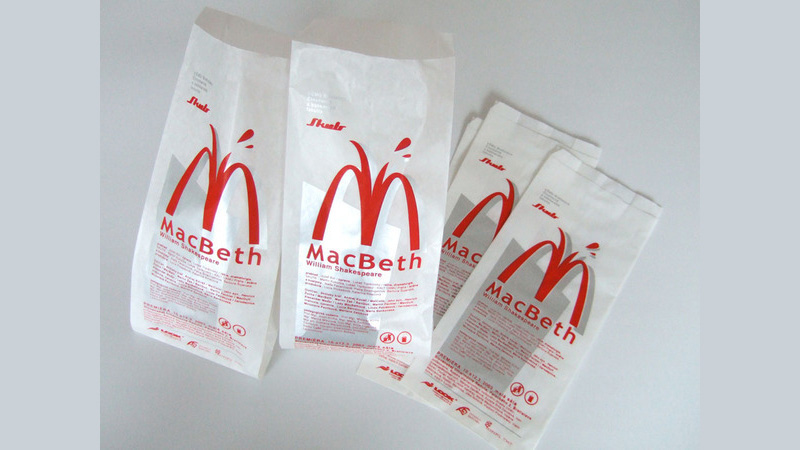
To promote a production of one of its plays, the Theatre Academy in Bratislava created the “Macbeth” direct mail campaign. It used paper bags as invitations sent directly to potential audience members.
The bags were designed to resemble the look of a paper bag but with unique and clever graphics, typography, and colors, to make them stand out and attract attention. The design was an interpretation of the play’s theme, setting, or characters, creating a sense of intrigue and excitement for the production. It had all the information about the play’s date, time, location, and other relevant details.
4. Volkswagen
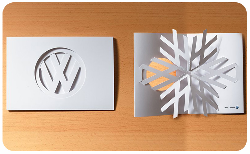
A uniquely creative direct mailer has the capability of catching the recipient’s attention and making it stand out from other mail. Furthermore, the physical nature of pop-ups can make the mailer more memorable and increase the chances of it being kept and shared with others.
Take a leaf out of Volkswagen’s direct mail marketing which featured a pop-up. When opened, it transformed its logo into a snowflake. As you can see from the image, not many elements were added, making the design more impactful.
5. The Economist
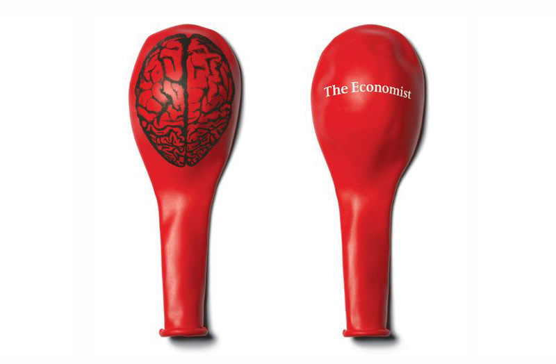
The direct mail campaign by The Economist involved sending balloons to potential subscribers with an image of a brain printed on them. The image was used as a metaphor to suggest that reading The Economist will make you smarter and help to expand your knowledge and understanding of the world.
The balloons are a fun and attention-grabbing way to deliver this message and make the campaign more memorable for the recipients. The use of physical mail also makes the message stand out in an age where digital communication is dominant.
6. LavOnline
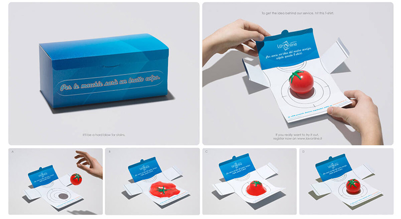
The “Tomato Splat” campaign, created by LavOnline, was a direct mail campaign showcasing the effectiveness of their stain removal products. The campaign involved sending a target to potential customers, encouraging them to throw a tomato at the target and see the results themselves.
The target is designed to simulate the removal of the stain, showing the effectiveness of LavOnline’s products. The campaign’s concept is to demonstrate the product’s capability and provide a memorable experience to potential customers.
7. WWF
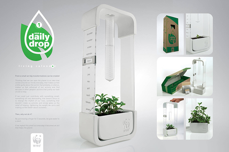
The “One Daily Drop Living Calendar” direct mail campaign was created by WWF to commemorate and celebrate the organization’s 50 years of environmental conservation. The campaign was published in Colombia in May 2011.
The interactive calendar requires recipients to move a finger for 3 seconds, giving water to a plant. The goal is to encourage recipients to repeat this small act daily to show support for WWF’s cause and change people’s perceptions of what they can do to help the planet.
8. Mariner Boating Holidays
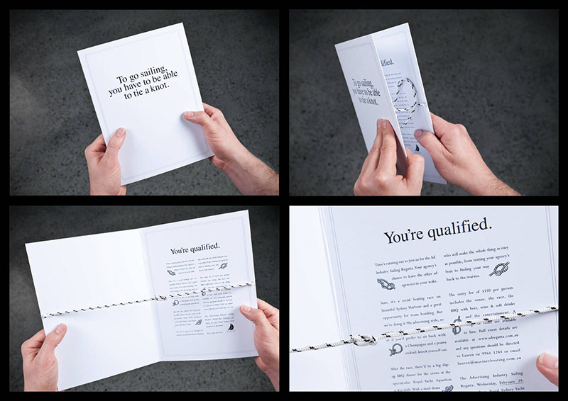
To show how easy it is to go sailing, the Mariner Boating Holidays created the “Tie a Knot” campaign.” When you open the direct mail piece, you will be able to tie a perfect knot, which is a metaphor for the ease of sailing. The campaign is interactive and hands-on, allowing the recipient to engage physically with the material, making it more memorable and effective.
The idea is to make sailing accessible and straightforward and to create an association between the brand and the sailing experience. By tying the knot, the recipient is participating in the experience, and in a way, “sailing” with Mariner Boating Holidays.
9. Club Med
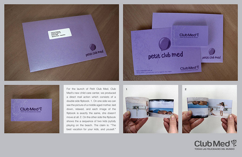
For the launch of its new child care center, Petit Club Med, travel company Club Med created the “Relax” campaign. Its direct mail action features a double-sided flipbook. On one side, it features images of a middle-aged mother who is laid down, relaxed, and doesn’t move at all. On the other side, the flipbook shows a sequence of two kids joyfully playing on the beach.
The campaign’s claim is to have “The best vacation for your kids and yourself.” It aimed to show that the club lets parents enjoy their vacation while the children are cared for.
10. Toyota
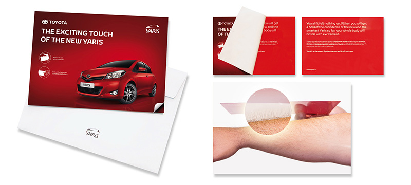
In August 2011, Toyota Slovenia used plastic and special foil to create a unique and interactive experience for its recipients. When the mail piece is opened, it uses electrostatic energy to make the recipients’ hair stand on end, simulating the sensation of excitement.
The campaign showcases the excitement and thrill of driving the new Yaris model. Using electrostatic energy is an innovative and memorable way to communicate that the new Yaris is exciting and will leave a lasting impression on the recipients.
Final Thoughts
While there are several types of direct mail marketing, you should choose the one that would suit your brand best to get optimum results. If you need terrific designs to go with it, you can always work with Penji. Click on this link to get more details.
About the author

Celeste Zosimo
Celeste is a former traditional animator and now an SEO content writer specializing in graphic design and marketing topics. When she's not writing or ranking her articles, she's being bossed around by her cat and two dogs.


