
An app’s dashboard is meant to offer users the crucial info they need at any given time. It’s the first screen that you see when you log-in, and what you do next may greatly depend on the data that you perceive.
Without a doubt, this User Interface (UI) element can significantly affect the User Experience (UX). It’s no wonder that app developers put a premium on excellent dashboard UI design and why it’s a crucial part of UX wireframes.
Many of our tech clients at Penji come to us when they need a stunning dashboard that fosters user engagement. They’re very much aware that a great app concept would be of little worth to users if the UI design isn’t good enough.
This article will tackle dashboard design and look at examples that reflect the best practices across mobile and web apps:
- The Importance of Dashboard UI Design
- Major Components of a Dashboard
- 21 Dashing Dashboard Examples
- What It Means for Marketers
Stick until the end, and we’ll show you a quick and hassle-free way entrepreneurs, marketers, and agencies request app designs from us.
The Importance of Dashboard UI Design
Before we dive right into dashboard app UI design, here’s a little trivia.
Did you know that Queen Elizabeth receives a “red box” every day containing daily documents sent by the government to the monarch? Because of her role as head of state, she needs to be in touch with the developments in Commonwealth countries and international affairs.
An app’s dashboard is somewhat like a “red box” for your users. It collates all the data gathered so that the user can stay on top of things and, more than that, take action.
Unlike a monarch, however, users won’t have the time nor patience to sit and browse the info over tea.
With 592 million apps downloaded on mobile daily as per App Annie’s statistics, users would most likely be running on the treadmill or waiting in line for coffee as they browse the dashboard.
In short, the dashboard data must be designed to be consumed fast, easy, and simple.
Types of Dashboard Design
Not all dashboards are created equal. That said, merely copying the most beautiful dashboard UI templates will probably do more harm than good.
When choosing a design type, it’s vital to consider the type of data you’re offering. Moreover, you have to present the info in a way that would help users make an informed decision as they take the next step.
Here are the three main types of dashboard design. Bear in mind that all three designs may use a mix of charts, graphs, and other presentation strategies to present data effectively.
Operational
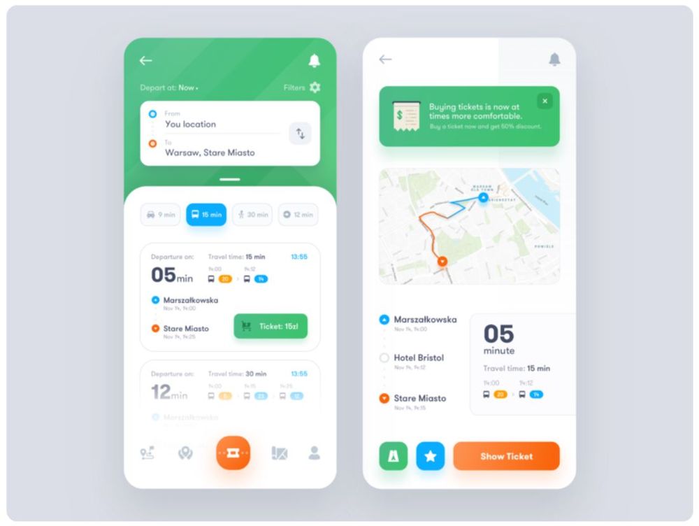
Image Credit: Vlad Ermakov
Operational dashboards offer crucial info to users who may be performing or monitoring tasks or events in real-time. It aims to show the current situational status and do so clearly and quickly. This dashboard for a transportation app designed by Vlad Ermakov falls under this category.
GOAL: Real-time monitoring
Analytical
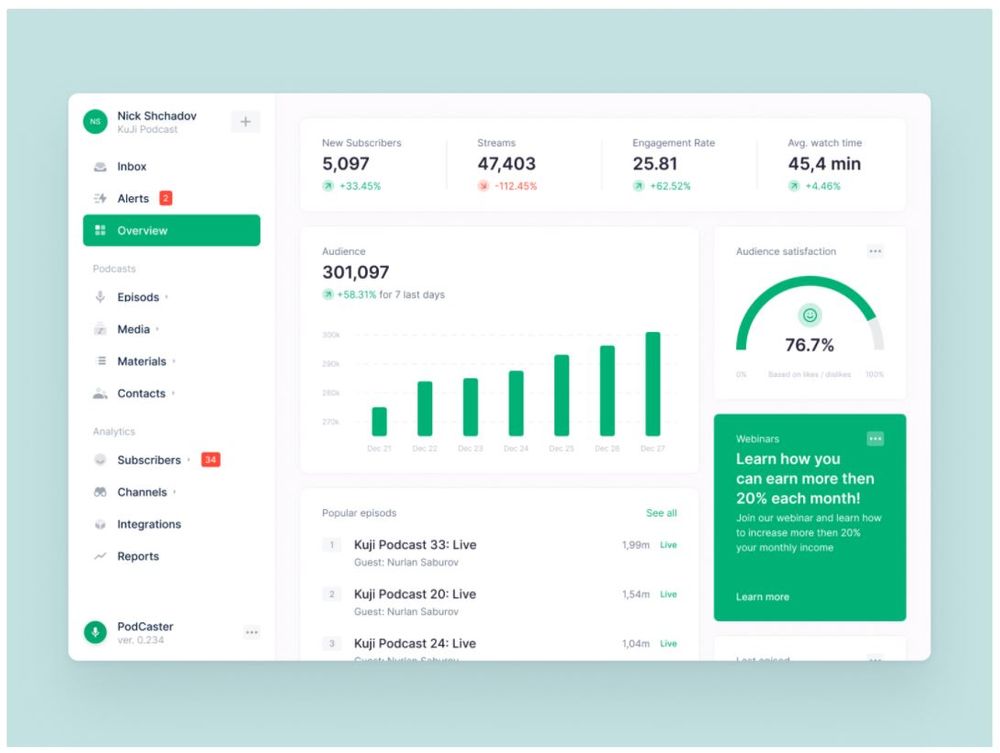
Image Credit: Valery Pevnev for Insoft
These dashboards present current data as compared to previous recordings. This design puts focus on data and makes it easy for the user to catch issues or potential problems. This podcast dashboard by Valery Pevnev for Insoft shows how the audience size may have increased or decreased over the past week. It also delivers data about satisfaction ratings, new subscribers, streams, and engagement rates at a glance.
GOAL: Analyzing data for decision-making
Strategic
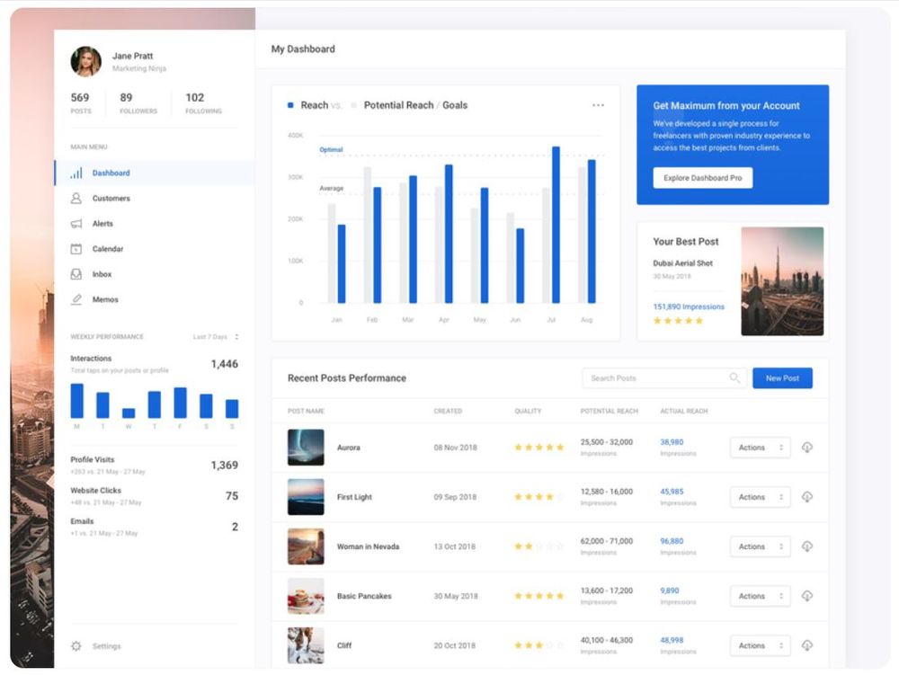
Image Credit: Jan Losert
This type of dashboard shows data and compares it with key performance indicators (KPIs). For instance, this influencer dashboard design by Jan Losert uses a bar chart to compare the client’s reach over the goals or potential reach per month.
GOAL: Plot performance over KPIs
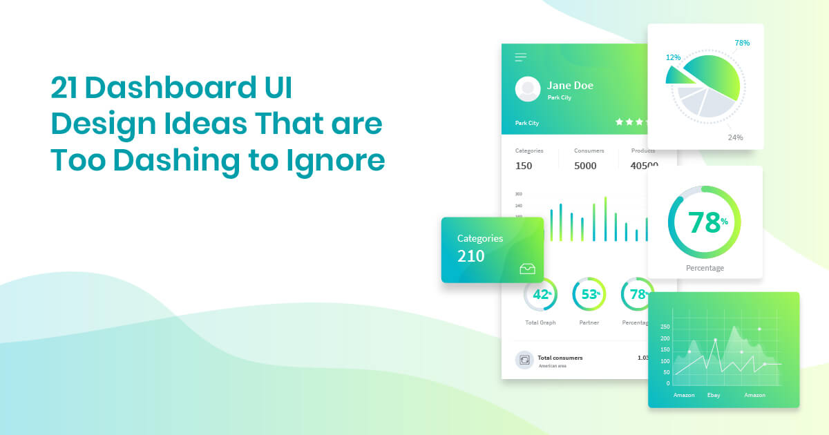
21 Examples of Excellent Dashboard UI Design
Whether you need a dashboard UI design android or iOS, let these dashing examples inspire you!
1. Colors and Waves
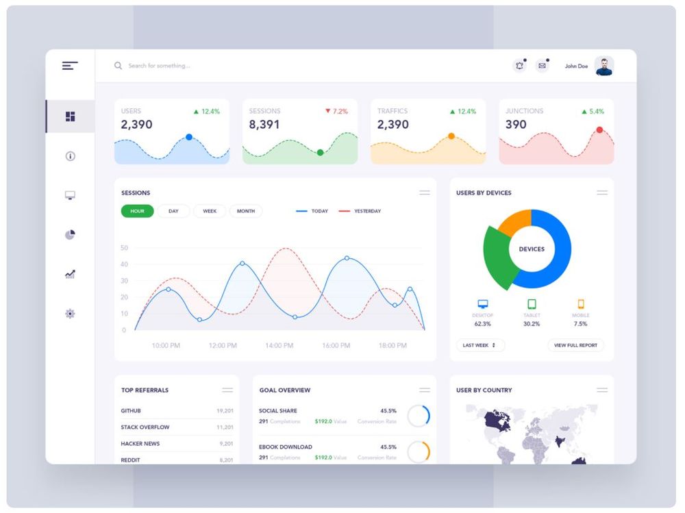
Image Credit: Manoj Rajput for Mindinventory
First on our list of dashboard design examples is this colorful number from Manoj Rajput for Mindinventory. This image combines hues of red, yellow, blue, and green. So, to soften the look despite the vibrant palette, it uses flowy waves on the graphs helping balance the aesthetics.
2. Candy Hues Over White
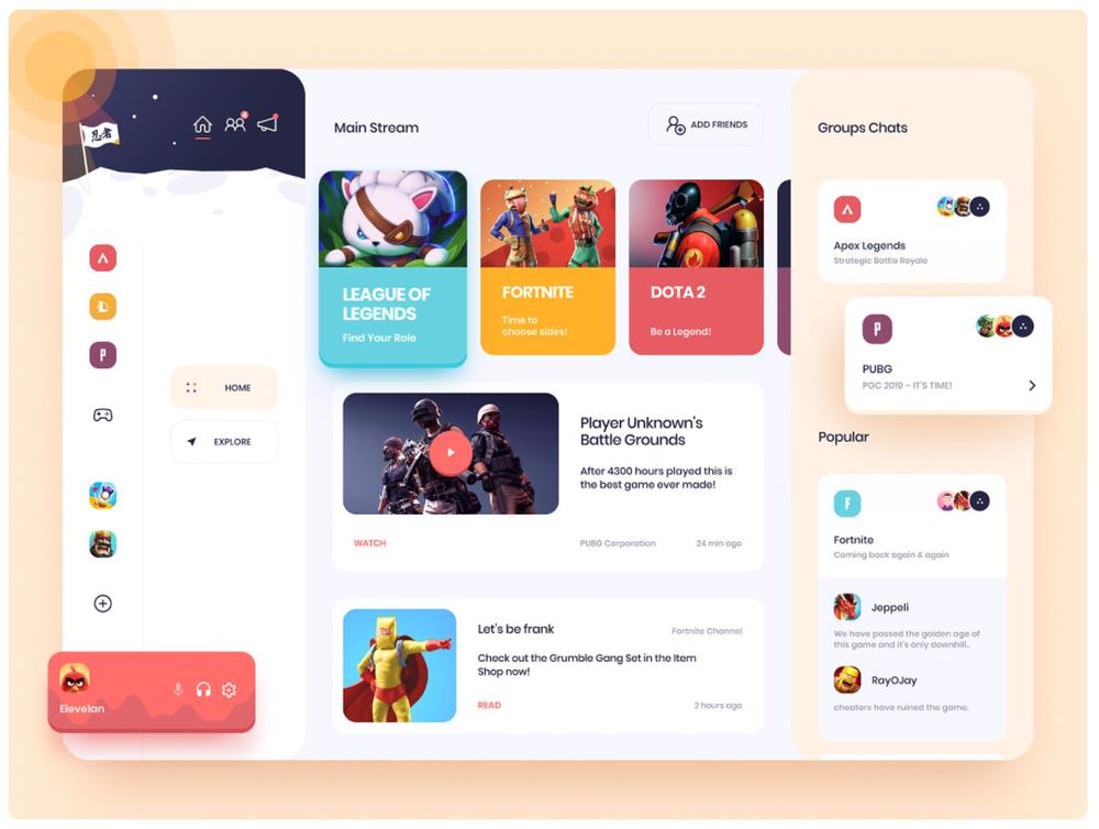
Image Credit: uixNinja
If you’re looking for a gaming dashboard design template, this design by uixNinja is a great example. As expected, the game thumbnails already offer interesting visuals, so the designer kept the background color to a minimum. Also, to complement the plain backdrop, the dashboard uses cute candy colors on the cards and icons.
3. Pretty in Purple
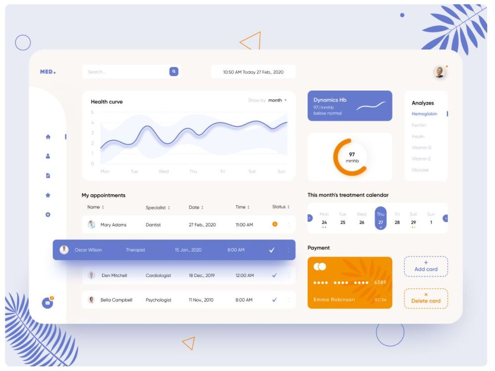
Image Credit: Anastasia
This purplish indigo and orange palette of this dashboard by Anastasia makes for a design that’s interesting but not overwhelming. In addition to that, soft lines and curved edges also give the dashboard an amicable feel, which makes sense for a health app.
4. Cute Visual Accents
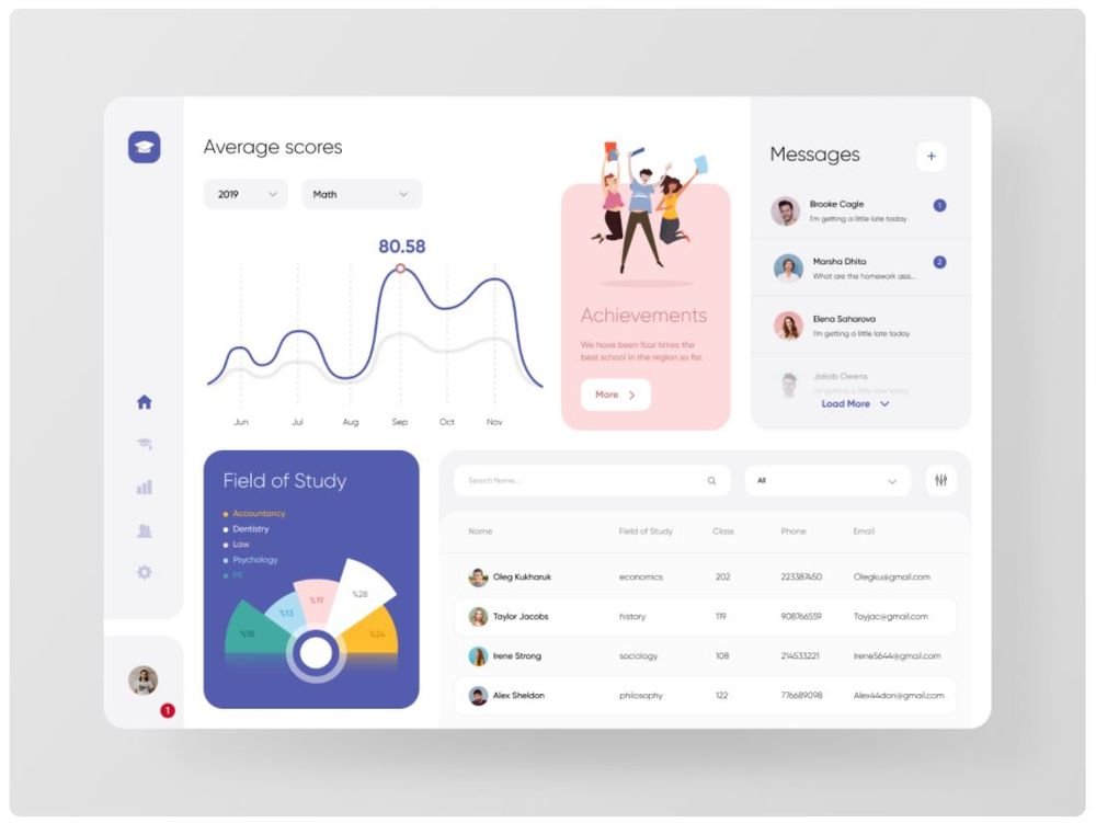
Image Credit: Zinat Farahani
This dashboard design by Zinat Farahani features cute illustration accents that give it character. That said, a design similar to this can be ideal if you want a dashboard that will reflect your unique branding. Customized illustrations are part of what we do at Penji. So if this design appeals to you, we could certainly help you out.
5. Clear Data Presentation
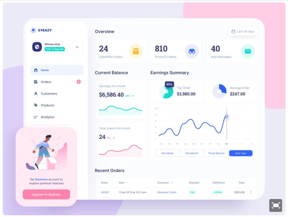
Image Credit: UGEM
Perhaps because of its plain background, this design from UGEM makes it easy to digest the data it’s presenting. Moreover, the box boundaries are very subtle, so the eyes instantly draw to the numbers and graph lines.
6. Refreshing Verdant
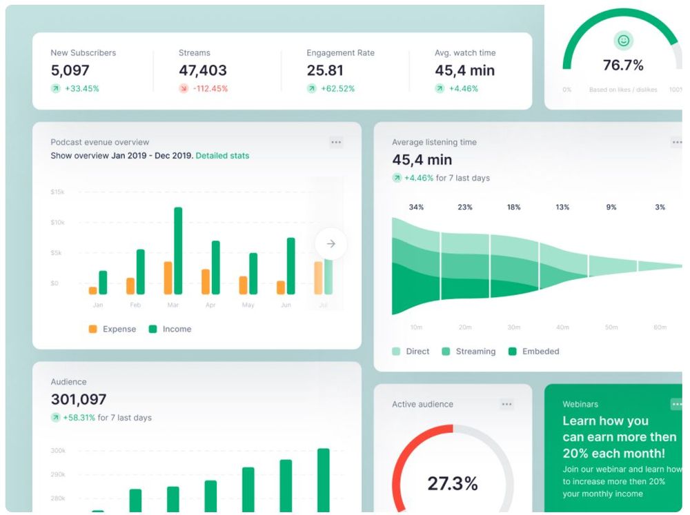
Image Credit: Valery Pevnev for Insoft
There’s something about this design by Valery Pevnev for Insoft that makes a viewer feel relaxed and refreshed. Perhaps it’s the harmonious color palette featuring various shades of green. According to Thomas Sanocki and Noah Sulman’s color relations experiment in 2011, people remember color schemes better because it’s harmonious.
7. Quirky Dark Mode
Image Credit: Anastasia
A dark visual doesn’t necessarily need to be serious and boring. This design from Anastasia shows how you can liven up a dark-hued dashboard with pops of fresh colors here and there. As seen from the design, the colored lines and bars jump out from the midnight blue background.
8. Decorative Graph
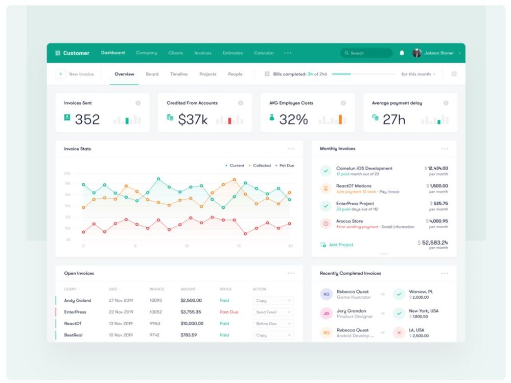
Image Credit: Vlad Ermakov for Toglas Studio
Besides presenting data, graphs can also be used as decorative elements in a graphic. This design concept is illustrated in this dashboard by Vlad Ermakov for Toglas Studio. The line graphs using hollow circles for each point adds an interesting touch to an otherwise plain background.
9. Wacky Artistic
Image Credit: Manoj Rajput for Mindinventory
If you’re going for a dashboard look that’s both quicky and artistic, check out this design by Manoj Rajput for Mindinventory. The design features cobalt blue, yellow, fern green, blush, and bubblegum. In addition to the creative palette, the wacky illustrations give this dashboard a unique personality.
10. Vintage Feel
Image Credit: Nicholas.design for Steelmonk
This design, created by Nicholas.design for Steelmonk, features a vintage color palette of mulberry and salamander. Amid the mulberry’s vibrance, the soft edges of the boxes and the graceful waves of the graphs make this design easy on the eyes.
11. Classic and Easy
Image Licensed by Penji
If you’re looking for a classic, back-to-basics dashboard that doesn’t show you stuff you don’t need, check out this design by Penji. The graphic features a no-nonsense layout and a simple color palette against a light background.
12. Clean UI
Image Credit: Vadim Drut for Heartbeat Agency
There’s something about this design by Vadim Drut for Heartbeat Agency that looks fresh and light. The color scheme, pie chart style, and line graph waves would make you think of an upscale beach resort!
13. Analogous Color Scheme
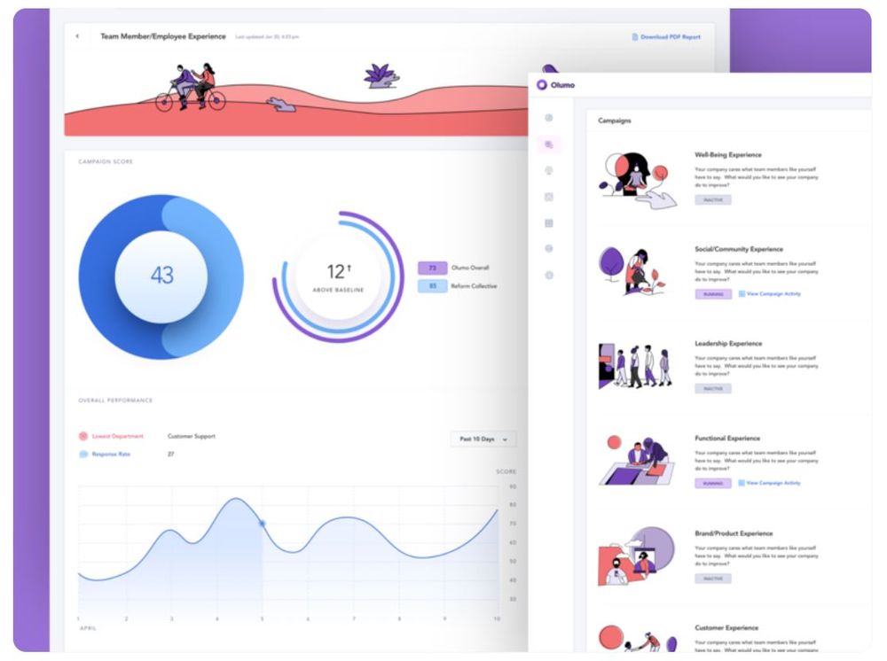
Image Credit: Eric Hoffman for Reform Collective
Analogous colors are those that sit beside one another in the color wheel. This design by Eric Hoffman for Reform Collective features pastel versions of blue, violet, and red amid a white background. In the same vein, the design uses a similar color scheme on the menu illustrations.
14. Midnight With Pops of Color
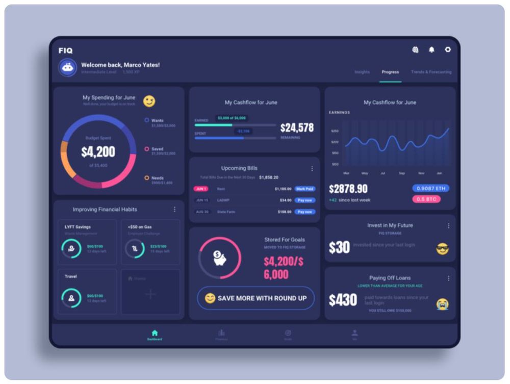
Image Credit: Dannniel for Marcato Studio
A midnight blue background may seem boring for some. But not when it’s paired with beaming hues just like this dashboard by Dannniel for Marcato Studio. Aside from the palette, the beauty of this design relies a lot on a clean and organized layout.
15. Energetic and Uncomplicated
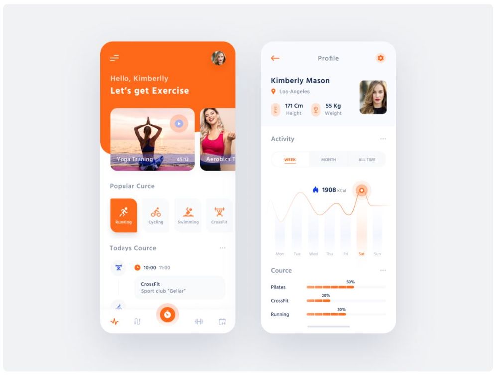
Image Credit: Igor Fartushny
If you’re looking for a dashboard UI design mobile that looks dynamic, use this design by Igor Fartushny as a peg. The dashboard is uncomplicated enough to understand at a glance but also provides that jolt of energy suited for an exercise app.
16. Subtle and Sweet
Image Credit: Aga Ciurysek for 10Clouds
The periwinkle and punch pink hues of this design by Aga Ciurysek for 10Clouds make for a cute dashboard. The palette is so subtle and soft that it belongs in a cupcake display case! And when a design looks good enough to eat, users won’t be able to keep their eyes off it.
17. Relaxingly Soft
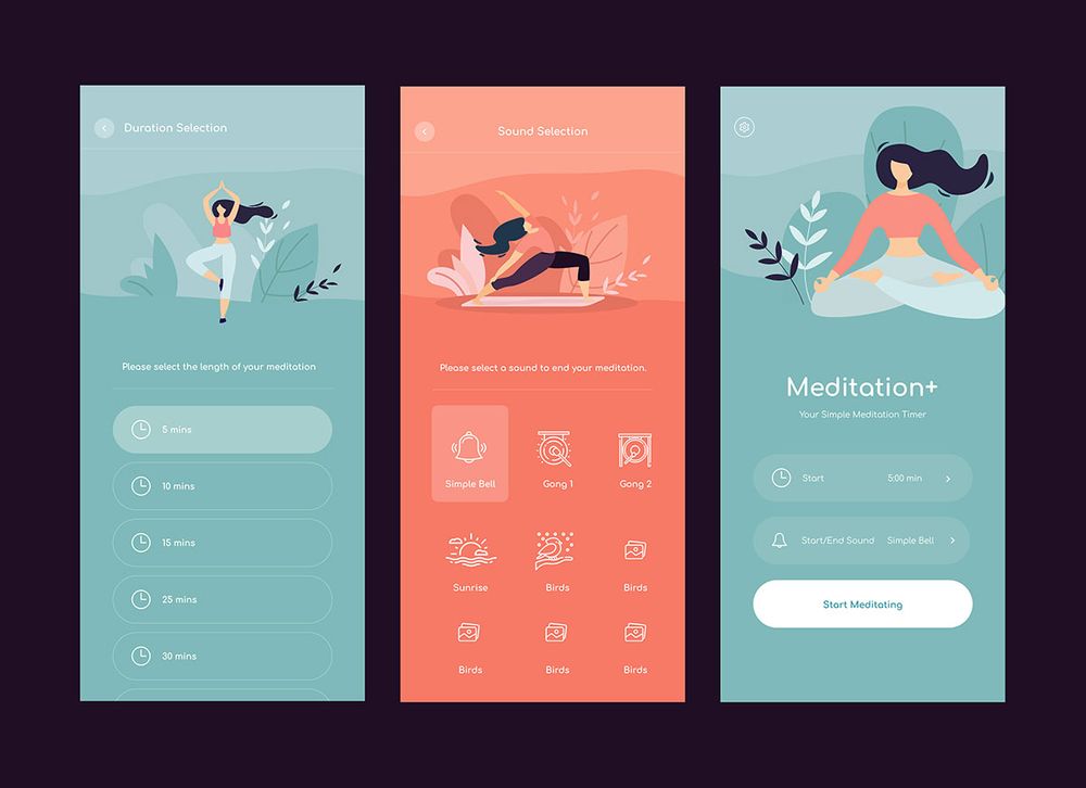
Image Licensed by Penji
This app dashboard created by one of our designers at Penji offers a soft aesthetic perfect for a meditation app. The sage and melon color palette, coupled with the modern minimalist illustrations, makes the app look relaxing but far from boring.
18. Translucent Elements
Image Credit: Sèrgi Mi for Fireart Studio
The main feature of this design by Sèrgi Mi for Fireart Studio is its beautiful area chart. The translucent shades not only present the data clearly but also creates a soothing visual. The accents that use gradients or shades similar to the chart further boosts the dark-colored dashboard.
19. An Image to Inspire
Image Credit: Giga Tamarashvili
Don’t be afraid to incorporate creative images into your dashboard. For instance, this design by Giga Tamarashvili features an image meant to inspire users to attain their fitness goals with the app’s help.
20. Soft Pastels
Image Credit: Michal Parulski for widelab
If you’re looking for a design that offers a modern take on a pastel palette, check out this dashboard by Michal Parulski for widelab. Along with the soft hues on top, the vivid purple on the bottom elements gives the dashboard an energy dose.
21. Catchy Gradient
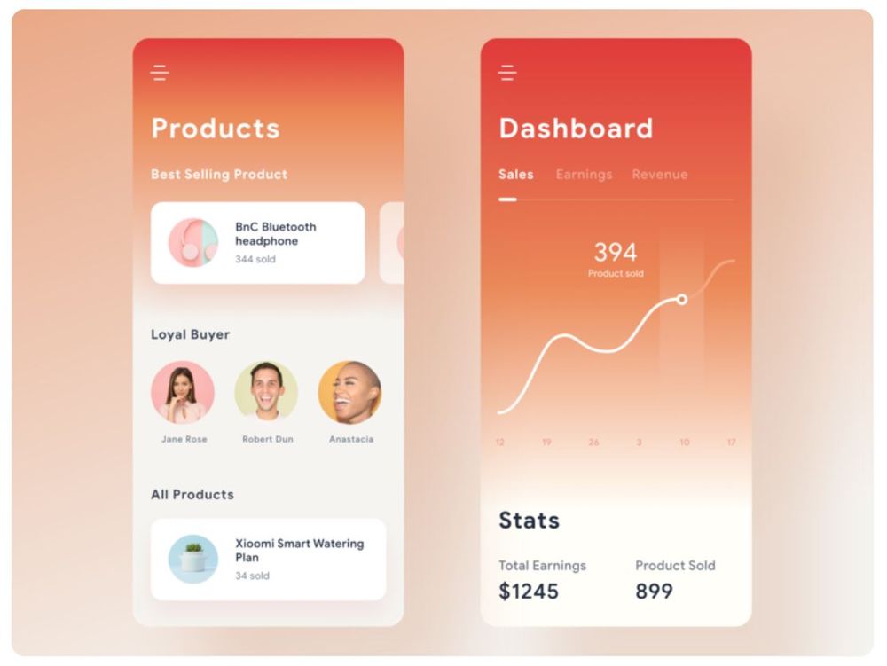
Image Credit: Ghani Pradita for Paperpillar
This app dashboard by Ghani Pradita for Paperpillar owes its dynamic look to the catchy gradient background. The simple typography and clean shapes aptly take a back seat so as not to make the design too noisy.
Requesting a Dashboard UI Design the Easy Way
As illustrated by the examples above, a generic dashboard UI kit won’t likely make the cut. If you want solid visuals, you need an experienced graphic designer who knows how to apply UX/UI best practices.
With Penji, you won’t have to look far. And best of all, it only takes three easy steps to request high-quality designs from us.
1. Create
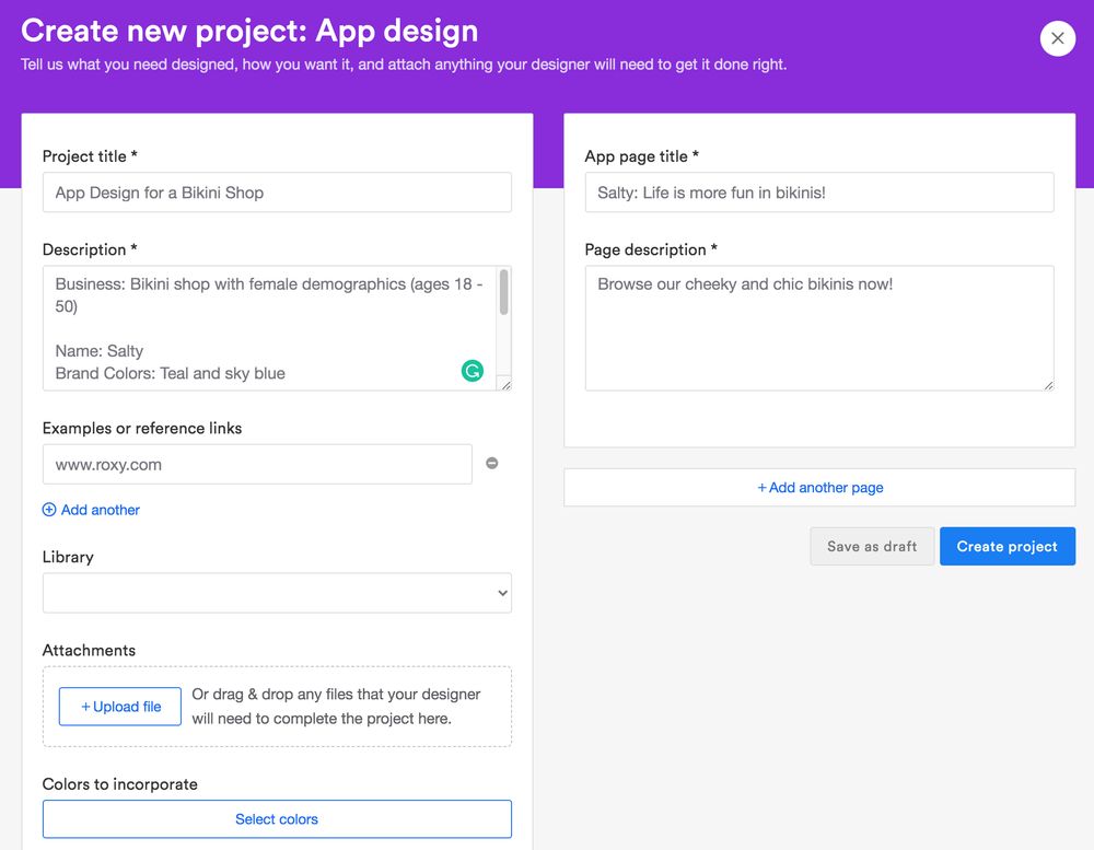
In the Penji dashboard, click the New Project button. Type in a title for your project and select a category. In the description box, describe the project in detail. Once you’re done, click Create Project. It will be assigned to a designer well-versed in your industry.
PRO TIP: It can be difficult to describe visuals in words. To help the designer fully understand your requirements, attach sample images or web links to design inspirations. And don’t forget to add the link to your app if it already exists!
2. Review and Revise
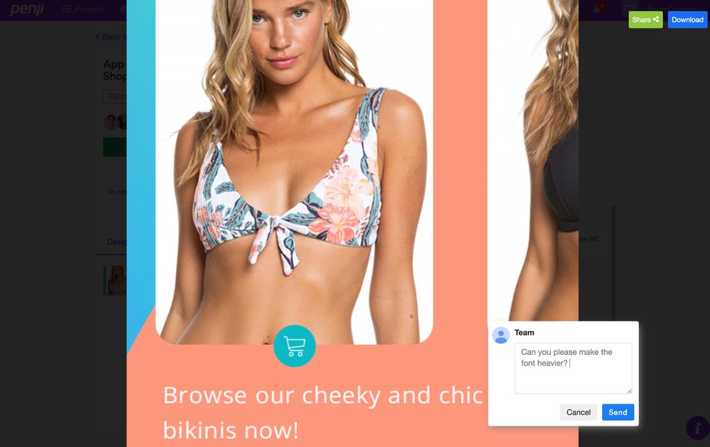
Within 24 to 48 hours, the designer will send you a draft. To review, just click the file on the thread. If you need anything revised, click on that part and type in your comments. The design will be sent back to the designer for revision.
3. Download
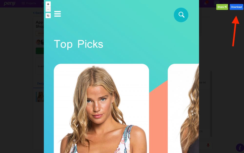
Once you’re happy with the design, hit Download at the upper right corner of the screen. The design will be saved straight to your computer.
Key Takeaways for Marketers
Here are some key lessons we can get from the stunning dashboard examples above:
- Be consistent with your labels, date format, and other written elements in every part of the dashboard.
- Select the right data representation tool for the data you’re presenting. Whether you’re presenting the info to show comparison, distribution, composition, or distribution, the chart or graph that you use must be appropriate.
- The layout flow should prioritize what’s important to the user. Viewers typically look at the screen’s top-left corner first, so it’s best to place the most crucial info on this area.
Marketing an app is not all about the social media marketing strategy or ad campaign plans. It also involves understanding what the audience needs from the app and incorporating those to improve the product.
Luckily, you won’t have to do it alone. With Penji, you can have the top 2 percent of designers create excellent visuals while you focus on growing the brand. Sign up today and try any of our unlimited design and unlimited revision packages risk-free for 15 days.
Want to inspire your teammates? Share this post on social media!
About the author

Carla Deña
Carla is a journalist and content writer who produces stories for both digital and legacy media. She is passionate about creativity, innovation, and helping small businesses explore solutions that drive growth and social impact.


