
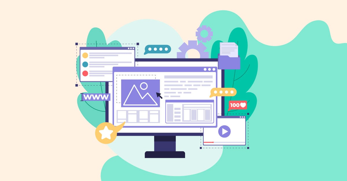
Tried and tested website layouts work because of readability and navigation. But you don’t have to stick with conventional layouts. Instead, you can tweak your website to fit your brand’s personality. With the help of graphic design services, you can bring these custom layouts to life. And if you need website design inspiration, here are 13 creative website layouts to copy!
Why Design Matters in a Website Layout
Since many website layouts copy a similar template or structure, it’s best if you incorporate design elements that will make for creative website layouts.
Well, for starters, you want to leave your visitors in awe. Sure, you might think they should immediately go to the product or service page and checkout. Sometimes, you’ll want people to explore further.
Let them learn about you.
That’s why it should also translate into your website layout. You might follow some trends here and there, but it’s good to add a bit of your company or self on the website layout. Spice it up with your branding. That’s how you can stand out—especially when supported by professional graphic design services.
Some design elements to take note of in a website layout:
- Visual hierarchy
- Color
- Negative space
Don’t forget some graphic design trends that would come in handy:
- Bright colors
- Illustrations
- Augmented reality
Also, don’t forget to make it a responsive website too. It’s a crucial part of a website. You can have compelling graphics, but if you can’t click on any buttons or the website loads slowly, you may lose some leads in the process. With the help of expert graphic design services, you can ensure both beauty and functionality work hand in hand.
1. Bored Solutions
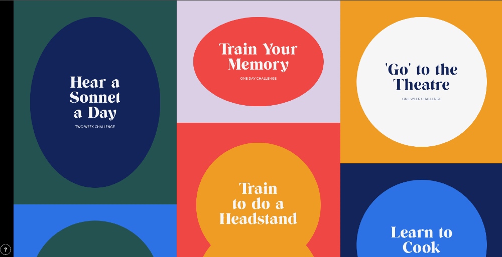
Bored Solutions puts its twist on a grid layout. They included circles and oblongs inside the differently shaped grids. This layout will allow users to scroll further because you’re curious about what other things you can accomplish in a week or a month. The creator(s) of this website made this during the pandemic.
So, what are you planning on trying out for a month or week? As for me, I think I’d like to go to the theatre.
2. Input Mag
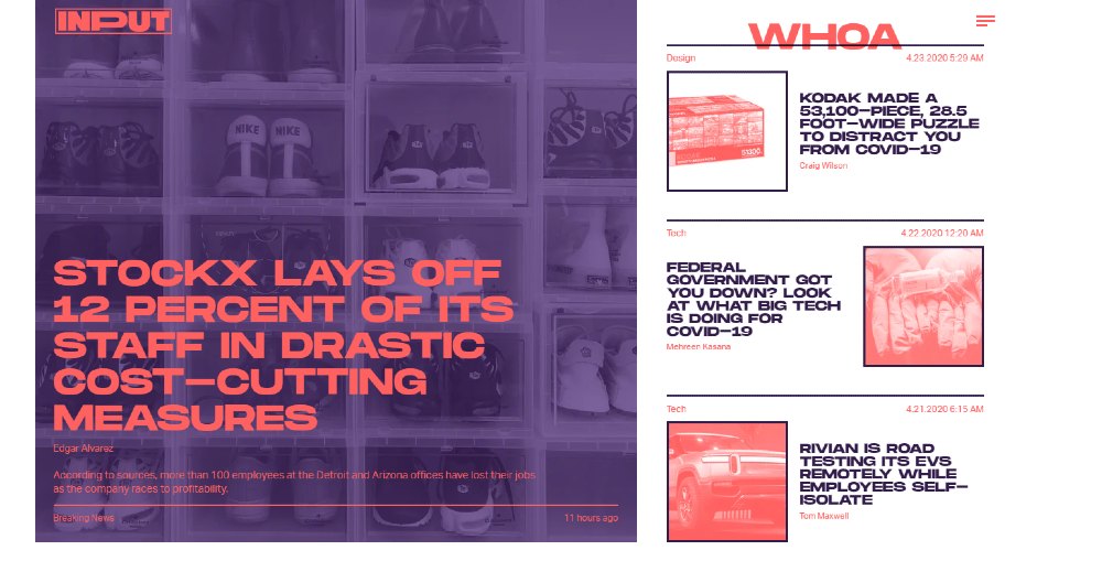
Once you load the Input Mag website, you’ll notice they combine hints of asymmetry and the z-shape flow. The use of colors are striking too, which makes your eyes stick to the page. As you scroll further down, you’ll see more stories and suggested products you might need.
The use of text for visual hierarchy purposes works because it makes you want to read the headline and even the whole article. They also utilize an endless scroll that lets users stay longer on the site so they can read more stories. It’s a common trend among media websites.
3. Brain Bakery
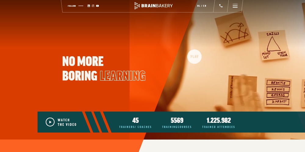
The Brain Bakery website leaves an impression because it doesn’t follow one structure on the website’s homepage. What’s consistent is the color because it pops. Even if the site doesn’t follow one layout, it makes you navigate easily on the page.
The modified cursor is a nice touch too! It helps when you want to interact with an object.
Plus, the menu bar looks skewed. It looks 3D in a way, which is a smarty take on the usual sticky menu bar.
4. The Wellesley 100
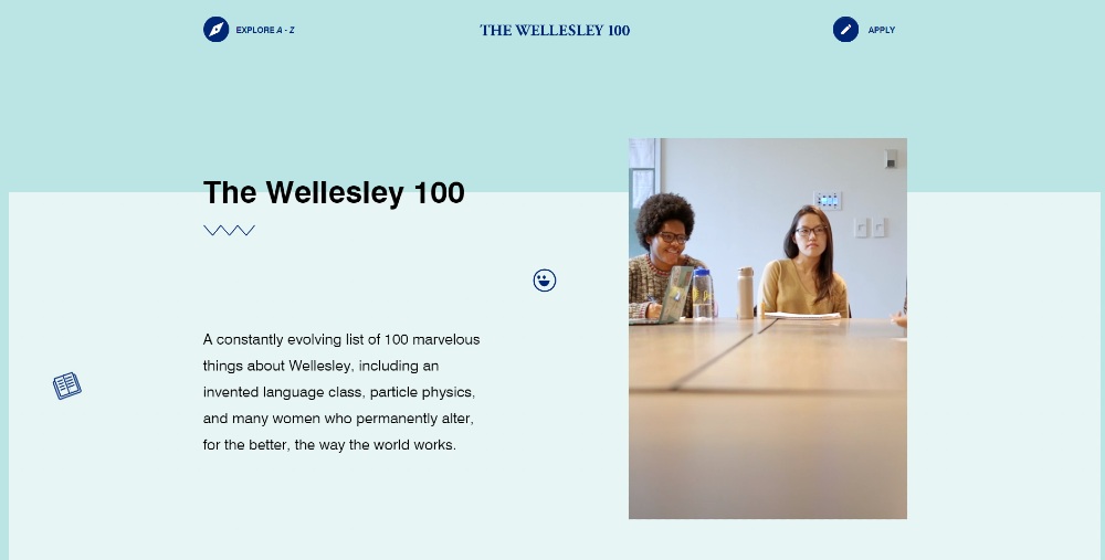
Instead of using a hero image, illustration, or any graphic design, the Wellesley 100 website uses a video, as is the trend. Just like some websites on this list, they utilize a combination of structures to make the site engaging and exciting.
Another interesting point to note is when you scroll a bit, click on the “surprise me” button, and learn something new about Wellesley. You’ll also notice that they stacked photos there, which is also indicative of asymmetry and visual hierarchy.
5. Vestre
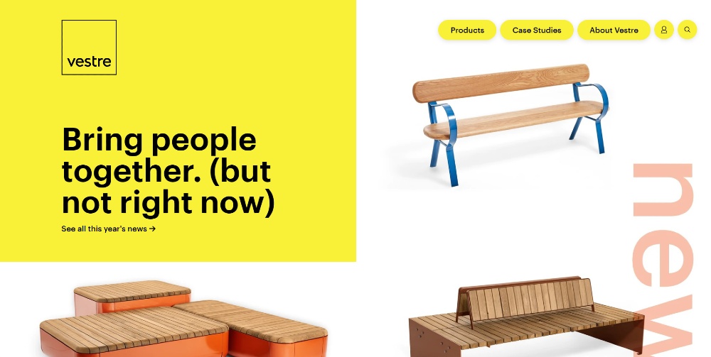
Yellow is the theme of Vestre’s website. You immediately see it once you open the site. As per the layout, they feature not just one hero image, but three. The huge square on the left is imposing, and it’s a great way to capture people’s attention—with the help of well-executed graphic design services.
Scrolling down, you’ll notice they adopted a zigzag layout while adding elements like a photo, video, and gifs to feature their products in different places.
6. Collagerie
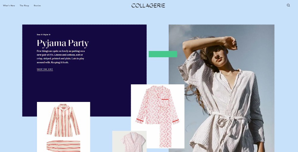
What makes Collagerie one of the most creative website layouts is they put a spotlight on the products. There’s minimal copy, which allows the visitor to appreciate the products more. They applied visual hierarchy on the boxes, so visitors get an idea of which the most recommended products are.
They make excellent use of strips, which act as a visual cue for the visitor to appreciate the product further.
7. Gomma Gomma
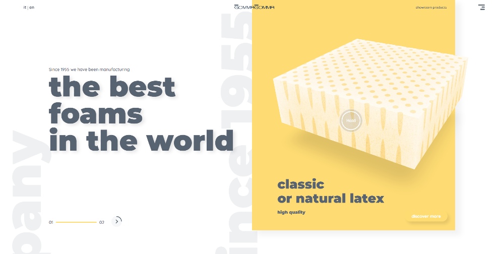
Unlike other product websites that use templates, Gomma Gomma goes the extra mile with their website.
What’s interesting about the products featured above the fold is you can interact with it. What’s great about it too is how your eyes dart to the product immediately. It stands out because it’s rendered in 3D and uses a background so you could put your attention on the product.
You’ll even see that the text moves as you move up or down the page, making the header text become either symmetrical or not. That gives the website its asymmetrical look.
Get a design package with unlimited graphic design
Try Penji risk-free for 30 days & get unlimited custom designs


8. Huys NYC
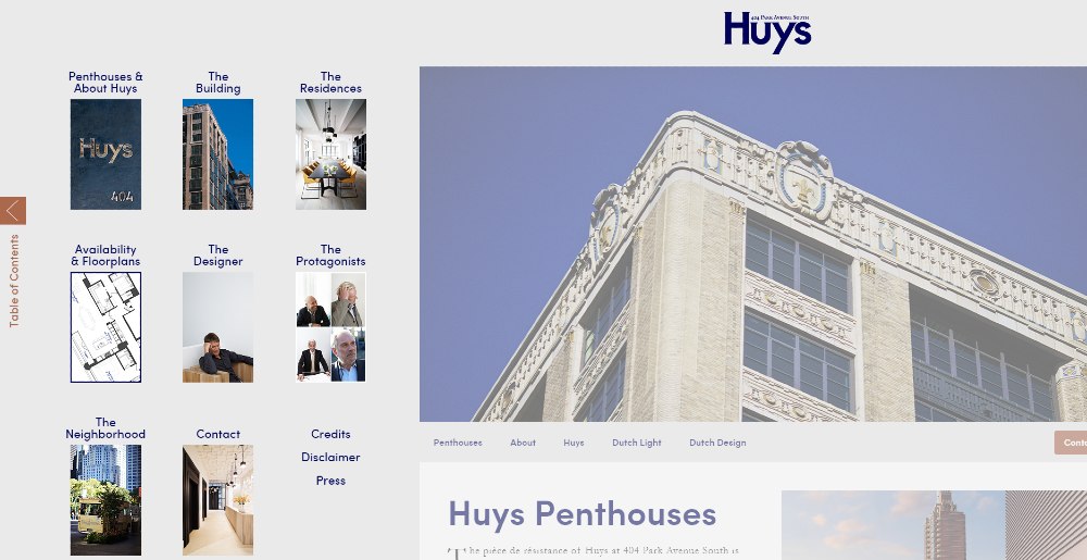
When you open the Huys NYC website for the first time, the menu bar appears on the left side. From there, you want potential renters to explore the available spaces and possibly learn more about the building and its history as well.
If you minimize the menu bar, you’ll see a single column that’s conveniently placed in the middle. Their website layout adheres to a z-pattern, allowing the eyes to follow as you scroll down, thanks in part to thoughtful graphic design services that enhance the user experience.
9. Signes du Quotidien
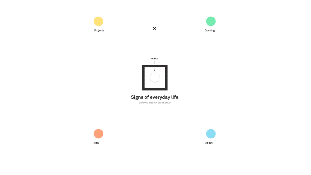
Signes du Quotidien makes excellent use of white space in their website layout. When you load the site, they ask you to click on the circle inside the box. That’s the menu.
Instead of using the bar, they animated the menu bar and placed them in the middle instead of putting them at the top or on the sides. To learn more about them, you can drag a circle onto the box.
When a new page loads, they use two columns. You’ll also notice they make great use of white space since they limited the elements to the middle while still observing symmetrical spacing.
Signes du Quotidien is French for Signs of Everyday Life.
10. Work at Galapagos
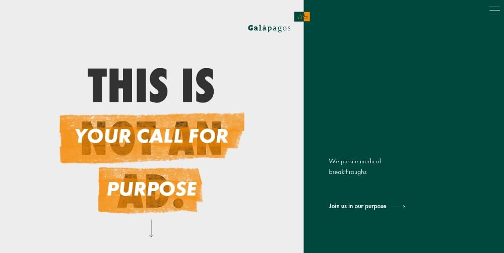
The Work at Galapagos has one of the best creative website layouts.
At the start, they use an asymmetrical website layout, but as you scroll down, the right side of the image becomes the menu bar. They also added directional cues so you can read more about Galapagos and why they’re hiring people.
The animated text also helps in navigating the website and making it interactive for potential candidates on the site—something made even more effective through smart graphic design services.
One of the best parts of their website is the use of audio instead of the usual video. An illustration of an employee serves as the visual. Plus, the visual hierarchy was well executed for that section too.
The bottom of the page ends with a split-screen where you can either click on their About page or Join the team. Not all websites utilize a split-screen at the bottom of the page. But it works for their site.
11. Woom
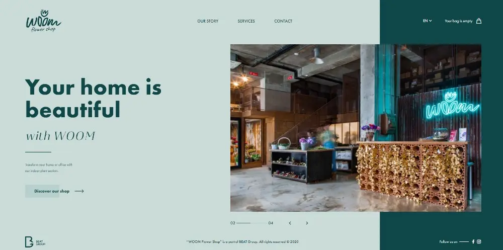
Woom uses a single page layout on their website. This allows visitors to do what they need to do on the site. You’ll notice the use of visual hierarchy on the text on the left side of the asymmetrical screen. The header text is bolded, while the following texts are either italicized or in its regular form.
When you click the next section from the homepage, you can browse their shop, contact them, or check out their events pages. The shop page is organized as a grid so visitors can view the products properly.
12. Any Cable
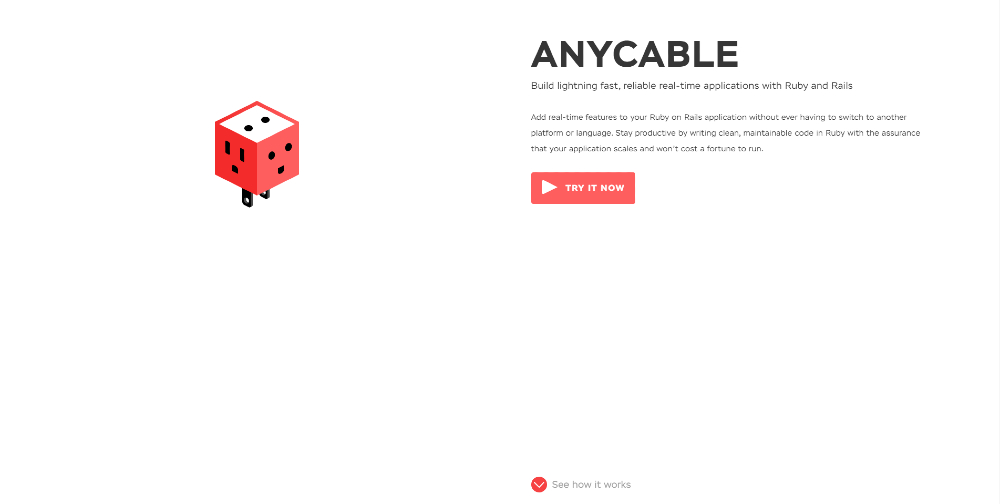
Any Cable uses a split-screen animation layout on their homepage. This allows users to learn about the process through animation and description. It’s also good they used different sizes for the text to indicate that it’s the next section. They add muted colors on the grids, but to emphasize data, they added colors to catch people’s attention.
Plus, they make great use of white space too. The minimalist website gets points for readability, and it’s easy on the eyes also. It’s one of the best creative website layouts because it integrates different elements that work.
13. Happy Egg
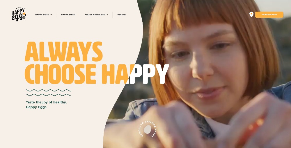
Instead of using a split-screen or a single image (or video), Happy Egg chose to customize above the fold, and they executed it well, making it one of the most creative website layouts on the list.
The edges take the form of uncooked egg out of its shell or like a sunny side up egg. Scrolling further down, you notice they also use striking colors to match the colors of their products or packaging. They made the site interactive too, making it enjoyable to browse the sections of the site.
Key Takeaways
Your website should serve as a way for customers to transact various things, such as checking out or scheduling an appointment. However, you should also spruce up your website to make it more appealing to your visitors, with the help of graphic design services, if needed.
Remember, your website layout is more than just aesthetics—it’s part of your brand’s first impression. A creative layout can be the difference between a bounce and a conversion. The more engaging your layout is, the more likely visitors will explore your site and take meaningful actions.
About the author

Katrina Pascual
Katrina is a content writer specializing in graphic design, marketing, social media, and technology. In her spare time, she writes monthly personal blogs to practice her craft.


