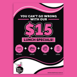
While many business owners believe that brochures are no longer relevant, statistics suggest otherwise. These “paper catalogs” are still a powerful tool to boost any business. Therefore, if you wish to take advantage of this opportunity, several online brochure makers are available for your use. But first, you need to understand the design process involved. Here is our guide to crafting creative brochure design for your brand.
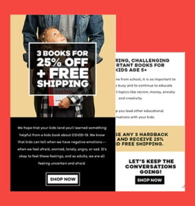
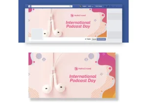
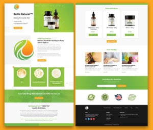
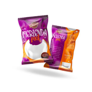
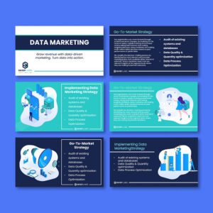
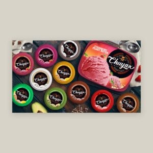
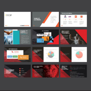
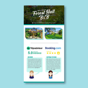
All brochures featured in this article were created by award-winning graphic designers at Penji.
What is a Brochure?
A brochure is informative advertising material primarily used to promote a company, organization, products, or services and inform the public of their benefits. The major objective of creating a brochure is to match the target audience’s attention with a beautiful visual design. It is also used to promote products, organizations, or services intuitively. Lastly, brochures help build trust and confidence between you and your prospective clients.
Unlike TV or print advertisements, brochures are more cost-effective, making tangible brochures more precious.
How a Well-Crafted Brochure Design Helps Businesses
More than just a marketing tool, a brochure is a compact extension of your brand. You can hand them out at events, mail them directly to clients, or place them in your stores. They are a tangible way to share your brand story, services, and values. Here are a few more reasons to get a brochure design service:
- Creates a Strong First Impression: The first thing consumers notice about a brand is design. Well-thought-out visual assets instantly convey professionalism, credibility, and trustworthiness. A brochure offers the capability to hook prospects from the very first glance, if designed right.
- Communicates Your Message Clearly: A well-structured brochure guides prospects to your exact message. It can also help customers digest complex information more easily, making it easier for them to understand your product or service better.
- Boosts Brand Recognition: Your brochure is an excellent outlet to reinforce your brand identity. Utilize consistent design elements to enhance brand recognition and create a lasting impression on prospects.
- Supports Sales and Conversions: Compelling copy and strategic calls-to-action can directly influence customer behavior. A layout that points them to where they want to go —visit your website, book an appointment, or contact your sales team —is crucial.
- Provides a Cost-Effective Marketing Tool: In a digital-first world, it’s a novelty to receive something tangible, all the more reason to design your brochure beautifully. Not only that, they’re sure to deliver high ROI, more so in face-to-face settings, such as trade fairs, shows, events, and others.
Standard Brochure Sizes
There are plenty of brochure sizes to choose from, and the most common ones include:
- 5.5″ x 8.5”
- 8.5″ x 11”
- 8.5″ x 14″
- 11″ x 17″
- 11″ x 25.5″
- Custom
7 Popular Brochure Layouts
This section will guide you through popular brochure layouts, helping you pick the best one for your content and goals.
1. Bi-fold Brochure
Bi-fold is the most straightforward brochure layout. A sheet of paper is folded in half, resulting in four panels that can be read from left to right, just like a magazine. While the vertical bi-fold is more popular, you can also create a horizontal bi-fold.
2. Tri-fold Brochure
The most popular creative brochure layout is a tri-fold, created by folding a sheet of paper into three sections. Tri-folds are also versatile, giving several folding options. Although all tri-folds have six sections, how you fold the paper will decide which sections are visible.
3. C-fold Brochure
A C-fold looks like the letter C when open. And when closed, one-third of the paper is nested between the others.
When designing a C-fold brochure, you must use each panel to guide readers through your content. The first panel typically serves as a cover, the middle panel as detailed content, and the third as a conclusion or call to action. Following this logical flow makes it easy for readers to understand your message.
4. Z-fold
A Z-Fold brochure is a versatile, three-panel format that folds in a zigzag shape, creating a “Z” when viewed from above. This layout offers an excellent flow for storytelling because it allows readers to unfold content in a logical sequence.
A Z-fold brochure is perfect for businesses that want to break down information into organized sections while keeping the content engaging and easy to navigate. While it’s tempting to fill each panel with information, too much text can overwhelm readers. Use one or two solid images and concise text to keep each panel focused and visually appealing.
5. Gatefold
The gatefold, sometimes called a window fold, is a unique tri-fold type. You don’t have to divide the paper into six equal sections. Instead, the right and left sides fold inward to meet in the middle. This creative brochure layout enables designers to prioritize visual design on the inner pages of the brochure.
6. Double gatefold
To create a double gatefold, follow the steps for a regular gatefold. Once you’ve folded it in half horizontally, fold it in half again vertically. This will create a central fold down the middle panel, resulting in a slimmer brochure that fits easily into envelopes and narrow spaces.
7. Double parallel fold
For a double parallel fold, you need two vertical folds. Try folding a sheet of paper in half, then folding it in half again. After that, half of the sheet is nested within the other. The final result would be eight panels.
Depending on the paper size, the brochure may be narrower than a typical tri-fold, similar in size, but with the addition of two panels.
3 Important Components of Brochure Design
To achieve its purpose, a brochure must incorporate crucial components such as content, layout, and graphics.
1. Content
When writing the content, you must understand the brochure’s purpose by gathering information related to the campaign. It would be best to avoid big chunks of text because too much can cause people to disregard the brochure. To attract more readers, you must provide only the key points. Images, drawings, and charts are more attractive.
Make sure the copy appeals to the reader’s needs and emotions. Additionally, ensure the brochure showcases your latest and best-selling products and contact details. In short, having a brochure on hand can encourage future inquiries or purchases.
2. Layout
The layout of the brochure will depend heavily on the amount of text and images included. Your budget also plays an important role, as the more elaborate a brochure is, the more expensive it becomes.
Depending on the amount and type of information you need to include, you can choose a simple or detailed brochure. A good and effective brochure presents information logically, flows seamlessly, and imparts all the relevant information at a glance.
3. Graphics
The design can make or break your brochure, and getting design elements down pat can help ensure the effectiveness of your brochure. Here are some critical aspects of your brochure design to consider:
- Use Colour to Set the Tone
- Use the Right Font
- Use the Right Photos
- Utilize White Space Effectively
Work With Penji For Brochures That Set Your Business Apart
Looking for professional brochure design services to create striking brochures for your business or event? Come to Penji! Penji offers affordable, unlimited graphic design services with over 120 categories. Work with vetted graphic designers to bring your chosen creative brochure layout to life. For more information about our work, watch the demo video at this link.
Conclusion
Creative brochure design services allow you to have beautiful and professional-quality catalogs and brochure designs. Our unlimited graphic design service offers affordable brochure designs that are sure to boost your brand.
About the author

Rowena Zaballa
With a background as a former government employee specializing in urban planning, Rowena transitioned into the world of blogging and SEO content writing. As a passionate storyteller, she uses her expertise to craft engaging and informative content for various audiences.

