
Any business wants to stand out from its competitors. And visual elements can make your company different from others. While you may have your visual assets, it’s how you present yourself to the public that matters as well. In a nutshell, that’s your corporate identity. But, why is it relevant and what are corporate identity design elements and examples you should remember?
Corporate Identity vs. Brand Identity
Before I tackle which elements you should have for your corporate identity, let’s look at what differentiates it from the brand identity.
What is corporate identity?
Corporate identity relates to the image presented by the company and how distinct it is from others. In corporate identity design, this refers to logos, websites, packaging, etc. IONOS expands on corporate identity as a means to communicate with your stakeholders internally and externally.
What is branding or brand identity?
Meanwhile, brand identity refers to how you want people to perceive your brand. Arek Dvornechuck even further extends it by saying that brand identity can even tell a story.
Now that you know the difference, learn how you can apply your corporate identity in designs.
Corporate Identity Design Elements
What makes up your whole corporate identity? Here are the three main elements your corporate identity should have.
1. Logo
Even if a logo plays a crucial role in your branding, it’s also a primary element of corporate identity design. Again, since corporate identity deals with how you present your business, the logo serves that purpose from the get-go.
Think about a logo being a prerequisite to all the corporate identity design elements. Without the logo, you won’t have a unique identity.
2. Fonts
Fonts are also part of corporate identity design. It may seem like a trivial part of your branding, but fonts will get your company recognized better.
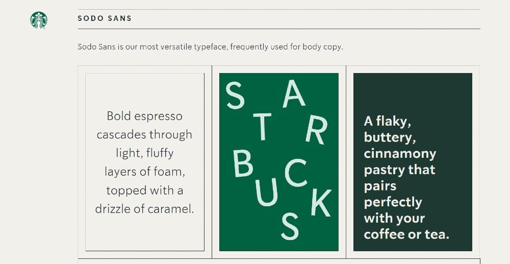
In some instances, brands would have their custom-made typography or fonts. This can further enhance their corporate identity design. Companies like Uber and Starbucks have their personalized fonts.
3. Colors
Your brand colors are also important to your corporate identity design. What do you remember when someone says Coca-Cola? Aside from the sweet, bubbly drink, it’s red as well, right?
How about Facebook? It’s blue.
Color has a massive impact on how people can remember your corporate identity. In fact, in a study published by the University of Loyola, color will get your brand recognized. That’s why the colors you choose should also be in the materials you print or publish. This way, people will remember your company much easier.
With these three elements in mind, you can have a consistent corporate identity design across different channels.
Corporate Identity Design Examples
Having the elements in mind, the materials you create, publish, or post can further enhance your corporate identity. Here are the top four corporate identity design examples you should prepare.
1. Brand Collaterals
What are examples of brand collateral should you have as part of your corporate identity design?
- Stationery, notebooks, and company documents or forms
- Pens and pencils
- Mugs or tumblers
- Hats or shirts
- Business cards
Even if stationery isn’t as widely used anymore, you still need a letterhead for important correspondence and other documents.
As listed above, you might sell merchandise or give away promotional items such as pens, mugs, or shirts. These items will help in recall for customers or leads. Or, if it’s for office use only, it could even act as a way to boost morale and strengthen internal branding.
You can incorporate your corporate identity into business cards. It’s not a piece of paper that you can use to network or share with other individuals. A business card can become an indicator of how your company presents itself to others.
Let’s say you’re a professional; you can stick to the traditional design and use your company colors. Meanwhile, if you’re looking to attract attention, you can play with the design and put your own spin on it.
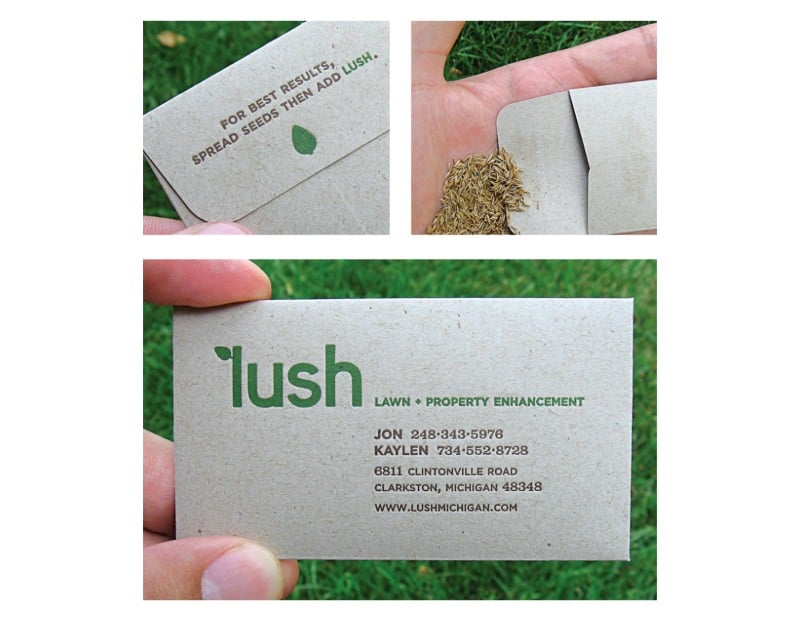
Struck designed Lush’s business card. As you can see, it doesn’t only act as a business card, but as a packet of seeds.
2. Packaging
Packaging plays a massive part in corporate identity design for eCommerce sites and companies that sell products. It’s not just cardboard boxes where you can add your logo, and that’s it. Some would go the extra mile to ensure that the packaging design would become unique to them.

One of the most notable examples of popular packaging designs comes from Tiffany & Co. Their signature “Tiffany” blue is present on the packaging design. Even if it only has the wordmark logo, anyone holding or carrying a robin’s-egg blue box will recognize the famous jewelry store.
3. Website
Publishing your website is the first step in creating your online presence. But you shouldn’t only create a website for the sake of having one. It boosts your credibility and acts as a marketing tool as well. That’s why you shouldn’t disregard the impact of having a website.
Plus, it’s not enough to have a website to fulfill your corporate identity. A well-designed website is essential in your corporate identity design. It can even become an extension of the image you want to project to prospective leads.
Adobe found that 73% of companies want to have a compelling website design. Not only will it make them unique, but it will further strengthen their corporate identity.
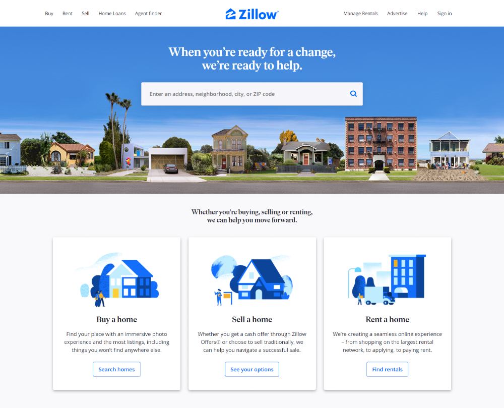
Let’s take this example from Zillow. It may seem like a simple site to navigate, but what makes it unique from its competitors is its use of colors and fonts. They even have custom illustrations posted to make their brand unique.
4. Online Marketing Materials
The materials you publish online are also part of your corporate identity design. You shouldn’t only rely on your website to present your image. You need to be present on social media channels and other marketing platforms to showcase your visual identity.
Here are some examples of online marketing materials that would contribute to your corporate identity:
- Blog graphics
- Social media
It’s these types of content that you can send to your subscribers or publish on your marketing channels. It will make you more credible and legitimate, helping ease in subscribers or leads to connecting with you more.
For example, with blog graphics, you can choose to have illustrations and incorporate your company’s colors. Your readers can remember you the more you publish blog graphics with the same color scheme and illustrations.
On the other hand, for email, you can design a newsletter or graphic that will integrate your logo and fonts. This will make you look more professional.
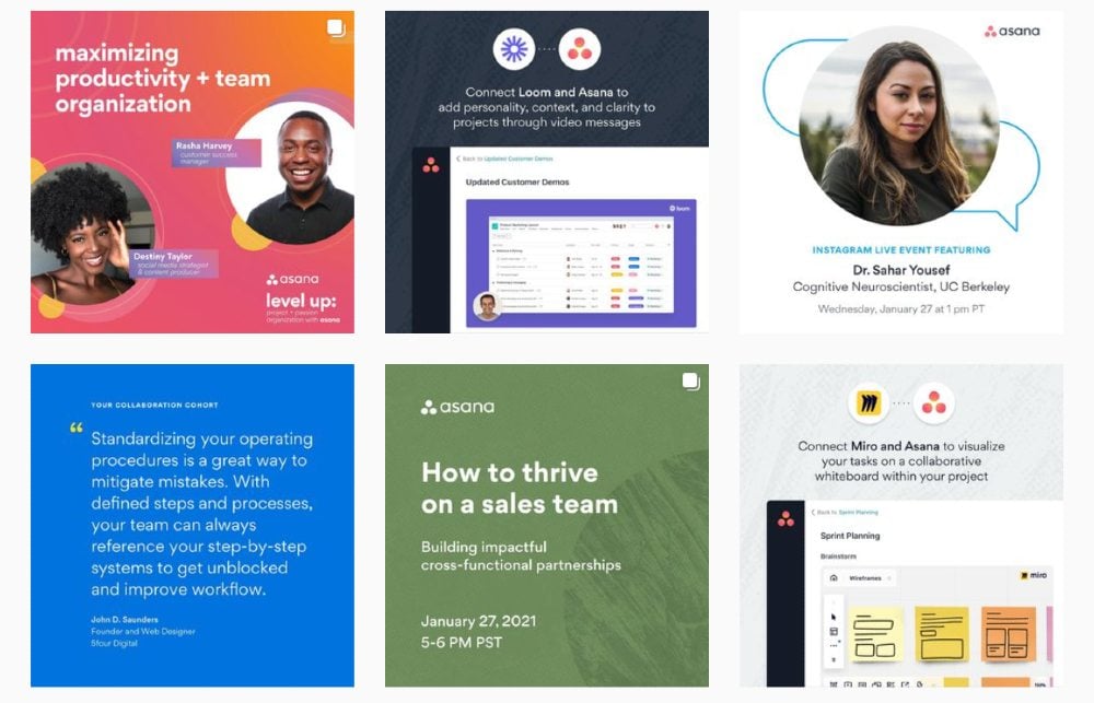
Finally, for social media, you don’t have to post your logo all the time. The best way you can integrate your corporate identity is through colors or fonts. You might have to play around with what works best and see which ones garner the most engagement. From there, you’ll know how to get more likes and comments.
Perhaps, you can sneak in your logo on posts like quotes or typography. But this one from Asana reminds us you can use a logo for events or software integration tutorials.
Final Thoughts
Aside from your branding, you should also take note of your corporate identity. You don’t want your company to get unnoticed. That’s why you should apply corporate identity in design. This way, you can express your identity visually and develop a strong and unique corporate identity.
About the author

Katrina Pascual
Katrina is a content writer specializing in graphic design, marketing, social media, and technology. In her spare time, she writes monthly personal blogs to practice her craft.


