Your cookbook doesn’t just need delectable, high-quality images. But it should also be organized and guide the reader to try new dishes. To do that, you need to look at cookbook designs from your fellow chefs. And if you need design ideas, here are cookbook layouts to get you egg-cited to create yours!
All images were from Amazon unless otherwise stated.
1. Cook Anime
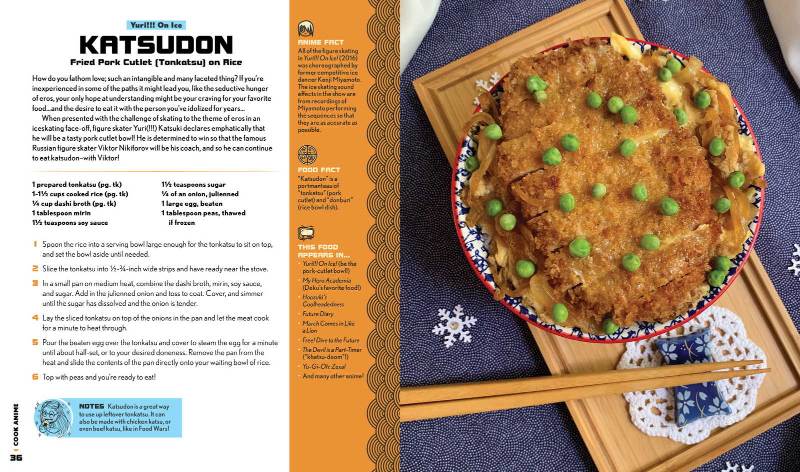
Image from Mighty Ape
Anime fans will definitely love this cookbook since it includes recipes from famous animes. The layout includes a wave pattern seen in most Japanese art or design. It’s great that it uses both color and font weights to help readers identify which section they are reading. Plus, it’s cool to see they used icons and anime-style drawings to make the cookbook more compelling and engaging.
2. Baking on Her Own
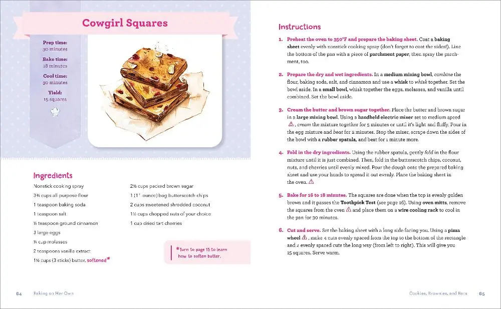
This cookbook uses illustration designs instead of actual photos. As one of the unique cookbook layouts in this list, the baked good illustration doesn’t take much space. Its location is on the upper left corner, while the instructions take up a whole page on the side. Aside from that, to ensure clarity, they bolded some text to emphasize instructions or points.
3. From Crook to Cook
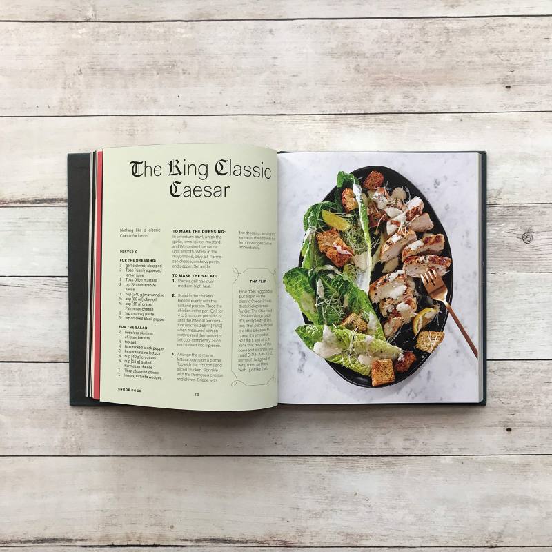
The layout for this cookbook follows a three-column structure to save space. To make it easy to read, it uses bolded fonts and numbering to distinguish the written content. Plus, the “tips” or “modification” section uses a pattern with loops for edges. It’s great because it will help draw the reader’s attention to that section.
4. Milk Bar: Kids Only
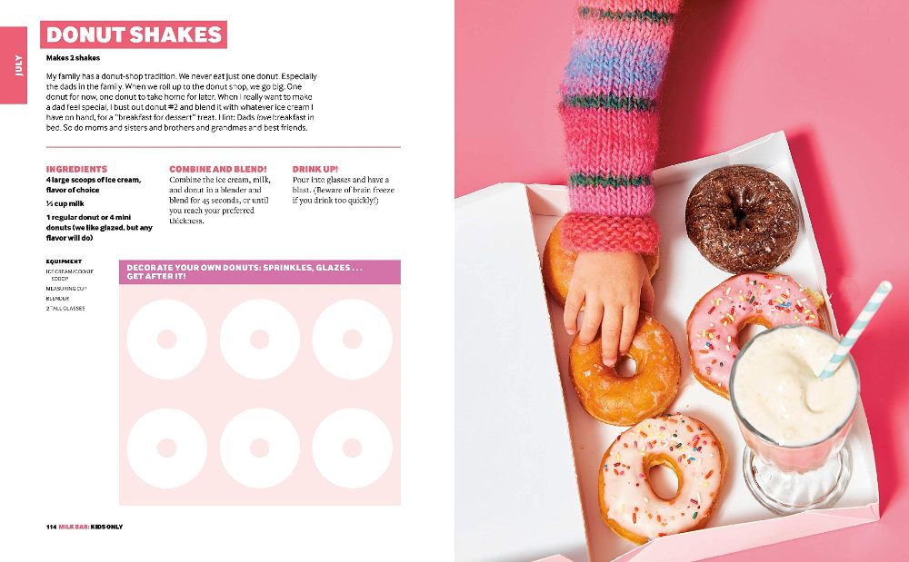
What’s great about this cookbook is it caters to its target audience. As one of the best cookbook layouts to look for inspiration, it’s colorful, and the content is easy to follow. As for the structure, it follows a three-column format, which is unusual in most cookbook layouts. However, it still works because fonts and colors can guide the reader on what section of the page they’re reading.
5. Avatar: The Last Airbender Cookbook
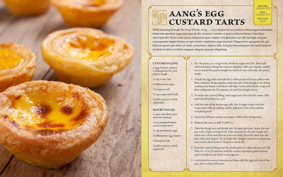
Avatar: The Last Airbender fans will love flipping through pages of the cookbook. The cookbook layout uses elements unique to the show. Plus, the recipe content is contained in a box with lines, which will make it easier for the cook to navigate the page.
6. The Milk Street Cookbook
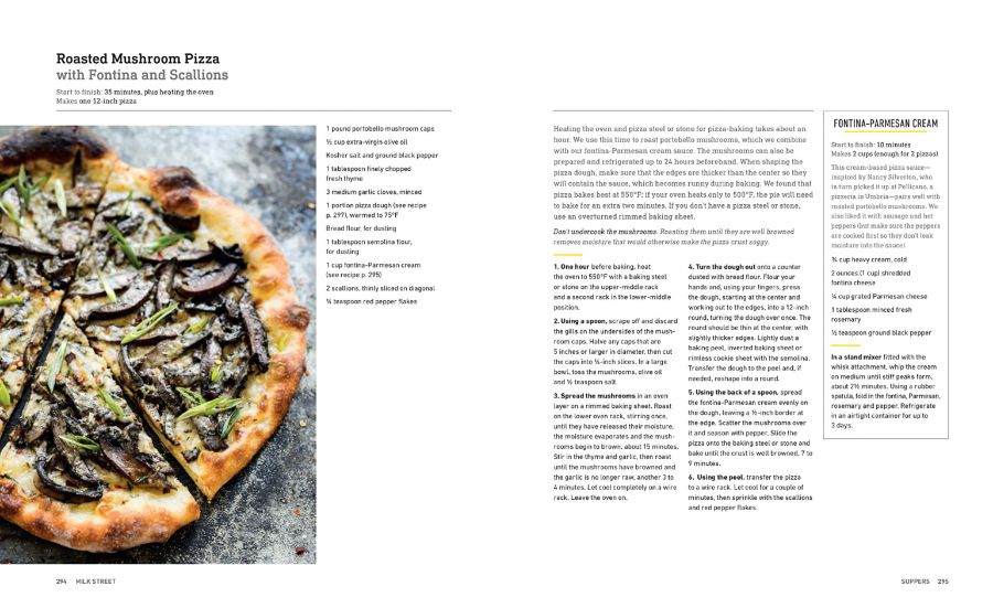
Here’s another example of a minimalist cookbook layout that you can use as inspiration for yours. As you can see, the recipe title is separated from the recipe with a gray line. Aside from that, a yellow line also separates content or indicates you’ll be reading another piece of content from the same page. Plus, on this page, there’s a column where you can read how to make the cream for the pizza.
7. Appetites: A Cookbook
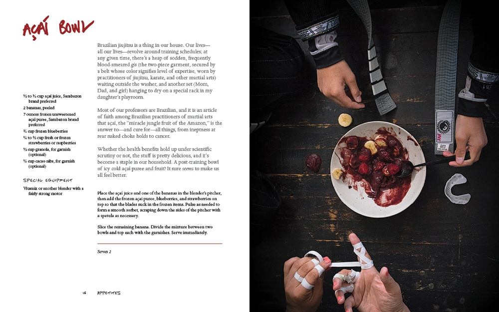
If you don’t want to use lines to separate the content on the page, here’s one of the cookbook layouts that use colors to make content distinct. Bourdain’s story about the recipe is in gray, and the recipe and ingredients are in black. Plus, the headline uses a handwritten-style font in red.
Like with most cookbook layouts, the ingredients are found at the outermost layer of the cookbook to put focus on the story and the recipe.
8. Pieometry: Modern Tart Art and Pie Design
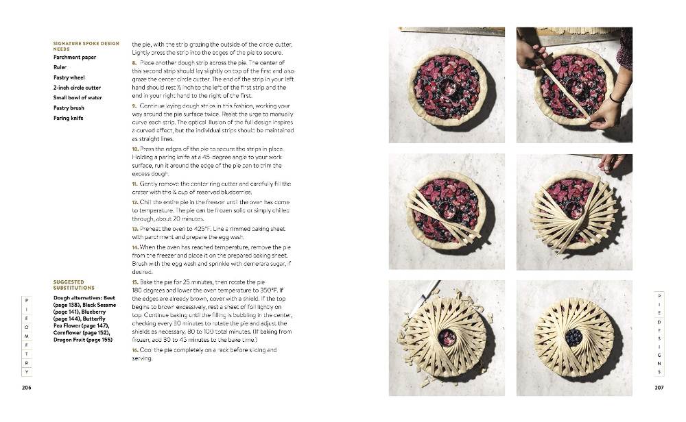
If you want to show off the procedure on how to cook a recipe, here’s one of the few cookbook layouts you need to see. They needed to add step-by-step photos because the design requires it. Plus, it also follows a minimalist and uncluttered style making it pleasing to the eyes.
9. The New York Times Cooking No-Recipe Recipes
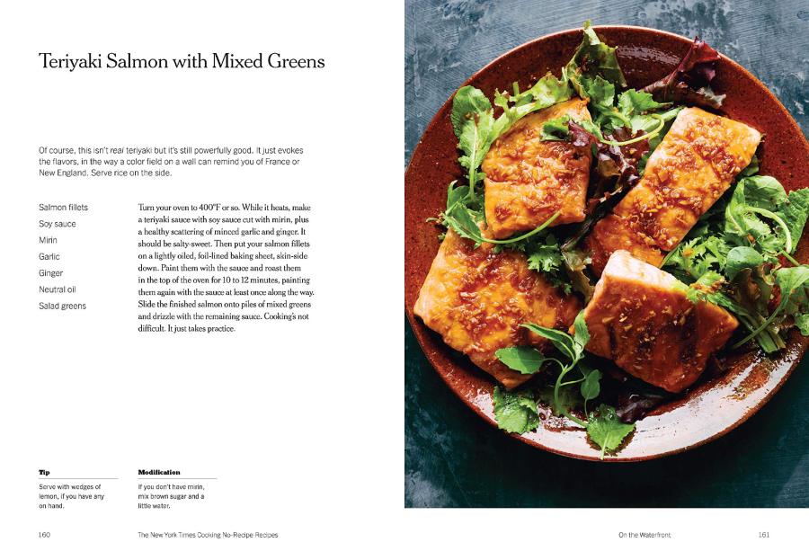
Rare would you see a newspaper publish a cookbook, and this one makes our list because of its simplicity. Instead of using a bullet or numbering system when describing the recipe, they’re telling a story. Plus, it uses whitespace well, ensuring the focus remains on the content.
10. Cook This Book
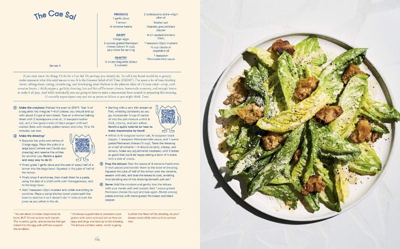
This cookbook has a modern design, and it’s organized thanks to the lines. Consider this cookbook as the opposite of the New York Times cookbook when it comes to structuring. It will help readers view the page because of the hierarchy and bullet points used. Not only that, but this cookbook also includes footnotes. That’s why it makes our list as one of the most unusual yet exquisite cookbook layouts.
11. Friends: The Official Cookbook
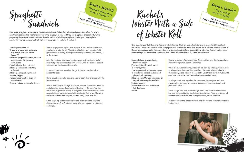
Friends fans will love this official cookbook since it has recipes posted from the show. Aside from that, there are recipes inspired by the characters. As for the layout, they have two types. One would have two columns worth of recipes, while another would have a photo of the food. It uses a line separator to distinguish the recipe from the ingredients. Plus, there’s also a spot on the right-hand corner revealing which episode the recipe was inspired by.
12. Back to The Future: The Official Hill Valley Cookbook
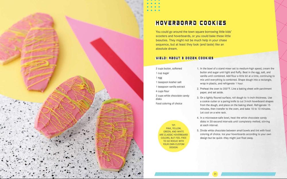
It seems that movie or TV show-inspired cookbooks are available for franchises with huge fanbases. This one by Back to The Future has one of the unique cookbook layouts. There are different designs referencing the time that Marty and Doc traveled to. The layouts follow the same structure, but the headline fonts are different.
13. Tex-Mex Cookbook
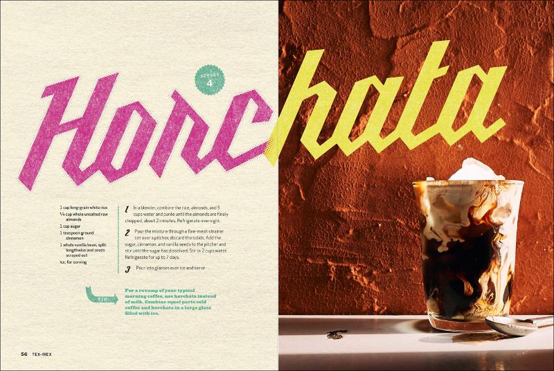
One of the best things about this cookbook is it mixes the layout depending on the recipe. It doesn’t stick to one structure, and it will catch your eye. Another thing to note is the squiggly line it uses instead of the straight line most cookbooks would have. It makes it quirkier, and it does bring out a fun element to the overall cookbook layout.
14. Food Babe Kitchen
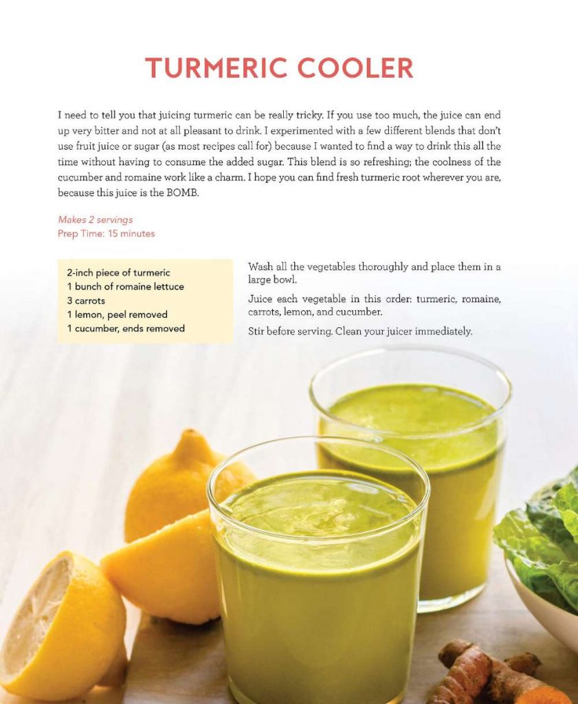
Most cookbooks would have two pages for a recipe and the meal’s photo. This one from Food Babe Kitchen incorporates the text on the image of the meal or drink. Other than that, it uses a square border for readers to identify the ingredients.
15. Magnolia Table

Here’s another organized cookbook layout that you can use as inspiration. The cookbook uses a visual hierarchy from the headline to the serving side. It’s easy to follow, too, since it uses a numbering system in describing the recipe. Plus, the italics also help distinguish it from the main content.
Request Cookbook Layouts and Design From Penji
As shown in the examples, cookbook layouts vary depending on the target audience, content, or creator. Plus, as seen in most of them, you’ll see that their branding reflects on the cookbook too. This makes it easier to remember them when they create recipes. And to achieve that result, you’ll need a graphic designer to help you create a compelling cookbook design.
You don’t have to look any further because Penji is here to help you create your cookbook. You can request a cookbook design that your readers will surely love. Plus, one of the best things about Penji is you can create projects for the designs you need in one month! Request social media graphics, email newsletters, and ad designs to promote your cookbook as well. That way, you can maximize your subscription. Sign up now and try the Penji platform 30 days risk-free.
About the author

Katrina Pascual
Katrina is a content writer specializing in graphic design, marketing, social media, and technology. In her spare time, she writes monthly personal blogs to practice her craft.
Table of Contents
- 1. Cook Anime
- 2. Baking on Her Own
- 3. From Crook to Cook
- 4. Milk Bar: Kids Only
- 5. Avatar: The Last Airbender Cookbook
- 6. The Milk Street Cookbook
- 7. Appetites: A Cookbook
- 8. Pieometry: Modern Tart Art and Pie Design
- 9. The New York Times Cooking No-Recipe Recipes
- 10. Cook This Book
- 11. Friends: The Official Cookbook
- 12. Back to The Future: The Official Hill Valley Cookbook
- 13. Tex-Mex Cookbook
- 14. Food Babe Kitchen
- 15. Magnolia Table
- Request Cookbook Layouts and Design From Penji


