Launching a new website entails a lot of energy and creativity, that’s for sure. But don’t make the mistake of not paying enough attention to the element that should precede it – the coming soon landing page.
You’re lucky to stumble through this article as we’ll discuss everything you need to know about how to pre-launch your website:
- The importance of a coming soon landing page
- Elements of a coming soon landing page
- Coming soon page examples to inspire
- Catchy coming soon landing page phrases
- BONUS: how to get a customized coming soon landing page
Did you know that an average landing page converts around ten out of a hundred visitors? When the stakes are this high, it’s best to leave the landing page design to a professional. Keep reading to know how you can get customized landing page designs from Penji to rock your conversion rates.
The Importance of a Coming Soon Landing Page
When you’re launching something new such as a new website, you need to hype it up and make your target market anticipate the big day. A landing page does just that by alerting your audience that something’s cooking and they need to watch out.
Aside from creating buzz leading to your launch, here are a few practical benefits of a coming soon page:
- Introduction. If you’re a new company hoping to get a little bit warm with your audience even before your big launch, a coming soon page can do that. This page will be the perfect opportunity to introduce yourself, what you’re offering, and to just get yourself out there. On the other hand, the coming soon page is for a relaunch; it’s also a great chance to give your audience a hint on how you’re revamping the business.
- Social media accounts. Data from Statista says there are 3.78 billion social media users worldwide in 2021. If you want to tap social networks’ huge marketing potential, you need to boost your social media presence. By including links to your coming soon landing page, you can increase your followers from the get-go.
- Email collection. Boost your lead generation by including an email collection section on your coming soon page. This will give you a headstart in terms of lead generation. In addition to that, it can also give you a ready email list you can market to once you’re about to launch.
- Brand identity. A coming soon page will be an awesome opportunity to show who you are as a brand even before you offer your products and services. Through visual design and the wording of your copy, make your brand identity shine to feed your target market’s excitement towards your brand.
Elements of a Coming Soon Landing Page
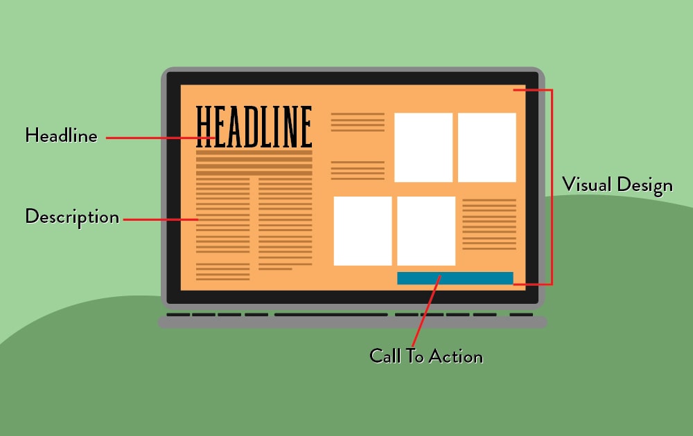
Here are the basic landing page elements to keep in mind. It’s crucial to remember, though, that these are just the bare minimum. Aside from these, you can also add other elements if you think they’ll help your landing page achieve its goal.
1. Headline
If there’s anything that has the potential to capture your market’s attention at a glance, it’s this element. Make your headline short but punchy – enough to make your audience stop dead at their tracks. Let’s put it this way: if the headline doesn’t interest the visitor, they won’t bother to look at the rest of the landing page. That’s how crucial this part is.
PRO TIP: Craft a headline with not more than 15 words total max. The shorter and the bigger the impact, the better.
2. Description
Once you hook your audience with a catchy headline, it’s time to pull them in with the description. Since the headline could be too brief, this is your chance to explain more about your offer. However, be careful not to over-explain. Just like a coming soon trailer of a movie, you wouldn’t want to reveal the entire plotline to your audience. Give them the good bits that will ensure they’ll come back for more.
3. Call-to-Action
If you look at the best pre-launch landing page templates, all of them have a call-to-action of CTA. If you’re directing your audience to your social media accounts, it could simply be a text that says, “Follow our socials.” If, on the other hand, you’re gearing your landing page for email collection, then a CTA button should do the trick.
PRO TIP: There are clever CTA copies you can apply to really give your audience that last push to do the “action” you’re suggesting. For instance, instead of “Subscribe now” for an email collection CTA button, “Get discount updates” could get more clicks.
4. Visual Design
Graphic design is, without a doubt, one of the landing page elements that you shouldn’t leave to chance. A landing page with an amateurish design will be a sure fire way to make visitors bounce even before they read your copy. When it comes to landing page design, make sure that you’ve got all bases covered – from shapes and color psychology to negative space and layout.
As mentioned above, brand identity is one of the benefits you can get with a good landing page. That said, it might not be optimal to use the first free coming soon landing page template you see online (scroll down to the bottom of the page to learn how you can get a professionally designed customized landing page).
Coming Soon Page Examples to Inspire
How exactly do you make your target market excited without pre-empting your big reveal? Here are a few examples to inspire.
1. Ample Negative Space
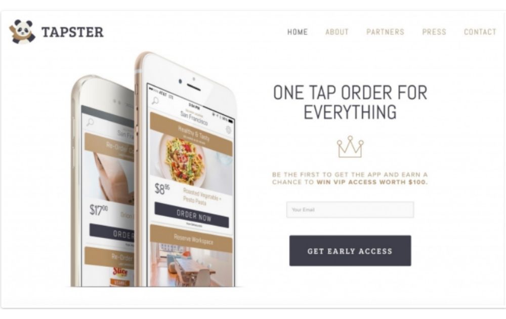
This coming soon landing page uses a short but powerful headline. In addition to that, the description offered a chance to win VIP access, thus giving visitors a bigger motivation to opt in.
2. Light Over Dark
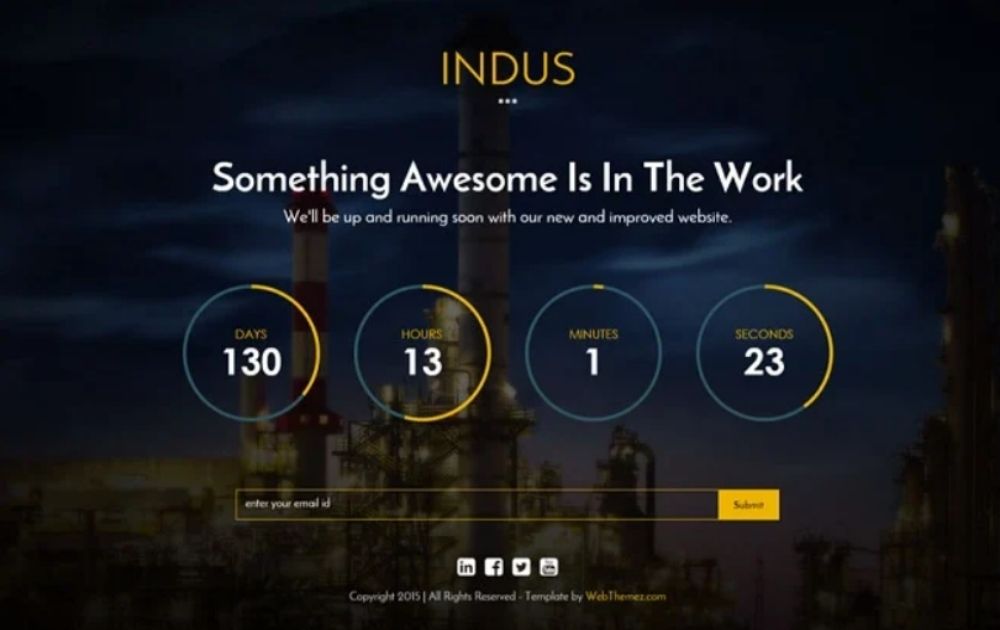
This design shows how light elements over a dark background can create an interesting visual. Also, the donut countdown timer makes for a unique element that’s both sleek and creative.
3. Relevant Image
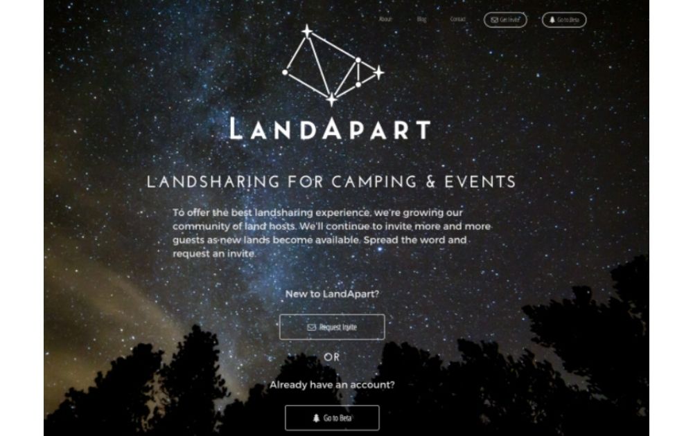
Landapart is a land-sharing platform for camping and other events. That said, the background image is not only beautiful but also relevant. After all, it’s the clear, starry skies you’d love to have if you were to go camping.
4. Link to a Portfolio
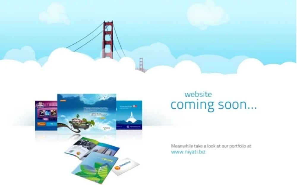
This landing page doesn’t merely inform the audience that a website is coming soon. Instead, it leads them to a portfolio to check out the company’s output even before the website is up. It’s one way for your potential customers to get to know you better before the big reveal.
5. Cool Palette
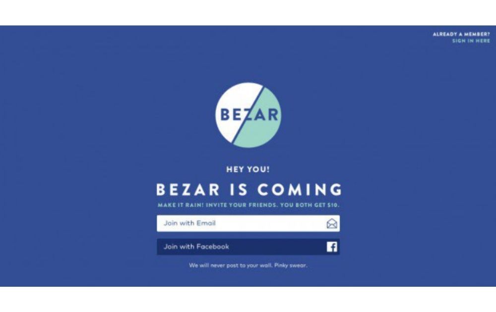
Bezar’s coming soon landing page features a coordinated palette of cool hues. According to color psychology, shades of blue offers feelings of serenity and calm. In addition to that, this landing page also offers two ways of subscribing – through email and through Facebook.
6. Clear Countdown
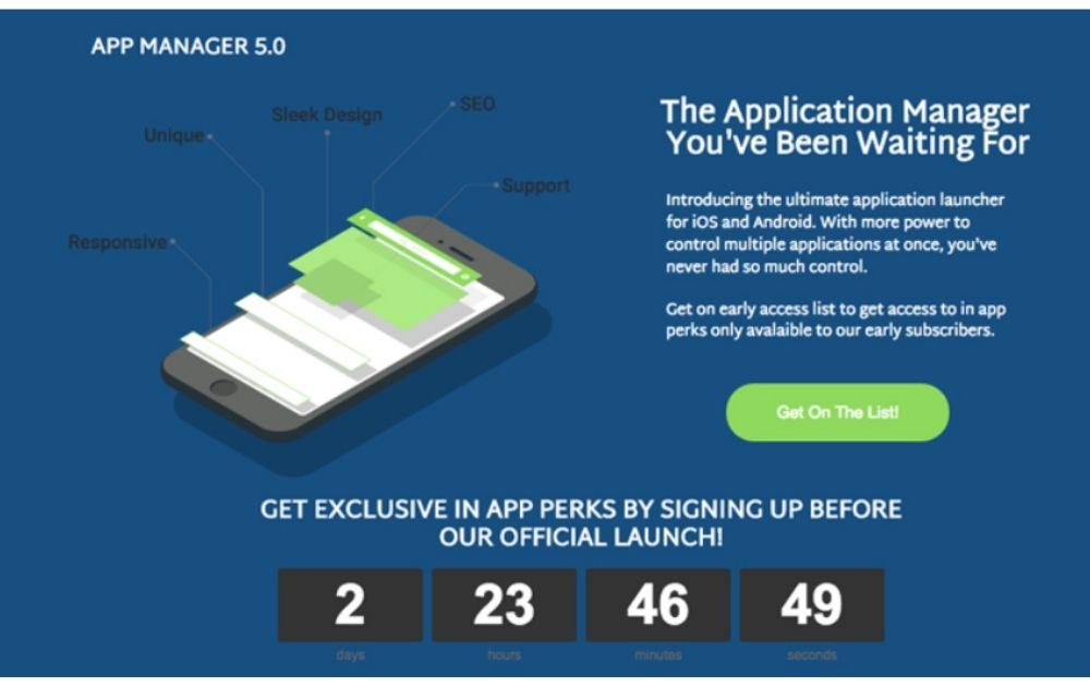
There are few better ways to encourage anticipation over a launch than a countdown timer. For instance, this landing page uses the countdown as a main element in the layout. As seen in the image, it also creates a sense of urgency; visitors should sign up to get a good deal before the countdown ends.
7. Bold Hues
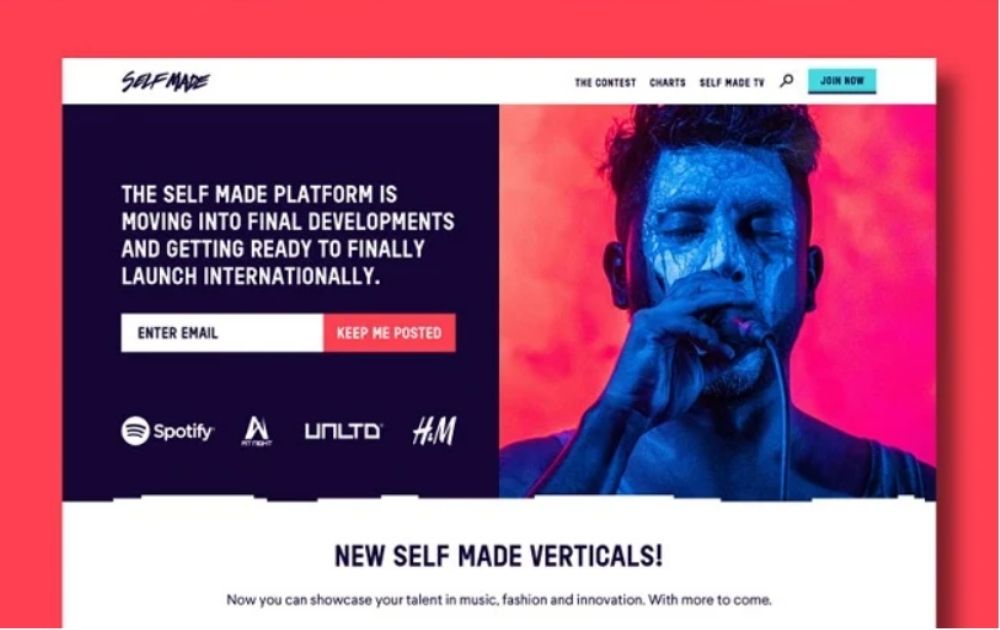
Whether you need a coming soon landing page WordPress, Wix, or Shopify-style, bold hues can surely do the trick. This image, for example, shades of crimson, magenta, and royal blue to catch attention.
8. Pop of Color
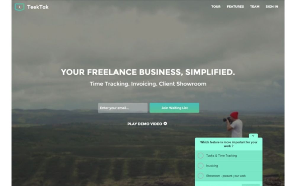
Neutral shades of grays and nudes are making the rounds these days. But if you want to add allure to the visuals, a pop of color is a good route to take. This visual, for example, uses just a splash of mint green on a gray canvas. And the pop up at the bottom right is another way to engage with potential customers, which they can use to improve their software.
9. Offer Invites
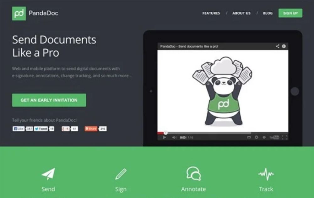
Getting an invite can make a prospect feel like a VIP. And that’s exactly what the CTA button on this landing page does. The page also has social media share links, making it easy for visitors to spread the word.
10. Minimalist Design
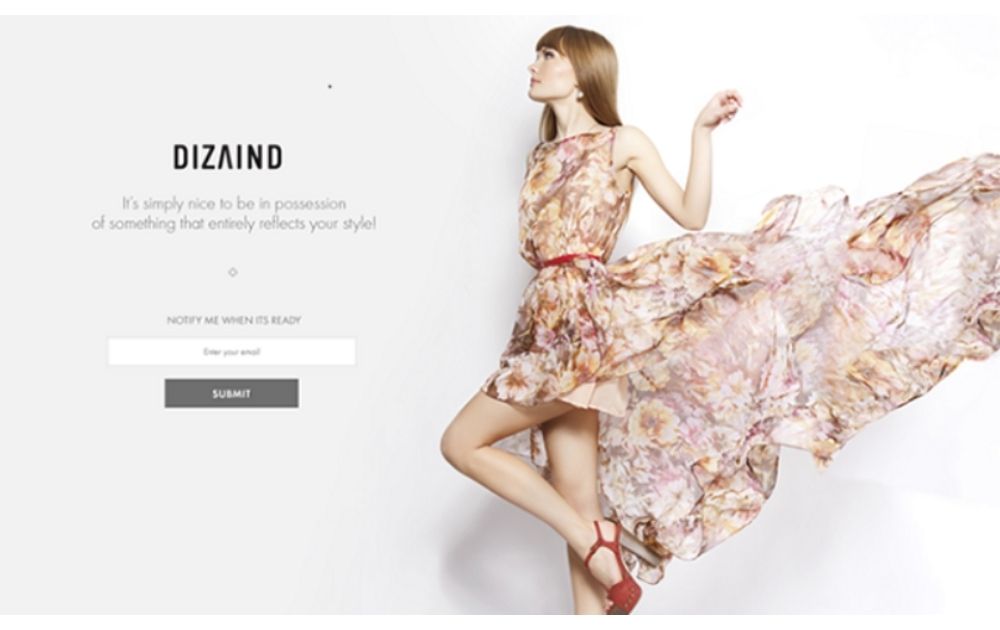
When you know your audience to the core, you know exactly how to hook them in without overselling your offer. This coming soon landing page, for example, only has a catchy image, a short description, and a CTA button. The fashion styling is enough to draw its audience in.
Catchy Coming Soon Phrases
Having the right copy to go with the design is one of the landing page best practices you shouldn’t forget. Here are some coming soon text sample ideas you can use for your landing page:
- Are you ready? [Brand Name] is coming soon.
- Better things are coming. CTA: Get update when [Brand Name] launches
- Something exciting is in the works. CTA: Get an invite
- [Brand Name] is coming. Sit tight!
- Be the first to know when [Brand Name] launches. CTA: Keep me in the loop
- Finally, a solution for [problem]. CTA: Get early access
Key Takeaways
Here are key takeaways for people who want to make the most of their coming soon landing page:
- A website teaser page is a great way to establish your brand, collect emails, and boost social media support before the website launch.
- An effective coming soon landing page has a headline, a well-written description, a call-to-action, and a relevant visual design.
- Take note of color psychology when designing your landing page. Your palette should complement your message instead of contradicting it.
- Consider adding a countdown timer to boost excitement.
- Make the visitor feel like a VIP right from the start by offering invites, discounts, or exclusive content when subscribing to your email list.
Need a customized coming soon landing page? Penji can help. We have the top two percent of designers, and our team knows just the right approach to pique your visitor’s interest. Here are a few samples of landing pages we’ve done for clients in the past:
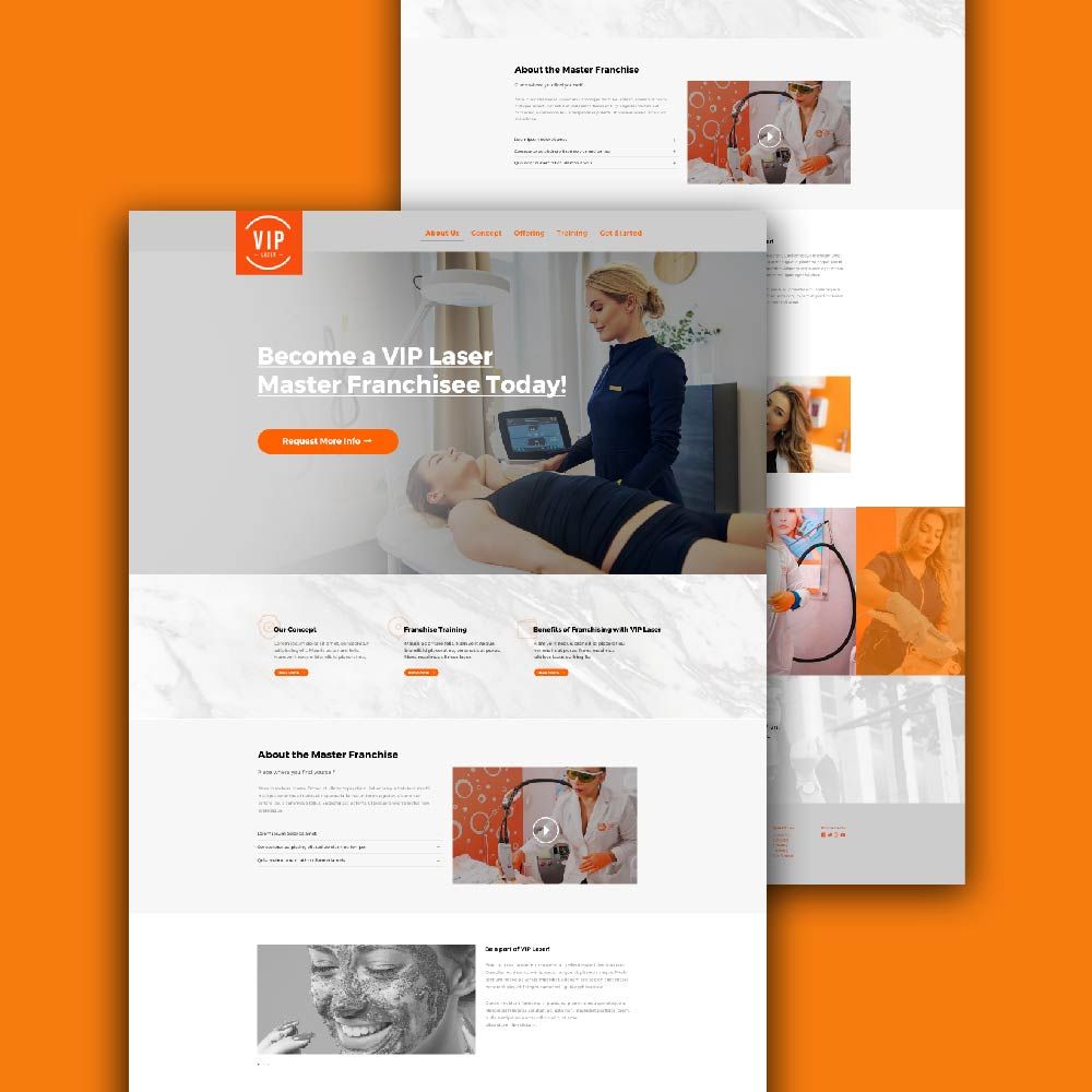
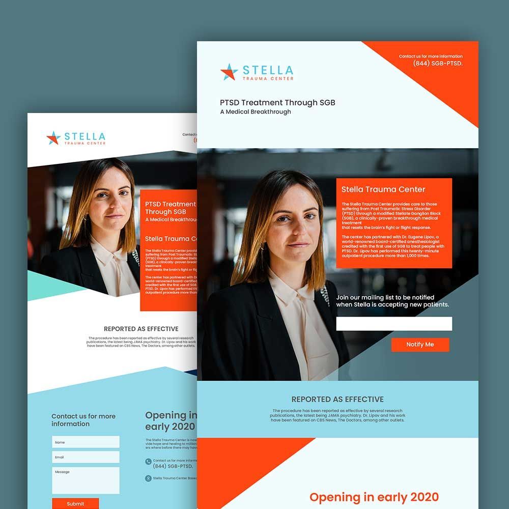
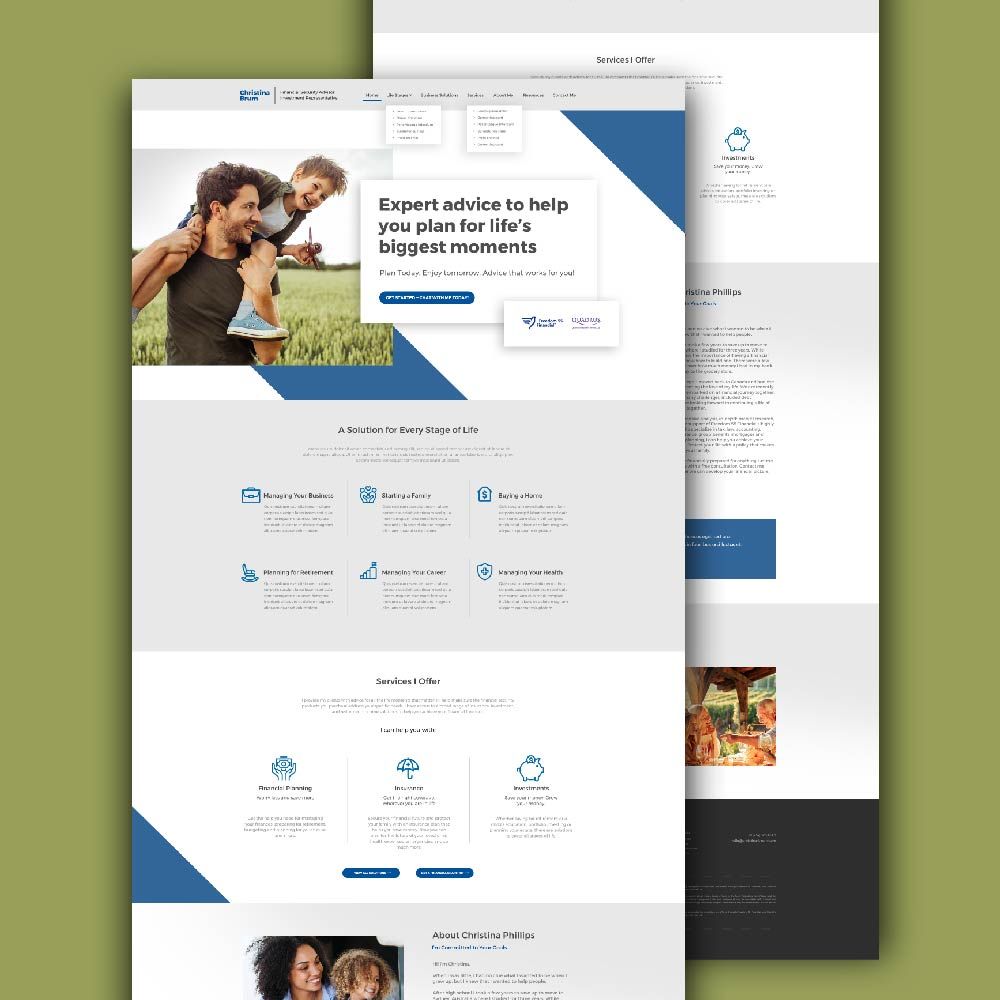
Best of all, we offer unlimited graphic design at a flat monthly cost. That means you can have us design everything you need – from illustration for design to custom sticker design.
Sign up now by clicking this link to enjoy 15% off the first month of any plan. The best part? You can try any of our packages risk-free for 15 days, so there’s nothing to lose.
About the author

Carla Deña
Carla is a journalist and content writer who produces stories for both digital and legacy media. She is passionate about creativity, innovation, and helping small businesses explore solutions that drive growth and social impact.


