Did you know that 50 percent of new customers are drawn in by signage?
That alone is reason enough to give coffee shop fonts careful thought if you want your venture to be successful.
Yup, running a cafe entails much more than serving delicious pour-overs and cold brews. In this day and age, when drinking coffee has evolved into a culture all on its own, the quality of drinks you serve is just as important as how you package your business – from interiors and music to coffee shop fonts and branding logos.
Here at Penji, for instance, we get a lot of graphic design requests from coffee shop ventures who are stepping up their game at marketing. After all, they know that visual appeal is crucial in building a brand that coffee lovers would want to support.
If you’re clueless about signage typography and are on the hunt for coffee shop fonts to use for your business, don’t look any further because we’ve rounded up the best ones online.
1. Special Elite Font
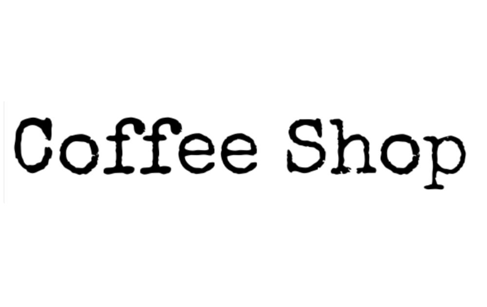
What font to use for coffee? If you’re looking for a rustic font for your coffee shop, check out this font by Astigmatic One Eye Typographic Institute. It gives off a certain character without being overwhelming, like other typewriter fonts. That said, it is one of the fonts for coffee shops that could make your place feel like somewhere Ernest Hemingway would enjoy a cafe noir from.
2. ShoCard Caps NF Font
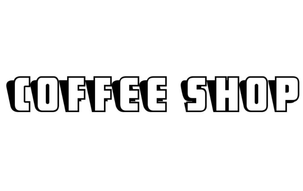
This font by Nick Curtis looks fun, retro, and reminiscent of the 90s. The black shadow creates a stark contrast in the visual, thereby creating a 3D look. This is one of those fonts for coffee shops that would make the venture look exciting and far from the run-of-the-mill cafe.
3. Rochester Font
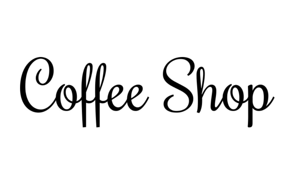
If you’re looking for coffee shop fonts that look elegant without being overly feminine, check out this option by Font Diner. While some script fonts tend to be too stylized to the point of being visually noisy, this design inspiration looks simple enough with just the right flair.
4. Grenadier NF Font
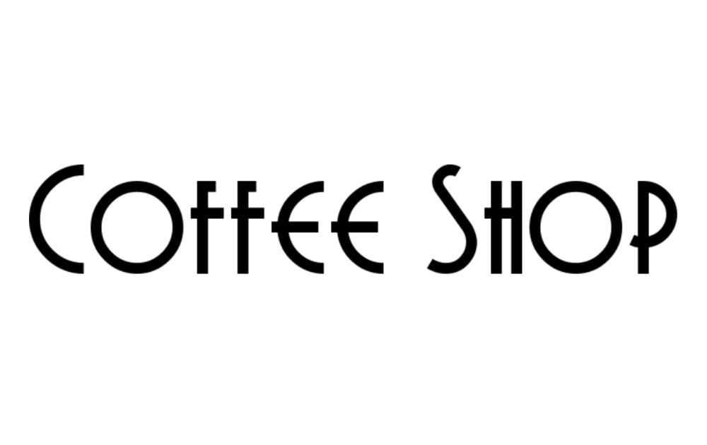
Not all sans-serif fonts look dull and boring. Just take a look at this font created by Nick Curtis. The art deco style looks vintage and glamorous at the same time. That said, it would be an awesome font to use if you’re trying to channel that kind of sophisticated but sleek vibe.
5. Alba Font Regular
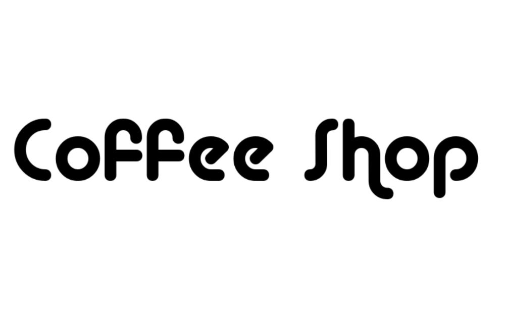
Here’s another sans-serif font that catches attention! This style by Font-a-licious is one of those coffee shop fonts that make you think of a diner. And just like your favorite retro diner, it looks easy and uncomplicated but comfortably familiar all at the same time.
6. KG Summer Sunshine Regular
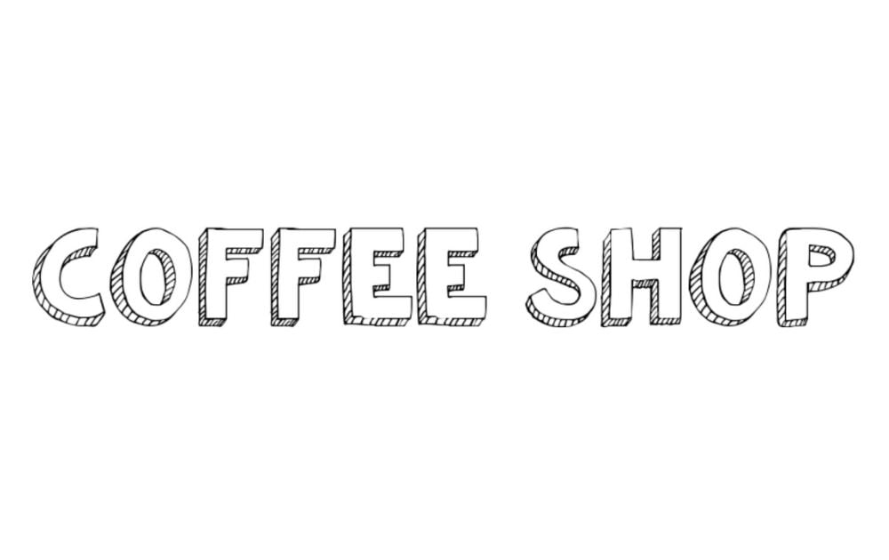
Here’s a great font created by Kimberly Geswein. The cute text looks like a doodle from someone’s notebook. That said, using this font on your logo or menu design will certainly give your cafe a playful appeal. In the same vein, this design inspiration will be a good way to relate with a younger audience segment.
7. Fredericka the Great Font
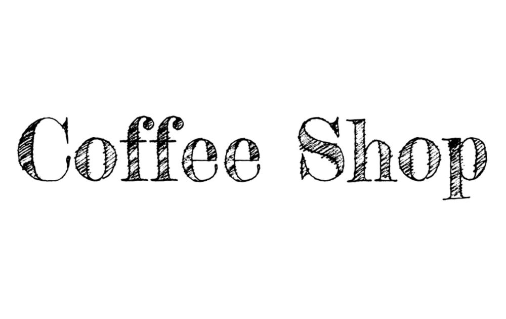
Here’s another hand-drawn style by Font Diner. If you’re drawn to using the popular blue mountain espresso font on your menu, Fredericka the Great will be a great one to use for the headings. Since both look hand-drawn, your menu will look bespoke and handcrafted – just like how many coffee lovers like their cup of joe.
8. Saucer BB Font
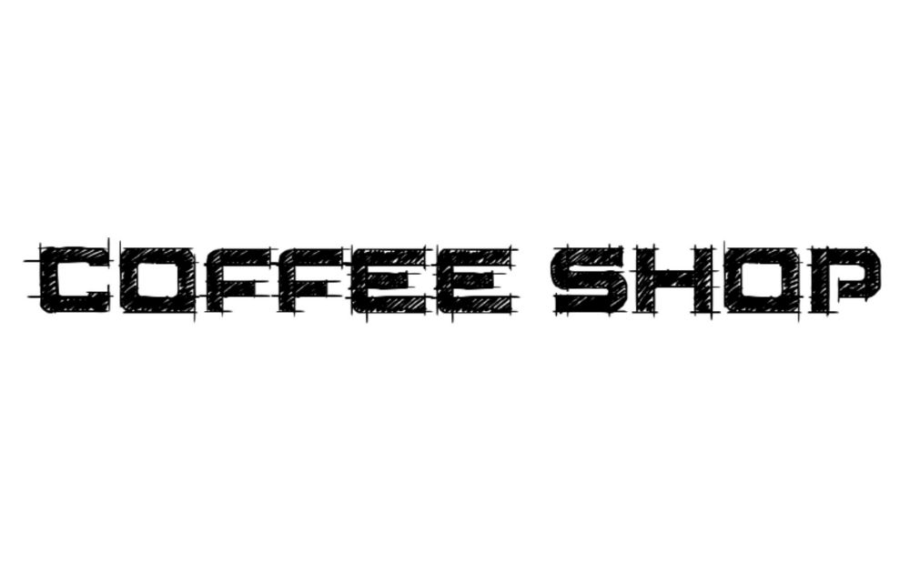
This font by Blambot Comic Fonts doesn’t look like anything you’d get from a coffee font generator. In fact, it looks like a manual illustration that an artist might have spent hours working on. And when it comes to a marketing visual, that kind of aesthetic appeal is always a good thing!
9. Gisellano Font
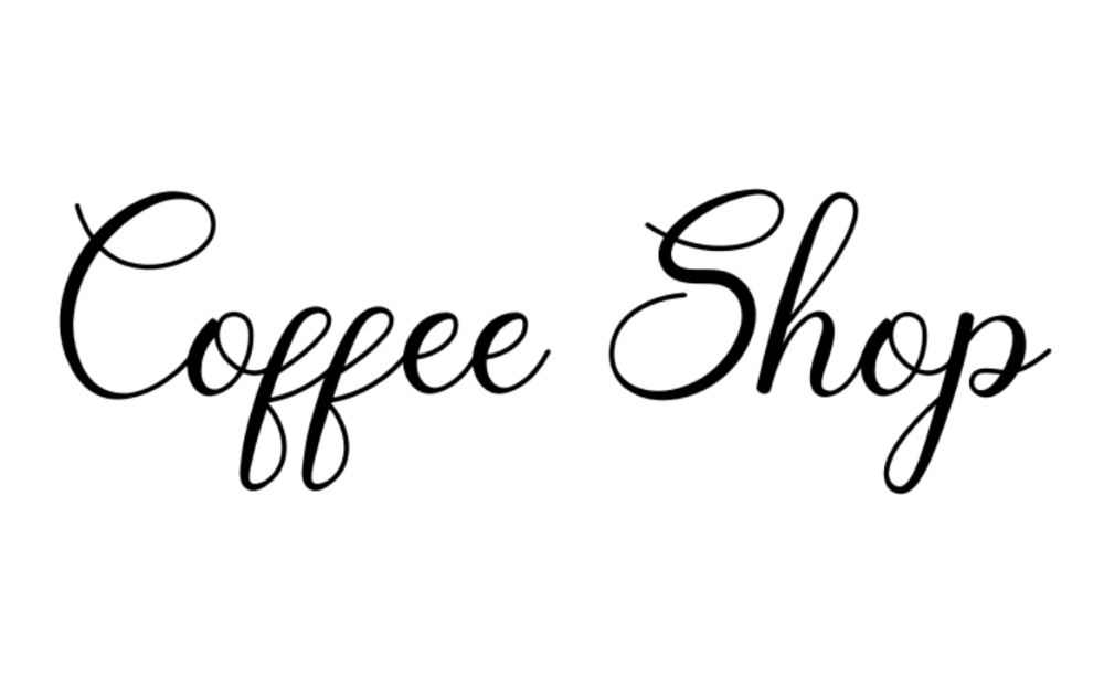
If you’re looking for a font that gives off a warm and cozy feel, consider this work created by Yan Studio. Out of all the different fonts for cafe ventures, curvy script styles like this gives the impression of a friendly neighborhood cafe. A coffee shop with this font on the logo looks like a place where you’d sit down with a cappuccino and a cupcake while reading a good book.
10. Homerun Font
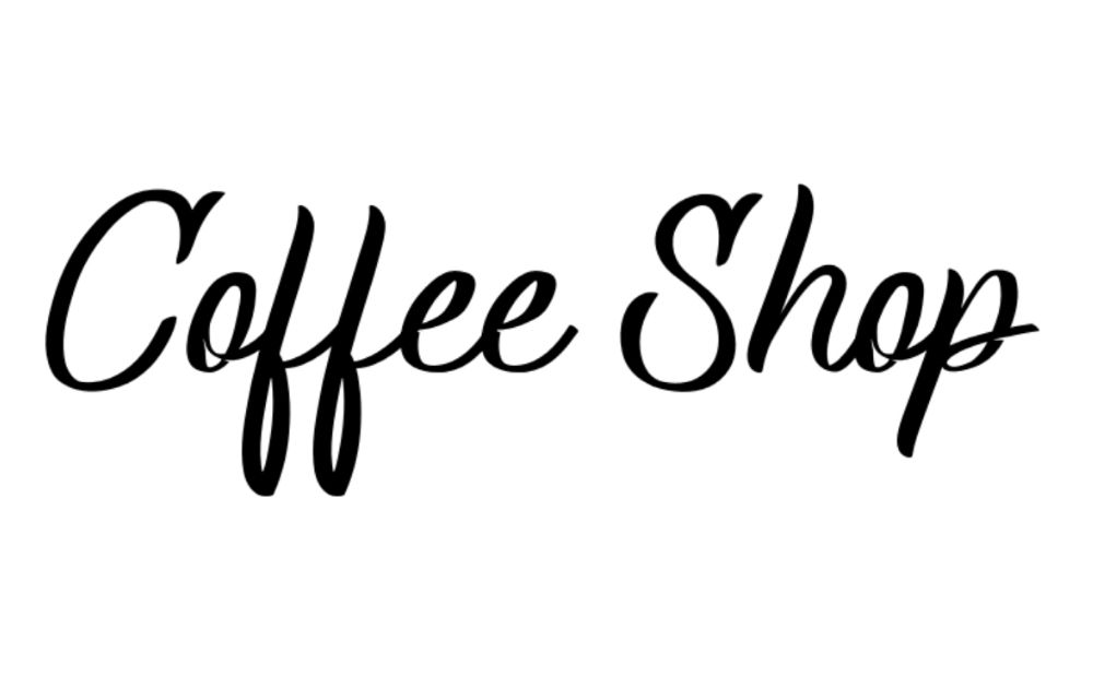
This font by madeDeduk is a good choice if you’re looking for a script font that doesn’t look too uptight. If you’re drawn to coffee calligraphy fonts like the cafe script font, then you’ll surely appreciate this one. Because the strokes look spontaneous, this design inspiration gives the feel of a barista writing the name on the shop window early in the morning just before brewing a fresh pot.
11. Kenyan Coffee Font
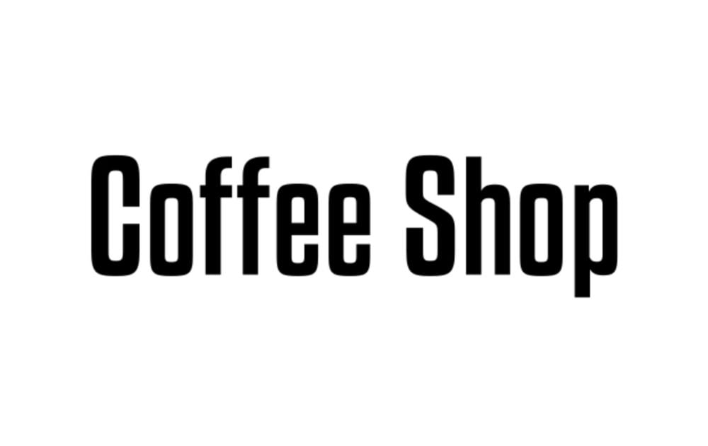
Evoking the rich aroma and deep flavors of African coffee beans, the Kenyan Coffee Font is one of those font styles with a bold and robust look. Its aesthetic appeal comes from blocky and strong characters, which are reminiscent of the traditional coffee sacks in Kenyan markets. This font is perfect for coffee shops aiming to convey a sense of authenticity and a connection to the roots of coffee culture.
12. Barista Script Font
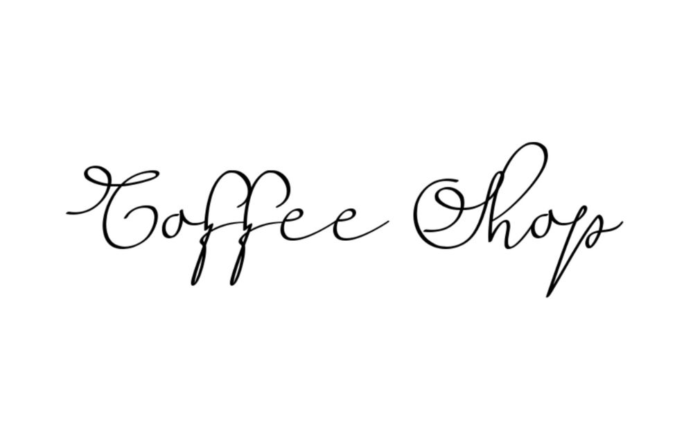
With its elegant curves and smooth lines, the Barista Script Font is reminiscent of the artful swirls in a barista’s latte art. This contemporary script font exudes a sense of sophistication and flair, making it ideal for upscale coffee shops and cafes. Its stylish design suggests a place where coffee is not just a drink but an art form. Since this font is cursive, however, make sure to triple-check readability when you apply this font style to your brand name.
13. Cafe Francoise Font
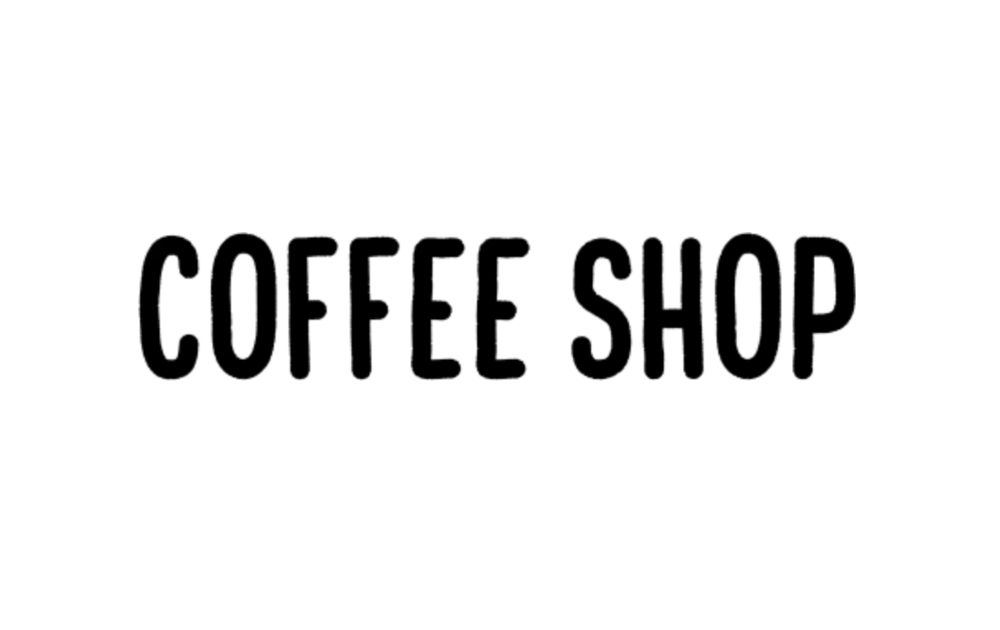
Capturing the charm of Parisian cafes, the Cafe Francoise Font is the epitome of elegance and grace. Its delicate characters and refined design transport you to a quaint cafe in the heart of Paris, where you can imagine sipping on a café au lait while watching the world go by. This is one of those font styles that’s perfect for establishments that want to convey a sense of romance and European aesthetic appeal. Not to mention, it’s a top choice in the readability department.
The Lowdown
Here are a few quick pointers to remember when choosing a brand font:
- Put emphasis on readability; the typeface should be legible and clear enough to read.
- There are a lot of beautiful fonts for coffee shops out there, that’s for sure. But limit your fonts to two to three per material.
- When combining typography, make sure that there’s a level of contrast. For example, combine a serif with sans serif font.
- When it comes to coffee shop fonts, you’d want something that will look good when applied to your shop name.
- The signage typography should jive with your brand style guide. Otherwise, your visuals and brand messaging will be incongruent – this can sour your entire marketing strategy faster than a cup of acidic brew could.
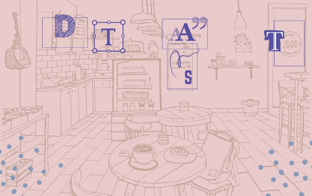
If you’re still not quite sure about what font to use and how to apply it to your brand visuals, leave the job to us at Penji. We have the top 2 percent of designers who all have excellent typography intuition (trust me when I say they know fonts – we had a font-guessing game at our last year-end party, and they killed it).
Here are some of the designs we’ve done in the past using fonts for coffee shops:


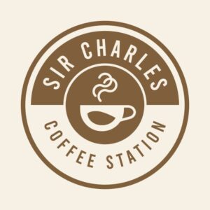
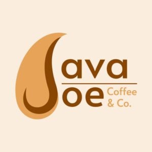
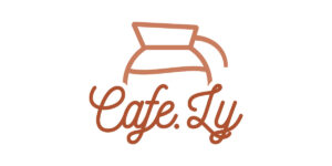

We offer unlimited graphic design at a flat monthly rate. That means you can have all the designs you need without breaking the bank. From book illustrations to coffee shop websites, we’ve got you covered!
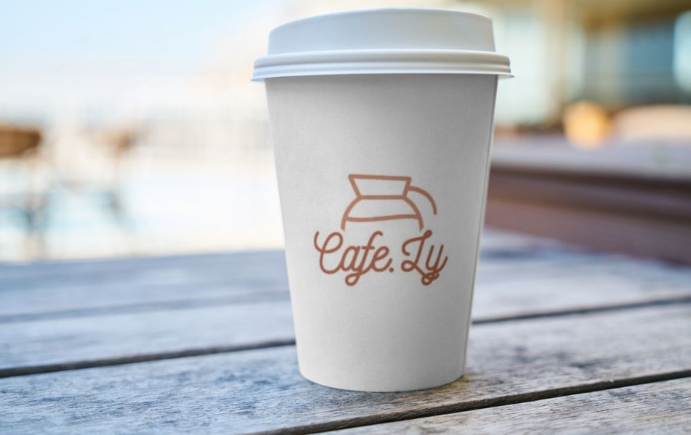
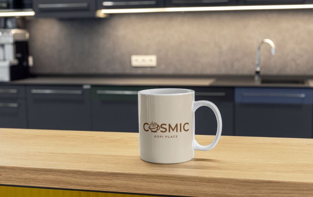
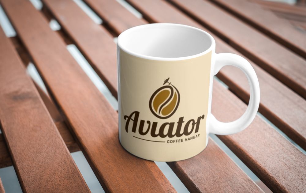
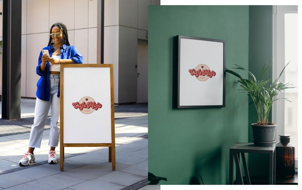
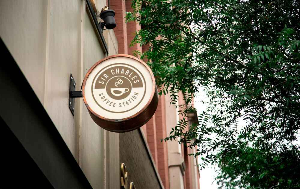
Here are Penji-made logos with fonts for coffee shops when applied on print:
Sign up now by clicking this link to enjoy 15% off the first month of any plan. And the best part? You can try any of our packages risk-free for 15 days so there’s nothing to lose.
Note: All font styles were compiled from 1001 fonts.
Frequently Asked Questions (FAQs):
What font does Costa Coffee use?
The Costa Coffee logo is crafted in a robust sans-serif font, a signage typography style closely resembling Lemon Milk Pro Bold, though the letter “S” has been subtly elongated vertically.
What is Starbucks font?
According to Starbucks’ official creative expression page, they use three font styles for their branding: Sodo Sans, Lander, and Pike.
What font does Dunkin use?
According to fontsgeek.com, the font used in the Dunkin’ logo is called Frankfurter Medium. This font has been associated with the brand’s logo for quite some time.
About the author

Carla Deña
Carla is a journalist and content writer who produces stories for both digital and legacy media. She is passionate about creativity, innovation, and helping small businesses explore solutions that drive growth and social impact.
Table of Contents
- 1. Special Elite Font
- 2. ShoCard Caps NF Font
- 3. Rochester Font
- 4. Grenadier NF Font
- 5. Alba Font Regular
- 6. KG Summer Sunshine Regular
- 7. Fredericka the Great Font
- 8. Saucer BB Font
- 9. Gisellano Font
- 10. Homerun Font
- 11. Kenyan Coffee Font
- 12. Barista Script Font
- 13. Cafe Francoise Font
- The Lowdown
- Frequently Asked Questions (FAQs):


